Rene Smit 🌱 retweetledi
Rene Smit 🌱
40.7K posts

Rene Smit 🌱
@rcsmit
Wijsheidwappie || Hospitality | Tourism | Service | Quality | Yoga | Meditation || languages | running | piano | chess | Python | Midjourney
Katılım Şubat 2009
1.7K Takip Edilen1.6K Takipçiler

I made a "should I be trading?" dashboard.
Scores the market across 5 pillars:
- volatility (put/call ratio, vix, positioning)
- trend (spx vs 20d, 50d, 200d ma's)
- breadth (advancing/declining, nas highs/lows)
- momentum (sector leaders, laggards, % participation)
- macro (fomc, rates, geopolitics)
Each is weighted, combined, and averaged to give me a score for the current environment.
Basically a yes, no, or stay small.
Sometimes I just need someone (or something) to remind me to stay out.
Happy to share the prompt if you guys want it...but I made this with @perplexity_ai's Computer.

English

@investingluc @perplexity_ai Did you do a backtest? This is what I get
In other words: better just to buy and hold instead of using this dashboard... (script buys in the morning after the signal)

English

here is the prompt I used on @perplexity_ai max (Computer)...feel free to mess around with the weightings, etc.
-----------------------
PROMPT: Build “Should I Be Trading?” — Bloomberg Terminal-Style Market Dashboard
Build a live, auto-refreshing Bloomberg Terminal-style web dashboard called “Should I Be Trading?” that evaluates the current stock market environment and outputs a clear, actionable trading decision for swing traders.
---
Core Output
The system must display:
1. Decision: YES / CAUTION / NO
2. Market Quality Score: 0–100%
3. Execution Window Score: 0–100% (separate)
4. Plain-English Summary: concise explanation of the environment
---
Data Inputs (Live or Latest Available)
Volatility / Risk
- VIX level, trend (5d slope), and 1-year percentile
- VVIX (if available)
- Put/Call ratio (estimate if needed from VIX regime)
Trend & Structure
- S&P 500 (SPY) vs 20 / 50 / 200-day moving averages
- QQQ vs 50-day moving average
- SPY 14-day RSI
- Market regime classification: uptrend / downtrend / chop
Breadth
- % of stocks above 20d / 50d / 200d moving averages
- NYSE Advance/Decline line + daily ratio
- Nasdaq new highs vs new lows
- McClellan Oscillator (optional if available)
Momentum / Participation
- All 11 S&P sector ETFs: XLK, XLF, XLE, XLV, XLI, XLY, XLP, XLU, XLB, XLRE, XLC
- Top 3 vs bottom 3 sector performance (relative strength spread)
- % of stocks making higher highs
Macro / Liquidity
- 10-Year Treasury yield (level + short-term trend)
- Dollar Index (DXY trend)
- Fed stance (derived or labeled: hawkish / neutral / dovish)
- FOMC calendar (flag if event within 72 hours or same day)
- Optional: CPI / Jobs flags
---
Scoring System
Calculate category scores (0–100):
- Volatility: 25%
- Momentum: 25%
- Trend: 20%
- Breadth: 20%
- Macro/Liquidity: 10%
Then compute:
Market Quality Score = weighted average
---
Decision Logic
- 80–100 → YES
Full position sizing, press risk
- 60–79 → CAUTION
Half size, A+ setups only
- <60 → NO
Avoid trading, preserve capital
---
Execution Window Score (Critical Layer)
Separate score that evaluates whether setups are actually working:
- Are breakouts holding above pivot levels?
- Are leading stocks maintaining gains after breakout?
- Are pullbacks being bought quickly?
- Is there multi-day follow-through?
Score 0–100 and factor into final explanation (but NOT the main score weighting).
---
UI / UX Requirements (Bloomberg Terminal Style)
Visual Style
- Dark blue/black background
- Monospace font
- Green / red / amber indicators
- Minimal, dense, high-signal layout
---
Layout
Top Bar
- Scrolling ticker (SPY, QQQ, VIX, DXY, TNX, sectors)
- Status indicator: LIVE / UPDATING
- Last updated timestamp (“updated 12s ago”)
- Manual refresh button
---
Hero Panel
- Large “Should I Trade?” decision badge (YES / CAUTION / NO)
- Circular score visualization (0–100%)
- Subtext: “Market Quality Score”
---
Core Panels (Grid)
Each panel includes:
- Current value
- Direction (↑ ↓ →)
- Interpretation (healthy / weakening / risk-off)
Panels:
1. Volatility
2. Trend
3. Breadth
4. Momentum
5. Macro
---
Sector Heatmap
- Horizontal bar visualization of 11 sector ETFs
- Highlight leaders vs laggards
---
Scoring Breakdown Panel
- Show weight + score per category
- Visual contribution to total score
---
Alert Banner
- Display when FOMC / CPI / major macro event is imminent
---
Terminal Analysis (AI Layer)
Generate a short explanation like:
“This is a strong trend environment with expanding breadth and moderate volatility. Sector leadership is concentrated in technology and industrials. Favor selective swing trades with disciplined risk.”
---
Mode Toggle
- Swing Trading Mode
- Day Trading Mode (adjust thresholds slightly tighter and faster)
---
Technical Requirements
- Auto-refresh every 45 seconds
- Server-side cache (30 seconds) to reduce API load
- Loading skeleton states while fetching
- Error handling for missing data
- Modular architecture (easy to swap APIs)
---
Output Requirements
Return:
1. Full frontend layout (React preferred, Tailwind optional)
2. Backend/data aggregation logic (Node or Python)
3. Clear scoring formulas (editable)
4. Example output using current/latest market data
5. API recommendations (free + paid)
---
Success Criteria
- Clean, fast, high-signal UI
- Accurate regime detection
- Simple, trustworthy YES / NO output
- Feels like a personal risk manager, not just a data dashboard
♥️Luc
English

Leren programmeren? Stanford.edu start met een gratis online cursus voor beginners. Voor gevorderden of docenten ook interessant, met name om met het educatieve systeem kennis te maken. codeinplace.stanford.edu/?utm_medium=em…
Nederlands

@haagseinsider @georgevanhouts Heb je dit gezien?
Doet me erg denken aan een script wat ik las in voorjaar van 2020 waarvan inmiddels 95% is uitgekomen

Nederlands
Rene Smit 🌱 retweetledi

@OfficialLoganK @GoogleAIStudio Helps you also getting online? My handstand analyser was made in 5 min, after 5 hours still not able to get online with all those cloud settings. And blank-cheque-google-api doesnt help neither
English

Tomorrow we will unveil the all new vibe coding experience in @GoogleAIStudio, the team has spent 4 months rebuilding it all from scratch and smoothing out rough edges to help everyone bring their ideas to life.
This is a big step forward, but just the start : )
English
Rene Smit 🌱 retweetledi


Voor Nederland
cbs.nl/nl-nl/visualis…
Global Statistics@Globalstats11
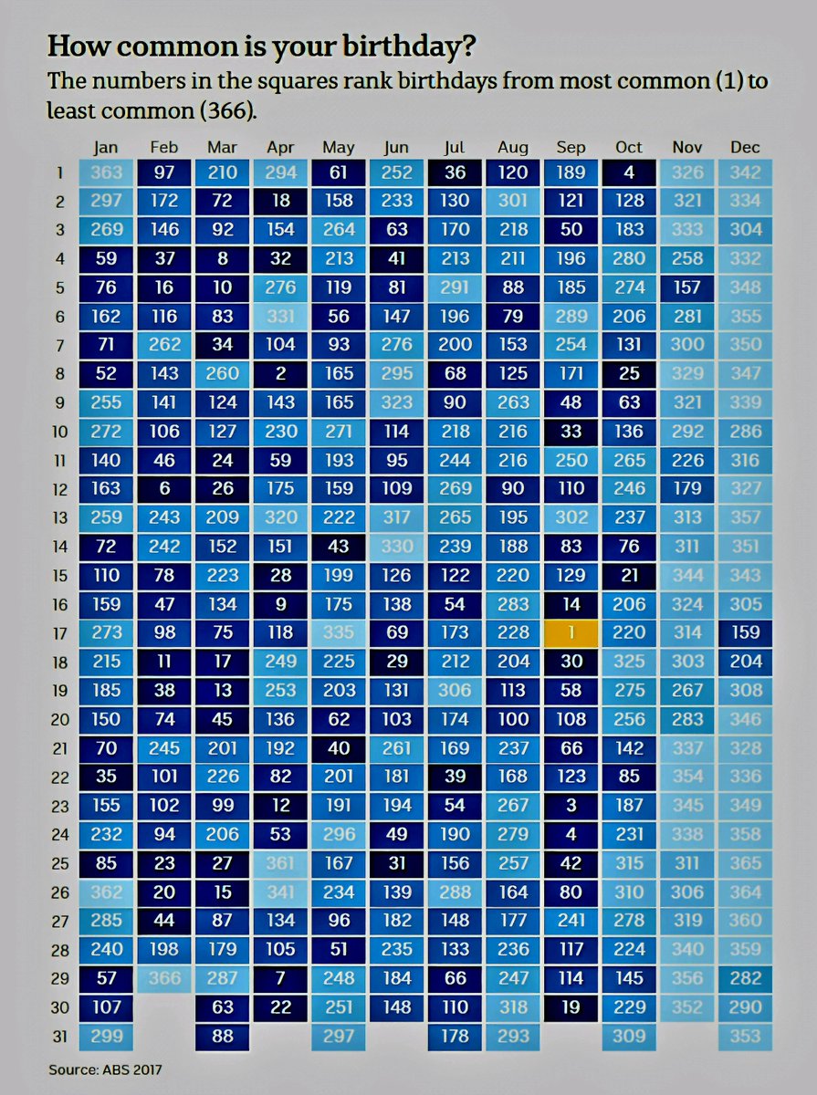
Most & Least Common Birthdays Ranked
Nederlands
Rene Smit 🌱 retweetledi

This animated globe by @tylermorganwall gives us a rather immersive view of global population. I particularly love how clear the "empty hemisphere" appears.
English
Rene Smit 🌱 retweetledi

Erg veel reacties op mijn overzicht van NL banen en de impact van AI.
De weergave geeft inzicht in het totaal en maakt oriëntatie mogelijk voor ouders, studenten en bestuurders.
De tabel/kaart leent zich het best voor een groter scherm. nljobs.hoeijmakers.net/?x
Nederlands

@rcsmit @ChGefaell Waarover zijn wij het oneens? Regelmatig toch ook eens?
Nederlands

Het kostte mij als amateur-prutser vijf minuten om de kaart te reproduceren @ChGefaell. Moet jou met jouw credentials toch ook wel lukken? ourworldindata.org/grapher/cancer…

JOSE GEFAELL@ChGefaell
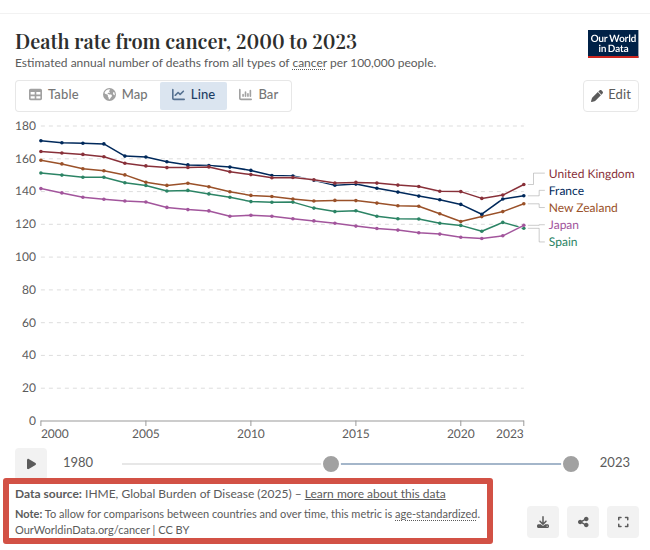
How strange – Our World in Data has changed the source for this chart today, and the conclusion is completely different. My post above was a copy-and-paste from a screenshot taken on 16 March 2026 at 23:50 CET. But just a few hours later, on 17 March 2026 at 12:30 CET, this is the screenshot you can now see.
Nederlands
Rene Smit 🌱 retweetledi


