Sarthak

345 posts

Sarthak banner
Sarthak

Sarthak

@sarthkk_a

Learning design and life! Behance: https://t.co/iqUIHGAVIs

Katılım Ağustos 2018
119 Takip Edilen25 Takipçiler
Sabitlenmiş Tweet
Sarthak
Sarthak@sarthkk_a·
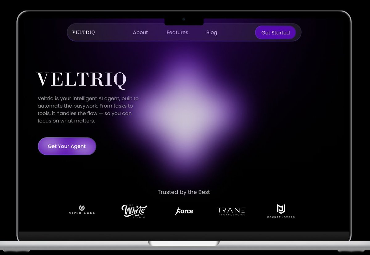
Built a landing page for this Client (my close friend now:) It's yet to be developed but here it is on Behance! Design goal: make it look smart enough to trust. tinyurl.com/mryyzy2x Would love your roast or praise 🫡
Sarthak tweet media
English
0
0
2
154
Sarthak
Sarthak@sarthkk_a·
Kendall wore quiet luxury when he felt secure—no need to prove anything. But the moment he drifted from the family and needed validation, his wardrobe turned loud—designer fits screaming for attention. Just shows how deeply psychology runs in Succession & in real life. Wild show!
Sarthak tweet media
English
0
0
1
64
Sarthak
Sarthak@sarthkk_a·
@vedantjamwal_ Is this an actual app or just a personal project? Would love to try it
English
1
0
1
38
Sarthak
Sarthak@sarthkk_a·
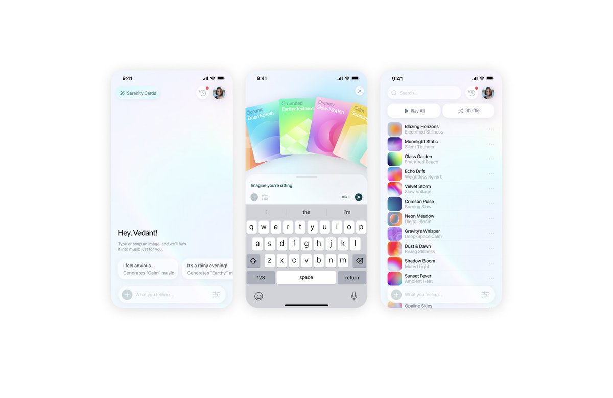
@vedantjamwal_ Glass morphism looks great here. Thought process behind the design?
English
1
0
1
67
Vedant · Product Designer
Vedant · Product Designer@vedantjamwal_·
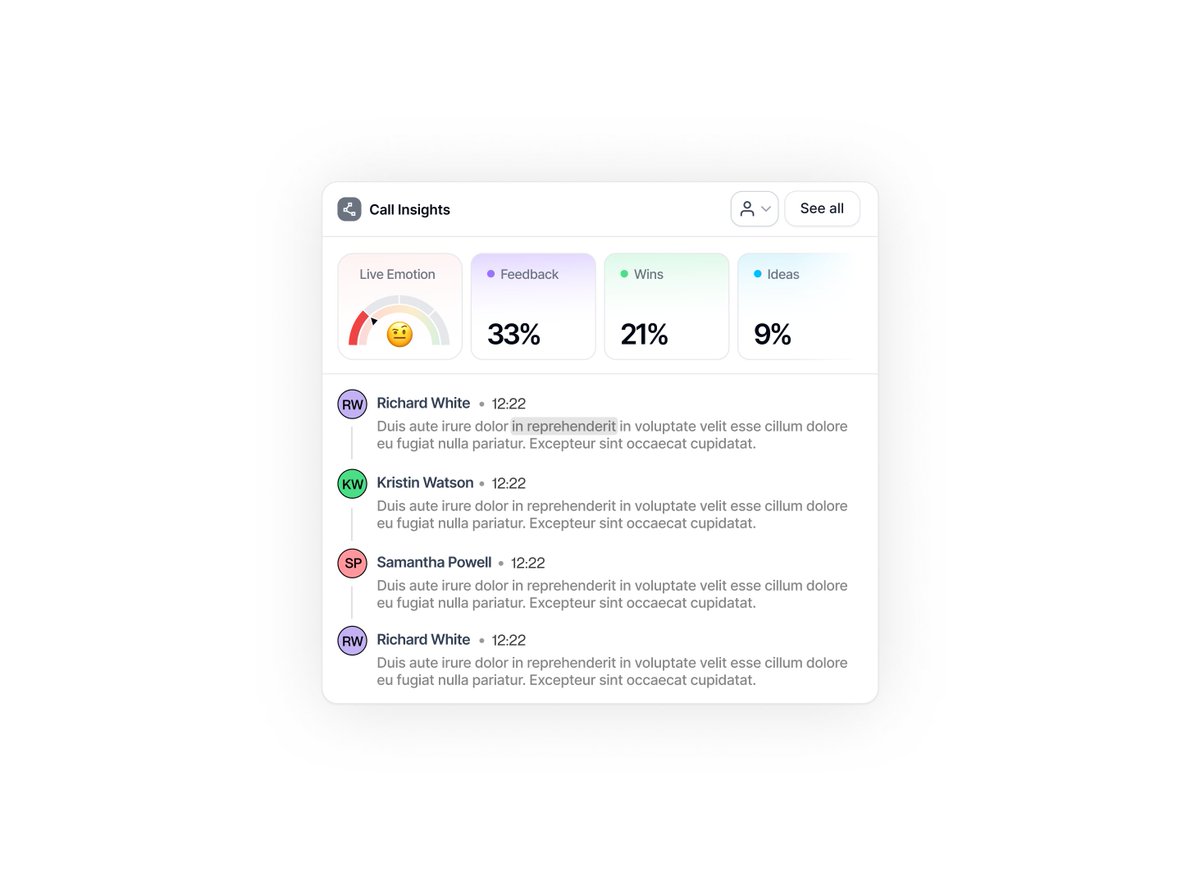
Most AI note-taking tools don’t work for people like us... I was on a product call with a founder of the biggest AI note-taking app last week. The AI note-taker kicked in, generated a “smart summary,” and I moved on. Later, when I sat down to figure out what we needed to design next, that summary was… useless. Not because it wasn’t accurate. But because it wasn’t emotional. As a designer (or even a founder or therapist), I don’t just want to know what was said. I need to understand how it was said. Where did the user hesitate? Where did the founder light up? What moment actually felt like a breakthrough? I find myself going back to the full recording — not to rewatch the whole thing but just to find that one moment where something clicked. A smart summary can’t give me that. It’s why I believe most AI call tools today are designed for sales teams and ops. People who want quick action items. And that’s great. But what about the rest of us — the emotion-driven thinkers? Designers. Founders. Researchers. Therapists. We don’t just need “what’s next.” We need what mattered. So I ended up designing a component for this (attached as an image) — just a side project — after a conversation with someone from one of the biggest call recording apps out there. They agreed... They agreed: this is a gap no one's really solving yet. The idea is simple: Highlight moments of feedback, wins, frustrations, and insights — and link them directly to the full transcript and video timestamp. Let us feel the call, not just read it. I’m not building a tool (yet), but if you're building in this space — or even just using these tools every week — I hope this helps you think from a broader perspective. We don’t just need better summaries. We need better listening. Notes for: @FathomDotVideo @meetgranola @firefliesai @whoisjenniai @otter_ai @meetjamie_ai Ps: If you want a full-blown deck of how I came to this solution, I'd love to share my design process with you guys. Just "Like" + "Comment your email" and I got you. #AItools #Notetaking #CallRecording #ProductDesign #UXDesign #EmotionDrivenDesign #DesignThinking #UserResearch #HumanCenteredDesign #Founders #Designers #Therapists #Researchers #ProductCritique #BuildInPublic #UXMatters #SaaS #StartupTools #ListeningDesign #DesignForEmotion
Vedant · Product Designer tweet media
English
1
0
5
508
Sarthak
Sarthak@sarthkk_a·
@vedantjamwal_ @Apple Also the vison pro would be having this glass morphism effect in their spatial design system, so it creates even more consistency. They really planned this well.
English
0
0
0
50
Vedant · Product Designer
Vedant · Product Designer@vedantjamwal_·
I love what @Apple did.... Alright, let's talk about this new Liquid Glass design in iOS 26. I've been seeing a lot of hate online, people calling it unnecessary or too flashy, but honestly, I'm really digging it. Here's why: First off, it's just so visually appealing. The translucency and how it plays with light is beautiful. It feels modern and fresh in a way that the flat design of the past few years just didn't. It brings a new level of vitality to the user experience. And it's not just about looks. The way the interface dynamically reacts to your touch and the content on screen is amazing. It makes the whole system feel more alive and intuitive. The colors adapt based on the content, so everything feels harmonious. I also appreciate how Liquid Glass creates a unified design language across Apple's platforms. Whether you're on your iPhone, iPad, or Mac, there's a consistent look and feel that makes the whole ecosystem feel more cohesive. Some might argue that it's just a cosmetic change, but I think it's more than that. Liquid Glass brings a new level of polish and sophistication to iOS. It makes using my devices more enjoyable, and that's what good design is all about. Yes, it's different, and change can be jarring. But I encourage everyone to give Liquid Glass a chance. Play around with it, see how it enhances the experience, and I think you might just end up liking it as much as I do. Key Advantages of the Liquid Glass Design Visually Appealing: Translucent material that beautifully reflects and refracts its surroundings, delivering a sleek and modern look. Dynamic and Reactive: The interface responds in real-time to user input and content, creating a lively and intuitive experience. Unified Design Language: Establishes consistency across iOS, iPadOS, macOS, watchOS, and tvOS, enhancing the Apple ecosystem's harmony. Enhanced User Experience: Brings a new level of sophistication and enjoyment to using Apple devices, making interactions more intuitive and visually pleasing. Improved Navigation: The design update brings more clarity to navigation and controls. Personalization: Elements like app icons and widgets use layered Liquid Glass for a sleek look and more personalization, including new tints and a transparent menu bar in macOS Tahoe. Hardware Harmony: The controls fit perfectly with the rounded corners of modern hardware and app windows. Functional Design: Liquid Glass creates a distinct functional layer for controls and navigation, giving users a larger canvas for their content
English
6
0
4
665
Sarthak
Sarthak@sarthkk_a·
@vedantjamwal_ @aave I see. So you start recognizing patterns as you gain experience in a niche. Thanks!
English
0
0
0
26
Vedant · Product Designer
Vedant · Product Designer@vedantjamwal_·
Whenever I get on a call with Web3 founders building from scratch, they almost always want to reinvent the wheel or make everything look ultra-futuristic. @Aave is one of the biggest names in DeFi, with billions in TVL and a massive user base. Yet, they rebranded and launched a fresh website. Why would a giant like that go through the hassle? Because even in web3, being “futuristic” or “degen” isn’t enough anymore. The new cool is making things: - Friendly - Open - Inviting ...for everyone, not just crypto-natives. Their founder literally said they want to build interfaces where people can interact in a way that’s familiar to them. The rebrand isn’t just about a new logo or color palette; it’s about making web3 accessible, usable, and even fun for the mainstream. They’re not just chasing hype, they’re building products that actually feel good to use, and that’s what brings new users in aka "the web2 folks" As a web3 founding designer who’s worked with multiple web3 startups, I’ve always pushed for simple, welcoming user flows over reinventing the wheel. It’s not about adding more “cool” features, it’s about removing friction, making onboarding a breeze, and letting people feel at home in your app. If @Aave can humble itself and double down on UX, so can the rest of us. Let’s make #Web3 the most inviting place on the internet. That’s the real flex.
English
2
0
14
705
Manav Jain
Manav Jain@manavj29·
It's here! 750+ Human Behavior Insights by @kunalb11 We've deep-dived into human behavior applications by studying Kunal's posts b/w 2012-2025 and manually collected (no GPT) ~750 sharp insights across 11 themes (psychology, social, etc) comment "Human Desire" for a copy
Manav Jain tweet media
English
751
69
1.1K
99.9K
Abiodun Osagie
Abiodun Osagie@abiodunosagie1·
Hi everyone! I'm starting a real estate project and need UI designers for an app, landing page, and admin dashboard. My budget is limited, so high-end designers may not fit. I'm looking to collaborate with three designers. Thank you! 😊
English
5
0
2
133
Sarthak
Sarthak@sarthkk_a·
@herropaulgg Hey Paul, would love to have chat about your app idea!
English
1
0
0
17
herropaul
herropaul@herropaulgg·
Looking for an Entry Level UI/UX designer to help create some mockups for an app idea! Reach out to me for more details if you’re interested, hoping this reaches the right audience 🫡
English
2
0
3
212
Sarthak
Sarthak@sarthkk_a·
Working on this new web design project for a travel agency, my first time in this niche. It feels refreshing to explore new niches, ideas and strategies! How's the hero section looking? Would love your feedback! Do check out my Behance! tinyurl.com/56r32tx2
Sarthak tweet media
English
1
0
1
155
Velika
Velika@VelikaSovereign·
@sarthkk_a That's awesome! When work and friendship collide, the magic just happens.
English
1
0
1
2
Sarthak
Sarthak@sarthkk_a·
Working for this client and we're already friends! Hope the project turns out amazing.
Sarthak tweet media
English
1
0
2
55
Timofey Bak
Timofey Bak@_mayweather·
FREE MIKE for 2 DAYS! 🎈 Guys, @framer template Mike is free for 48 hours - regular price is $49. It’s a minimal, perfect for your portfolio - whether you’re a freelancer, creative… honestly, it's ok for anything. If you want it for something, just let me know. To get the remix link: 1. Drop a comment “Comment” 2. Follow me so I can send you a DM 🥂 Link to Mike is 👇
English
240
17
320
23.2K