the screenshot first company

1.1K posts

the screenshot first company banner
the screenshot first company

the screenshot first company

@screenshotfirst

Adding RIZZ with App Store screenshots 🌈 Boosting conversion rates with stunning designs NGL, Purp, Wave AI, Runna, Promova, Bump ✨ DM for inquiries!

App Store Katılım Ocak 2024
127 Takip Edilen15.5K Takipçiler
Sabitlenmiş Tweet
the screenshot first company
the screenshot first company@screenshotfirst·
We’re The Screenshot First Company We just hit 10k followers 🎉 It’s the perfect time to re-introduce ourselves: We specialize in creating captivating visuals and adding rizz that make your app shine in stores. Clients: Promova, Gringo, Happn, Bump, Paired, Cal AI, Sleepiest, Purp, Kismia, Uxcel, Jammable, Riveo, and counting. Huge thank you to everyone who’s been part of the journey 🚀
the screenshot first company tweet media
English
14
8
353
55.4K
the screenshot first company
the screenshot first company@screenshotfirst·
Lovely app! Learning a language through listening and translating row by row is a really lovely approach. The first screenshot with the illustration is charming. But after that it drops into dense UI and hand mockups that don't connect back to that initial vibe. The set feels like two different apps. Right now it leans too much into vibe on frame 1, then jumps straight into features without ever landing the value. You need all three: vibe + outcome + value. A few ideas from the refs: - Mix faces with UI. Someone listening with headphones, smiling, with the app screen (or parts of the UI) floating next to them. Instantly shows what the experience feels like. Think Taxfix or Getsafe style. - Lead with the outcome. "Understand real Japanese in 30 days" hits harder than "One-Tap Import: Multimedia & Text-to-Speech." Sell what happens, not how it works. - Keep the illustration style but extend it. That first frame character is great. Use it across more frames instead of switching to stock hand mockups. - Go simpler on the UI frames. The sentence deconstruction screen has way too much text for a screenshot. Zoom into the one moment that matters. As a first step, try keeping that illustrated character throughout, paired with cleaner UI highlights and outcome-driven headlines. Refs below 🌈
the screenshot first company tweet mediathe screenshot first company tweet mediathe screenshot first company tweet mediathe screenshot first company tweet media
Remember@remembe49954766

@screenshotfirst Please apps.apple.com/app/id67528538…

English
1
1
5
661
the screenshot first company
the screenshot first company@screenshotfirst·
Such an interesting concept! Personal safety app with a social layer is a really cool idea but the screenshots are hard to crack right now. Every frame looks visually different from the next. Different colors, different styles, stock photos mixed with 3D elements mixed with UI. It feels like a few separate apps instead of one. The idea is strong and interesting. You just need to simplify and commit to one visual direction. A few ideas from the refs: - Try simple illustrations to explain the concept. Safety is abstract and hard to show with UI alone. A clean illustration like Maple or Sizl does could instantly communicate what the app is about. Simple, minimalistic, works as excellent hook! - Lead with the hook, not the features. Something like "Your people. Your safety net." with one strong visual. Then explain features after. - If you go with realism, commit fully. Look at how Qonto uses real photos across every frame but keeps one consistent color palette and layout style. No mixing. - Big bold headlines per feature. Each frame should be instantly readable. Right now the text gets lost. Pick one lane. Illustrations, realism, or bold type with UI. Not all three at once. Refs below 🌈
the screenshot first company tweet mediathe screenshot first company tweet mediathe screenshot first company tweet mediathe screenshot first company tweet media
Elisha Seruma@3lishaseruma

@screenshotfirst Here you go looking forward to your feedback! apps.apple.com/ca/app/obserc/…

English
2
1
24
3.2K
the screenshot first company
the screenshot first company@screenshotfirst·
Such a cool niche! Quitting caffeine is a real struggle and having an app for it is smart. And the copy is actually great! "Caffeine withdrawal is predictable" and "You're not failing, you're healing" are really strong lines. They hit emotionally :) But the dark, data-heavy UI is fighting against that emotion. Everything feels clinical when it should feel encouraging and warm. A few ideas from the refs: - Try bold typography over coffee imagery. Your headlines are strong enough to carry a frame on their own. A big "You're not failing, you're healing" over a photo of someone putting down their coffee cup. That's powerful. - Combine actual coffee photos with minimalist line drawings, similar to Sizl's aesthetic. You could include an abstract graph illustrating the consumption decline - Go lighter and warmer. The green-on-black Matrix vibe doesn't match the supportive tone of your copy. Try your best headline on a warm light background with a simple coffee illustration. Let the visuals and words do the work. Refs below 🌈
the screenshot first company tweet mediathe screenshot first company tweet mediathe screenshot first company tweet mediathe screenshot first company tweet media
はとむぎ🌌個人開発@hatomugiDev

@screenshotfirst This is a rather niche app, but could I get some feedback on the design, how it's communicated, and anything else? As a Japanese person, I'm a bit unsure about the subtle design and typography nuances in English-speaking cultures. apps.apple.com/jp/app/uncaf-q…

English
2
0
25
3.4K
the screenshot first company
the screenshot first company@screenshotfirst·
Show us what you got! Vol. 10 🌈 Drop your app link below 👇 We'll come back with pro tips, fresh visual ideas, and conversion-boosting references. What are you building?
the screenshot first company tweet media
English
50
0
34
7.1K
the screenshot first company
the screenshot first company@screenshotfirst·
Lovely app concept! This is a cooking app but the screenshots don't feel like cooking at all. It's dark, text-heavy, and there's no food anywhere. Nothing makes you hungry or excited to try it :) A few ideas worth exploring: - Show the food! Beautiful dishes, fresh ingredients, something sizzling. That's your hook. - Try bold typo over real food photos. Just a big headline like "What's for dinner?" with a gorgeous meal behind it. Simple and effective. - The recipe cards could be a fun visual element. Think of them like the TripBFF travel cards but for recipes. Swipeable, colorful, appetizing. - Go light and warm. The all-black screenshots feel like a developer tool, not a cooking companion. Warm tones, kitchen vibes. As a first step, throw out the dark UI entirely for screenshots. Lead with a beautiful food photo, your headline on top, and just a hint of the app underneath! Refs below 🌈
the screenshot first company tweet mediathe screenshot first company tweet mediathe screenshot first company tweet mediathe screenshot first company tweet media
Branson Pfiester@branson_atx

@screenshotfirst apps.apple.com/us/app/chop-ai… would love some tips!

English
0
0
16
2.6K
the screenshot first company
the screenshot first company@screenshotfirst·
Nice app! Love the icon and the 3D elements. "Walk more. Scroll less." is a killer first line! The screenshots are actually not bad. The hand mockups feel real, the 3D objects add personality. But the set feels a bit inconsistent. Frame 1 is clean and punchy, then it gets busier and more data-heavy as you go. The TikTok blocker angle on that first screenshot is your most unique hook. Lean into it harder across the set. That's what makes you different from every other step counter. A few ideas worth exploring based on the refs: - Try an illustration-led opening frame. Something like Roots does with their nature scene. You could do a fun outdoor illustration that sets the vibe before showing any UI. - Use a bento grid to organize features. Step count, GPS, workouts, app blocking. - Keep the 3D objects but simplify everything around them. Pick one hero element per frame. Try keeping that same clean energy from frame 1 throughout. Less data, bigger headlines. Refs below 🌈
the screenshot first company tweet mediathe screenshot first company tweet mediathe screenshot first company tweet mediathe screenshot first company tweet media
Hieu Dinh@hieudinh_

@screenshotfirst apps.apple.com/us/app/steps-w… how can I improve it?

English
3
2
64
4.9K
the screenshot first company
the screenshot first company@screenshotfirst·
We're looking for apps in Health & Fitness category to design App Store screenshots for. This is one of the most competitive categories in the store and most apps look exactly the same. Green palette, person stretching, "Track your workouts" headline. You've seen it a thousand times. We think health and fitness apps deserve screenshot sets that actually stand out. Not just pretty, but built to convert in a category where everyone blends together. If your app helps people move, eat better, sleep, meditate, recover, whatever it is. DM us. Let's make something the rest of the category wants to copy 🌈
the screenshot first company tweet mediathe screenshot first company tweet mediathe screenshot first company tweet mediathe screenshot first company tweet media
English
8
3
89
5.5K
the screenshot first company
the screenshot first company@screenshotfirst·
Lovely app! Right now the screenshots are all dark UI that blends together. And the cards, the most exciting part, are tiny and buried in lists. This is a collectibles app. The cards should be the hero. A big holographic Charizard taking up half the frame will stop someone scrolling way faster than a portfolio table. "TCG Money won't sleep anymore" is a fun line. Lean into that energy everywhere. Try mixing bold card visuals with just a peek of the UI underneath. Show the thrill, not just the spreadsheet. Refs below 🌈
the screenshot first company tweet mediathe screenshot first company tweet mediathe screenshot first company tweet mediathe screenshot first company tweet media
English
0
0
0
77
the screenshot first company
the screenshot first company@screenshotfirst·
Love the app icon! That receipt aesthetic has so much character. It feels real and tactile. The screenshots don't carry that same energy though. Right now it's just dark UI dumps, one after another. Every frame looks the same and nothing grabs your eye. You have a real design direction sitting right there in your icon. Try pushing that receipt, paper, tactile feeling into the screenshots themselves. Imagine light backgrounds with paper textures, real-world objects like wallets or coins, that handwritten receipt vibe blending with your clean UI. Also, go lighter. The all-dark screenshots blend together and feel heavy when scrolling. Finance apps that go light and minimal tend to stand out more in the category right now. As a first step, try a light first frame with your icon's receipt style as the backdrop, a strong headline like "Track, budget, split. Done." and one clean UI shot on top. Refs below 🌈
the screenshot first company tweet mediathe screenshot first company tweet mediathe screenshot first company tweet mediathe screenshot first company tweet media
Tyo@SetyonoDwi

@screenshotfirst Let’s go! love to get your feedback/tips for Spenzy screenshot apps.apple.com/id/app/spenzy/…

English
5
1
62
6.7K
the screenshot first company
the screenshot first company@screenshotfirst·
Nice app concept! 
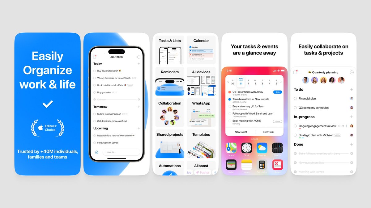
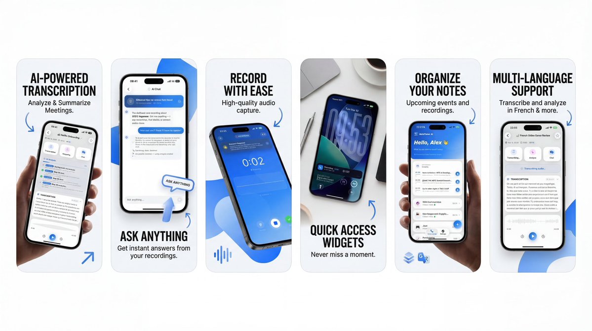
These screenshots have the same problem we're seeing with a lot of AI-generated App Store screenshots right now. Too much text, too many UI elements, and every frame is trying to explain a feature instead of making you feel something. The dark mode on top of that makes it all feel dense and hard to scan. The copy is actually pretty good: "Your day, held together" and "Type it like you say it" are strong lines. But they're buried under cluttered screens. A few directions worth trying: - 
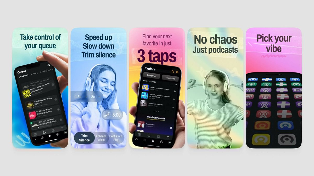
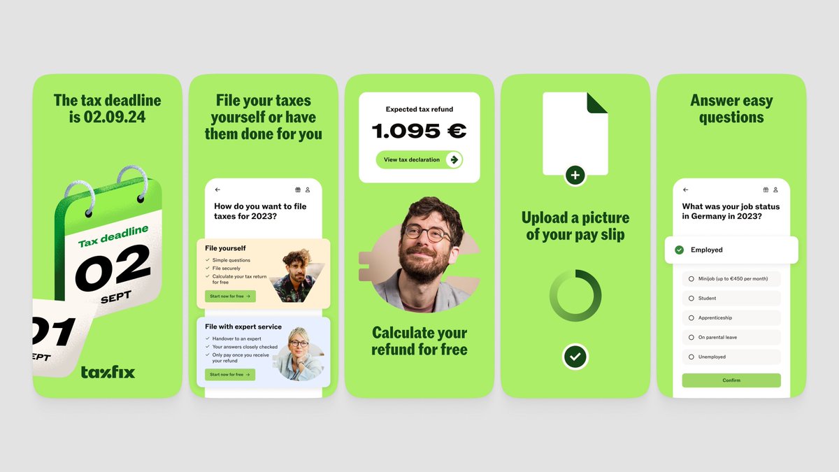
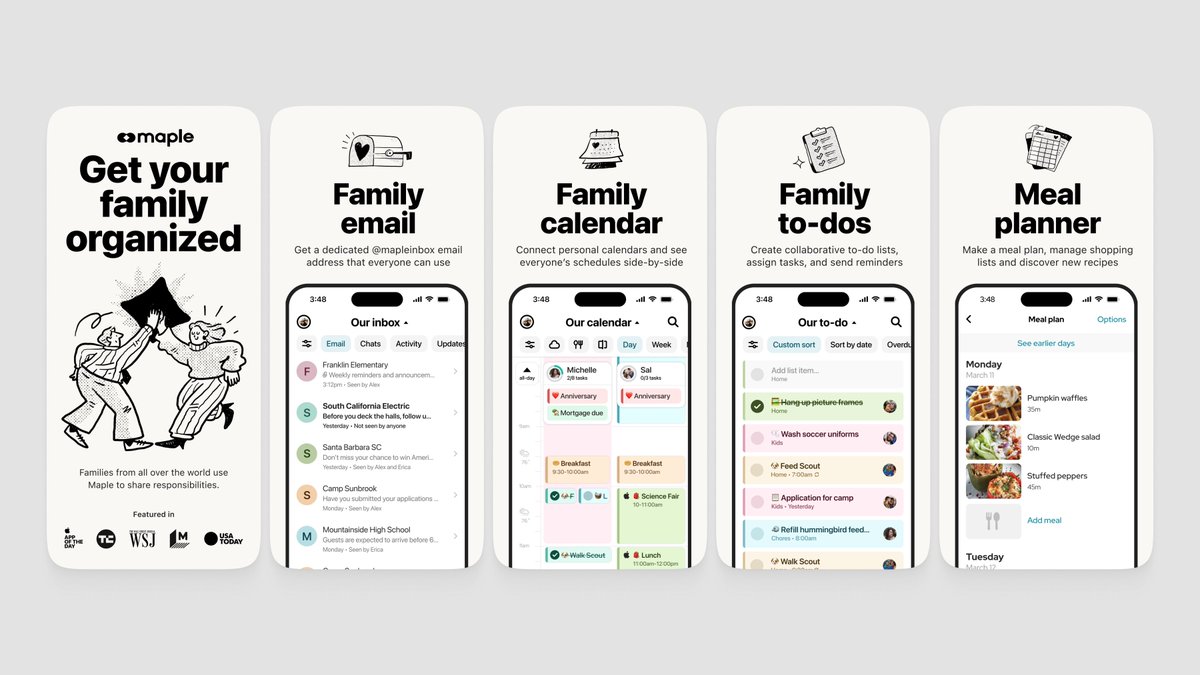
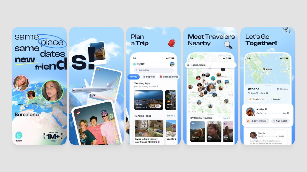
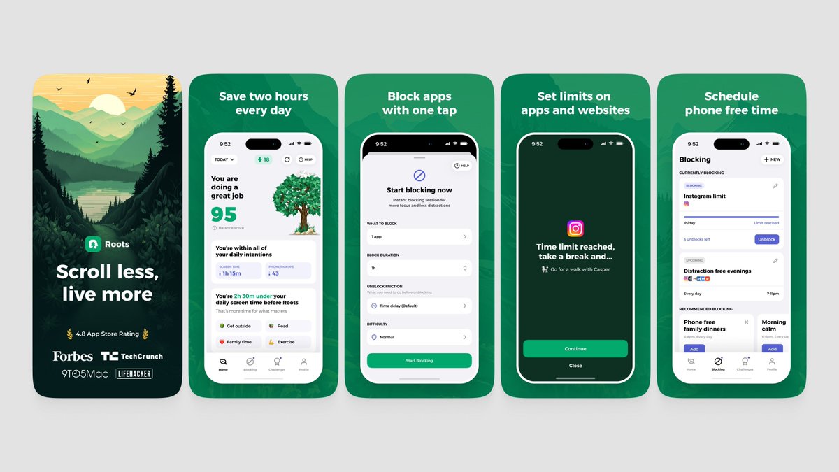
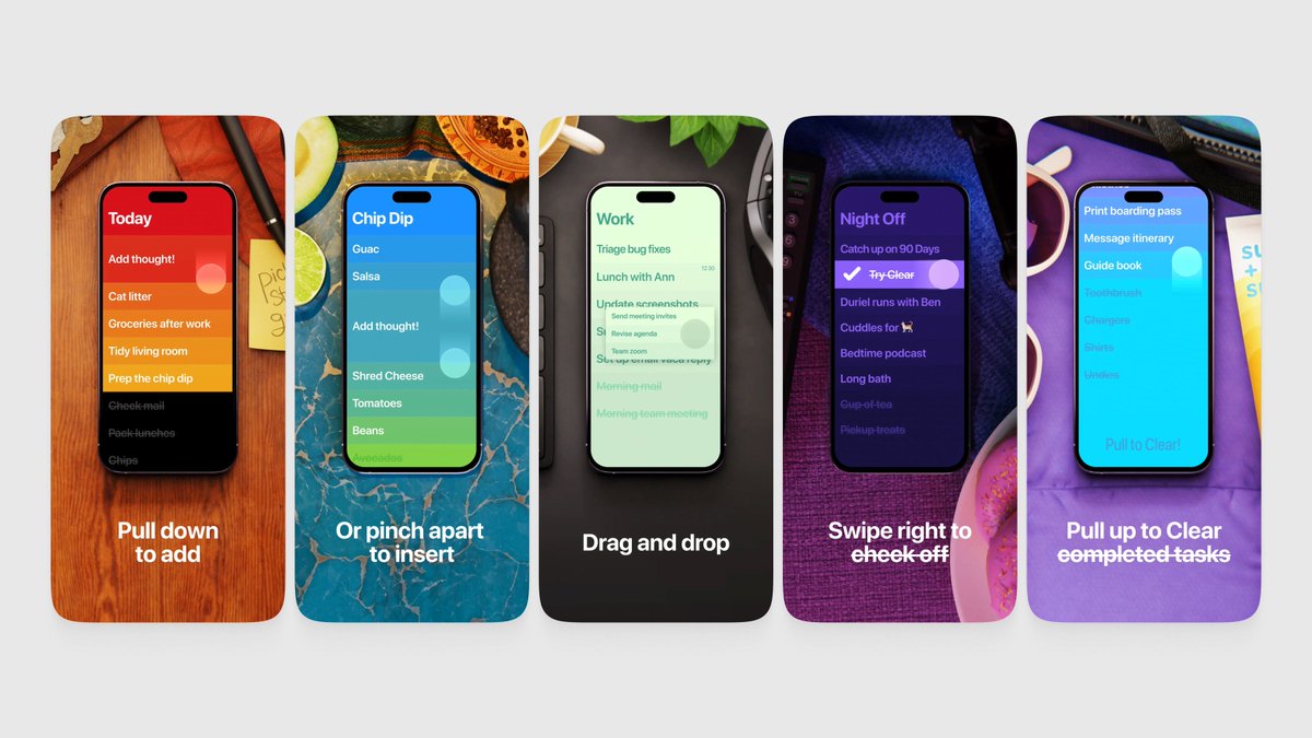
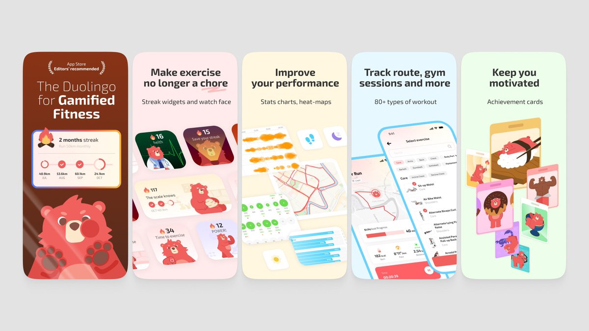
Strip it way back. Look at how Pebble does it. Minimal UI, big headlines, tons of whitespace. Let each frame communicate one idea instantly. - Show the outcome, not the app. Instead of showing the full task list UI, show a completed day. Instead of the calendar picker, show "Meeting with John 3pm tomorrow" already scheduled. The magic moment, not the process. - Go light mode for screenshots. The dark UI is fine in the app but in the App Store it makes everything feel heavy and harder to read at a glance. - The BuddySync frame needs work. Right now it's showing invite codes and empty states. Show two people actually synced up, tasks shared, accountability in action. First step: try remaking that first frame with just "Your day, held together" and a clean, zoomed-in view of a few tasks. Nothing else.
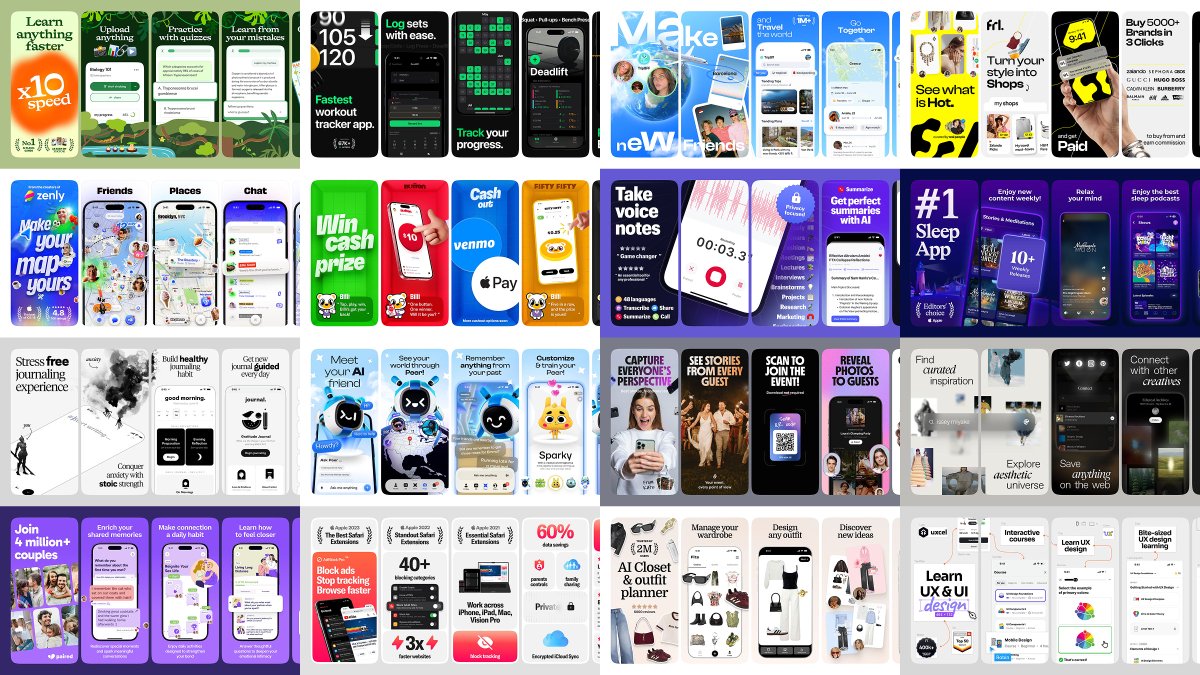
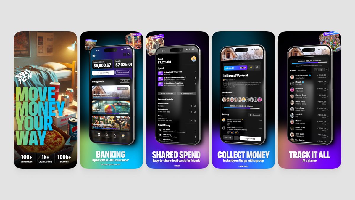
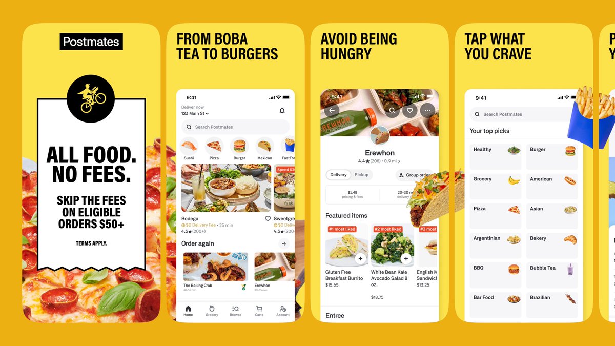
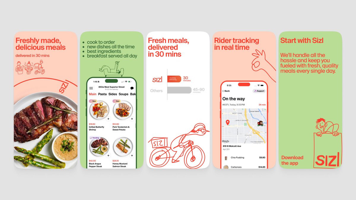
 Refs below 🌈
the screenshot first company tweet mediathe screenshot first company tweet mediathe screenshot first company tweet mediathe screenshot first company tweet media
Ivan Loh@ivanlohck

@screenshotfirst apps.apple.com/us/app/buddyta…

English
2
1
62
6.8K
the screenshot first company
the screenshot first company@screenshotfirst·
You have a solid numbers for a utility app like this! The screenshots right now are good, minimalistic, functional but they feel very developer-made. Dark backgrounds, walls of text in the UI, and every frame is basically just a full screen dump. Nothing grabs your eye or tells you why this app matters. The biggest issue: you're showing what the app looks like, but not what it does for people. Nobody scrolling the App Store is going to stop and read paragraphs of transcribed text in a screenshot. A few directions worth trying: - Lead with the outcome, not the feature. Instead of "Live Transcribe Voice Memos" try something like "Never miss a word from your meetings." Sell the relief. - Brighten it up. The dark red and black palette feels heavy. Look at how Otter does it. Light, clean, approachable. Transcription apps should feel effortless, not intense. - Show less text in the UI. Zoom into the key moment. Use bento grid. A clean summary, a highlighted action item, a translation result. Not the full wall of text. - The flags screenshot (100+ languages) is a good idea but the execution is just a grid of tiny flags. Try highlighting 3 or 4 key languages with bigger visual weight instead. As a first step, try remaking that first frame with a light background, a short value-driven headline, and just the top portion of the recording screen. Clean and simple. Refs below 🌈
the screenshot first company tweet mediathe screenshot first company tweet mediathe screenshot first company tweet mediathe screenshot first company tweet media
English
0
0
1
71
the screenshot first company
the screenshot first company@screenshotfirst·
Nice app, @gonahmias ! The screenshots right now are decent but feel a bit scattered. The green diagonal shapes, the mascot, the review quote, the UI. Each frame is pulling in a different direction and there's no consistent visual story tying it all together. A few things worth trying: - Pick a visual identity and commit. Right now it's half mascot, half serious finance app. Either lean into the character and make it playful (like the bear in Helth or the llama in Waterllama) or go clean and minimal. Both work, but the mix doesn't. - Simplify the first frame. Increase the title size. That always improves readability. - The mascot has potential. If you keep it, give it a bigger role. Right now it's just floating in one frame. Either make it the thread through every screenshot or remove it. As a first step, try a cleaner opening frame. Just the headline, one clean phone showing the dashboard, and a consistent background. No reviews, no mascot, no diagonal shapes. Refs below 🌈
the screenshot first company tweet mediathe screenshot first company tweet mediathe screenshot first company tweet mediathe screenshot first company tweet media
English
0
0
2
67
the screenshot first company
the screenshot first company@screenshotfirst·
Cool concept! Right now the screenshots are trying to say everything at once. Too much text, too many UI elements, and the actual app gets lost in the noise. You don't really explain what the app does through the visuals, and the text doesn't quite get there either. That said, your 4th screenshot (the widgets one) actually works well (beside need to highlight the widget bit better). It's minimal, in context, and immediately makes sense. More of that energy. A few directions to explore: - Lead with value, not features. Instead of "AI-Powered Transcription" try something like "Never take meeting notes again." Sell the outcome. - Show the app in context. A phone on a desk during a meeting, someone recording a lecture. Let people picture themselves using it. - Try a bento grid for features. For utility apps like yours it's a great way to show multiple features without cramming everything into one frame. - Simplify the UI shots. Pick the one most impressive part of each screen and highlight just that. As a first step, try remaking the first frame with a simple photo of a meeting or lecture, your phone recording, and one strong headline about the result. Refs below 🌈
the screenshot first company tweet mediathe screenshot first company tweet mediathe screenshot first company tweet mediathe screenshot first company tweet media
English
1
0
0
49
the screenshot first company
the screenshot first company@screenshotfirst·
@ParthJadhav8 check out these tips we've prepared for you lovely idea with the claude skill, btw! x.com/screenshotfirs…
the screenshot first company@screenshotfirst

Beautiful app, Parth! Bloom has that rare combo of thoughtful design and real utility for coffee nerds. We saw your Claude skill drop btw. We've been quietly cooking something similar on our end, so you beat us to the punch. The skill is a cool idea, though we think the screenshots it produces still need a human touch 😄 Speaking of which. Your current screenshots are clean but they lean too hard into features and UI. There's a lot of text (small text is really hard to read💀), a lot of screens, and not enough of the feeling that makes coffee people fall in love with an app like this. A few directions worth exploring: - Show the coffee. A beautiful V60 pour from above, beans mid-grind, steam rising from a fresh cup. That's your hook. People should feel the ritual before they read a single word. - Lean into the vibe. Bloom isn't just a tracking tool, it's part of a morning routine. The screenshots should feel like that. - Keep UI minimal but intentional. Pick one or two screens that show what makes Bloom special (like that flavor window or the freshness tracker) and let them breathe. - Use shorter, value-driven headlines. "Your coffee, perfected" is great. But "See your coffee's best days, before they pass" is a lot to process at a glance. As a first step, try swapping that first frame for a gorgeous overhead coffee photo with just your tagline on top. Let the product page feel like a specialty coffee menu, not a feature list! Refs below 🌈

English
0
0
0
439