@miutuallove Ah, sim, eu converti aqui e deu 386 em conversão direta, não sei o quanto é de imposto pra esse tipo de transação, mas daria pelo menos un 80 reais mais barato provavelmente
Português
『caim』 | かいん
496 posts

@semserif
tricolor, ux/ui designer e namorado de uma doutorando em estatística que mexe com letrinha colorida


You will gen pay fo this @GenshinImpact


conceito embalado plastico bolha

Who is the most hated anime character ever ?

acho tao performático a pessoa se referir ao anime pelo nome japonês quero pegar esse hábito


acho tao performático a pessoa se referir ao anime pelo nome japonês quero pegar esse hábito


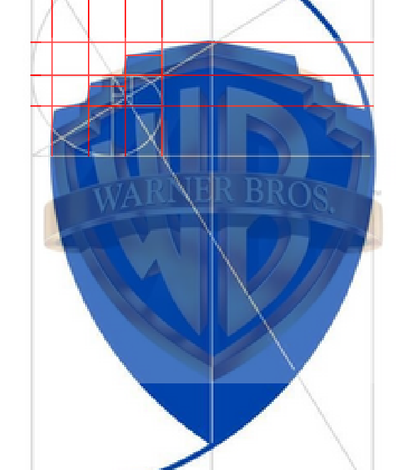
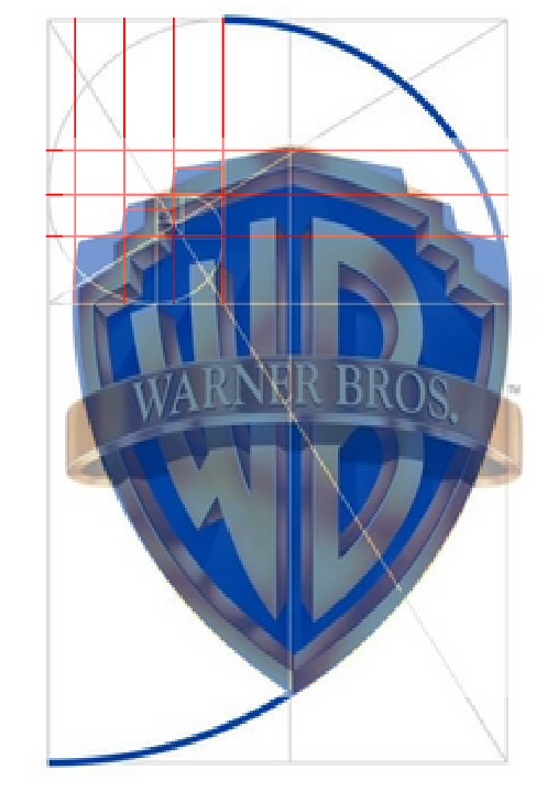
The Golden Ratio Secret Behind Warner Bros.’ Sleek 2019 Makeover. In 2019, Emily Oberman and her team at Pentagram spearheaded a bold modernisation of the legendary Warner Bros. shield. Recognizing the need for a versatile "digital-first" identity, Oberman streamlined the 1923 classic by removing the iconic sash and refining the proportions of the "WB" letters using the golden ratio. The redesign transitioned the brand from a static, heavy emblem to a sleek, flat-blue monogram that thrives across social media and mobile platforms. By introducing the custom "Warner Bros. Sans" typeface, Oberman created a cohesive visual language that successfully bridges the studio’s storied Hollywood heritage with a contemporary, minimalist aesthetic. #logodecks