Romeo_2w
80 posts


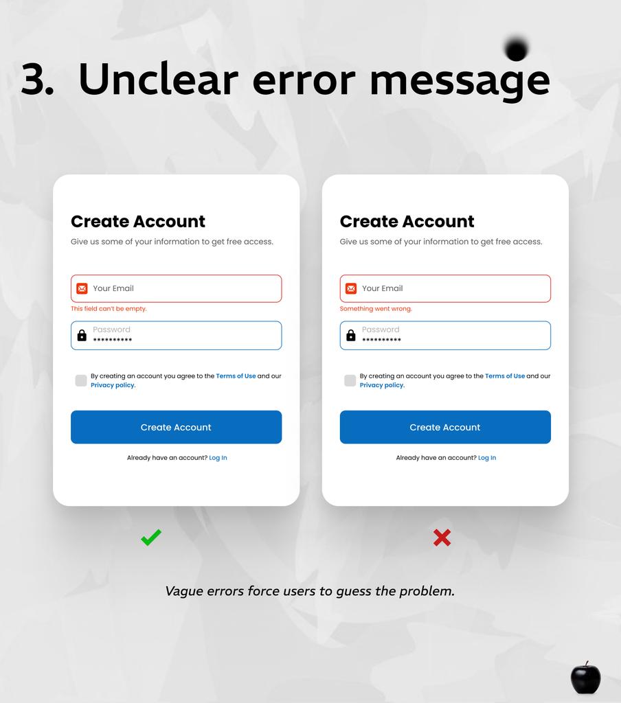
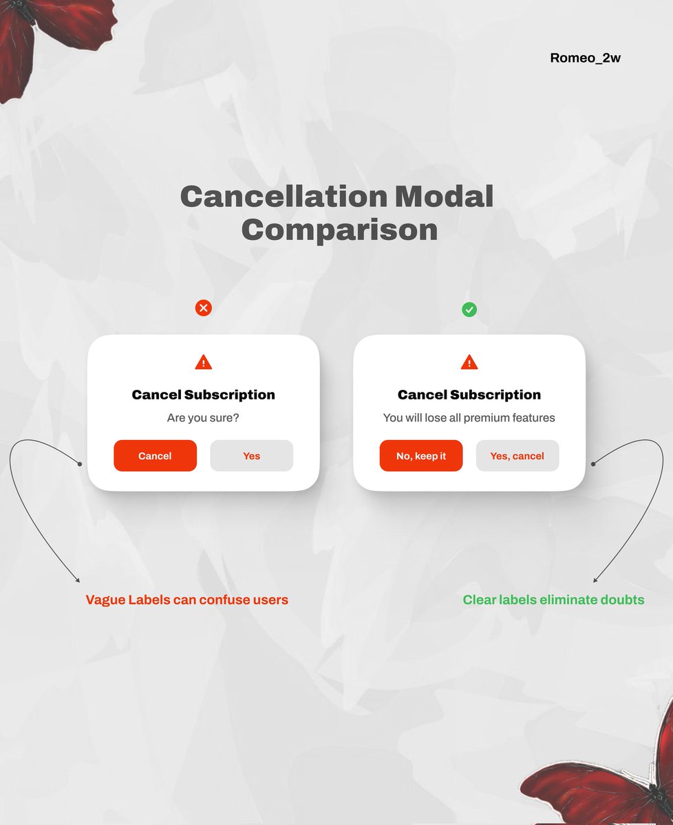
Clear errors make better experiences.Instead of confusing users, guide them to the solution.
Romeo_2w@senpai537
English


Everyone is into tech on X, or is it just my TL that's making me feel this way
English

Looks like I have gone around to deserve balloons again


English