Sabitlenmiş Tweet

The bottom is IN @60000USDT #BTCUSDT
We are not going below this.
Next target : 80000-85000 USDT 🚀🚀
English
M A V E R I C K
2.4K posts
@skytrotter_KB
Human

New earning path for ME Protocol agents: @IdleProtocol compute network. Every .me agent can now: → Join IDLE as a compute worker → Receive paid tasks through the gateway → Complete jobs and earn 85% in USDC → Payouts on Solana every 5 minutes Create agent → get identity → start earning. That's the loop. More coverage for IDLE. More income for ME Protocol agents. Create your agents on ME and backed by $HYRE
IDLE Protocol integration is now live in DAEMON. @IdleProtocol powers a distributed compute network where anyone can earn by serving endpoints on Solana. From inference and compute to web tasks, GPUs, APIs, PCs, wallets, and data, IDLE has 4,000+ active nodes live. DAEMON adds the agent layer: Discover resources. Check endpoint health. Score agent-readiness. Review wallet and resource reputation. Preview risk before calls. Track receipts and usage trails. So agents can know what is safe, useful, and worth calling before they spend money or touch a resource. Discover → Score → Call → Prove


JUST IN: 60% chance S&P 500 hits 8,000 this year


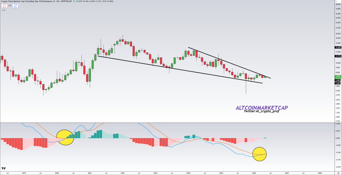


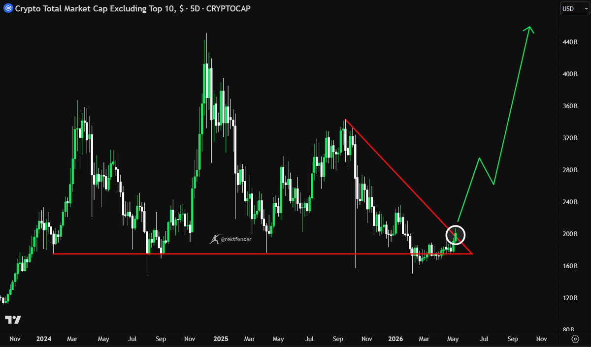
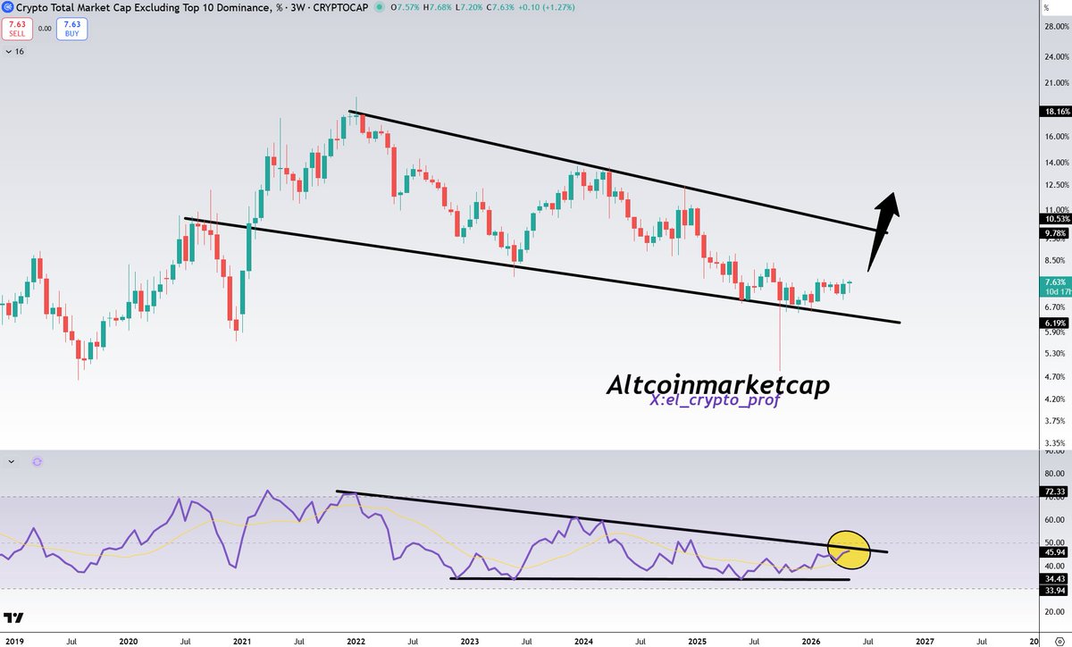
I've been saying for months now... Where we are is almost identical to 2019/2020.... NOT 2022. And as we can see, 4 months on from this post, OTHERS.D is playing out just how it was back in 2019/2020, starting to uptrend. Not just in 2019/2020, but also 2016. Each period has a: - Bottoming chart on HTF - 2W MACD curling up - Business cycle entering expansion Exact same as now. The cycle tops we have had have the total opposite conditions: - Blow off top chart - 2W MACD turning down - Business cycle in expansion for 18 months Each time OTHERS.D has bottomed like this, everyone has called alts dead, and then it has gone on a 18 month run. Take a clear look at this chart.... where does it look like we are now? Are we in a similar position to a cycle top, or a cycle bottom? It is obvious is it not? The craziest thing is that everyone will see a chart like this and tell me its stupid. It is just objective data that shows the overall market position and shows how each chart looked at different phases in the past cycles. To me, it is very clear where we are.

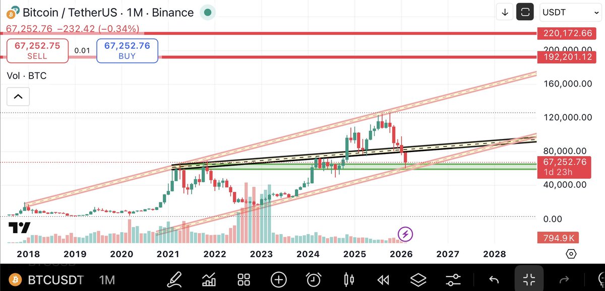
$BTC - Daily chart flashing a warning sign. ⚠️