This lollipop chart compares current 24h trading volume vs the same metric 30 days ago (log scale).
Green = growth, Red = decline, labels show the × change.
Lets you spot where trading activity and attention has shifted in the market.
30D vs Now — Crypto 24h Volume 📊
In the past month:
Gainers → OKB (+23×), Pepe (+3.8×), Solana (+3.6×)
Drops → TRON (–2.1×), Uniswap (–1.5×), BNB (–1.4×)
Volume isn’t just price, it shows where market attention flows.
#Crypto#DataViz#BTC#ETH
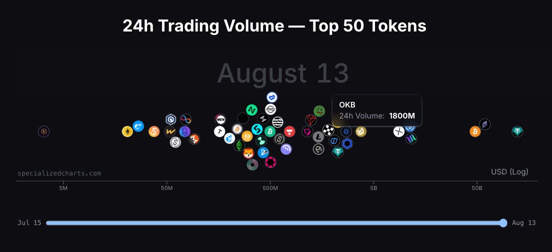
📊 Been animating a 30-day view of the Top 50 tokens by 24h volume.
OKB had the biggest move — up 21× from $80M to $1.8B. BTC & ETH showing strong upward momentum too.
💥 The entire crypto market is shifting.
Watch 24h volume surge across the top 50 tokens. Not in a table, but in motion.
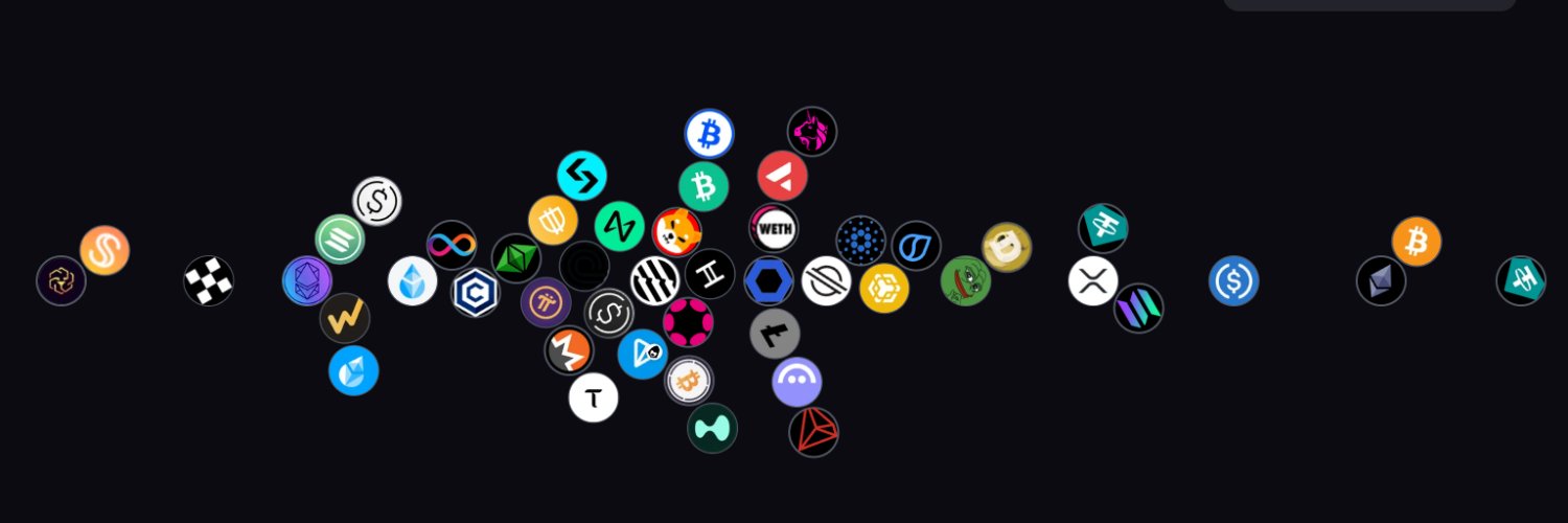
Here’s an animation showing how the top 50 tokens moved over 7 days, based on their 24h trading volume.
Each token drifts right as trading heats up.
Each position is scaled by log(volume).
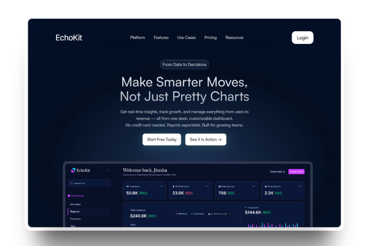
@jainjitasha Overall it looks great, minor suggestions From Data to Decisions badge can go bit closer to the headline, also contrast of some of the gray text in the dashboard might be improved. Well done!
@disarto_max I prefer the dark one on the left. It is more readable. The right one with opacity has nice glassy look but a bit distracting and less readable. Also worth trying dark one with 90% opacity as well.
This is a live depth chart with ~10 min of history.
You’re seeing:
• Real-time CVD (Cumulative Volume Delta)
• Buy/sell volume imbalance
• Evolving liquidity depth
Liquidity. Pressure. Movement.
Here’s what a market really looks like time-compressed. Built with custom tooling. More soon.
#Crypto#DepthChart#TradingTools