Sabitlenmiş Tweet
Sharique Ali
5.4K posts


Sharique Ali
@srq_ali
Web3 Mod • Brand Strategist • Google Ads for B2B & SaaS Scaling brands and keeping Web3 communities running smoothly.
Doha, Qatar Katılım Şubat 2017
392 Takip Edilen501 Takipçiler

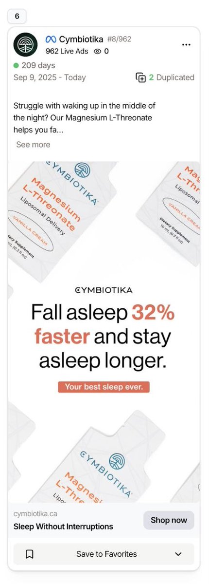
This Cymbiotika magnesium ad has been printing like crazy for 209 days (and counting) because it took a daily frustration and turned it into a simple, believable promise with zero mental effort required to say yes.
Plus the fact that it's been duplicated 2 times tells me this creative is so reliable they're just cloning it to keep scaling instead of trying to reinvent the wheel.
Let me analyze this piece by piece so you understand what's actually happening here.
Initially, the hook hits a very real nightly pain.
"Struggle with waking up in the middle of the night?"
This isn't generic "sleep better tonight" bullshit.
This is a specific, annoying, recurring problem that millions of people deal with every single night.
And the people who have this problem are:
⦁ Already frustrated (waking up at 3 AM sucks)
⦁ Already looking for solutions (they've tried everything)
⦁ Already primed to buy (desperate for relief)
If you wake up at 3 AM every night staring at the ceiling, you're stopping your scroll right here.
This is textbook problem-aware messaging and you're immediately qualifying the exact audience who needs this product without wasting impressions on people who don't.
Then, the headline is a PROPER benefit statement with specific numbers.
"Fall asleep 32% faster and stay asleep longer"
This is HUGE, and it's what most people get wrong.
Why does this work so well?
Because it's:
⦁ Specific (not vague "sleep better")
⦁ Quantified (32% is measurable improvement)
⦁ Feels scientific (your brain goes "this isn't marketing...this is data")
Most brands would just say "sleep better" or "improve sleep quality" and nobody gives a shit.
But when you see "32% faster," that's tangible, believable and seems worth trying.
Even if you don't consciously question where that 32% came from, the specificity creates instant credibility.
It also promises immediate + emotional relief.
"Stay asleep longer"
This hits deeper than generic "better sleep" because it solves the actual emotional pain:
⦁ Waking up at 3 AM and not being able to fall back asleep
⦁ Tossing and turning all night
⦁ Feeling dead tired the next day despite being in bed 8 hours
That's relief people crave, not just a nice-to-have improvement.
The benefit is both immediate (tonight) and ongoing (every night after).
Another thing is they're using visual contrast in the hierarchy.
Look at the color choices:
Black headline → Orange "32%" → Black text
That vibrant orange number POPS against everything else and forces your eye directly to the most important part of the message.
This isn't accidental by any chance.
This is strategic visual hierarchy that makes sure you see "32% faster" before you even read the rest.
Most ads have no visual hierarchy and everything blends together, so your eye doesn't know where to focus.
Along with that, it removes thinking COMPLETELY.
Look at how simple the message flow is:
Problem → Result → Done
That's why it converts because there's zero mental effort required to understand what you're getting.
Also the product looks clean + premium.
The visual execution is doing a lot of work here:
⦁ White background → purity, cleanliness
⦁ Minimal design → trust, sophistication
⦁ Sachet format → modern, advanced (not cheap pills in a bottle)
⦁ Three sachets at different angles → shows packaging from multiple perspectives, makes product feel more substantial
It feels like a high-end health product, not some random $10 supplement from the pharmacy.
The visual design communicates premium positioning before you even read the copy.
Again, they're showing product sachets at different angles.
This is subtle but effective.
Three sachets, different angles - it's product demonstration without being boring.
It's showing you:
- Get multiple sachets (not just one dose)
- See the packaging clearly (Cymbiotika branding, orange accents)
- Understand the format (convenient single-serve sachets)
That creates product familiarity and makes it feel more real.
In this ad, "Liposomal Delivery" Is Their Unique Mechanism.
Right on the packaging: "Magnesium L-Threonate" with "Liposomal Delivery"
Most people don't fully understand what that means.
But it sounds:
- Scientific
- Advanced
- Different from basic magnesium you get at CVS
That creates curiosity + authority at the same time.
Instead of just selling magnesium, they're selling "Magnesium L-Threonate WITH Liposomal Delivery," which is premium positioning that separates them from the $8 bottle of magnesium oxide at Walmart.
So they're competing on absorption technology and formulation quality (not price).
The mechanism sounds smart but simple too.
"Magnesium L-Threonate"
Even if you don't know what L-Threonate means, it sounds more sophisticated than just "magnesium."
And that's enough to justify a higher price point and create differentiation in a crowded supplement market.
Another upside is, it taps into a high-frequency problem.
Sleep issues are:
⦁ Daily (happens every single night)
⦁ Frustrating (ruins your next day)
⦁ Emotionally draining (affects mood, productivity, relationships)
So this isn't a "maybe I need this" purchase.
This is a "I deal with this EVERY night and I'm desperate for relief" purchase.
High-frequency pain = high purchase intent.
This ad makes the product feel “SAFE” too.
No crazy claims like:
- "Cure insomnia instantly" ❌
- "Never wake up again" ❌
- "Miracle sleep supplement" ❌
Instead it's:
- Calm
- Measured
- Controlled
- Scientific
Which makes it believable instead of triggering skepticism.
Health-conscious supplement buyers are tired of overhyped garbage and they want something that feels legitimate and backed by science.
Plus, the CTA is crystal clear.
"Sleep Without Interruptions" → Shop now
You know exactly what you're clicking for and what outcome you're buying.
And lastly…
It's built for cold traffic.
This ad works on people who've never heard of Cymbiotika because:
- Instantly relatable problem (waking up at night)
- Easy-to-understand solution (better magnesium)
- Quick emotional payoff (fall asleep 32% faster)
That simplicity is why it can run for 209 days without creative fatigue as it's not dependent on novelty or complexity.
So what should you steal from this?
If you're selling supplements or health products:
1. Target ONE specific problem (not 10 vague benefits)
2. Use specific numbers (32% faster, not "better sleep")
3. Show clean, premium visuals (white background, minimal design)
4. Highlight your unique mechanism (L-Threonate, Liposomal Delivery)
5. Use visual hierarchy (orange number pops, draws the eye)
6. Keep the message simple (Problem → Result → Done)
7. Feel safe, not aggressive (confident, not pushy)
8. Build for cold traffic (instantly relatable, no education required)
If your supplement ads are listing 10 benefits with cluttered design and vague "feel better" promises, you're getting destroyed by ads like this that solve ONE problem with surgical precision.
This ad works because it's clear, it's specific, it's visually compelling, and it solves a real pain point with a measurable benefit.
Most ads try to be clever.
This one just solves a problem really fucking well.
That's why it's been running for 209 days and still printing money.
English


Figma & Canva right now:
Claude@claudeai
Introducing Claude Design by Anthropic Labs: make prototypes, slides, and one-pagers by talking to Claude. Powered by Claude Opus 4.7, our most capable vision model. Available in research preview on the Pro, Max, Team, and Enterprise plans, rolling out throughout the day.
English


If only I had the best health 😭😭
plss pray 💔
English


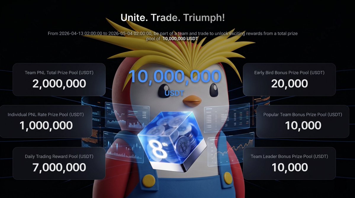
MEXC just dropped a team-based trading competition with a 10M USDT prize pool and honestly the structure is different from what I usually see.
You don't just trade solo. You create or join a team, compete on leaderboards, and the prize pool actually grows the more people join currently sitting at 3M USDT, cap is 10M.
So early movers have a real advantage here. More teams = bigger pool. Simple math.
The most attractive thing here is that 0 fees on BTC & ETH spot, daily Lucky Wheel, and early bird bonuses for people who get in fast.
If you're already trading, you might as well be doing it where there's a pool on the line right?
The campaign is gonna run till May 4th.
Sharing the Link here, make sure to check it out mfs: mexc.com/futures-activi…
English