Mobile UI for LivingIP.
Not the desktop squeezed into a phone. Three-column layout becomes single-column, leaderboard gets its own screen, voting sits at thumb height.
Whitespace isn't empty space. It's what makes a complex product feel simple at a smaller scale.
Wireframe to final for LivingIP.
Three columns from day one.
Structure was right on the first pass.
The visual layer is what made people want to stay.
Gradient avatars, color-coded voting, XP leaderboards.
Here's a fun shot from our recent work with Jinba for their launch video.
Product captures are the bare minimum. We bring your product to life to give your launch the impact it deserves.
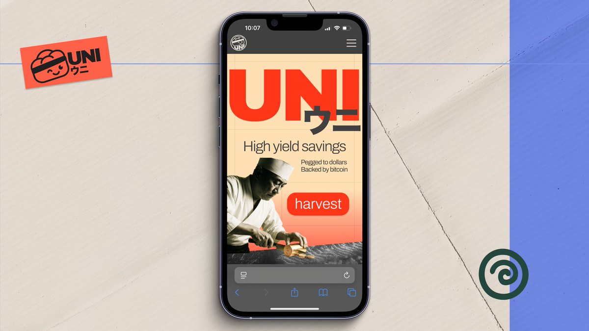
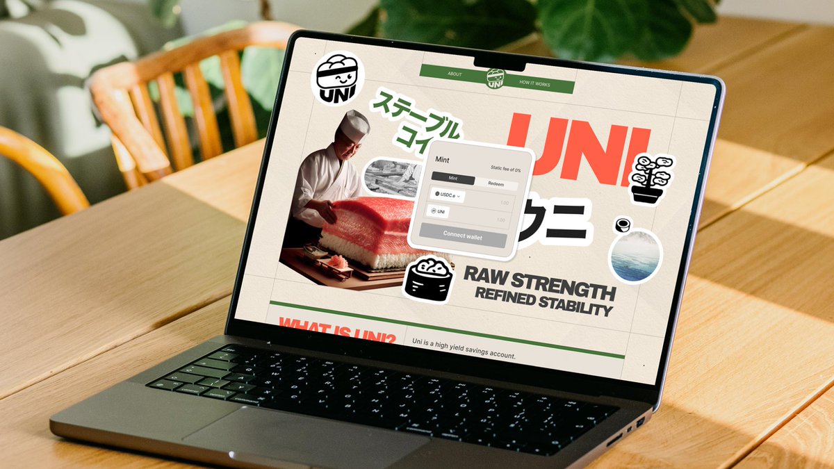
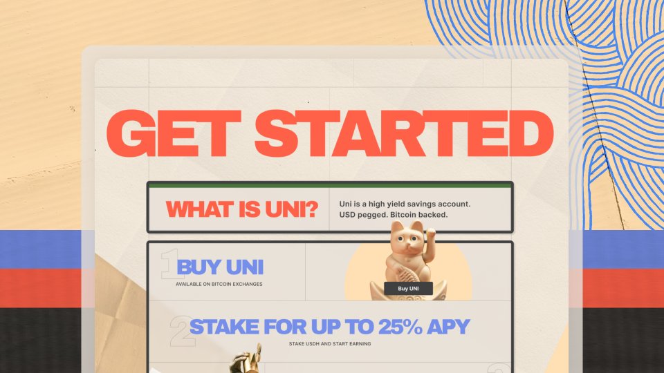
Site for UNI, desktop and mobile.
The CTA says "harvest." Sushi chef in the hero, washi textures through every section, warm tan palette that makes yield feel like something you grew.
When the product is abstract, the design has to make it tangible.
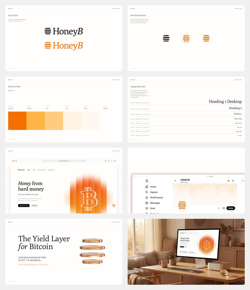
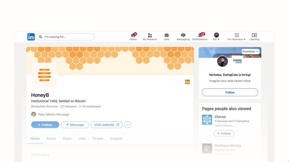
"Honey from hard money." HoneyB Branding.
Amber palette graduated like honey viscosity, stacked lines that read as beehive, and sat stack. When the product is yield on idle Bitcoin, the brand should feel like stored energy. Great partnership through brand, site, and product.
Feature card for Perena.
The motion is barely there. A gentle bit of motion helps the card feel grounded while the world behind it breathes.
The card says "secure." The motion says "calm."
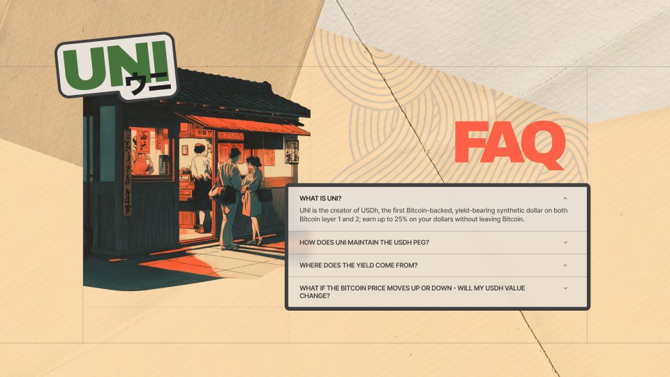
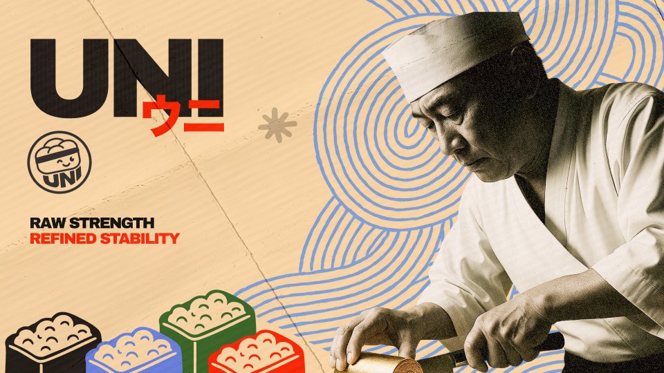
Brand identity for UNI.
A Bitcoin-backed stablecoin named after sea urchin, so we built the whole world around it. Katakana wordmark, maneki-neko, wave patterns, kraft paper palette.
When every crypto brand looks the same, having a point of view is the whole strategy.
Here's another fun shot from our recent work with Jinba for their launch video.
For this sequence, we wanted UI elements to break away from the confines of their components, to create a more engaging and organic transition.
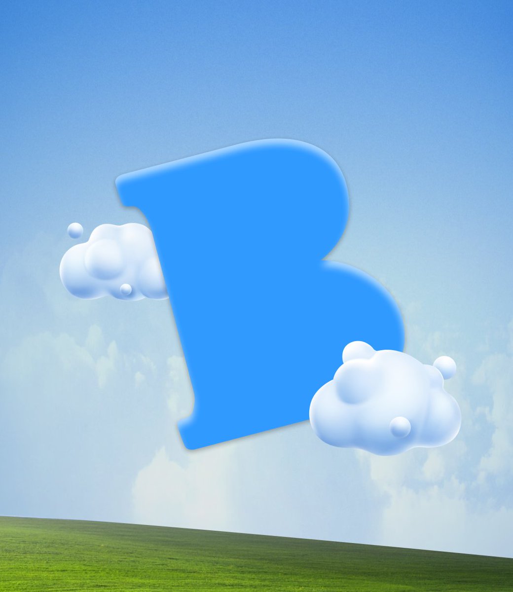
Brand and product for Breeze.
3D piggy bank with wings as the mascot, sky blue palette, a big floating "B" in the clouds. Finance brand that earns trust by being immediately understandable.
When your users find finance intimidating, the brand has to feel like an invitation.
Motion work for Pyra.
Invest your paycheck, earn yield, spend credit instead of selling. The animation had to feel like the product: momentum that never stops.
Co-designed and built the landing page for Perena.
The swap module sits above the fold because that's the job to be done.
Start with the action, build trust downward.
The details signal craft, and craft signals care.
Soft launching something we've been using internally.
AI asset generator that only makes images in your brand. Feed it your style, everything stays on-brand. Every time.
Great for velocity. Nightmare was consistency. So we fixed that.
Beta's open 👇