Sabitlenmiş Tweet
std dev
6.4K posts


@billy_sweeney I am building an editor myself, and I can confirm this is insane amount of work, bravo 👏
Btw sorry I borrowed your color picker design a bit 😁

English

We sure do! I designed this — here's how it works:
→ Real-time auto-calculated color contrast info and pass/fail indicators
→ Visible boundary and pass/fail zones on the color spectrum
→ Auto-detects the category
→ Auto-detects the background
→ Auto-correct a failing color to the nearest passing color
→ Adheres to WCAG 2.2 categories across levels AA and AAA
→ Settings menu to control preferences
→ Flyout to view auto-detected background color
Dan@pizzaboy
Figma now has an AA contrast checker built in!
English
@MaksimXBT No one should own a creative space. Especially a company built on corruption and nepotism.
English

@subproject_22 no more lock-in sounds good till someone builds on top of your design systems and owns the ecosystem
English

pretty clear that shadcn tokens from the start were built tied to v0 feature v0.app/docs/design-sy…
including whole tweakcn story. you were told a year ago that this is bullshit
thats why you pushed away real creators in shadcn space only to keep affiliates who keeps pushing this locked bullshit like styles, presets etc
this is ending now
English

@subproject_22 looks great!
not sure what you mean by shadcn lock-in though
English


i’m building an army
ana howard@AnaArsonist
can we end the gradient orb pfp trend? i can't tell who any of you are 😭
English

@ConvictionFAQ We’re just getting started - shadcn.run launched only a week ago 😉
Also, we’ve got a little history with @shadcn, right buddy? Vercel can’t stand competition and plays VERY dirty.
Stay tuned and grab some 🍿
English

@subproject_22 Hm why your account is so underrated ? Good views, but so few followers for your high tier content!
English
@rtheoryxyz That was my biggest pain point with shadcn/ui - so I decided to fix it.
English

@subproject_22 theme portability is underrated. design systems get healthier when tokens stop acting like vendor handcuffs
English

I miss the coding flow state. There's a flow state working agents sometimes but it's not the same thing.
English
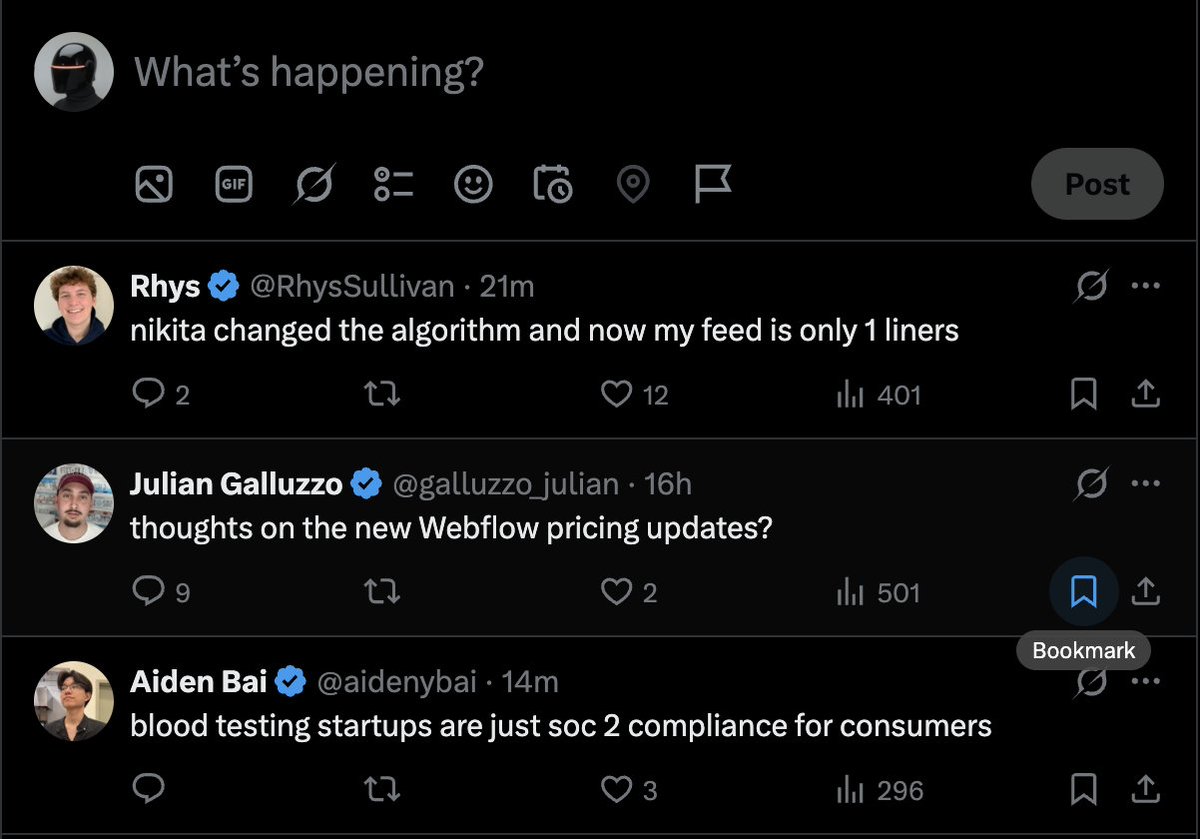
Among the 207 shadcn/ui registries we track on @shadcnrun, exactly 0 are using the “style” abstraction.
This is not a feature for creators. It’s a plug for v0.
English
@tranmautritam Oh folks from GitButler are font maniacs blog.gitbutler.com/but-head-font
English

Most monospaced fonts feel like spreadsheets.
Fliege Mono doesn't. Ink traps, lowercase ascenders slightly taller than the cap height, 6 styles + a variable. Free for personal and commercial use, by Pavel Laptev.
→ pavellaptev.github.io/Fliege-mono
English

Designers using Claude:
"Please update this buttons color to a gradient, right now its a solid color, aslo make radius more fun"
the PR:
English

Our Alarm clock icon looked pretty realistic with detailed bells, and a classic design. It worked fine, but something about it was bugging us.
Can we make this a bit cleaner?
So we simplified it. We refined the proportions, kept all the essential elements but ditched the extra detail. The new version feels fresher, more minimal.
The redesigned version integrates better with modern interface design. Less visual noise, cleaner aesthetics.
Sometimes realistic detail can compete with other elements on screen. For clean interfaces, wouldn't this simplified approach actually help the whole UI feel less cluttered?
Do you think we lost something important in the simplification? Or does the cleaner approach actually make it more effective as a UI element?
Would love to hear your thoughts on this realistic vs minimal debate.

English