Thomas Brambor retweetledi

Slides from my #rstudioconf talk are up on my site! #0" target="_blank" rel="nofollow noopener">williamrchase.com/slides/assets/…

English
Thomas Brambor
35 posts

@tbrambor
DataNerd, @rstats, Social Scientist, #DataViz Aficionado

I feel so very, very, very sorry for Rep. Massie’s constituents. The level of mindless incompetency he displays here is almost beyond comprehension. cnn.com/videos/politic…


#rspatial post: How to make dot-density plots in #rstats using the tidycensus and sf packages. tarakc02.github.io/dot-density/
milestones of DataViz + infographics, 1630-1904 too fast? see them all @ infowetrust.com/scroll/
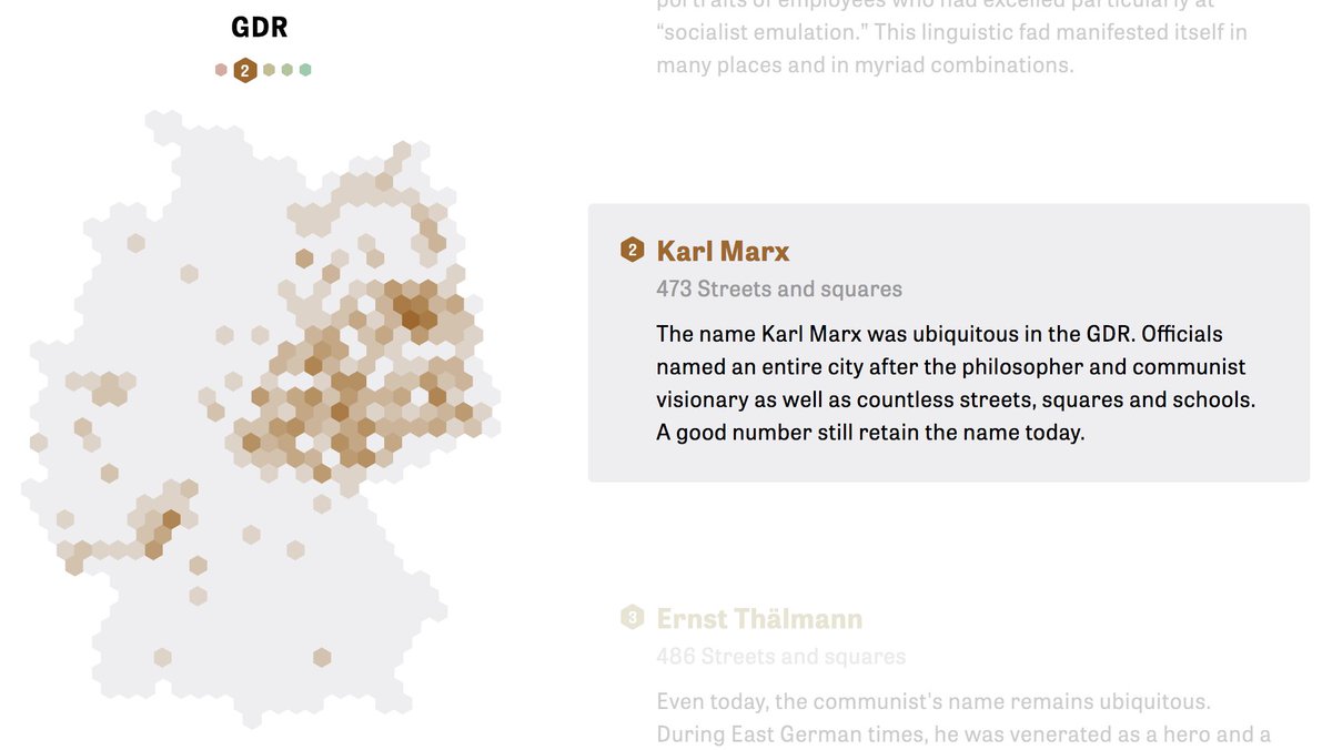
There are more than a million #streets and #squares in #Germany. Taken together, they show hidden patterns of things we like to remember and what we would prefer to forget: zeit.de/feature/street… now in english @albertocairo @jburnmurdoch @lisacrost #streetscapes #dataviz
Every border in the world according to what year it was formed — waiting now for the paper that uses this as an instrument HT @M_Clem moverdb.com/world-border-a…