

Temitope
553 posts
Temitope
@Temitop604
Aspiring Data Analyst | Documenting my journey learning Data Analytics | Excel | SQL | Data Visualization | Cowrywise Ambassador
Lagos state Katılım Mayıs 2021
199 Takip Edilen135 Takipçiler
Temitope retweetledi

Which tool do you love working with:
Excel
SQL
Power bi
Python
English
Temitope retweetledi

Dear @as02774 and every other beginner that is learning.
I will start by saying “completing one course perfectly before starting another.”
This approach actually increases forgetting.
In data analytics, the better strategy is layered learning + continuous reuse, not one-course-perfection because every tool is interconnected to each other.
Here’s how to move from one course to another without losing the previous one:
1. Learn in Layers, Not in Isolation
Think of your skills like a stack:
Excel = foundation for analysis & reporting
SQL = data extraction & structuring
Power BI = visualization & storytelling
You don’t leave Excel behind when learning SQL. You carry it forward.
So instead of:
Finish Excel → forget → start SQL → forget → start Power BI
Do this:
Learn Excel → use it while learning SQL → use both while learning Power BI
2. Always Combine Old + New Skills
Every time you learn something new, force a connection:
Excel + SQL → import SQL results into Excel PivotTables
SQL + Power BI → write SQL queries as data source
Excel + Power BI → compare dashboard outputs with Excel analysis
This “mixing” is what locks knowledge in memory.
3. Build One Evolving Project
Instead of separate projects per tool:
Start ONE project and upgrade it:
Example: Sales Analysis Project
Stage 1 (Excel): clean and analyze sales data
Stage 2 (SQL): store and query the data
Stage 3 (Power BI): build dashboard on top of it
Result:Same dataset. Same story. Different tools.
This prevents forgetting because you’re not starting over, you’re building on memory.
4. Use “Active Recall” Weekly
Once a week, without tutorials:
redo a SQL query from memory
rebuild an Excel PivotTable
recreate a Power BI visual
Even if you forget and check notes, that struggle is what strengthens memory.
5. Keep a Mini Revision Routine
You don’t need long study sessions.
Try this simple rotation:
Mon: Excel (30 mins)
Wed: SQL (30 mins)
Fri: Power BI (30 mins)
Result:
This keeps all tools “alive” in your brain.
6. Don’t Wait for Mastery Before Moving On
This is a common beginner mistake.
You don’t need to master Excel before SQL. You don’t need to master SQL before Power BI.
In real jobs:
you learn while working
you revisit tools when needed
7. Focus on Concepts, Not Tools
Tools will fade if you focus only on buttons.
But concepts stay:
filtering data
grouping data
relationships
aggregation
visualization logic
Once you understand these, you can switch tools anytime.
Even experienced analysts still Google SQL syntax, DAX formulas, or Excel functions. What matters is not memorizing everything, but building the ability to:
understand concepts,
know where to find answers,
and apply them repeatedly.
Simple Rule to Remember:
“don’t finish tools. Reuse them.”
Yours in data,
Ekanem
Data Analyst | Power BI Developer
Aditi Shaktawat | Data Analytics@as02774
@ekanemjr_99 I am consistently trying to learn data analytics. Recently I finished Sql and Excel . Will start Power bi soon but I am skeptical that what if I forget everything that I learnt?
English
Dear Vivian,
Based on your first Powerbi dashbaord, here is my comprehensive review, rating, and actionable feedback for corrections.
Firstly, always use this Windows shortcut to get a clean screenshot to publish your work online.
1. Window+G
2. Fn+ Prt Sc
Overall, the dashboard is ok and will rate it a 6.5 / 10.
Reasons: It established a clear layout with structured KPI cards and separate visual sections.
However, there are several design, formatting, and data-modeling choices that can be refined to make it better.
Detailed Feedback & Corrections
1. KPI Cards & Formatting (Top Banner)
Fix the Title:
The title reads "SUPER PHONE SALES DATASET".
Datasets are what analysts connect to; dashboards are what end-users read. Change this to something more business-oriented, such as "Super Phone Sales Performance Dashboard".
Clean up "Count of Order ID"
Showing a raw count as 9889 looks unformatted.
Rename the field in the visual well to "Total Orders" and add a comma separator so it displays as 9,889.
Card Border Consistency: The third card ("Total Discount") is missing its right-side border or has a lighter border than the others. Ensure the border properties match across all 5 cards.
2. Title Text & Default Aggregations
Remove "Sum of...": Power BI automatically prefixes fields with "Sum of" or "Count of". It is a major tell of an unpolished dashboard.
Fix: Rename the titles manually in the formatting pane.
-Change "Sum of Sales by Category and Region" to "Sales by Category & Region".
Change "Sum of Sales by Year" to "Sales Trend by Year".
Change "Sum of Sales by Top 10 State" to "Top 10 States by Sales".
3. Chart Corrections & Visual Best Practices
"Sum of Sales by Category and Region" (Stacked Column Chart):
Currently, you have data labels turned on inside very small stacked segments. This makes numbers overlap, overflow, and become entirely unreadable.
Fix: Turn off data labels inside the bars, or switch this to a Clustered Column Chart if comparing the exact regional numbers side-by-side matters. Alternatively, keep the stack but rely on tooltips for the exact breakdown.
"Top 10 Best Selling Product City" (Stacked Column Chart):
This chart is heavily cluttered. There are far too many small stacked colour segments representing individual products/categories inside each city, making the legend massive, and the chart impossible to interpret at a glance.
Fix: If the goal is to show the top cities, use a simple, clean Horizontal Bar Chart showing sales by City without the complex colour stacking. Let a tooltip or a drill-through handle the product breakdown.
X-Axis Labels: The city names at the bottom are truncated and cut off. A horizontal bar chart will give the city names plenty of room to read left-to-right.
"Sum of Sales by Top 10 State" (Bar Chart):
Similar to the city chart, the X-axis labels (Washingt..., Pennsylva...) are cut off.
Fix: Turning this into a Horizontal Bar Chart will instantly fix the readability of the state names.
4. Slicer Section (Left Panel)
Whitespace & Alignment: The slicers on the left (Region, City, State, Order Date) have a lot of unused vertical space between them, while the charts on the right are a bit cramped.
Hierarchy: Consider leveraging Power BI’s hierarchical features or dropdowns to save space. Making City and State dropdowns instead of open lists will make the left panel look much cleaner.
Weldone on this, it is a god job.
Kind regards,
Ekanem.
Data Analyst & Powerbi dev.
vivian@vheeorji22
My First Power BI Dashboard Please Rate 🤗 I am also down for correction
English
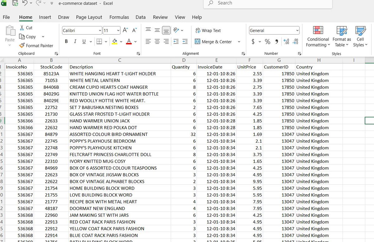
Cleaning a data with a date column that has different date format is so annoying😭
I spent hours trying to figure out what’s wrong while working on a dataset few days ago. I kept thinking about what was wrong.
I almost ended up crying that day but I didn’t cry sha 😂
Temi ✨@cheftee_lead
Next video: How do deal with blank cells. Who’s ready???
English
@keji_social I’m praying for a good job that will give me peace of mind
English

Asalamualaeykum warahmotullah wabarakatuh
May Allah SWT ease our worries, bless our hustle, protect our families
and grant us good news that we’re praying for. 🙏
As you see this tweet, drop one word you’re praying for today🤲
English
Temitope retweetledi

Temitope retweetledi



Temitope retweetledi

Temitope retweetledi

@sid_ipynb Well said
It’s really the most important work. A piece of uncleanliness in a dataset make an insight wrong
English

@Temitop604 3 hours that felt like 3 years.
Turns out 40% of the dataset was duplicates and nobody told me.
Data cleaning isn’t unglamorous work it’s the most important work. It just doesn’t get the credit. 😐
English


@Temitop604 Is it possible you share one and I also work upon them .
English
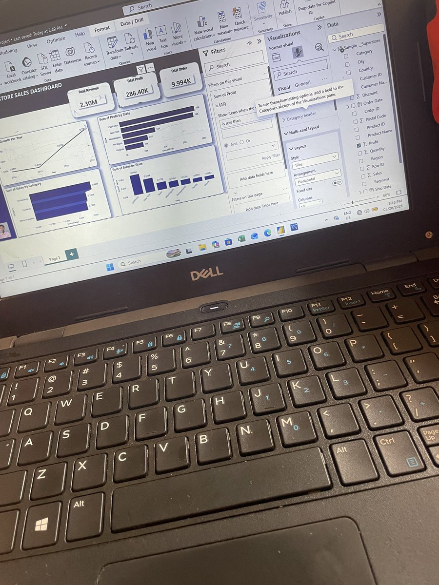
@AbbottBirungi Yes but some datasets are so messy like the one I’m working on now
English


@Temitop604 Remember cleaning data for hours for my final year project training data.
English