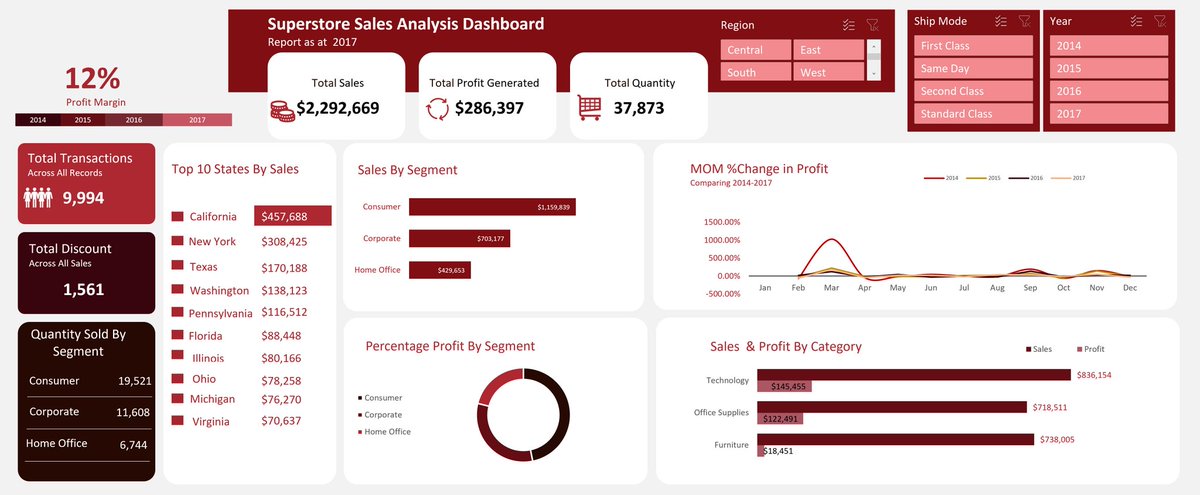
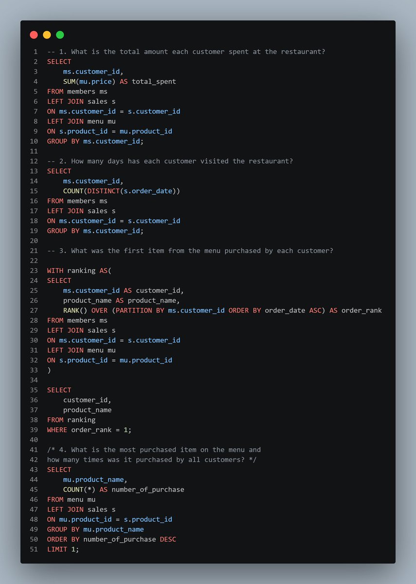
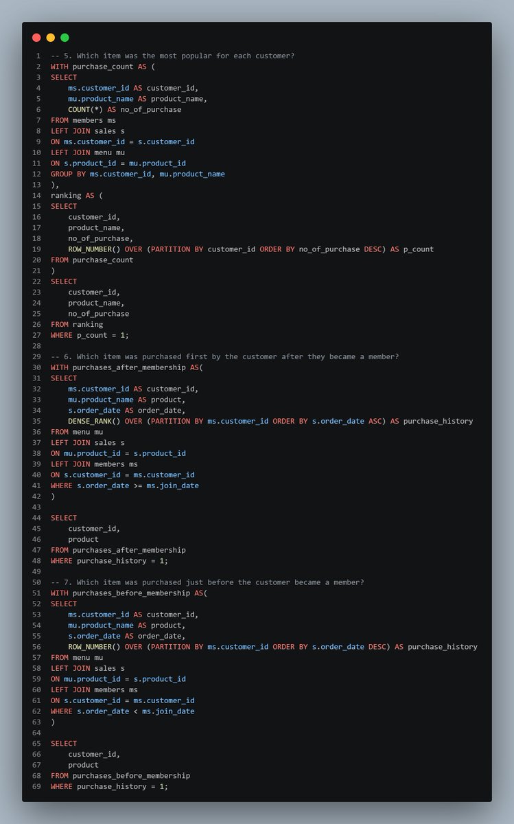
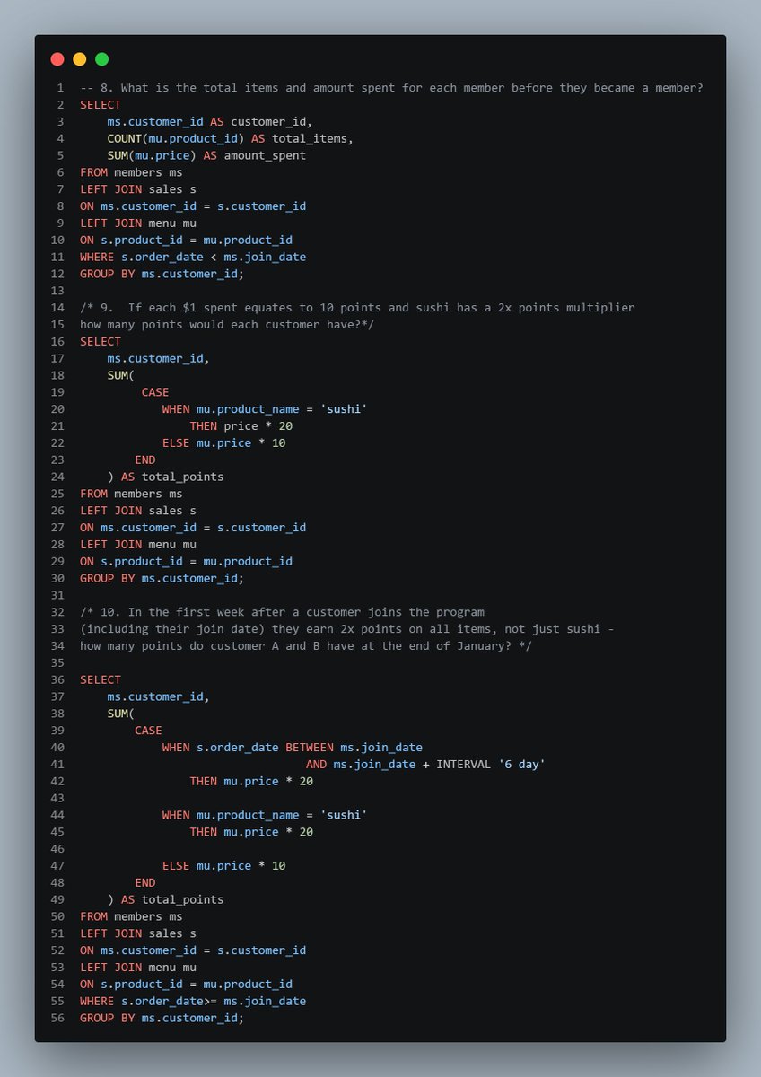
I have completed an analysis of a brewery dataset containing sales information from 2017 to 2019. My descriptive analysis covered sales and profitability, brand performance, and geographic distribution. I'm open to corrections.
Idarabong | That Analyst
4.2K posts

@tidalyst
Data & BI Analyst | BI Developer | Retail &E-Commerce Analytics | Data Analytics Tutor| https://t.co/6jqDe95Jsx


I have completed an analysis of a brewery dataset containing sales information from 2017 to 2019. My descriptive analysis covered sales and profitability, brand performance, and geographic distribution. I'm open to corrections.


I pulled together 405 fully funded scholarships for 2026. Tuition, stipend, flights, the whole thing covered. Europe, Asia, the Americas, Africa, and global programs. Free list below.


You have a table that contains sales data and approximately 1,000 rows. You need to identify outliers in the table. Which type of visualisation should you use? A. area chart B. scatter plot C. pie chart D. donut chart #datafam


After university graduation, when I got my first salary, I gave my dad ₦20,000. He looked at the money and laughed. Then he handed it back to me. Tbh, I didn't understand why.