Type Project (EN)

145 posts

Type Project (EN) banner
Type Project (EN)

Type Project (EN)

@typeproject_en

Type is face, Type is voice. For Japanese posts: @typeproject Instagram: @typeproject_official

Tokyo Katılım Nisan 2025
8 Takip Edilen68 Takipçiler
Type Project (EN)
Type Project (EN)@typeproject_en·
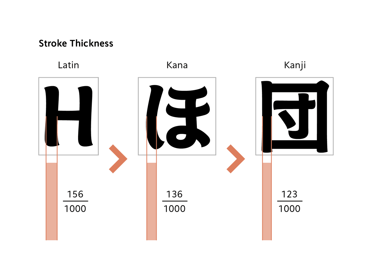
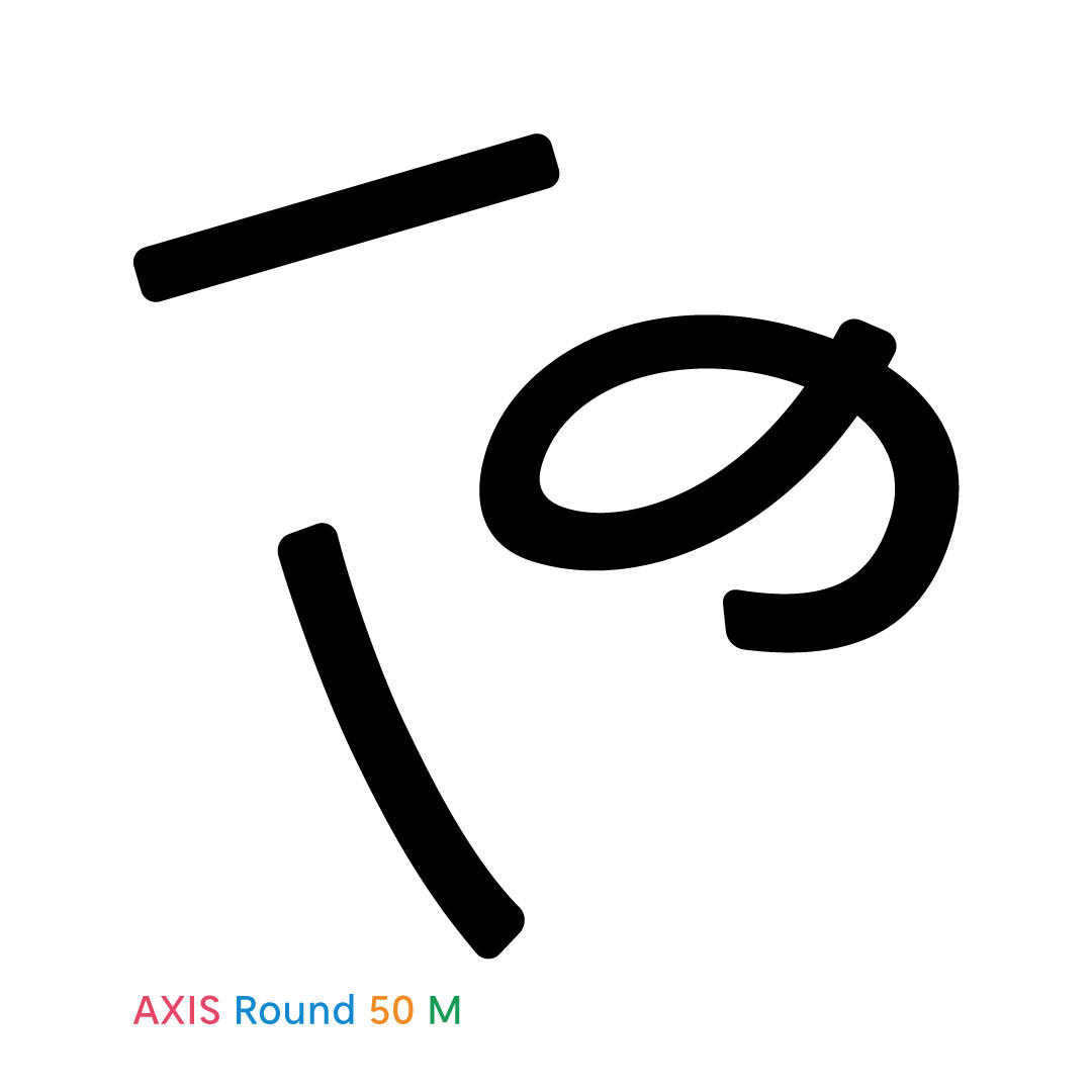
With its sharp AXIS Font contours given a subtle rounding, AXIS Round 50 retains the crisp feeling of the modern sans-serif while generating a soft and airy quality. Discover more on our Instagram: instagram.com/typeproject_of…
Type Project (EN) tweet media
English
0
0
0
40
Type Project (EN)
Type Project (EN)@typeproject_en·
A key charm of Kinshachi Font Hime’s Kanji is the dynamic energy of the ツ and ソ-shaped components in 栄, 金, 来, and 笠. Fine details in the entry strokes and uroko (serifs) add to its luxurious, gorgeous look when typeset.
Type Project (EN) tweet media
日本語
0
0
1
53
Type Project (EN)
Type Project (EN)@typeproject_en·
Look at Kinshachi Font Tonos Kanji side by side, and its unique design accents instantly stand out. The most eye-catching feature is the upward-curling terminals on characters like 八, 大, 金, and 天. There are plenty of other hidden gems—can you spot them all?
Type Project (EN) tweet media
English
0
0
1
40
Type Project (EN)
Type Project (EN)@typeproject_en·
‘For the circle, we deliberately avoided making a perfect circle but just made it a soft shape. The dots in Latin characters like “i,” “j,” “.,” “;,” etc. are slightly softer and rounder, so we have aligned them accordingly.’ TP Apricot Development Story staffblog.typeproject.com/en/4956
Type Project (EN) tweet media
English
0
3
6
840
Type Project (EN)
Type Project (EN)@typeproject_en·
Hama Mincho’s design incorporates the scale and distinctive character of the city of Yokohama, and for styles that accentuate vertical/horizontal stroke contrasts. Discover more on our Instagram: instagram.com/typeproject_of…
Type Project (EN) tweet media
English
0
0
0
69
Type Project (EN)
Type Project (EN)@typeproject_en·
‘During the design process of TP Apricot, the design of mathematical symbols required ingenuity in adjusting thickness. For thick weights in high contrast in particular, we struggled to determine the appropriate thickness.’ TP Apricot Development Story 03 staffblog.typeproject.com/en/4936
Type Project (EN) tweet media
English
0
0
0
63
Type Project (EN)
Type Project (EN)@typeproject_en·
Our smartphone wallpaper series is going strong, and May’s featured font is TP Iris, inspired by early-summer irises. There are still very few known examples of the font in actual use, so we’d love to see you bring out its full potential! staffblog.typeproject.com/4743
Type Project (EN) tweet media
English
0
0
0
160
Type Project (EN)
Type Project (EN)@typeproject_en·
A hands-on online workshop will follow the next week on May 9. The program is designed for participants to select a Latin typeface of their choice and design Kanji, Hiragana, and Katakana characters that harmonize with it. wordsoftype.com
Type Project (EN) tweet media
English
0
1
13
1.8K
Type Project (EN)
Type Project (EN)@typeproject_en·
An online lecture featuring Yui Yoshitomi (Type Project) and Ikumi Honda (Iwata) will be held on May 2. Hosted by wordsoftype.com, this session will provide an overview of the history of Kanji, Hiragana, and Katakana, alongside insights into contemporary typeface design.
Type Project (EN) tweet media
English
0
2
6
2.1K
Type Project (EN)
Type Project (EN)@typeproject_en·
‘horizontal hints cannot be specified for characters that do not have horizontal stems, such as the uppercase letter “I” in sans-serif typeface. In cases like these, ghost hints are used.’ [TP Staff Blog] Story of Hints 04: “What are Ghost Hints?” staffblog.typeproject.com/en/4921
Type Project (EN) tweet media
English
0
0
0
78
Type Project (EN)
Type Project (EN)@typeproject_en·
‘It is a story blending fantasy and mystery, in which a witch and an investigator team up to tackle magical crimes. Jun Mincho and TP Mincho High Contrast are used in the title, for the name of the author, and on the book band part.’ [TP Staff Blog] staffblog.typeproject.com/en/4913
Type Project (EN) tweet media
English
0
1
2
601
Type Project (EN)
Type Project (EN)@typeproject_en·
‘Because I experienced a lot of twists and turns with the hiragana design, I created three design proposals for Japanese brackets in the initial prototype.’ [TP Staff Blog] TP Apricot Development Story 02: Japanese Brackets, Three Types of Prototypes staffblog.typeproject.com/en/4899
Type Project (EN) tweet media
English
0
2
5
392
Type Project (EN)
Type Project (EN)@typeproject_en·
Our smartphone wallpaper for April features TP Gothic. It’s a classic Gothic at its core, but the architectural precision of its forms reflects the Type Project identity. We also love the lively flow of the double-story “g.” Check it out! staffblog.typeproject.com/4743
Type Project (EN) tweet media
English
0
0
0
142
Type Project (EN)
Type Project (EN)@typeproject_en·
‘The position of the top vertex of the triangle “A” is slightly shifted to the left of the center of the line connecting the two lower vertices. This is because placing the vertex in the middle makes it look tilted to the right.’ [TP Staff Blog] staffblog.typeproject.com/en/4881
Type Project (EN) tweet media
English
0
1
9
348
Type Project (EN)
Type Project (EN)@typeproject_en·
‘In the previous article, I explained about how horizontal and vertical hints work to control stroke thickness and position. Another major role of hints is to “arrange heights.”’ staffblog.typeproject.com/en/4870
Type Project (EN) tweet media
English
0
2
5
470
Type Project (EN)
Type Project (EN)@typeproject_en·
‘TP Apricot includes not only basic ligatures such as “fl” and “fi,” but also ligatures such as “ft,” “fb,” and “ffi” that are not included in the normal StdN version.’ [TP Staff Blog] TP Apricot Development Story 01: Unusual Latin Glyphs staffblog.typeproject.com/en/4857
Type Project (EN) tweet media
English
0
3
3
1.1K
Type Project (EN)
Type Project (EN)@typeproject_en·
TP Apricot’s unique character is most evident in its bolder weights, often giving it a "chubby" and friendly look. However, we highly recommend the thinner weights for their rhythmic and delicate charm!
Type Project (EN) tweet media
English
0
2
6
784
Type Project (EN)
Type Project (EN)@typeproject_en·
‘When applying visual adjustments to actual design work, the shapes of characters are often organic, and we do not always deal with geometric shapes as shown in the diagrams above.’ Visual Adjustment and Typeface Design 02 “Line Length and Intersection” staffblog.typeproject.com/en/4840
Type Project (EN) tweet media
English
0
2
2
745
Type Project (EN)
Type Project (EN)@typeproject_en·
It’s quite rare to find an English resource that covers Japanese typeface design—including Latin, Kanji, and Kana—in such incredible depth, don't you think? typeproject.com/en/story/story…
Type Project (EN) tweet media
English
0
0
2
99
Type Project (EN)
Type Project (EN)@typeproject_en·
We’ve published the "TP Apricot Development Story." The designers involved share the meticulous details of their development process. The level of openness about their trials and errors is so high, it’ll leave you wondering if anything was left out. typeproject.com/en/story/story…
Type Project (EN) tweet media
English
0
0
1
66