Dexter Design

1.1K posts

Dexter Design banner
Dexter Design

Dexter Design

@uiuxsahiil

UI/UX Designer | Sharing design breakdowns, UX insights & conversion tactics | Helping designers level up | Medium writer @ Bootcamp | Open for projects

Katılım Mayıs 2015
14 Takip Edilen215 Takipçiler
Sabitlenmiş Tweet
Dexter Design
Dexter Design@uiuxsahiil·
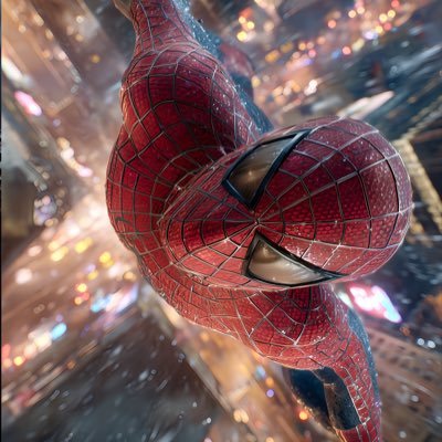
3D design that pops! I just finished a project that’s turning heads and sparking conversations. Here’s what I did: 1. Focused on unique textures 2. Played with light and shadows 3. Added unexpected elements It’s not just design-it’s an experience. What do you think? #uiux #designer #3d #animation #MotionDesign
English
7
2
33
1.1K
Dexter Design
Dexter Design@uiuxsahiil·
Top Premium usually shows up in restraint the top design feels like it knows exactly what to show and what to hide even the glow the spacing even the single CTA everything is controlled not trying too hard. and in the bottom one is solid but it leans more into “feature showcase” There’s more happening grid, multiple CTAs dashboard preview which makes it feel a bit more functional than premium. Both are good just different energy but if the goal is premium,the quieter confidence of the top wins.
English
0
0
0
19
Rakibul Hasan
Rakibul Hasan@uxwithrakibul·
Really appreciate the thoughtful feedback, Dexter. Glad the human-first approach came through that was exactly the intention behind using the face and starting with “How are you feeling today?”. Great point about the gradient intensity as well. Definitely something to refine so the experience stays calm during repeated use. Thanks for sharing such detailed insights!
English
1
0
1
10
Rakibul Hasan
Rakibul Hasan@uxwithrakibul·
AI Health App! Thoughts?
Rakibul Hasan tweet media
English
8
0
12
1.8K
Mark Lou
Mark Lou@markproduct·
Left or Right 🤔 Curious what designers prefer.
Mark Lou tweet media
English
90
6
232
11.1K
Dexter Design
Dexter Design@uiuxsahiil·
B works better. Imagine opening this app for the first time you land here and your brain is basically asking one thing “What do I do next?” In A all the buttons feel equal your eye bounces between them for a moment before deciding In , the green “Continue with Email” immediately answers that question the color creates a clear entry point so your eye lands there first and the rest becomes secondary options. That small change does two things psychologically first : it reduces decision friction by giving the brain a starting point. second : it guides the flow instead of making the user figure it out. Only small tweak I’d suggest increase the text contrast inside the green button a bit more so the label pops clearly at a glance.
English
1
0
1
46
Clinton Michael
Clinton Michael@SirClintt·
I need points to prove why option B is better, Drop your comments :)
Clinton Michael tweet media
English
38
11
130
4.5K
Dexter Design
Dexter Design@uiuxsahiil·
Looks clean and easy to scan when someone opens notifications they’re usually just trying to answer one quick question “Is there something I need to act on?” and your layout makes that pretty straightforward. So really good work .. But one thing i would like to add in your design .. People don’t read notifications they scan them for what matters most to them think about platforms like LinkedIn they show many notifications but users quickly scan for things like job alerts, post reactions, or application updates. Right now every item feels visually equal adding a bit more hierarchy for important alerts could help users instantly spot what deserves their attention.
English
1
0
0
20
Alex Tatu
Alex Tatu@uiNerd·
Working on a notification system 🔔 Trying to keep it: Clean | Readable | Actionable Did I check all the boxes?
Alex Tatu tweet media
English
3
1
16
285
Dexter Design
Dexter Design@uiuxsahiil·
The design itself is nice because Mobile hero sections are a really tight space to grab attention and push someone toward action and you handled that well it feels clear and focused. But your caption feels a bit overconfident. Clean UI isn’t that rare anymore with all the tools and resources designers have today even junior designers can produce very clean layouts. The bigger question is something else are you designing for the user, the business, and an actual problem? Is the design solving something meaningful or creating any real impact? Clean design is a great starting point but what really separates an expert is when the design goes beyond looking clean and actually changes something for the user or the product.
English
0
0
1
9
Stephen
Stephen@srotimi_ui·
I make clean hero sections.
Stephen tweet media
English
39
6
517
9.2K
Dexter Design
Dexter Design@uiuxsahiil·
Honestly neither A nor B works well. In A the price placement feels random and the “Order Now” action doesn’t behave like a button it reads more like a link which weakens the main conversion action if ordering is the goal that CTA should feel clearly tappable. In B the problem flips price and CTA are squeezed into the same area, making the interaction awkward the “Order Now” doesn’t visually behave like a button either and the cluster of elements makes the bottom section feel a bit cluttered. So the issue in both isn’t the drink or layout it’s action clarity the order action should be visually dominant and comfortably tappable not hidden inside the layout
English
1
0
12
2K
Dexter Design
Dexter Design@uiuxsahiil·
Right just picture this you’re working late, clicking fast, trying to clean up some old projects suddenly a modal pops up and your brain barely reads it you’re mostly scanning the buttons. On the left “Yes” and “No” force you to stop and think for a split second like Yes to what? No to what? That tiny hesitation is where mistakes happen. The right version removes that ambiguity “No, keep it” and “Yes, delete it” tell you exactly what will happen before your finger clicks your brain doesn’t have to translate the action. In destructive actions like delete clarity beats simplicity the extra words aren’t noise they’re guardrails that prevent accidental clicks
English
0
0
0
36
Ali Grids
Ali Grids@AliGrids·
Which delete modal feels clearer?
Ali Grids tweet media
English
64
5
143
18.3K
Dexter Design
Dexter Design@uiuxsahiil·
I'll go with A Imagine you’re reviewing your cart before checkout you suddenly think “Maybe one more pizza” In A,your thumb already knows what to do. Tap "+"done or Tap – if you change your mind. No thinking no extra step it feels natural because the control matches the moment quick adjustments. With B and C you pause for a second you have to tap the field or open the dropdown then choose again it’s a small delay but in a cart flow those tiny pauses add up. One small tweak though the quantity control could sit a bit closer to the price you know when people change the count their brain immediately thinks about the cost so keeping those two visually closer would make the interaction feel tighter..
English
0
0
0
58
UI/UX Savior
UI/UX Savior@UiSavior·
Which is Better? A, B or C 🤔
UI/UX Savior tweet media
English
65
4
130
18.6K
Dexter Design
Dexter Design@uiuxsahiil·
I’d go with A. The biggest reason is the clarity of the primary action. “Add to Cart” with text removes any guessing when people are browsing quickly a labeled CTA makes the intent obvious in B the cart icon alone weakens that clarity a bit. and see also the two-button layout in A creates a clearer decision flow like More Detail → Add to Cart. One for exploring, one for buying. but one thing i want to highlight here the only thing A could borrow from B is the placement of the color variants. Right now they sit near the logo which feels slightly disconnected from the product info. Moving them closer to the price or title would make the selection feel more natural.
English
0
0
0
7
Dexter Design
Dexter Design@uiuxsahiil·
@adsafayet Overall it feels like a sidebar designed to stay out of the way while still keeping orientation clear, which is usually the hardest balance to get right.
English
0
0
0
18
Dexter Design
Dexter Design@uiuxsahiil·
@uiNerd Really clean and easy to scan.. Nice balance between information density and clarity without making the table feel heavy.
English
1
0
1
26
Alex Tatu
Alex Tatu@uiNerd·
A very clean layout for search history ✅
Alex Tatu tweet media
English
3
0
11
249
Dexter Design
Dexter Design@uiuxsahiil·
After is good now... The biggest difference is clarity of focus in the old screen, calories, macros, and the food log all compete at the same level, so your eye doesn’t really know where to start in the new one the calorie gauge becomes the anchor when someone opens a nutrition app the first question is usually “how much do I have left today?” and the redesign answers that immediately. The gauge also works better than the small ring because it shows progress in a more readable way you don’t have to decode it you just glance and understand where you are in the day. The card structure helps too each section (macros, activity, logs) now feels like its own block instead of everything blending together that makes scanning easier especially when people open the app multiple times a day.
English
0
0
0
594
rico
rico@_heyrico·
Before -> After working with us What do you think?
rico tweet media
English
70
18
736
47.6K
Dexter Design
Dexter Design@uiuxsahiil·
Overall this is pretty clean. The list is easy to scan avatar, name, message preview, date, unread count nothing feels noisy which is good for a chat view since people usually skim this screen quickly. I’d also change the date to time for recent messages. If the message came today showing something like 2:45 PM or 10:30 AM helps people instantly understand when it arrived once it passes today then switching to “Yesterday” or a date makes more sense. It matches how people naturally think about conversations “Did they text me this morning or yesterday” ? and makes the list easier to scan.
English
1
0
1
12
Zainstudio
Zainstudio@hellozainstudio·
Subtle but impactful?
Zainstudio tweet media
English
8
2
16
528
Dexter Design
Dexter Design@uiuxsahiil·
After The biggest improvement is focus when someone opens a finance app their brain is usually doing two things: first - Check balance second - Do something with the money The redesign makes that flow obvious the balance card becomes the visual anchor so the first glance answers the user’s main question instantly. Then the next layer of actions (Send, Add, Request, Convert) sits right under it which feels like the natural next step. Impressive Work....
English
0
0
2
183
Marcelo Design X
Marcelo Design X@MarceloDesignX·
Which version do you prefer — Before or After? I wanted to explore what a redesign of @Wise could look like. Right now it feels a bit too flat to me, so I tried giving it more hierarchy and presence.
Marcelo Design X tweet media
English
41
7
159
8.8K
Dexter Design
Dexter Design@uiuxsahiil·
C firstly the arrow moving out of the circle matches the mental model of leaving or exiting when people see it they immediately read it as going out of the system. Color also plays an important role logout is an exit action so using red adds the right level of emphasis and caution it separates it from normal navigation actions and helps users quickly recognize it as something that ends their session. Compared to the others C combines two strong signals first- Directional clarity (arrow leaving the container) second - semantic color (red for exit/ending action)
English
0
0
0
94
UI/UX Savior
UI/UX Savior@UiSavior·
Quick UI poll: Which logout button feels most intuitive?
UI/UX Savior tweet media
English
28
2
36
12.2K
Dexter Design
Dexter Design@uiuxsahiil·
White can actually be the better choice here. When people pick a location they’re trying to read the map quickly street names, intersections, landmarks. The light version makes those details easier to recognize. In the dark one the map looks stylish but some street labels and context get lost even the labels and street have similar shade of grey that creating visibility issue.. that can slow someone down if they’re trying to confirm the exact spot. that’s why most map apps like Google Maps and Apple Maps default to light mode during the day it’s simply easier to read geographic details. so from a usability point of view the light version helps users orient themselves faster.
English
0
0
1
44
Adi
Adi@AdityaSur11·
Map Card UI Light or Dark?
Adi tweet media
English
23
4
86
2.5K
Dexter Design
Dexter Design@uiuxsahiil·
B Think about the real moment someone sees this screen they’re not exploring they’re trying to get in quickly. Maybe they just opened the app again maybe they were logged out maybe they’re in a hurry their brain is basically in “let me in” mode. In A the big social buttons take a lot of space and attention before the user even finishes scanning the email/password fields their eyes hit four large options it slightly interrupts the flow. so from my side in B the journey feels smoother You land on the screen Your eye goes straight to Email → Password → Login If you prefer social login the icons are there but they don’t dominate the screen. That’s closer to how people actually behave most returning users already know how they logged in last time so they move almost on autopilot.
English
0
0
2
2.6K
Dexter Design
Dexter Design@uiuxsahiil·
This is actually the right way to work A rough sketch like this forces you to think about the idea first not the visuals the core concept is already there a person facing a doorway the final design just elevates that idea with lighting, scale, and atmosphere. A lot of designers jump straight into Figma and start moving pixels. Sketching first helps you lock the story and layout before the polish.
English
1
0
1
94
Abubaker
Abubaker@AbubakerDev·
Rough sketch → final hero section 👀 My sketches are messy, but they help me understand exactly what I’m building before I even start. A quick wireframe or sketch gives you clarity on the final design, no guesswork.
Abubaker tweet media
English
20
1
94
2.4K