Maria dsgn retweetou

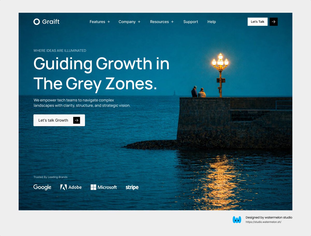
Finding the balance between heavy cinematic visuals and a clean aesthetic.

English
Maria dsgn
157 posts


@codedbymaria_
Web Designer & Developer UI/UX • Frontend Dev • Clean web experiences Crafting digital products with clarity & detail


we never negotiate on delivering something great 🧑🍳 if we can't do our best craft, we don't ship it


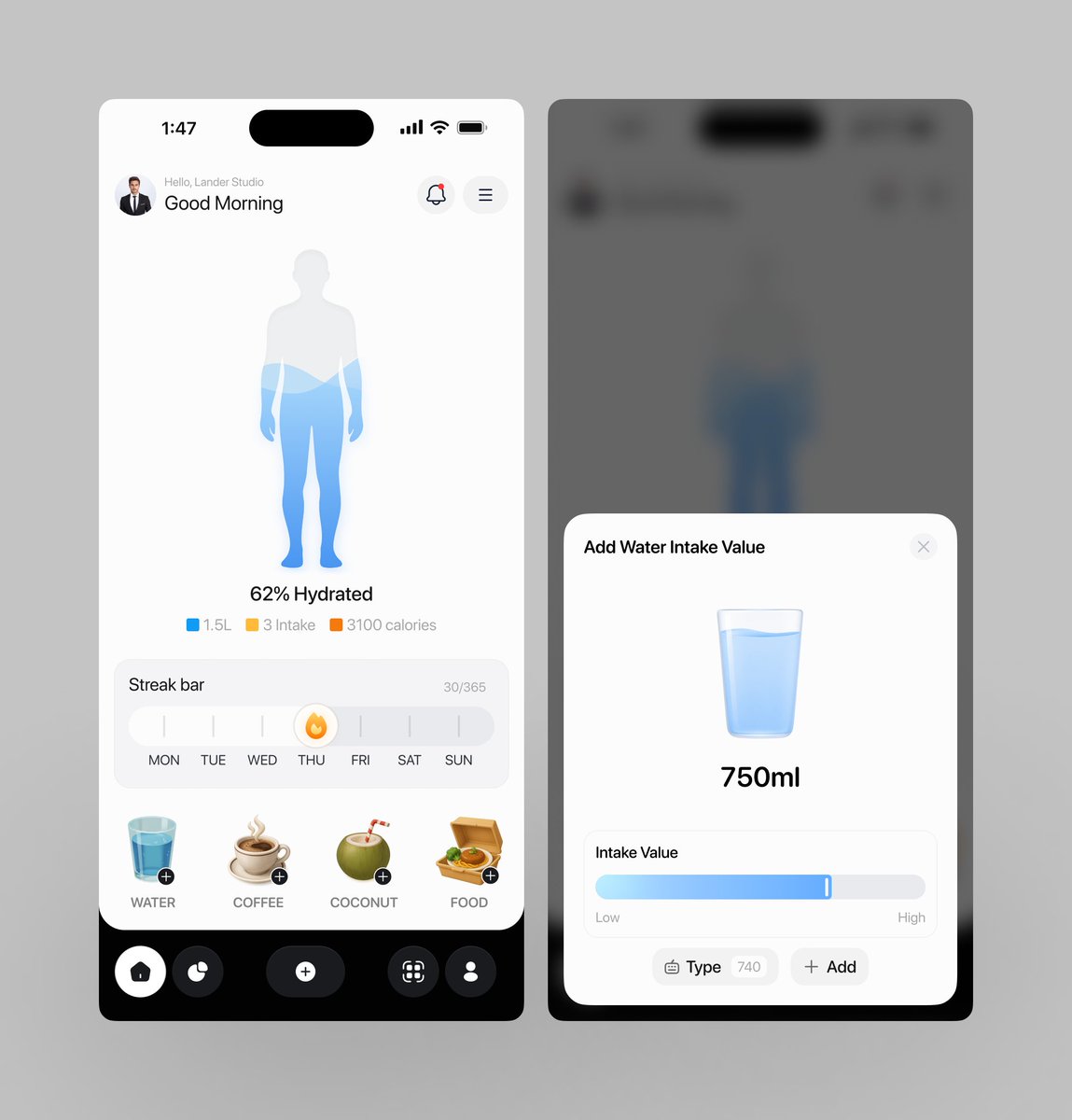
This level of glass effect in UI should be illegal 😭🔥