Day 33/60—Python for Data Science 📊
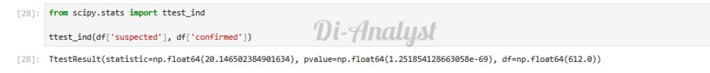
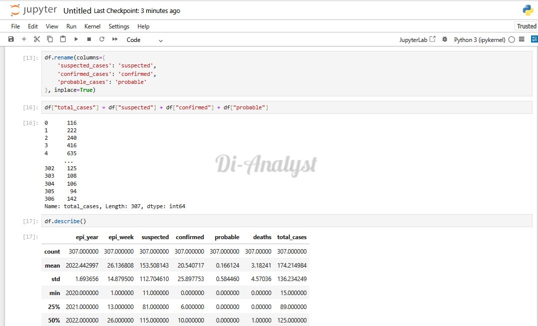
Been working with a real epidemiological dataset, analyzed weekly case trends, visualizing outbreak patterns, and running a hypothesis test to compare suspected vs confirmed cases.
#DiAnalyst #DataAnalysis #PythonForDataScience #Healthcare


English