ทวีตที่ปักหมุด
LunaticRed ✝️🇯🇵
1.6K posts
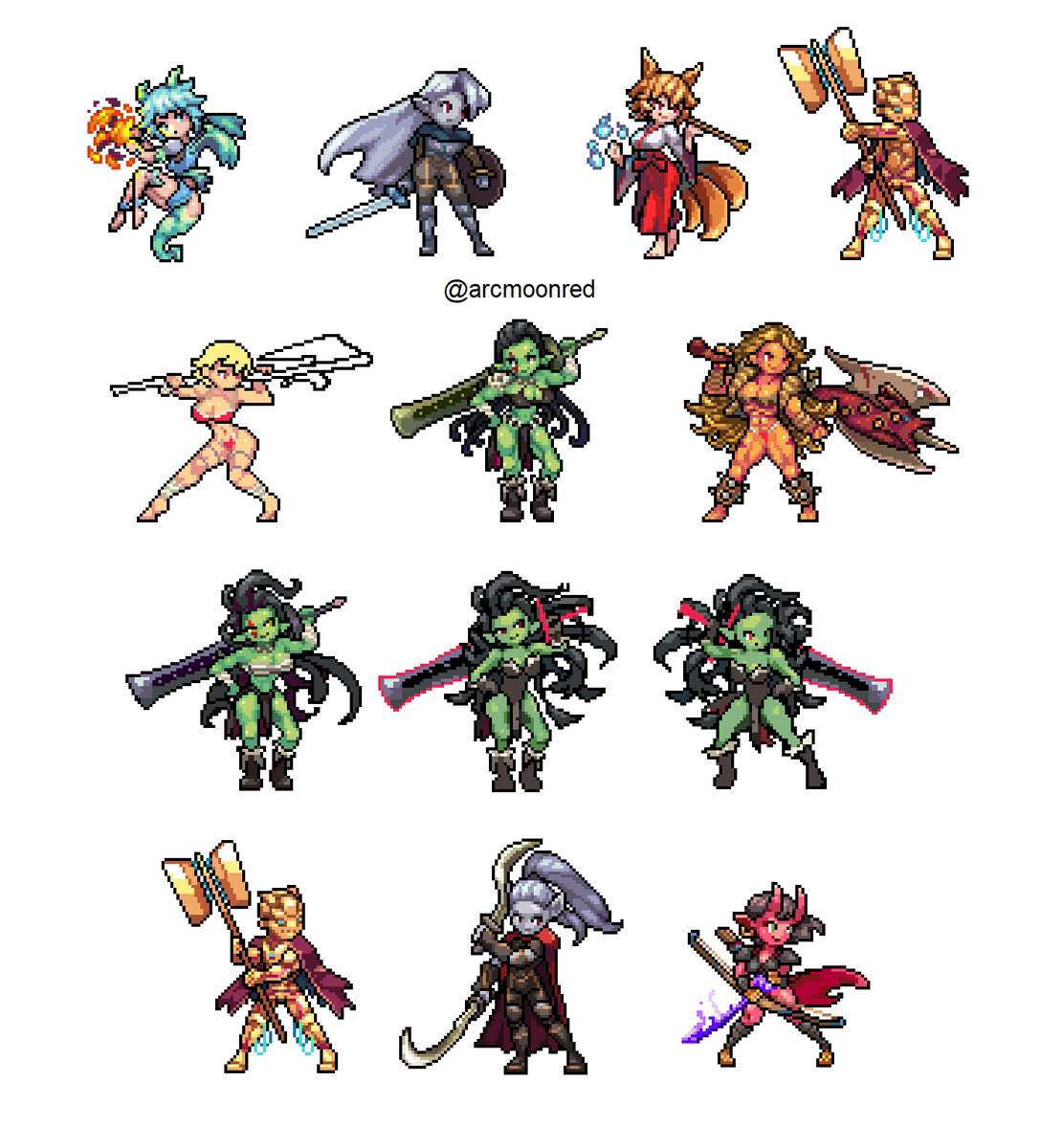
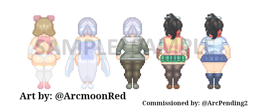
@ArcmoonRed
Christian artist. That's all. Discord for comms: iurilua (Worked as 2D Key Animator on @gastovathegame)


@ariga_megamix Was there a special drawing technique to make sure consumer CRT TVs don't blur the sprites? I remember the Crash Bandicoot developers saying they made him orange because the red version would bleed colour on some TV sets of the time.