ทวีตที่ปักหมุด
Rishi Rawat
5.8K posts

Rishi Rawat
@BetterRetail
If you like this ad👆🏼you'll like my Twitter content.
A copywriter in Michigan เข้าร่วม Eylül 2007
2.1K กำลังติดตาม2.9K ผู้ติดตาม
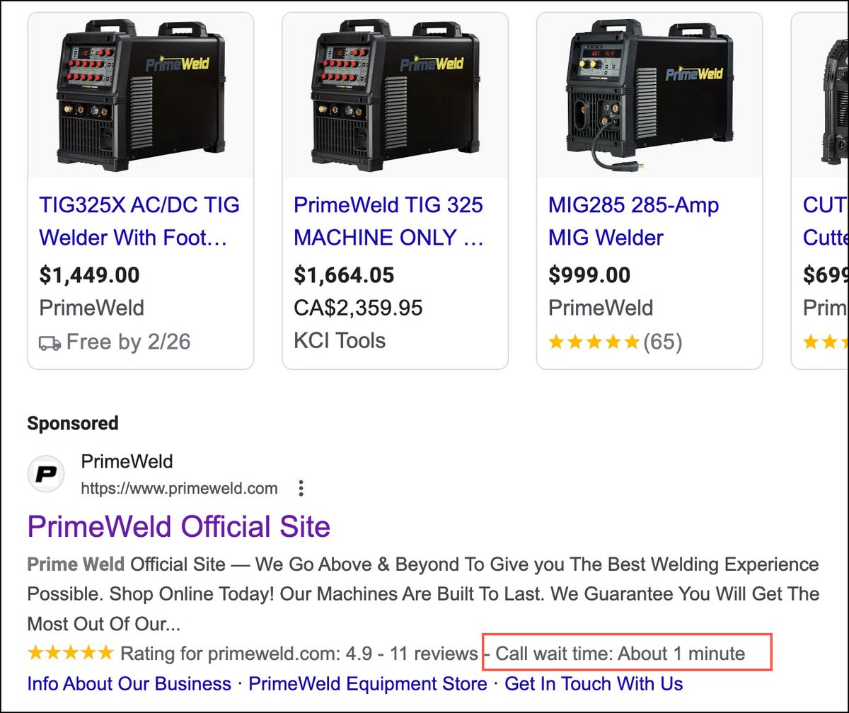
Interesting data tag in Google Search results. I assume it's been added by Google and not the business.
English

@BetterRetail My eyes arent what they use to be. Build for the older demographic, contrast is good.
English
In our quest for fancy typeface, we forget how readable typewriter font style is:
English
@itsme_jvt I did the 12 to 16x shift but for both mobile and desktop. I will study it some more on Monday.
English

@BetterRetail Screwed it up would not be my first conclusion. Perhaps just not a lever in yr case?
FYI this was
- mobile only
- audience skews older
- increased from 12 to 16px
English
My favorite recent “stupid test” increased font size on mobile
(I argued against it)
It won 👀
Rishi Rawat@BetterRetail
In our quest for fancy typeface, we forget how readable typewriter font style is:
English
I think our/my approach to conversion optimization is all wrong.
A chef will tweak a recipe a 100 times to discover the perfect balance.
We/I will try an idea five times and give it a final verdict.
English
@SarahLevinger I can tell you what the Starbucks CEO would say.
English

Insurance is boring and deadly serious.
I have so much respect for the designer who walked into the meeting with these fun graphical elements for the homepage.
Serious respect.

English

@stuli1989 @reemaabajaj Add multiple CTAs on the page that essentially ask, "Is this your first time buying from us?"
When clicked, introduce yourself and focus on communicating 3 things:
A: Price Justification
B: Demonstration of expertise
C: Us versus them
English

Okay, my time to ask for help
We are running our biggest Calligraphy and Marker Festival ever
How can we make this Category page better?
artlounge.in/calligraphy-an…
Any suggestions @BetterRetail , @reemaabajaj
Tag others who can help pls!
English
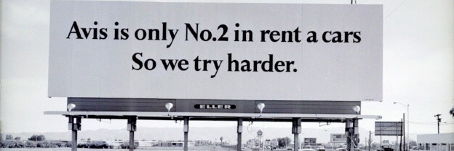
If your product has a dramatic benefit showcase it dramatically.
English
I like this progress bar design.
(See my green arrows)
"You’ve come this far; you have this much more to do. You can do it."

English
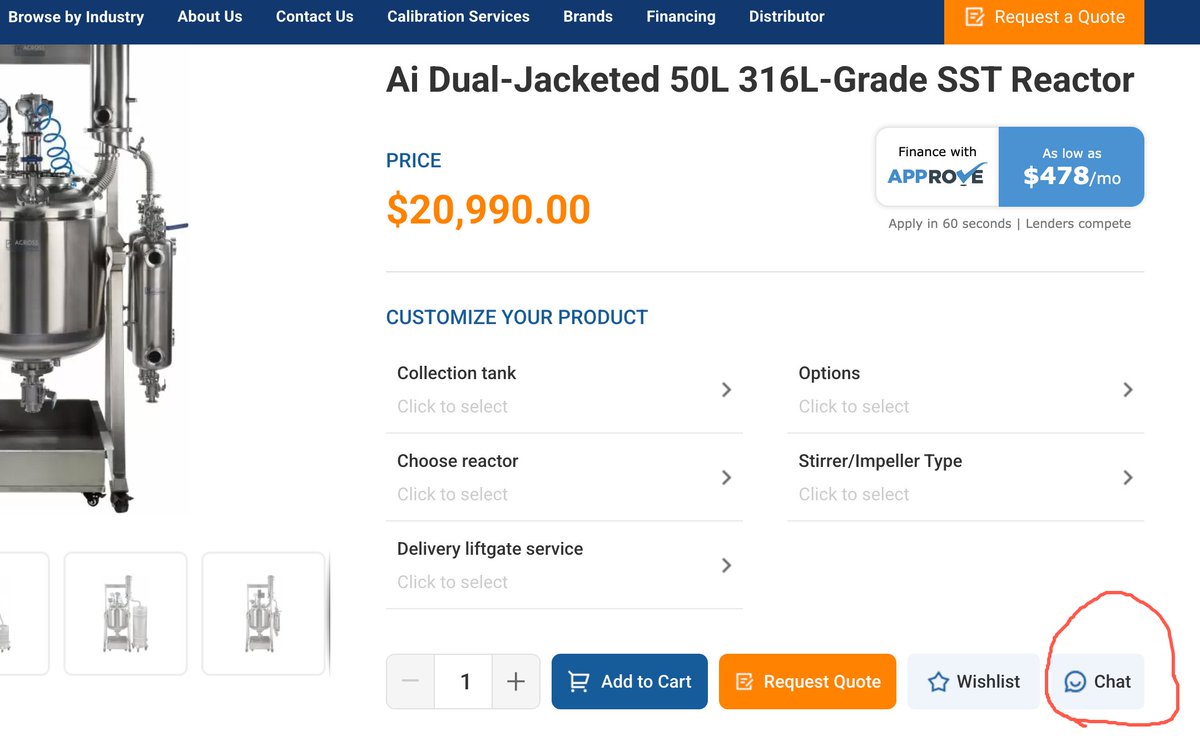
I like this placement of the chat CTA near the add-to-cart button.
English
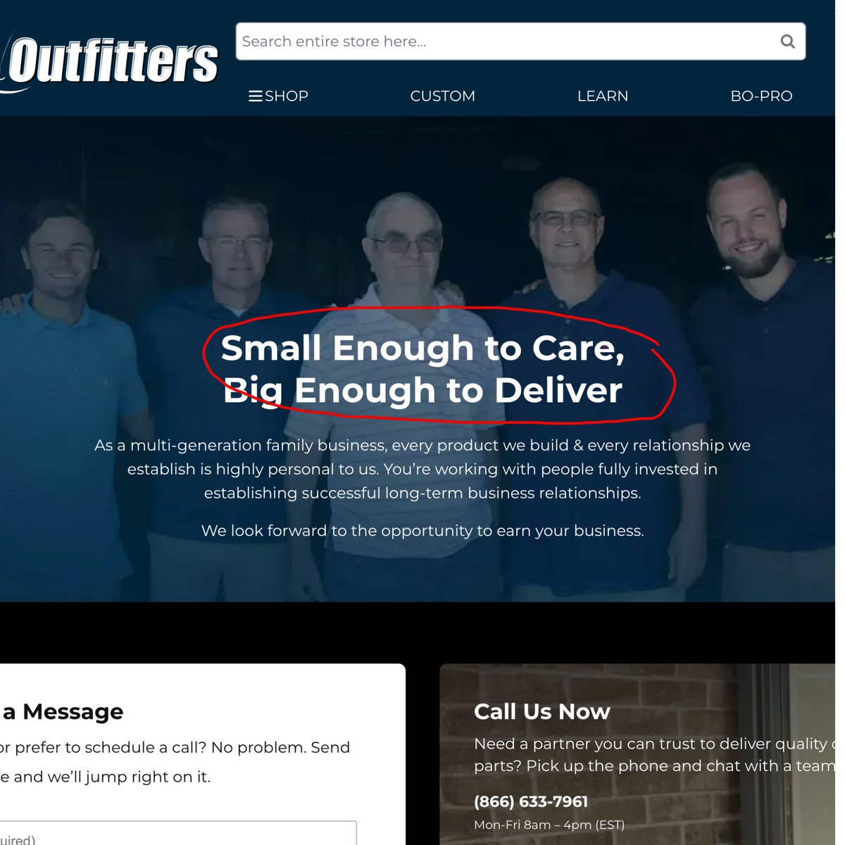
Brilliant headline + I love the background multi-generational photo.
English
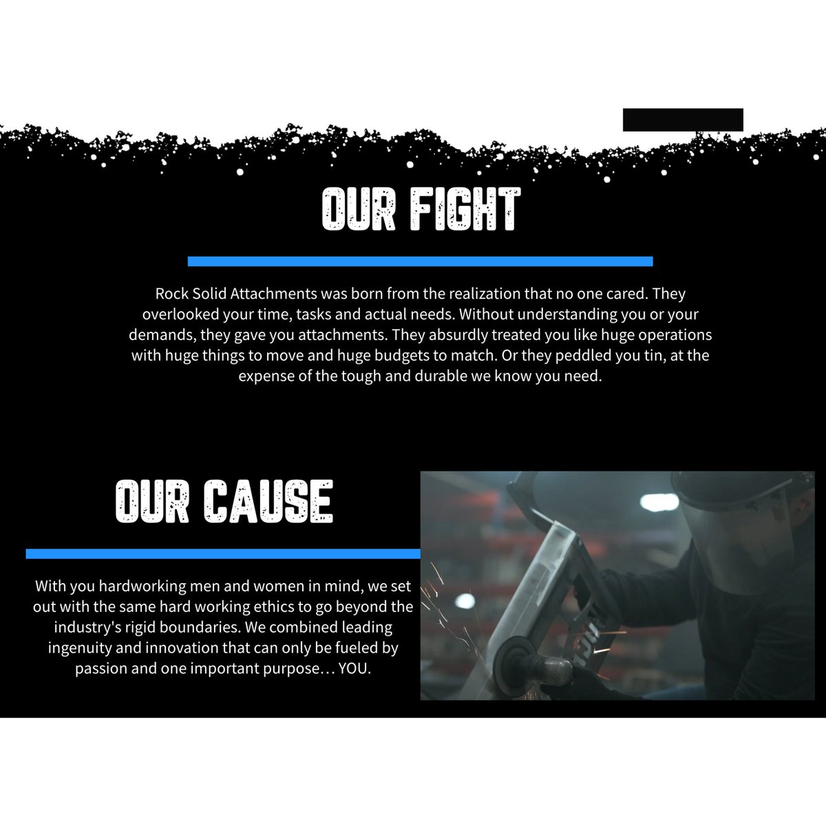
First, I love this CTA (Our Cause). Image 1.
Second, I like the content that appears when that CTA is clicked. Image 2.

English
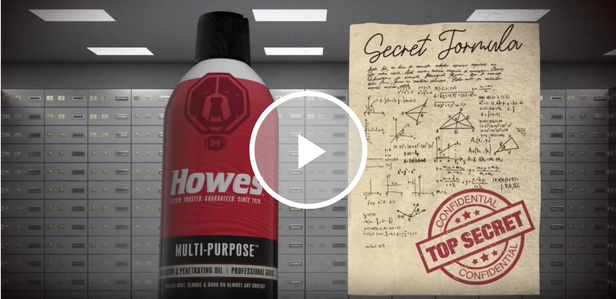
This is a clever video thumbnail.
The keyword secret formula increases curiosity.
English
Camel cigarettes once ran a contest offering $50,000 to the customer who could identify what changes they had made to their packaging.
Can you imagine how much brand recall is created when millions of customers spend dozens of minutes closely inspecting your product packaging?
English

@BetterRetail these do the job of background music in videos—guide the reader along the narrative and emphasise where needed
when used right, it just serves the greater good imo
English
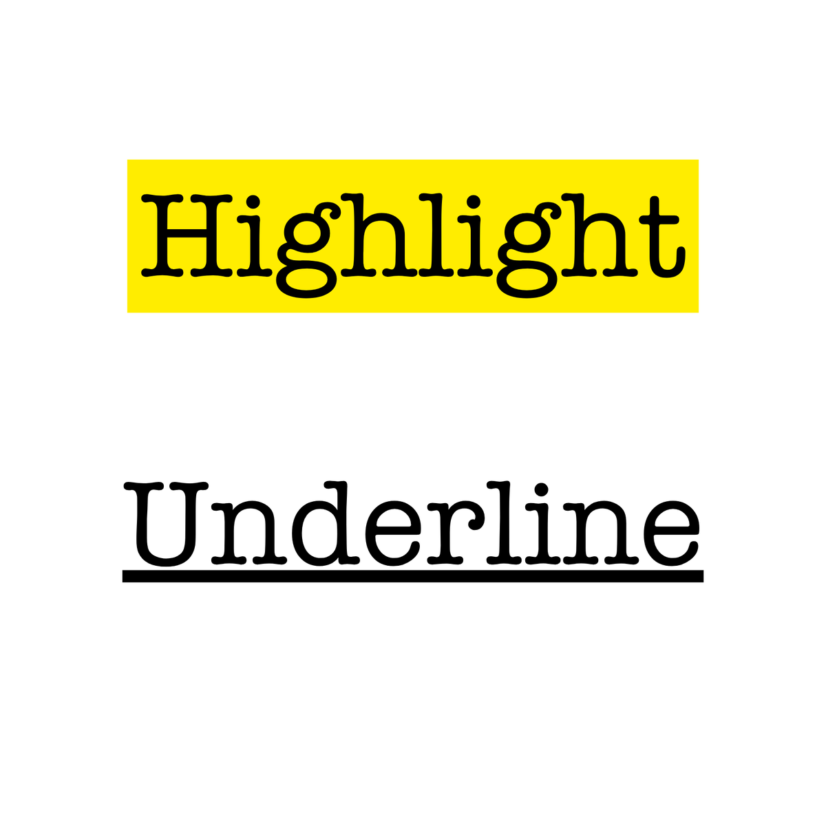
Question for my copywriting friends.
When writing, we are taught to highlight/underline important sections.
I'm in two minds about this.
At one level, I can see how this helps skimmers.
But ...
English

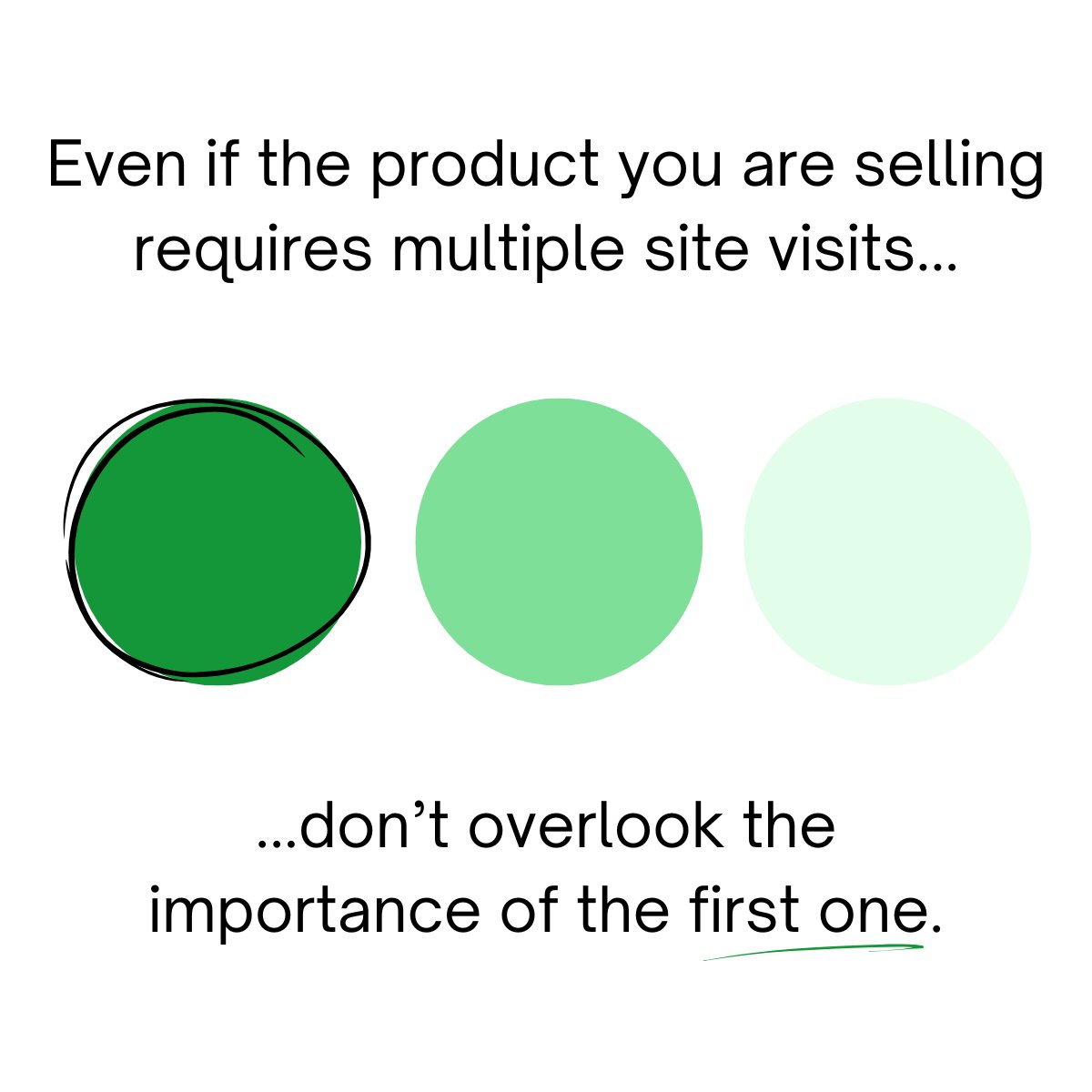
@BetterRetail Skimming is inevitable, so make sure text emphasis sets the storyline you want
To me, text emphasis goes (from most to least):
1. Highlight
2. Underline
3. Bold
4. Italics
It’s like the Headlines test: if you read only your emphasized words, does the page still make sense?
English