Esmat Sarafraz รีทวีตแล้ว
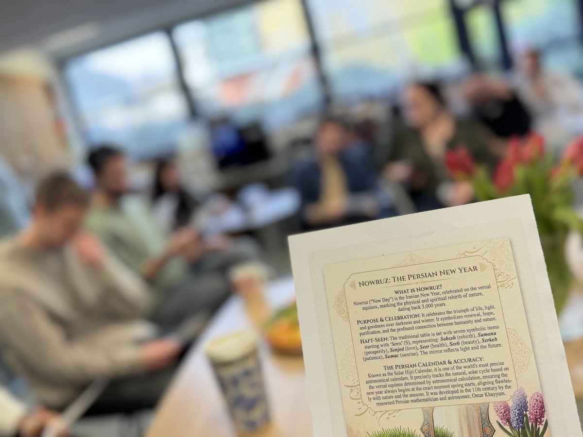
We’re celebrating the Persian new year, based on the calendar developed in the 11th c by the renowned Persian mathematician and astronomer Omar Khayyam 🪐
Happy new year and best wishes of peace and prosperity!

English
Esmat Sarafraz
429 posts

@esarafraz
A sometime researcher and always genetics enthusiast, studying genetics of flowering time @UTAS_ 🌱🧬💻Alum. @UnivOfTehran
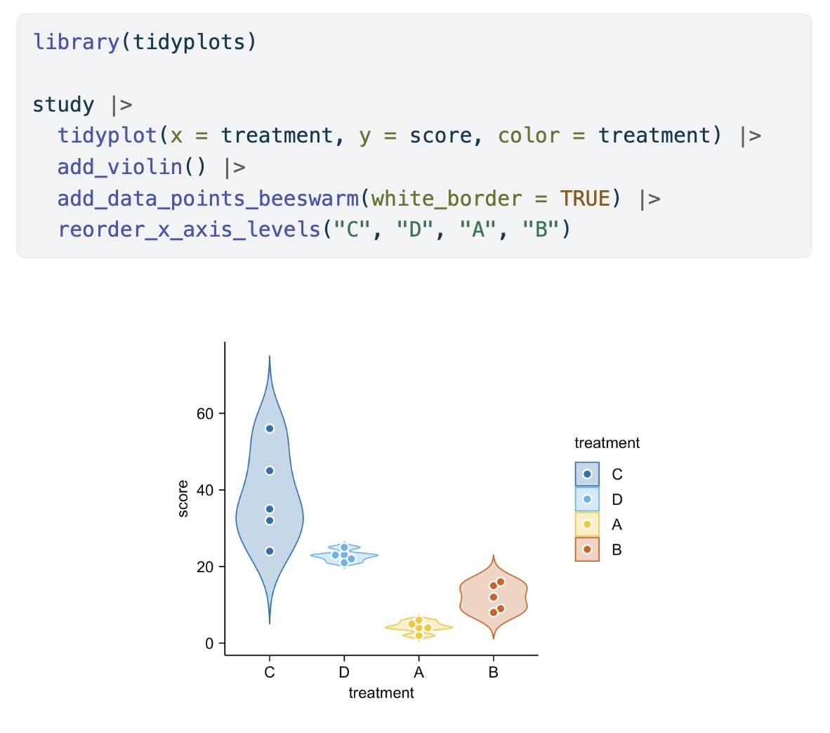
Running a research lab is about leading people. I created a free toolkit on the human side of lab leadership—covering hiring, mentoring, conflict navigation, lab culture, and performance management. Open access: doi.org/10.5281/zenodo… #TeamScience #AcademicLeadership


In the sorghum fields at Melkasa with the fantastic EIAR sorghum breeding team and @SorgGuy. Great to come back and see the team using the bird cage (purchased through @ACIARAustralia and @gatesfoundation) to run their crossing nursery safe away from hungry birds! Great job!