ทวีตที่ปักหมุด
Shift Nudge
665 posts


Shift Nudge
@shiftnudge
Professional interface design training for working designers. A proven framework that helps you finish your work to the level it deserves. Made by @mds
Apply → เข้าร่วม Şubat 2019
1 กำลังติดตาม11.4K ผู้ติดตาม
Shift Nudge รีทวีตแล้ว

Just finished @mds's @shiftnudge course after seeing his episode on @ridd_design's @joindiveclub.
Gotta say it was an absolute masterclass and would recommend for any product designer looking to upskill on visual/ui design.
English
Shift Nudge รีทวีตแล้ว

The first leg up I got was in my first month, I took a Ui design course from @shiftnudge, really great content that will ramp you up into UI-UX.
From there, it's copying other peoples work, following design tutorials here on X, and then copying more peoples work - really helps to give an idea of how your favorite designers create their UI
English

I just signed up for the free @shiftnudge Figma course. Soo much content packed into a single hour. There are only 12 five-minute videos and each one is 🔥
shiftnudge.com/figma
English
We’re investigating an issue with our payment provider that’s causing checkout failures.
Will update as soon as we have more info.
English
Shift Nudge รีทวีตแล้ว
Shift Nudge รีทวีตแล้ว

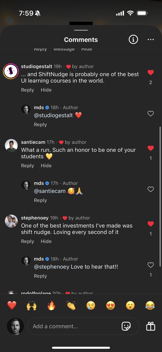
Been getting great feedback for the UI Principles workshop yesterday.
Posted the replays and the schedule for all of the weekly live critiques coming up for Shift Nudge students.
If you want in on the action...
→ shiftnudge.com

English
👀
MDS@mds
Some details to consider to enhance clarity, usability, and visual cohesion in this card UI... TYPOGRAPHY - Increase title font size to make project names more prominent and easier to scan. - Use uppercase for status labels to enhance visibility and reinforce importance. - Adjust text hierarchy by de-emphasizing secondary details (e.g., deadlines, progress) to keep focus on project titles. LAYOUT - Add more spacing around elements for a cleaner, less cramped appearance. - Ensure consistent alignment for text and progress bars to create a more structured layout. - Position status labels at the top of each card for quicker identification of project states. COLOR - Use a cohesive color palette for status labels to enhance harmony and polish. - Double-check color contrast to ensure small text on colorful backgrounds meets AA accessibility standards. - Match progress bar colors to status labels for visual consistency and stronger progress tracking. - Opt for softer, refined colors over harsh primary tones to create a modern, intentional design. STYLE - Reduce border contrast for a cleaner, more modern aesthetic. - Refine progress bar design with even spacing and alignment for clarity and intention. - Place status tags in a distinct location to improve scannability and reinforce project states. --- Example pulled from the @shiftnudge community. Enrollment is starting soon—hop on the list to get notified when we go live... → shiftnudge.com
ART
@MichaelFangman Looking good!
Don't forget your iOS status bar (top) and home indicator (bottom), which will affect the design a little.
Could potentially bump the line height on the body copy, maybe even fade out after three lines with a [read more] link
English

Here's a recent design exercise I worked on while going through the @shiftnudge course. It explores combining text and elements. It's been refreshing to experiment with new ideas and concepts through these exercises ⚡️

English
@tainted_sh If you can send a DM I can let you know details about enrollment.
English