Naka-pin na Tweet
Ion C.
706 posts


Ion C.
@ionorbits
Designer https://t.co/7DXje0Cojb | Apps, dashboards, design systems | Building Capsule UI
🚀 Sumali Eylül 2009
217 Sinusundan65 Mga Tagasunod
Been doing interviews the past few weeks. Aiming for something bigger.
Freelancing is great but working on a mature product, going deep on one thing, that's been pulling me lately.
But reality hits different. Being on the job market in 2026 is brutal. Up against hundreds of applications, AI-filtered processes, rounds that feel like a second job just to get to the first door.
What actually moved the needle for me:
- knowing someone on the inside
- trying the product and sending unsolicited feedback to support after applying.
In a sea of hundreds, you have to show up differently.
I feel you, designers out there grinding through this. It's a lot.
English

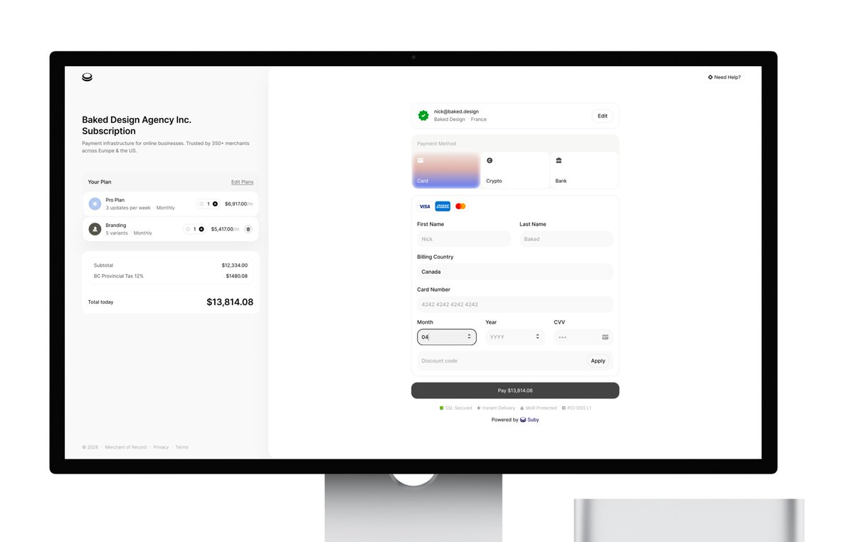
I've designed a bunch of these over the years, so here's a random drive-by hopefully educational roast.
Make sure your card number, month, year and CVV are in one line and the focus switches automatically after each one is filled. That reduces the amount of necessary taps by 4.
Year only needs two characters — there are no cards issues in 1924.
Turning month/year into a dropdown is devilish tbh. Especially terrible on mobile.
Country should be a dropdown though, preferrably with IP detection.
Card logos should be inside the card button, they don't belong inside the actual details.
No need for extra trash button when reducing the number from 1 to 0 can achieve the same purpose.
The right side is much more important than the left side, but white on grey stands out more. There's even a study that it affects conversion.
Subtotal/tax don't need their own container and could be better aligned, but that's cherry picking already.
Sorry, I worked with fintech so much, I just couldn't scroll by lol
English

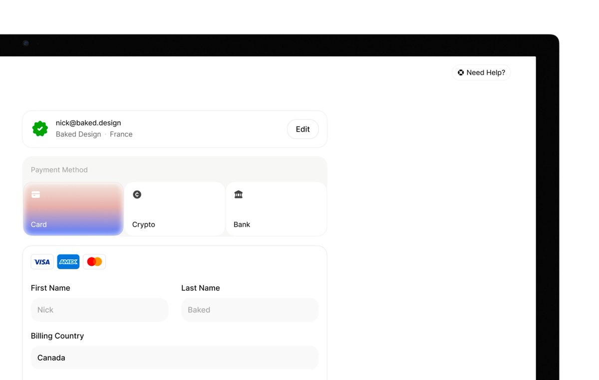
Replies are filled with spam or sharing portfolio link, no tried taking a stab at it so I did
> ditched repeating items (SSL, Secured, Discount)
> edit/update plans on the right
> Payment happens on the right panel
> added color - just because!
45mins


Gap | Suby@gaspardlezin
I'm looking for the best UI/UX designer to redesign our payment checkout. UIs I like: @AcctualTeam, for example. I want attention to detail, elements that reassure the customer, and smooth animations. Thank you for your help.
English
Started building MD files for Capsule UI this week. Feeding Claude the system rules, component logic, design decisions and watching it generate accurate, consistent output on the first try.
Might be late just discovering this but .md files are basically a brain you can hand to any AI and it just gets it.
English

I’m thrilled to announce we’ve raised $44M to build a new home for product design. Meet @noondesign.
No workflow is more broken and fragmented in 2026 than the product designers’. The very same people who care most about building software don’t have software purpose built for them. @kushagrasinha7 and I have lived this problem first hand as designers ourselves.
That’s why we built Noon. The first product design tool that works entirely on your product code, so you can design not only how a product looks, but also how it works. With AI at its core that works in seconds, not minutes.
For the first time, you can create, iterate, build, test and ship. All in one canvas. No translations or roundtrips to the codebase and back.
Comment “Get Noon” and we’ll get you on the list for early access.
English
@chasingaround_ @figma Used Claude to read my semantic tokens and auto-generate the documentation table: names, descriptions, color mapping, all of it.
This is the kind of work I kept pushing to the bottom of the list. Took minutes.
English

Dark mode lesson:
Transparency is your best friend. If you want colors that adapt from light to dark without losing your mind, use transparency, not fixed hex values.
And if you're using transparency, stick to neutral gray. Slate, stone, cool grays, all look wrong the second the background shifts.
English


We just refreshed the Nuova website.
Not just visually, but strategically.
Running a design agency is no different than running any other business.
Your website has one single job.
It needs to position you clearly, speak directly to the right clients, and ultimately convert.
So the real challenge becomes interesting:
How do you build a website that is still visual and design-driven, while also being clear, structured, and focused on conversion?
That’s exactly what we’ve been working on.
We restructured the entire site:
• clearer service pages
• industry-focused positioning
• stronger messaging
• new sections designed for social proof, clarity and trust
Still visual, but now much more intentional.
The hard truth about agencies websites is that work alone doesn’t convert (unless you are a well known agency with huge clients)
If someone lands on your site and can’t quickly understand what you actually do, why you’re different, why they should trust you, and whether you solve their problem… they leave.
Curious to hear your take:
What makes you trust a design agency website?
English
@skirano @MagicPathAI okok, I like how this sounds: "ontological shock".
English

In a few days, we’re shipping something at @MagicPathAI that makes the dream of designing in code with perfect handoff, especially for large teams, finally real.
I’ve been in this field for 20 years, and early in my career this would have felt like an ontological shock.
English
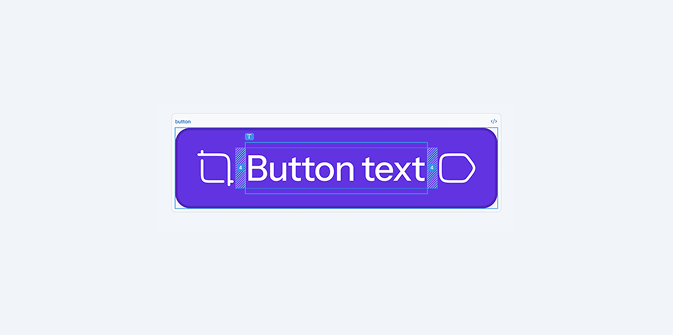

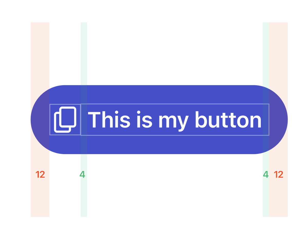
I found that instead of having different paddings depending on having an icon or not (which is annoying to set up) if you put some padding on the actual text inside the button, you get the same result.
If your button has an icon on the left, then the padding is just 12px. But when the padding is compounded with the padding of the text, you get 16px.
This way you don't have to juggle conditional paddings, and this just works
Jesse@jesse_vermeulen
the difference between a senior and a junior designer
English

@venkatofl Rounded corners. Very underground, not many people know about it.
English

Lately I've been keeping a fair amount of personal projects active:
1. Capsule UI - Love the fiddling and playground experimentation. Miles to go but that's the point.
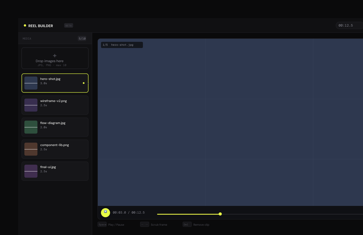
2. Designer Reel Creator - Rare visits but zero pressure. Just slow progress.
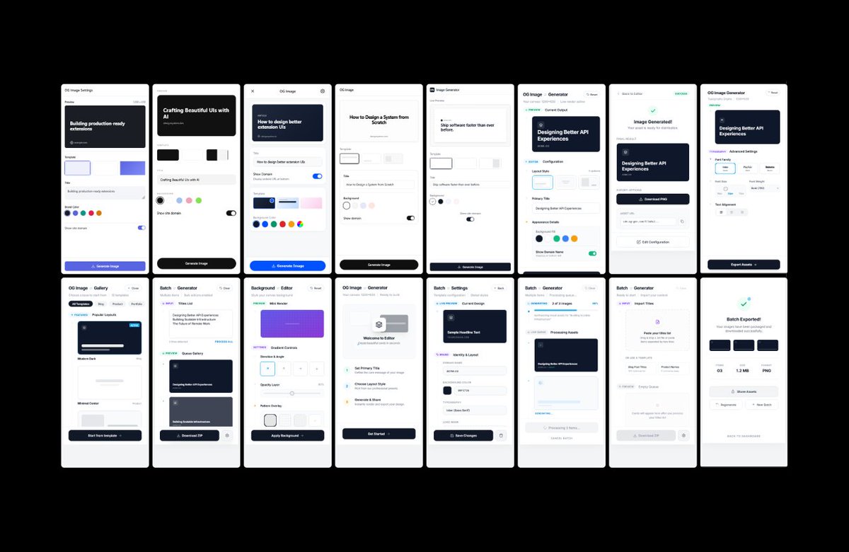
3. OG Image Chrome extension - Exploring ideas and different vibes.
Even though the (design) world moves fast, I've rediscovered the pleasure of taking it slow.
Just want to get myself acquainted with new workflows and have fun with it.
English
Yeah, the YouTube tutorials definitely glossed over some complexities.
Turns out I had a lot of troubleshooting to do and discovered the original Figma MCP was 'locking' the ports, so Claude couldn't communicate through the Bridge.
Anyway, water under the bridge. Working now and it's worth the pain.
English

@ionorbits I'm sorry, and you're welcome! 😅
But for real, yeah, the setup is cumbersome. I can't deny that, but once you're set up, the benefits are unreal. Really, the only limitation to what it can do is a lack of creativity. Have fun with it, experiment, enjoy it.
English
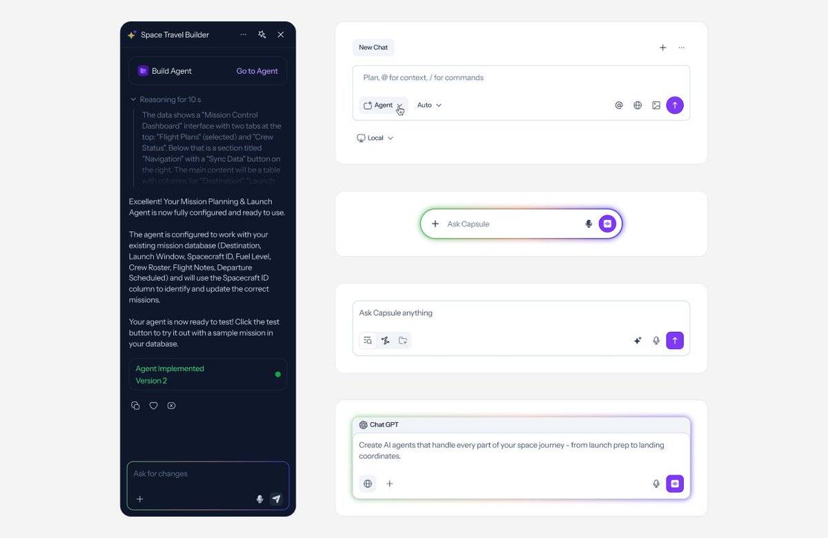
Been exploring ways to integrate Claude into my design workflow. Finally carved out time yesterday to install Figma Console MCP by @tpitre .
Setup? Total pain. Took hours to get it talking both ways with Figma. Almost gave up.
Today I tested it: generated complete semantic color documentation for Capsule UI in under 5 minutes.
A task I'd been postponing for months because it felt daunting and time-consuming.
Done. Just like that.
English