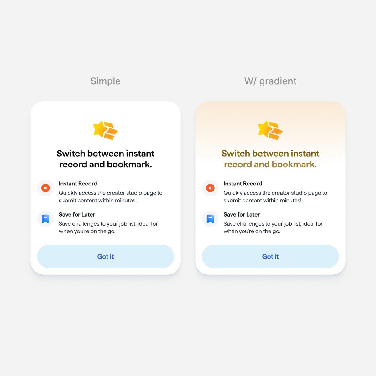

It looks great. I would choose option B. I really like the shadow because it helps separate the elements nicely, but I would recommend centering the text inside the blocks, because right now the composition feels visually too weighted to the left. The only issue for me is that the text blocks might need a bit more contrast.
English