- Welk lettertype vinden mensen hip, Herman?
- kweetnie, gewoon, kies iets gatlelijk en moeilijk leesbaar, dat zal dan wel hip zijn.
#wtfisda#rockwerchter
@_TommyMason@Sarahbonddesign I once ditched a client because he demanded to change the typeface I had used in the design to either Montserrat or Raleway.
@Chris_McGinn_@logogeek What I’m trying to say here: either design a symbol or a wordmark. If you do the latter, don’t pretend it’s meant as a symbol if it turns out people can’t read it.
@Chris_McGinn_@logogeek To me the KIA logo is too close to type to be considered a symbol. And too close to a symbol to be a legible wordmark. It’s actually not of both. Nobody would try to read the Nike swoosh. Ask people to draw the FedEx logo and most people will have the font and colours wrong.
The new KIA logo is a nice reminder why legibility matters - “Google searches for “KN car” have risen exponentially as approximately 30,000 people a month are misreading the new logo as “KN” instead of “KIA”.
@dgtlnk That is from Marketing. We here at Customer Care are now relieved to tweet - Issue Resolved! We found the root cause, server is back up and running fine. Our sincerest apologies for the issue - and the bad timing. Talk about Cyber Monday...
It’s #CyberMonday, and there’s still time to get amazing foundry-wide deals! Today, get 50% off the entire Nasir Udin foundry …. That’s 20+ families and 100+ styles for your library.
Shop: ow.ly/onqC50LOcBv
@scottnichols@DannPetty Good (graphic) design has died the last 10 years because marketeers think every design decision needs to be justified by research. I loved the time when designers were actually marketeers with a sense of style but without the marketing blablabla.
One of the biggest lies we’re taught as designers is that you have to be able vocalize every single decision you make with data or research.
Nah.
Add that gradient because you think it looks cool. Use that typeface bc you enjoy it.
That’s all the excuse you need.
@TheAdmiral@hankchizljaw “And we want to show 10 pictures of the office.” “Wouldn’t it be better to choose 1 great pic?” “But our office has many amazing corners. Can’t you show them all? Like in this little slider-thing?” “I wouldn’t suggest that because […].” “We think it would be great!”
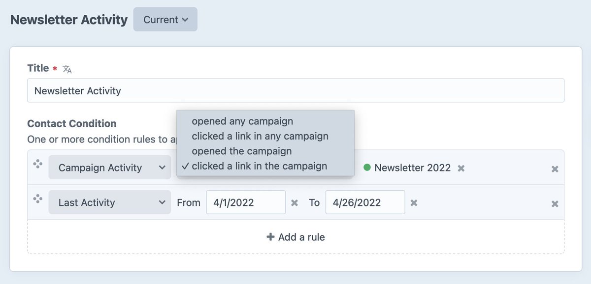
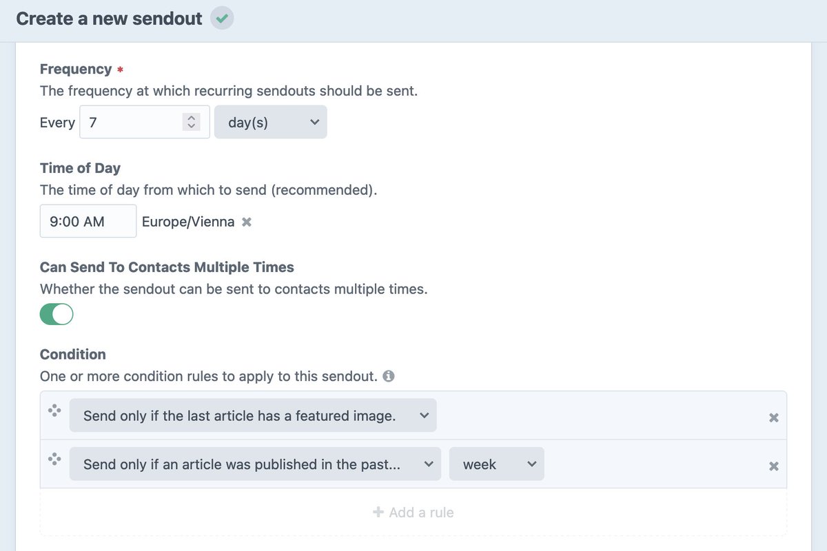
📨 Campaign 2.0.0-beta.3 released, adding condition builder fields to segments and sendouts 🏗️
This feature allows you to use the built-in rules OR add your own custom rules, one of the many things we love about #CraftCMS 4⃣ !!
Changelog: #200-beta3---2022-04-26" target="_blank" rel="nofollow noopener">github.com/putyourlightso…
@AisleOne@sannewijbenga Totally agree. The internet became a place with dull websites all looking the same. 20 years ago the coolest websites were designed and developed by 1 person or a small team. Now we have split up aspect and 50 “senior” ui/ux/design/… people are involved in 1 bland site.
I just read most of an article before the paywall finally kicked in and this is probably the first time I was thankful for slow JavaScript on a website
@ruffsnap@SquareBubbleNRG@yikeodom@Adobe + there was an option to only buy InDesign, Illustrator, Photoshop. Now it’s one or all apps. Adobe saying “it’s expensive because you get so many apps”. I don’t need 80% of those apps.
@SquareBubbleNRG@yikeodom@Adobe Prior to that buying Photoshop was $700-1k, and the Master Collection was thousands. Wasn’t just a “couple hundred”, it was prohibitively expensive for most people who weren’t getting it covered through work.
@ruffsnap@SquareBubbleNRG@yikeodom@Adobe Fact is you could buy it and use it for however long you wanted. Now: if I stop paying for one month, I can’t even open my old archived files because I’m not paying anymore.