Angehefteter Tweet

💤
180.4K posts

@ShadowStarMode
Sundown #RaisedByWolves


What do you think?


What do you think?

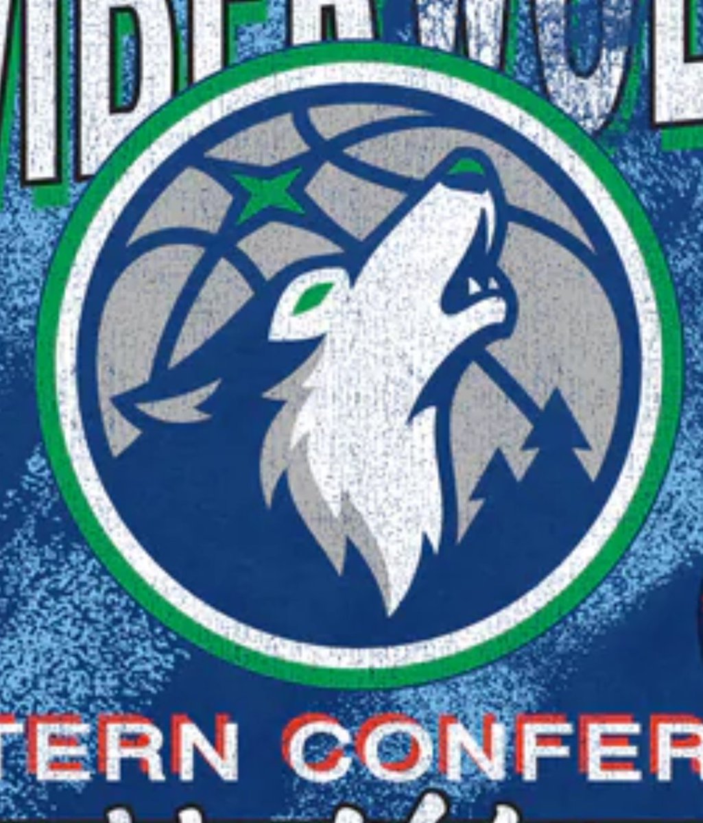
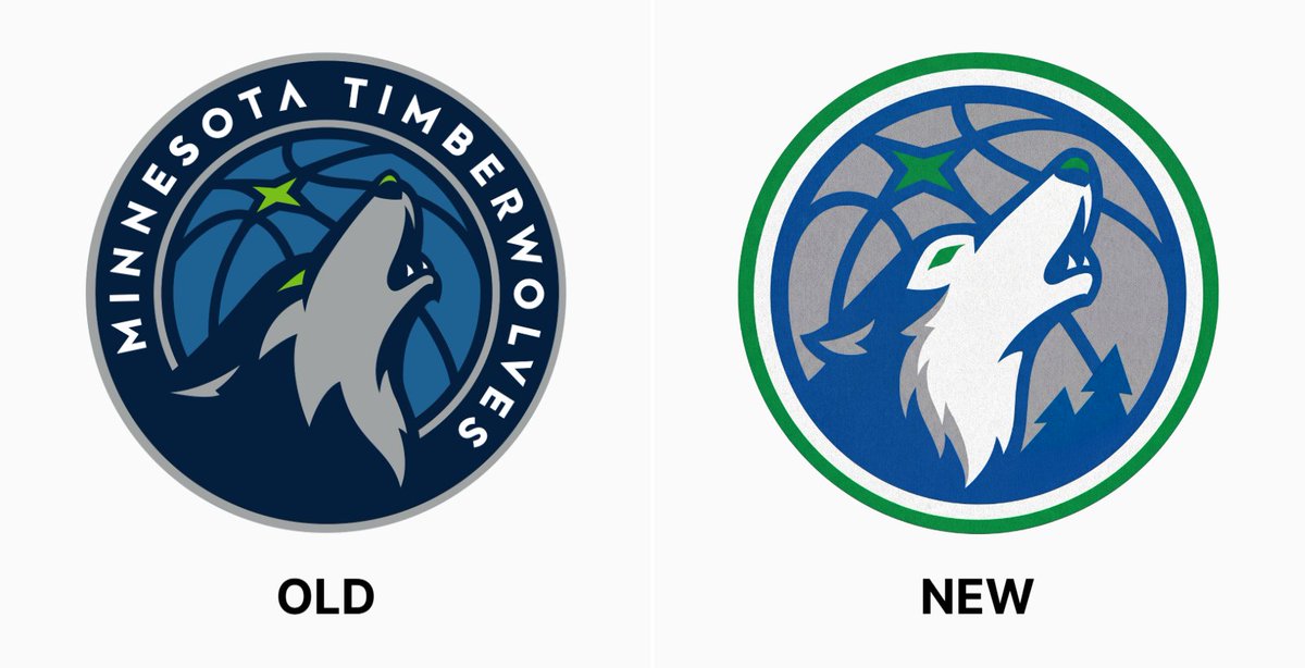
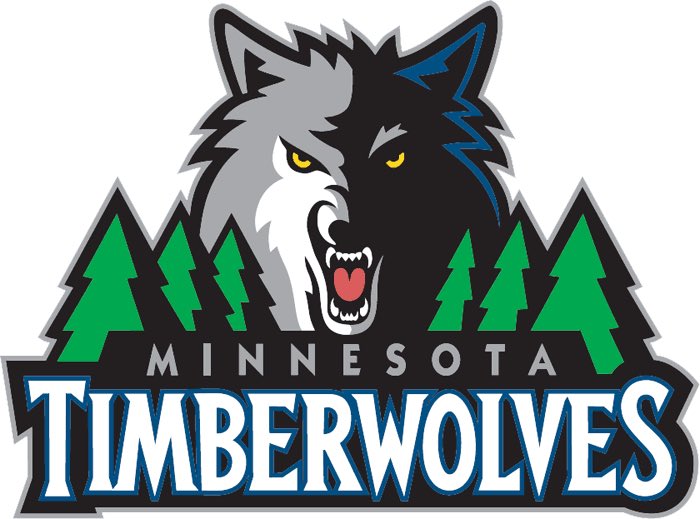
Minimalism is such a stain on sports. There’s no space better suited for kooky maximalist fun design, but instead we’re slowly turning everything into a millennial targeted D2C olive oil brand (derogatory)


Minimalism is such a stain on sports. There’s no space better suited for kooky maximalist fun design, but instead we’re slowly turning everything into a millennial targeted D2C olive oil brand (derogatory)


What do you think?

There is a non zero chance the NBA store leaked the new logos already (couple weeks ago)