Angehefteter Tweet
Ashfall Studio
283 posts


Ashfall Studio
@ashfallstudio
Brand identity & digital experiences for innovators. From AI startups to Google.
Global Beigetreten Nisan 2023
510 Folgt1.9K Follower
Ashfall Studio retweetet

@peterkonti @pie6k @littleplainsxo @pizzaboy @adriastudio @OTW_studio @oaklinestudio_ @_offgrid @LucieBajgart @CedrikStephen @AlexAperios @keilethh @kubadesign @danielsun_ui @socoloffalex Thanks, @peterkonti 🙌🏻 @pie6k let us know if you want to chat, we're proud Screen Studio users 😎
English

@pie6k These first come to mind.
From all over the place...
Agencies: @littleplainsxo, @pizzaboy, @adriastudio, @OTW_studio, @ashfallstudio, @oaklinestudio_ , @_offgrid, @LucieBajgart
Designers: @CedrikStephen, @AlexAperios, @keilethh, @kubadesign, @danielsun_ui, @socoloffalex
English

Logo design question:
Can you recommend anyone who can do amazing logo design work?
We're thinking of iterating on the Screen Studio logo a bit for our next big release.
Only solid portfolios please
English
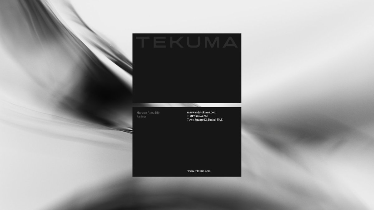
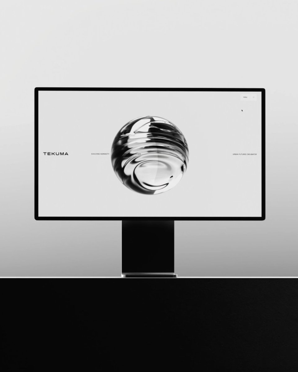
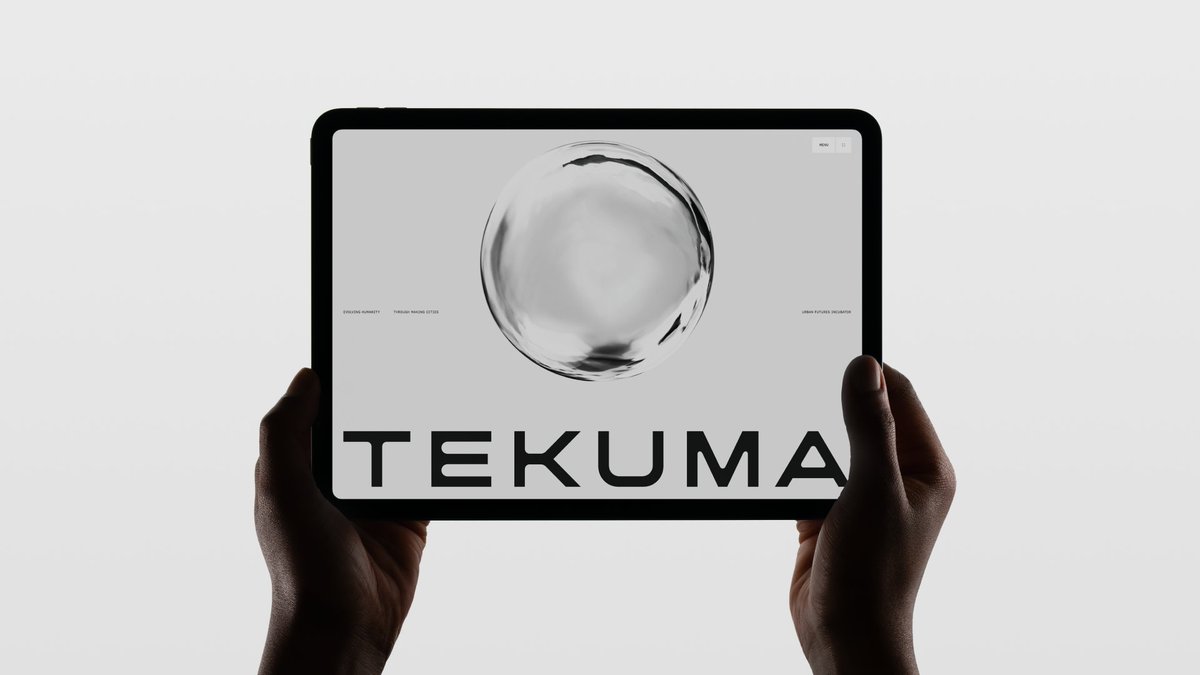
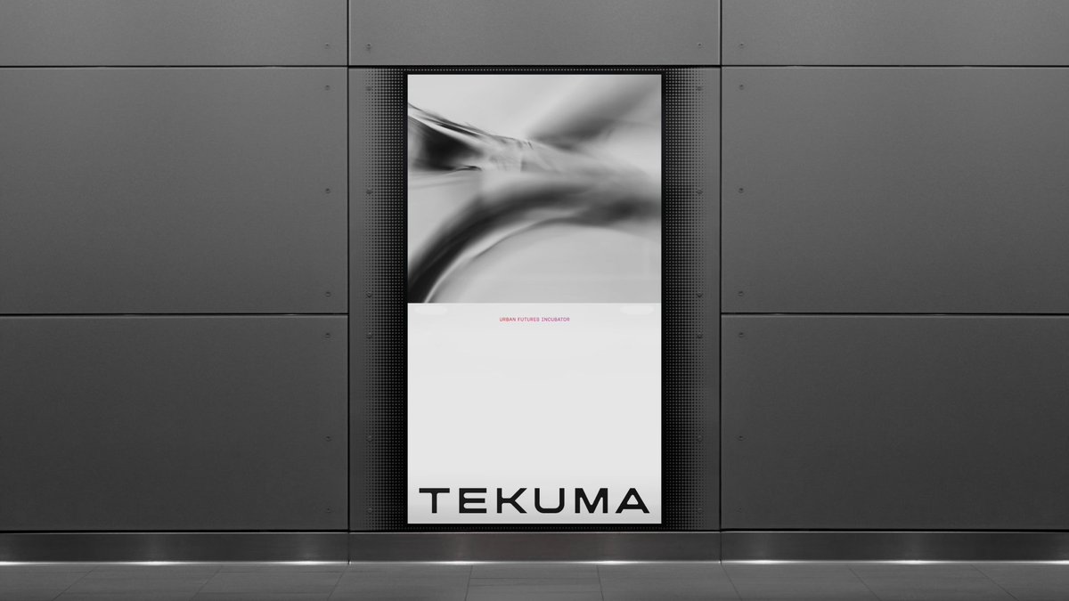
We're very excited to see an in-depth feature article about our work for Tekuma on The Brand Identity (@TweetsByTBI).
Go give it a read if you'd like to learn more about the strategy, direction, and design details of the brand system.
Link in comments 👇🏻


English
Ashfall Studio retweetet

For Tekuma’s rebrand, @ashfallstudio balanced boardroom authority with urban futurism through controlled contrast and restrained motion.


English
Ashfall Studio retweetet
Global design studio @ashfallstudio’s identity for Tekuma balances boardroom authority with urban futurism through controlled contrast and restrained motion.
Explore the full case study below ↓

English
Ashfall Studio retweetet

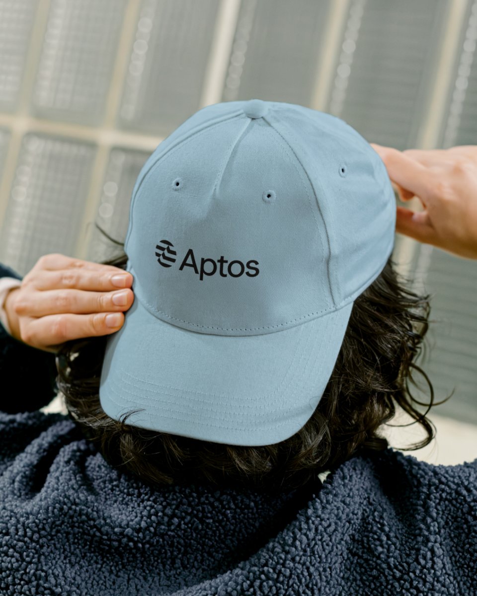
Charmed to work on the rebrand of one of the prominent Web3 players, Aptos — with @ashfallstudio repositioning them as a trusted institutional partner for builders.
A wave-like movement was embedded not only into the logo, but carried throughout the entire identity — resembling the flow of data. Smooth, there-and-back transitions create a sense of continuity, stability, and precision.
The typeface Season by Displaay added another layer to the system. With its variable axis shifting from serif to sans serif, we were able to mirror that same fluid transformation within the typography — creating seamless transitions in motion that echo the brand’s evolution from experimental to institutional.
English
Ashfall Studio retweetet

Ashfall Studio retweetet

@ashfallstudio created a new brand identity for TEKUMA - an urban innovation practice – that carries institutional authority alongside future ambition. Read the full case study 👉
mindsparklemag.com/designs/tekuma…
English
Ashfall Studio retweetet

Work that I'm probably the most proud of in my 12-year long design career: A strategic repositioning and rebranding of @Aptos, one of the world's biggest Web3 innovators, we did at @AshfallStudio last year.
English
Ashfall Studio retweetet
An unused direction for the Tekuma brand identity we just released at @AshfallStudio.
Still dig this one. Keywords: Elegance, futurism, harmony.

English
Ashfall Studio retweetet


Ashfall Studio retweetet

New on the Blog: “Heidelberg CCUS” — a Case Study by @ashfallstudio
awwwards.com/heidelberg-ccu…
A behind-the-scenes look at how an immersive digital experience was created—transforming technical complexity into clear, emotionally resonant storytelling.
English
New case study: Tekuma
For the visionary urban design practice spun out of MIT we built a brand designed to be understood before it’s explained.
English
Ashfall Studio retweetet
Stoked to see the Heidelberg CCUS experience we created at @AshfallStudio nominated for Site of the Year by @Awwwards 🤍
English
We're very excited to see our Heidelberg CCUS experience nominated for Site of the Year by @awwwards 🤍
English

Thank you, 2025!
You were our best year yet. A year of incredible growth, bringing more new experiences, learnings, and relationships than we could have ever hoped for.
Hey, 2026. Let's rock! 🤘🏻
English
Ashfall Studio retweetet
Creative and technology studio @ashfallstudio moved Aptos beyond typical crypto aesthetics.
Explore the full case study below ↓
English
Ashfall Studio retweetet
A rejected brand direction for an urban innovation client at @AshfallStudio from last year. This one focused on the strategic contrast of harmony and futurism in their work. ✨
GIF
English