アイス

308 posts

アイス banner
アイス

アイス

@chocminticecube

Persona 5 | shuake | 主明 | ☕🥞 | 2024 | Eng+Chi | Age: (19+)

Joined Mart 2021
763 Following87 Followers
Pinned Tweet
アイス
アイス@chocminticecube·
🎨✍️ Answer my survey to earn a 𝙛𝙧𝙚𝙚 𝙘𝙤𝙢𝙢𝙞𝙨𝙨𝙞𝙤𝙣 of your profile picture!!! Topic is about collab painting (like wplace and MagicalDraw)! You can skip the questions that are not suitable for you.🫶🏻 The duration is within 8 minutes forms.gle/RhPz5kUunosHCi… #wplace
アイス tweet mediaアイス tweet mediaアイス tweet media
English
1
0
1
352
アイス retweeted
アイス retweeted
Ayu (ꥆꤿꥈ) @ CF22
Ayu (ꥆꤿꥈ) @ CF22@nowhiringagents·
Hmm yeah lets not do this
Ayu (ꥆꤿꥈ) @ CF22 tweet media
English

25
215
2.1K
1.5M
アイス retweeted
いいの | デザイナー
いいの | デザイナー@iino_design·
雑誌風デザインの素敵なWebメディアサイト👀 連載記事のサムネイルデザインが全て違ってとてもいい...
日本語
1
186
2K
71.7K
アイス retweeted
UI/UX Savior
UI/UX Savior@UiSavior·
Fall in love with this Apps!
UI/UX Savior tweet mediaUI/UX Savior tweet mediaUI/UX Savior tweet mediaUI/UX Savior tweet media
English
1
14
305
11.4K
アイス retweeted
qo
qo@qosicart·
mockup vs final
qo tweet media
English
17
304
2.2K
42.3K
アイス retweeted
かわち
かわち@_kw_t·
拓衛
かわち tweet media
日本語
0
335
1.6K
20.7K
Yukumikirichan
Yukumikirichan@m1zkii·
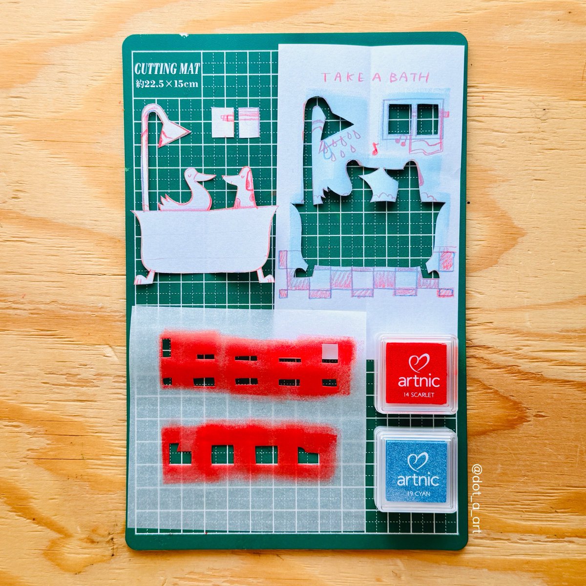
@hourlydenreze Does anyone know if this is the game? I want to download it and try it out🥹
Yukumikirichan tweet media
English
2
0
5
487
denreze hourly
denreze hourly@hourlydenreze·
I’m crying this is her favorite pose
denreze hourly tweet media
English
10
280
3.2K
21K
アイス retweeted
トミナガハルキ | フリーランス歴10年な人
かわいい相関図を簡単に作れる【三角関係ジェネレーター】を公開しました。写真や画像も利用でき、画像で書き出しもできます。機能が多いのでPC限定にはなりますが、サクサクと関係図を作ることが可能です。 amix-design.com/tl/tool-dia/
日本語
54
9.5K
32K
5.3M
Nick Stepuk
Nick Stepuk@stfnco·
Designed a sleek holographic coupon for the Easyfast v2 platform update All @framer superpowers are in use: shaders, vectors, masks, 3D Q2 will be full of new releases and experiments Can make a tutorial. Want one? ↓
English
33
5
227
8.9K
アイス retweeted
Carlos ☻
Carlos ☻@cjmlgrto·
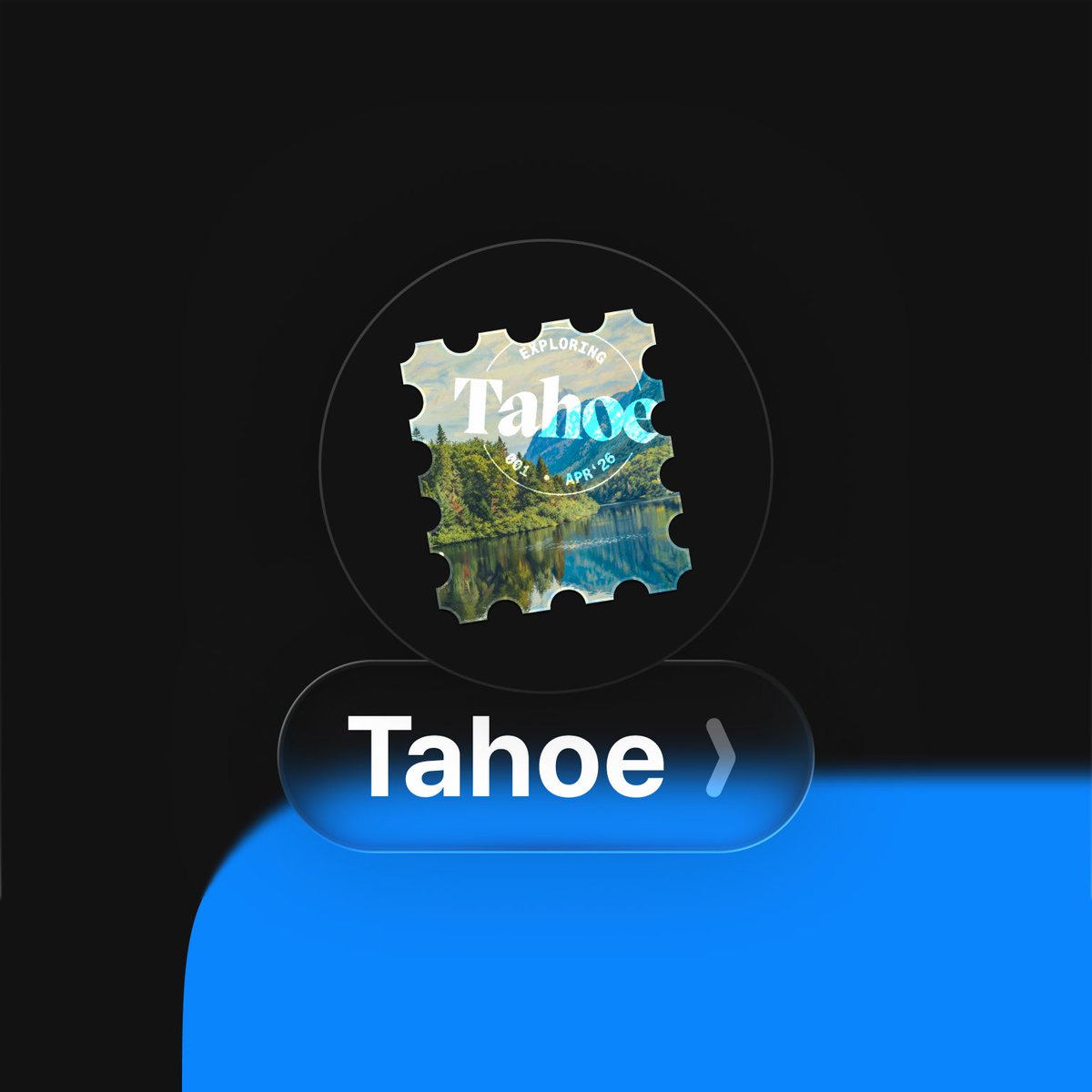
I take my group chats very seriously
Carlos ☻ tweet mediaCarlos ☻ tweet mediaCarlos ☻ tweet mediaCarlos ☻ tweet media
English
30
126
4K
130.9K
アイス retweeted
초록말
초록말@chorokmal·
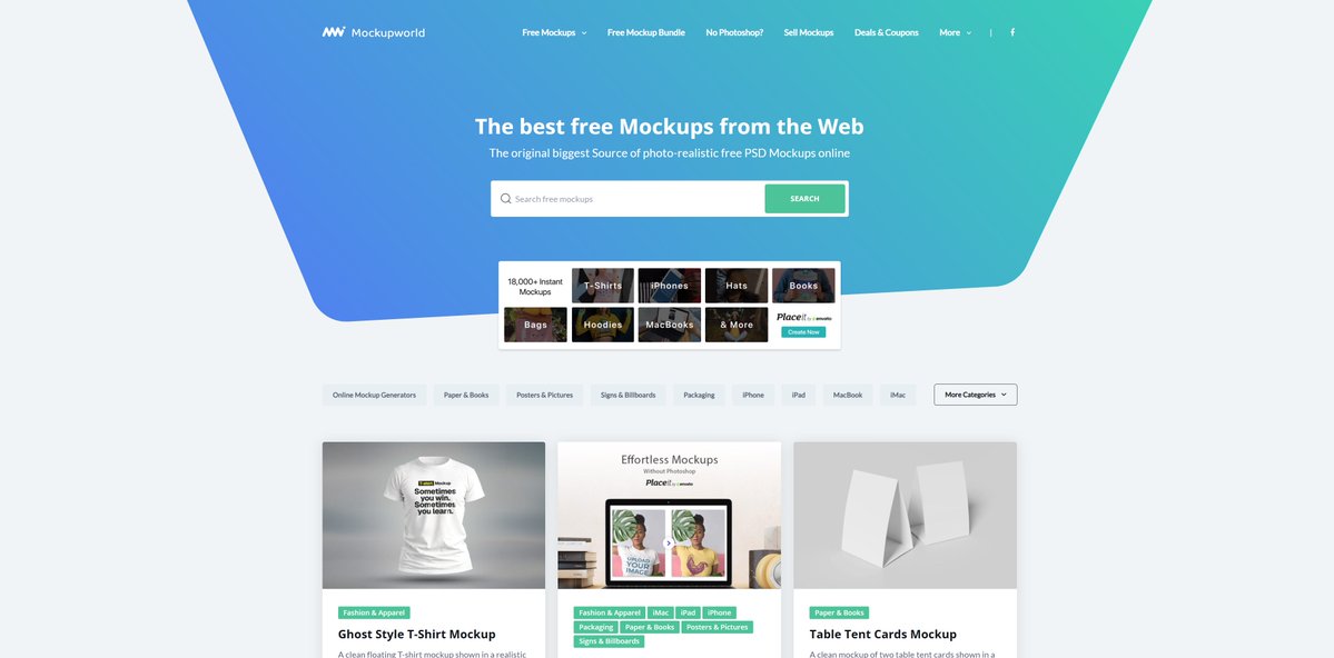
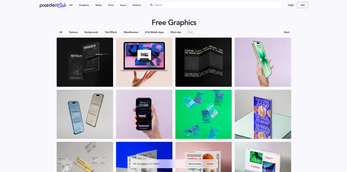
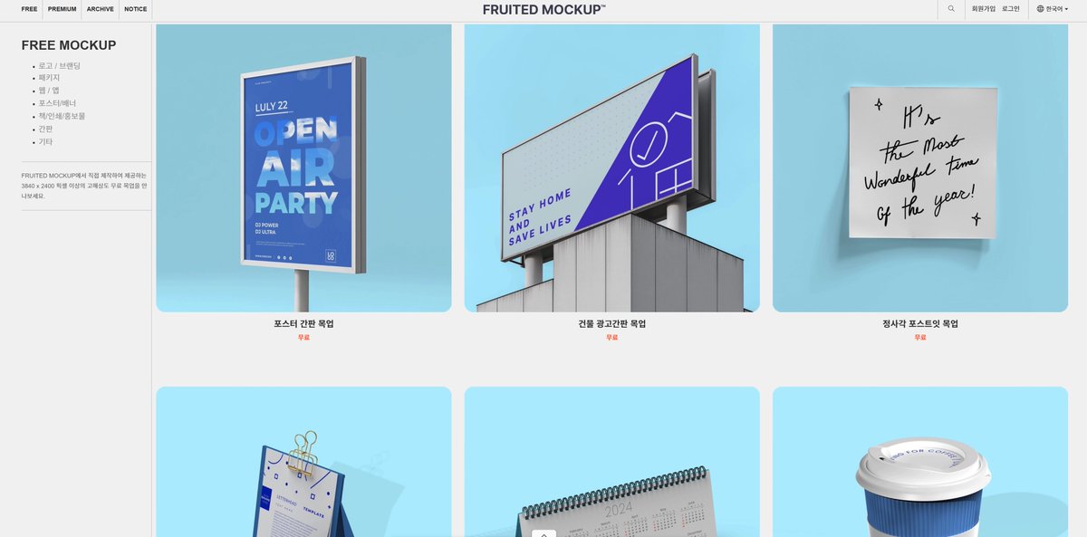
무료 목업사이트 추천드릴게요! 1. Resource boy (책자 위주) resourceboy.com/mockups/book/ 2. Pixeden Club (디바이스 등) pixeden.com/free-graphics 3. Unblast (패키지, 굿즈 등) unblast.com/mockups/ 4. Frutied Design (패키지, 간판 등) fruited-design.kr/free_mockup 5. Mockup World (배너, 명함 등 종류 불문 다양한 목업) mockupworld.co
초록말 tweet media초록말 tweet media초록말 tweet media초록말 tweet media
바라@bara_S2_0

팀디자이너분들..목업 사이트 추천해주세요 ㅠㅠ 갑자기 포트폴리오 만들래서 뇌절온 1인

한국어
3
1.9K
5.2K
464.3K
アイス retweeted
charlota
charlota@0xCharlota·
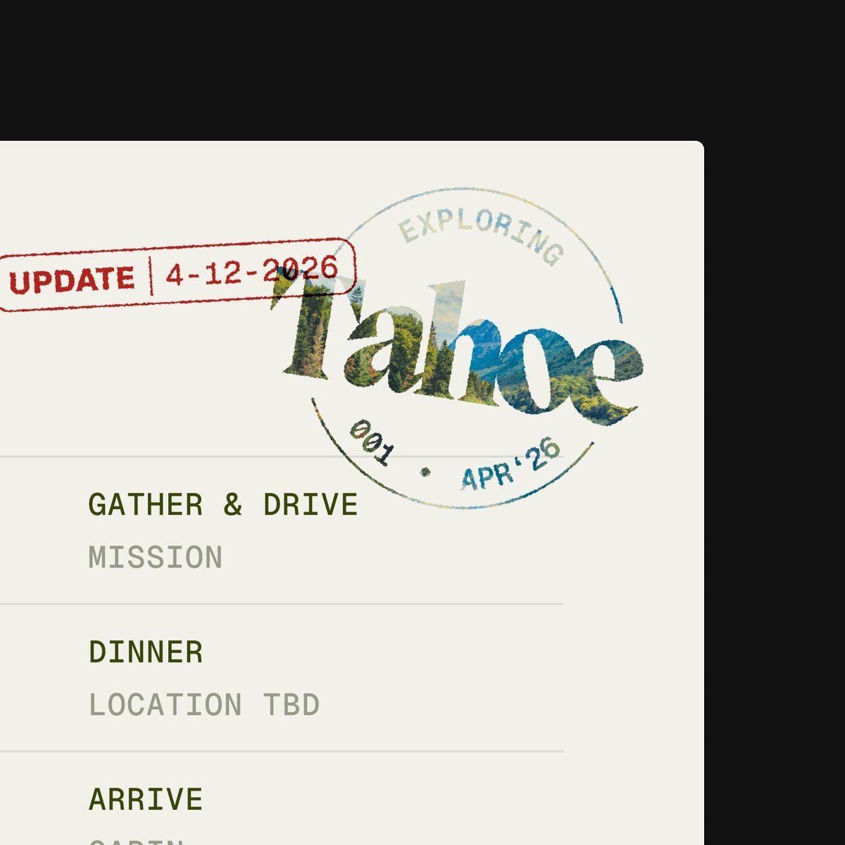
got a very nice testimonial from a client, so I made a fun little @framer component with it for my website:
English
13
2
175
6.9K
アイス retweeted
charlota
charlota@0xCharlota·
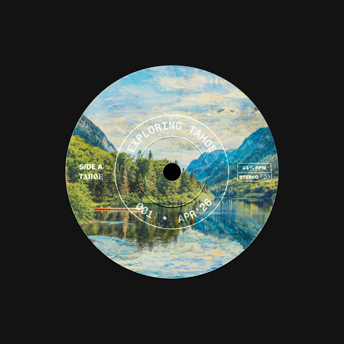
Red is passion. Blue is trust. Green is growth. Cool. Now what? Before you pick a brand colour, ask what it needs to do. 🎨Here are 10 non-obvious questions I'm now asking myself before touching a palette: (in an interactive colour swatch component made with @framer) 1. Does colour need to differentiate categories, or is this a single-product brand? Multiple product lines, tiers, or services turn colour into a wayfinding system. That changes how many hues you need and how they relate to each other. 2. Where does this brand actually live — digital, print, interior, hardware? Colours that sing on screen often die in CMYK, on a wall, or on injection-moulded plastic. Design for where the brand is going, not just where it launches. 3. What does the brand smell like? Sounds absurd, but trust me, try it anyway. Earthy, synthetic, clean, medicinal, smoky…. this can already inspire a colour palette! 4. Will colour carry meaning (data states, navigation, hierarchy) or just mood? A brand colour that also doubles as your error red is a problem waiting to happen. 5. Is the UI data-dense or spacious? how much room does colour actually have to breathe? A marketing site can carry saturated colour. A dashboard can’t… it creates visual fatigue and fights the content. In dense UIs, brand colour needs to work at accent weight, not on every surface. 6. Will there be a lot of photography or illustration? If yes, the main palette can be minimal, even a single colour plus neutrals. The imagery does the expressive heavy lifting. A complex palette on top of rich visuals creates more noise. 7. What colours dominate the competitive landscape? And do we want to fit in or stand out? Every category has default codes. Fintech = blue. Health = green. Legal = navy. Differentiation requires knowing what you're differentiating from. (sometimes fitting in is the right call.) 8.Does the product need dark mode? Some palettes that work beautifully in light fail completely inverted. In crypto, SaaS, and developer tools, dark is often the default. Test both directions before falling in love with a palette. 9. How long does this identity need to hold — two years, five, ten? Trend-forward palettes date faster than they feel. (hello brat green!) 10. Does this colour fit into the visual world your audience already lives in? or put it bluntly, is this a colour someone would pay for on a hoodie, or only accept for free? does this colour feel at home in the environment where the product is actually used? and does it hold up next to the other tools / objects your user has chosen to surround themselves with? Colour psychology is the astrology of brand design. The real question isn't what a colour means in the abstract. it's what it needs to do in this specific brand, in this specific context, at this specific scale. good luck choosing! 🎨
English
3
2
60
12.2K
アイス retweeted
charlota
charlota@0xCharlota·
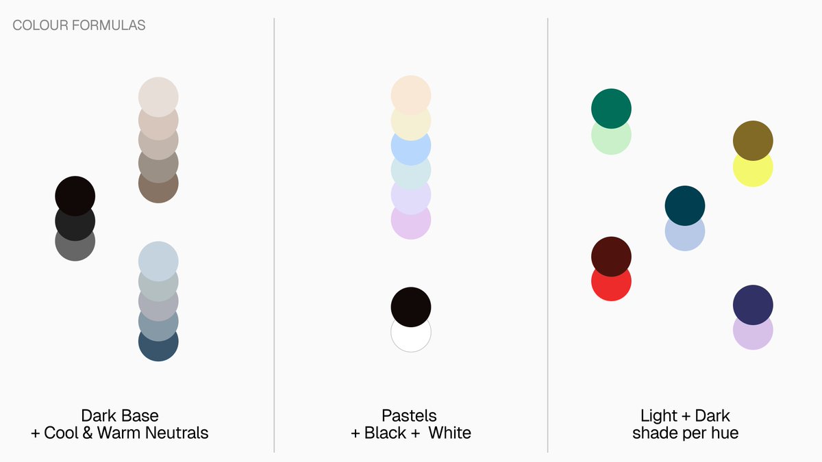
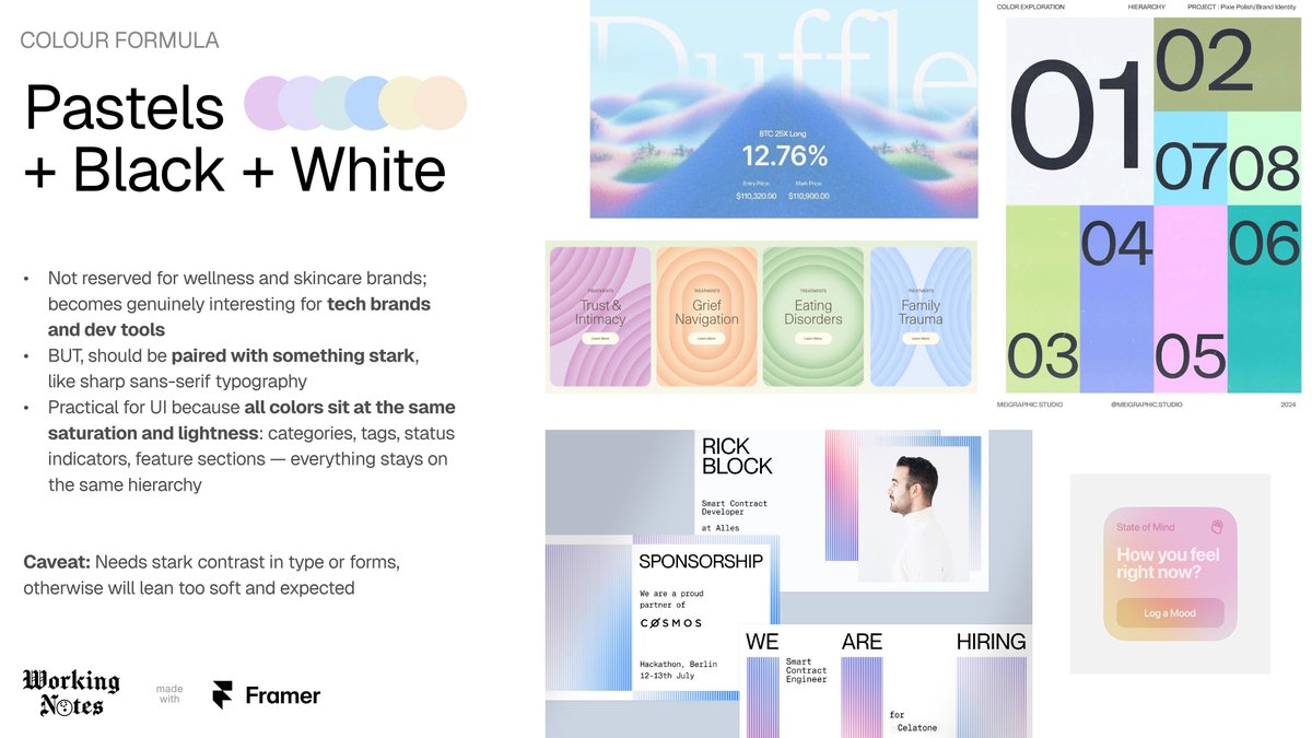
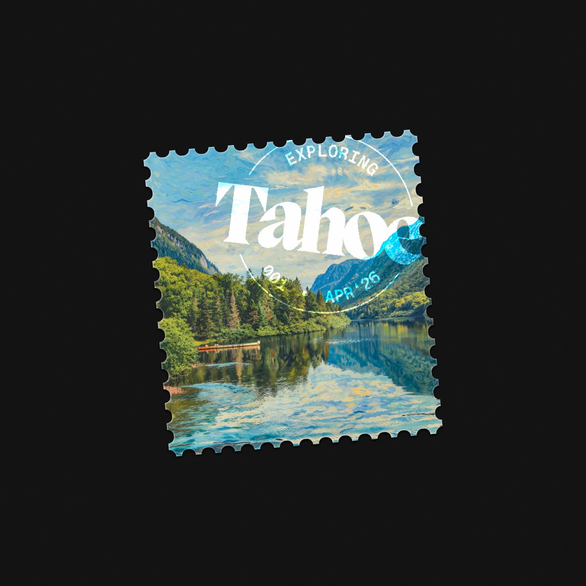
3 more colour formulas I keep reaching for when building brand identities in @framer. Not specific # hex codes, but overall moods. Dark Mode + Cool & Warm Neutrals → dark backdrop absorbs both warm (sand, stone, gold) and cool (slate, sage, silver) without them clashing. The subtle temperature tension is what creates depth — a single-temperature palette can't do that. Great for fintech, consulting, VCs, dev tools. BUT! careful, this palette leans hard on photography and texture to come alive; without it, you're left with a bunch of grey-adjacent rectangles. Pastels + Black + White → not just for wellness and skincare brands! Pastels get genuinely interesting when paired with something stark — sharp sans-serif type, heavy black, clean white space. Because all colours sit at the same saturation and lightness, they land on the same visual hierarchy automatically. That makes them incredibly practical for UI: categories, tags, status indicators, website feature sections. BUT! without that typographic contrast or sharper forms adding interest, it can read very soft and expected fast. Light + Dark Shade Per Hue → pick multiple hues, give each a light and dark version, use both at equal weight. You end up with a large palette that feels bold without chaos. Works for basically any industry. It signals abundance without excess. A startup with two colors looks scrappy. A startup with twelve colors looks chaotic. But six hues × two values = twelve colors that feel organized and intentional. BUT! with this many colours pulling equal weight, you probably still should to pick a primary. Without an anchor, the system feels too democratic to the point of being directionless. Built these with @framer, hope they help next time you're building a colour palette! (Visual references are from other designers' work I admire, not my projects.)
charlota tweet mediacharlota tweet mediacharlota tweet mediacharlota tweet media
English
4
18
387
13.2K
アイス retweeted
Kailash
Kailash@kail_designs·
This is it. The biggest portfolio template on @framer is here. Introducing Glide. 16 pages. Case studies. Interactions. Light + dark theme. Looks like a senior designer’s portfolio. Clean, minimal with attention to detail. Works even if you’re just starting out. And now, it is free. Forever. no “like + repost” nonsense. The link is in the comments. if you like it, support it. Enjoy✌️
English
16
9
168
13.3K