

rob retweeted

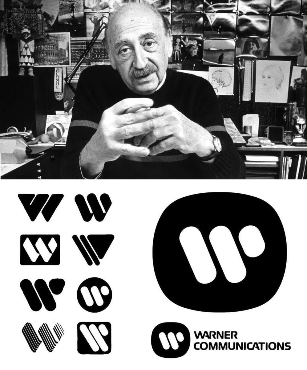
Saul Bass, a legendary graphic designer celebrated for his groundbreaking work in film titles and corporate branding, created the iconic Warner Communications logo in 1972 in collaboration with Herb Yager & Associates.
Officially known as the "Big W," the design featured a bold, stylized, cable-like letter W that symbolized connectivity and unity. This modern mark successfully brought together Warner’s diverse array of film, music, and publishing divisions under one cohesive identity, replacing the traditional Warner Bros. shield that had defined the company for decades.
Paired with a modified version of the Handel Gothic typeface, the logo emphasized Warner’s forward-looking focus on communication and media innovation. The enduring design remained in active use until the company’s major 1990 merger with Time Inc., highlighting Bass’s remarkable talent for crafting simple yet timeless visual identities that resonate across generations
#logodecks
English