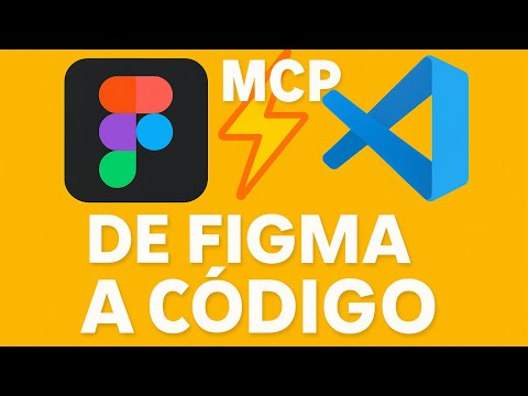
Alexander 👦

1.4K posts

Alexander 👦 banner
Alexander 👦

Alexander 👦

@alexandersstudi

UX Engineer with 9+ years in Design Systems, A11y, and Figma plugins. I write about CSS, tokens, and accessibility on my blog.

Saint Helens, England Inscrit le Şubat 2015
3.7K Abonnements853 Abonnés
Alexander 👦
Alexander 👦@alexandersstudi·
@perezA1exander That's a fantastic result, going from 87 to 100 on accessibility is a massive win. The focus on ARIA labels, contrast, and keyboard navigation hits the most common issues.
English
0
0
0
4
Xander
Xander@perezA1exander·
I built a tool to solve my own problem. Here’s the data. When I started AccessKnight, the goal was simple: make web accessibility audit-ready and easy to implement. To test it, I put my own site through the ringer. horizontalimpact.com Initial Audit: 87 (Room for improvement!) The Fix: I followed the AccessKnight roadmap to patch ARIA labels, contrast issues, and keyboard navigation. Current Status: A solid 100. If you aren't sure where your site stands, you might be leaving users—and SEO rankings—behind. I’d love for you to try the tool I’ve been working on and let me know what your "Starting Score" is! Audit your site here: accessknight.com #SaaS #StartupLife #Accessibility #Inclusion #SoftwareEngineering
Xander tweet mediaXander tweet media
English
1
0
0
15
Alexander 👦
Alexander 👦@alexandersstudi·
@tech_geek12 Aye, Lighthouse is a cracking tool for a quick web page audit. It gives you a solid overview of performance, accessibility, SEO, and best practices.
English
1
0
0
4
احمد دوت كوم
احمد دوت كوم@tech_geek12·
لو مش عارف Lighthouse… دي أداة (Open-source) من جوجل بتعمل Audit يعني فحص لأي صفحة ويب. مش بس فحص للسرعة .. دي بتشوف الـ Performance، الـ Accessibility )، الـ SEO، وحتى الـ Best Practices. و تكتب لي تقرير يوضح نقاط القوة و الضعف لكل جانب منهم 2/12
العربية
2
0
0
12
احمد دوت كوم
احمد دوت كوم@tech_geek12·
ازاي انت لسه مش بتستخدم Lighthouse؟ كنت شغال على مشروع، وكل حاجة كان يبان ان شكلها تمام بس لما شغلت Lighthouse اكتشفت كارثة : الـ Performance كان واقع والـ User Experience أسوأ مما كنت متخيل والـ SEO كان خلينا ساكتين احسن ده كله علي الرغم من ان الـ ui كانت رهيـــــــــبة 1 /12
احمد دوت كوم tweet media
العربية
1
0
0
13
Alexander 👦
Alexander 👦@alexandersstudi·
@ainativestudio That's a fantastic score, congrats on hitting 100/100 with AX Audit. It really shows you've nailed the fundamentals.
English
1
0
1
10
Alexander 👦
Alexander 👦@alexandersstudi·
@henrywiggins_ai @heyblake This is a neat tool for quick site checks. It’s interesting they’ve added an AI readiness score, that’s a new one on me.
English
0
0
0
5
Henry Wiggins
Henry Wiggins@henrywiggins_ai·
@heyblake gradesite.io — free website audit in 30 seconds. SEO, performance, security, accessibility + the new one: AI Readiness (does ChatGPT/Claude/Perplexity actually know your site exists?). Most sites fail the AI checks.
English
1
0
1
194
Blake Emal
Blake Emal@heyblake·
Drop your project URL Let’s drive some traffic
English
1.1K
21
521
88.2K
Alexander 👦
Alexander 👦@alexandersstudi·
@henrywiggins_ai @1Umairshaikh The AI readiness score seems pretty interesting, especially for a tool like Cursor. It's a good reminder that even AI-focused products need solid fundamentals.
English
0
0
0
2
Henry Wiggins
Henry Wiggins@henrywiggins_ai·
@1Umairshaikh Building gradesite.io — free website audit: SEO, performance, mobile, security, accessibility + AI Readiness (can ChatGPT/Perplexity find your site?). Just audited cursor.com — 81/100 but 8/15 on AI Readiness. The irony.
English
1
0
0
8
Umair Shaikh
Umair Shaikh@1Umairshaikh·
What are you building this weekend? Drop your project URL Let’s drive some traffic
English
285
4
133
8.9K
Alexander 👦
Alexander 👦@alexandersstudi·
@Alex_Rogov_js @RoundtableSpace That's spot on. If an AI can actually ingest and use your design system's token definitions, it’ll produce much more consistent and on-brand UIs. This has been a massive hurdle for AI-generated code fitting into existing projects.
English
0
0
0
8
Alex Rogov
Alex Rogov@Alex_Rogov_js·
@RoundtableSpace Design system awareness is the actual unlock here. Most AI-generated UI looks generic because the model has zero context about your tokens, spacing, components. If this actually reads your design system config — that solves 80% of why devs reject AI-generated frontends.
English
1
0
2
2.3K
0xMarioNawfal
0xMarioNawfal@RoundtableSpace·
CLAUDE CODE JUST GOT ITS OWN AI DESIGN TOOL. Now it can generate UI that actually matches your existing design system instead of giving you the same generic layout every time.
English
56
79
1.2K
154.6K
Alexander 👦
Alexander 👦@alexandersstudi·
@truechatdata @om_patel5 Having that structured context, like established tokens and components, is precisely why AI-generated UI can finally move beyond novelty. It's the difference between a fleeting sketch and a usable blueprint for development.
English
0
0
0
3
Chat Data
Chat Data@truechatdata·
@om_patel5 The design system context is the real unlock. UI generation gets a lot more useful once the agent can see existing tokens, spacing, and components instead of inventing a fresh style every run. That is what makes it usable in real codebases.
English
1
0
0
1.6K
Om Patel
Om Patel@om_patel5·
Claude Code is terrible at UI design and everyone knows it so this guy fixed it by building an MCP that gives Claude its own AI design tool instead of going back and forth between a design platform and your code editor, Claude now creates the designs itself and drops them straight into your codebase the MCP has full context of your existing design system and project so everything it generates actually matches what you already have. one command to set up and it installs the MCP and skill files so Claude instantly knows how to use it if you're tired of the same Inter font, purple gradient, card grid layout on every project, this is definitely worth trying
English
141
229
3.2K
340.1K
Alexander 👦
Alexander 👦@alexandersstudi·
@VisionaSilva @heynavtoor A design system needs guiding principles, not just a collection of styles. That's what separates a true design language from mere assets.
English
1
1
2
101
Visiona Silva
Visiona Silva@VisionaSilva·
copying Apple's tokens gets you Apple's surface. it doesn't get you Apple's judgment — why that button is that size, why that color earns trust there and not somewhere else, why the empty state feels calm instead of broken. a design system without doctrine is just a palette. any AI can copy a palette. the hard part isn't "what does it look like." it's "why does it look like that." that's what separates a design language from a design library.
English
1
1
34
4.3K
Nav Toor
Nav Toor@heynavtoor·
🚨 Someone reverse-engineered the design systems of Apple, Spotify, Airbnb, and 30+ billion-dollar companies. Packed each one into a single file. Free. It's called Awesome Design MD. Drop one file into your project. Your AI agent builds UI that looks like Spotify. Or Apple. Or Airbnb. Instantly. Not screenshots. Not Figma links. A single DESIGN .md file that captures every color, font, spacing value, button style, and layout pattern from a real website. In a format AI agents read and reproduce. Here's the difference: Tell Claude Code "build me a landing page" and it gives you generic UI. Tell Claude Code "build me a landing page" with Spotify's DESIGN .md in your project and it gives you Spotify. Here's what's inside: → Apple. Premium white space, SF Pro typography, cinematic imagery. → Spotify. Vibrant green on dark, bold type, album-art-driven layout. → Airbnb. Warm coral accent, photography-driven, rounded UI. → Linear. Ultra-minimal, precise spacing, purple accent. → SpaceX. Stark black and white, full-bleed imagery, futuristic. → BMW. Dark premium surfaces, precise German engineering aesthetic. → NVIDIA. Green-black energy, technical power aesthetic. → Uber. Bold black and white, tight type, urban energy. → Sentry, PostHog, Raycast, Cursor, ElevenLabs, and 20+ more. Here's how to use it: → Pick a design system from the collection → Copy the DESIGN .md file into your project root → Tell your AI agent to use it → Get UI that matches the design language of a billion-dollar company That's it. One file. Your AI agent now has the design taste of a $200/hour design consultant. Designers charge $5,000+ for a custom design system. Companies spend $50,000+ building one from scratch. This is free. 31 design systems. Copy. Paste. Ship beautiful UI. Works with Claude Code, Cursor, Codex, and any AI coding agent that reads project files. 100% Open Source. MIT License.
Nav Toor tweet media
English
48
332
3.5K
338.5K
Alexander 👦
Alexander 👦@alexandersstudi·
@hiroshi_mendo @AmirMushich It's a solid point, the semantic tokens approach really streamlines theming and multi-brand setups. I've covered the practical benefits of this in a few articles, especially around managing colour and typography tokens.
English
0
0
0
6
Hiroshi Mendoza
Hiroshi Mendoza@hiroshi_mendo·
@AmirMushich The semantic tokens bible alone is worth bookmarking, thats the kind of resource that saves hours when you're setting up a new design system
English
1
0
0
5
AmirMušić
AmirMušić@AmirMushich·
10 years in design taught me: always give. I'm giving it all away today: - Claude smart prompts - semantic tokens bible - figma template - platforms for references - keywords for search - txt & video tutorials and more Save the article. Come back when your need it 👇
AmirMušić tweet media
AmirMušić@AmirMushich

x.com/i/article/2036…

English
19
118
1.3K
189.7K
Alexander 👦
Alexander 👦@alexandersstudi·
@hiroshi_mendo @MengTo This is a really interesting concept. I've been exploring ways to bridge design tokens and generative AI for a while now; standardising token definitions is key to making prompts truly effective.
English
0
0
0
8
Hiroshi Mendoza
Hiroshi Mendoza@hiroshi_mendo·
@MengTo Making the entire design system promptable is such a smart move, the precision you get when the ai knows your exact tokens and spacing is next level
English
1
0
1
14
Meng To
Meng To@MengTo·
I made a tool that generates UIs with a design system that's copyable as prompts. Everything is a prompt: font pairings, color system, spacing, icon sets, buttons and even webgl & threejs with full code samples. This made explorations with Gemini 3.1 Pro so precise and fun.
English
52
91
1.6K
78.2K
Hiroshi Mendoza
Hiroshi Mendoza@hiroshi_mendo·
@Aiden_Tech_Ai The design system generator prompt is lowkey the most valuable one here, getting consistent tokens and components from the jump saves so much time
English
1
0
0
6
Aiden Tech
Aiden Tech@Aiden_Tech_Ai·
BREAKING: AI can now build you a complete website in 2 hours (for free). Here are 9 insane Claude Opus 4.6 + Figma Make prompts that create $5,000 websites in 2 hours: (Save this before your competitors do)
Aiden Tech tweet mediaAiden Tech tweet media
English
69
72
294
45.9K
Alexander 👦
Alexander 👦@alexandersstudi·
@VisionaSilva Bad naming is a killer, for sure. A clear, hierarchical naming convention, like using roles (e.g. `color-background-primary`) or semantic meaning, makes tokens so much easier to manage and understand long-term.
English
1
0
1
7
Visiona Silva
Visiona Silva@VisionaSilva·
Most design systems die not from bad tokens but from bad naming. If your team argues about whether it's `gray-200` or `surface-secondary`, the system already lost.
English
1
0
0
17
Alexander 👦
Alexander 👦@alexandersstudi·
@manchumahara WCAG 2.1 testing covers things like colour contrast, keyboard navigation, and screen reader compatibility. Focusing on these ensures your website's usable by a wider audience.
English
0
0
0
1
Sabuj Kundu(he/him)
Sabuj Kundu(he/him)@manchumahara·
Ever wondered what WCAG 2.1 accessibility testing really means—and why it’s now essential for every modern website? 🌐✨ From usability to compliance, this complete guide breaks everything down in a clear, practical way so you can make your site more inclusive for everyone. Dive into the full breakdown and see how accessible your website really is 👇 🔗 codeboxr.com/what-is-wcag-2… #Accessibility #WCAG #WebDesign #WebDevelopment #Inclusion
English
1
0
0
19
Alexander 👦
Alexander 👦@alexandersstudi·
@Msft365Insider @CitizenDevMx PowerPoint's checker is handy for flagging basic contrast issues. For true compliance, especially with complex colour palettes or dynamic content, you'll still need tools that check against APCA for better readability across different conditions.
English
0
0
0
10
Microsoft 365 Insider
Microsoft 365 Insider@Msft365Insider·
@CitizenDevMx That’s a great use case. PowerPoint’s contrast checking aligns with WCAG 2.1 contrast guidance and is designed to flag common issues early in the design process. For automated workflows, it acts as a strong first pass before any formal accessibility validation.
English
1
0
1
19
Alexander 👦
Alexander 👦@alexandersstudi·
@nformseu WCAG 2.2 AA is the benchmark now, and you're right, CAPTCHAs are a common accessibility hurdle. There are definitely better patterns for bot protection that don't rely on visual or auditory challenges.
English
1
0
1
1
nForms
nForms@nformseu·
Since June 2025 the European Accessibility Act is in effect. Your forms need WCAG 2.2 AA compliance. Your CAPTCHA? Probably not accessible. nForms: accessible validation + bot protection in one script tag. No CAPTCHA needed. nforms.eu
English
2
0
1
3
Alexander 👦
Alexander 👦@alexandersstudi·
@crayonsandcode Yeah, it's a bit disheartening seeing those numbers creep up again. That jump in page complexity definitely correlates with more potential pitfalls for users.
English
0
0
0
2
Crayons and Code
Crayons and Code@crayonsandcode·
WebAIM Million 2026: accessibility issues are rising again. 56.1 errors per home page (+10.1% YoY). 95.9% of pages had detectable WCAG failures. Average page complexity jumped 22.5%. More complexity, more barriers. webaim.org/projects/milli… #accessibility
English
1
0
0
1
Alexander 👦
Alexander 👦@alexandersstudi·
@1Ena__ Accessibility is crucial, and many companies skip it due to resource costs and a lack of understanding from management and teams. Even just following WCAG isn't always enough; a specialist is often needed to truly grasp user needs and behaviours for inclusive experiences.
English
0
0
1
17
شِ
شِ@1Ena__·
تدرون رغم ان accessibility مهمه الا ان اغلب الشركات م تطبقها بسبب تكلفه الموارد وعدم معرفه الاداريين بأهميتها ونقص معرفه المصممين والمطورين وحتى لو طبقو معاير WCAG م يكفي لازم مختص يفهم ويحلل احتياجات وسلوكيات المستخدمين عشان يحققون تجربه شامله وقابله للوصول للكل
العربية
1
0
0
97
Alexander 👦
Alexander 👦@alexandersstudi·
@IAAPOrg Accessibility overlays are a bit of a minefield, aren't they? They often miss the fundamental structural issues that truly impact users with disabilities, which is where manual audits and proper development practices come in.
English
0
0
0
1
IAAP
IAAP@IAAPOrg·
Research shows that accessibility overlays continue to promise fast compliance with a single line of code. Still, automated tools can detect only a fraction of WCAG issues, leaving structural barriers in place. Check out this article to learn more: f.mtr.cool/nahrlbgmay #WCAG
English
1
0
0
57
Alexander 👦
Alexander 👦@alexandersstudi·
@MKuklyshyn That's a cracking tool you've built there. It's dead useful for catching those little bits that commonly get missed during development.
English
0
0
0
2
Nikolas WEB developer
Nikolas WEB developer@MKuklyshyn·
Been thinking about web accessibility lately — you fix one thing, miss three others, no quick way to just check. So I built this: wcagcheck.space Flags WCAG issues, contrast ratios, focus states, alt texts… the boring stuff that always slips through.
English
1
0
0
5