@WGreen14 @ZachKleinWSB Exactly this.
The problem starts with the logo. Which they then double down on build upon in worse new ways.
English
Coach Chefanski
4.8K posts
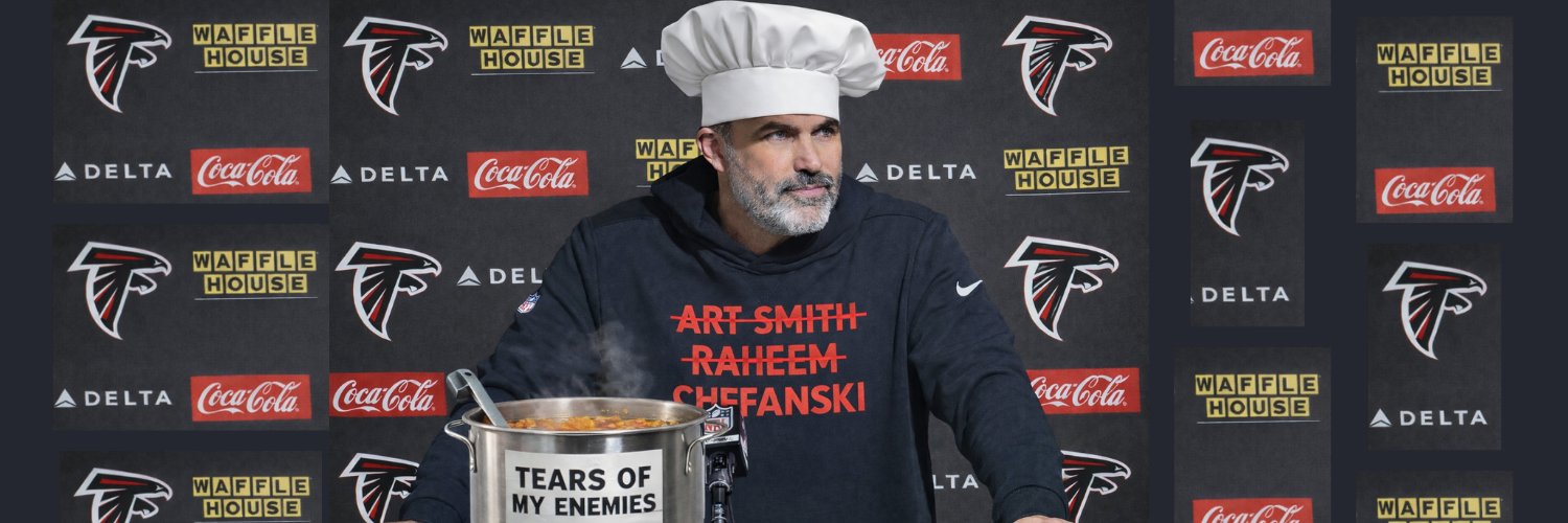
@Chefanski
Cookin up Ws. #TrueToAtlanta #DirtyBirds


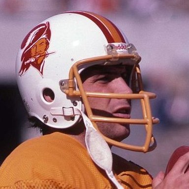
The Arizona Falcons 😭😭 They are nearly identical.


Such a good point, and it goes back to the bigger point I always make: Give it time! I think it’s unfair to judge a uniform completely until you’ve seen them on the field multiple times There are countless examples this decade where initial reaction to new uniforms went from “I don’t like them!” to “They’ve grown on me…” Change is uncomfortable, and setting your own expectations clouds your judgment of reality Those are just common mindsets people experience in anything, let alone sports uniforms


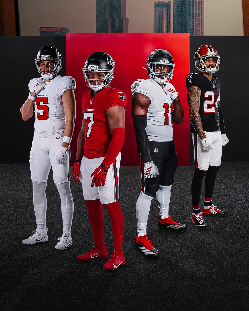
Authentic, Fast, Timeless

A destination two years in the making Go "Behind the Design"


A destination two years in the making Go "Behind the Design"


🏈 NEW UNIFORMS ARE HERE: The Atlanta Falcons have officially unveiled their 2026 uniforms. A new red home + white road jersey, notched numbers, updated helmets, and "Dirty Birds" inside the collar. Throwbacks survive. More pics + details: news.sportslogos.net/2026/04/02/atl…

A destination two years in the making Go "Behind the Design"


The improvement cannot be overstated.
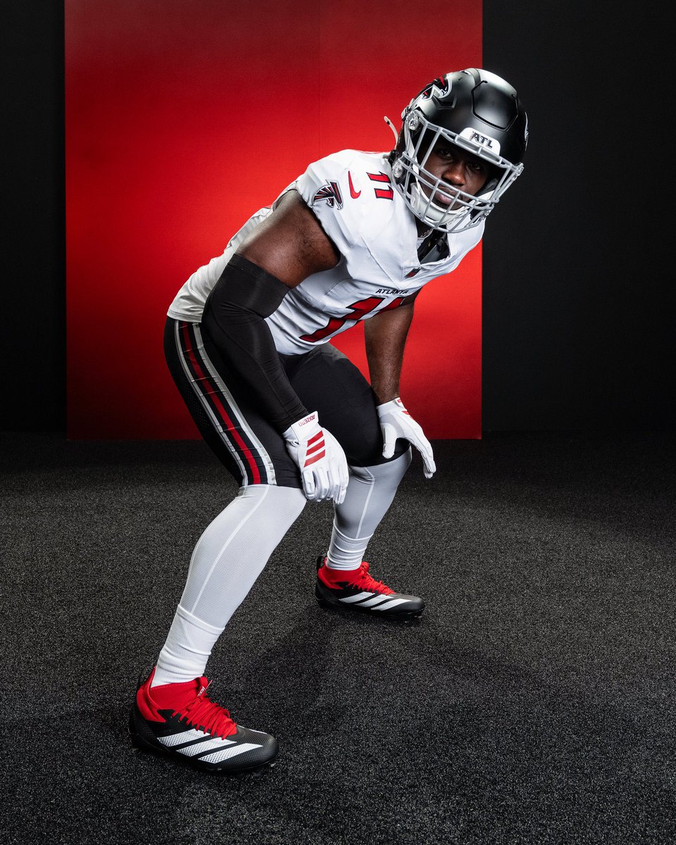
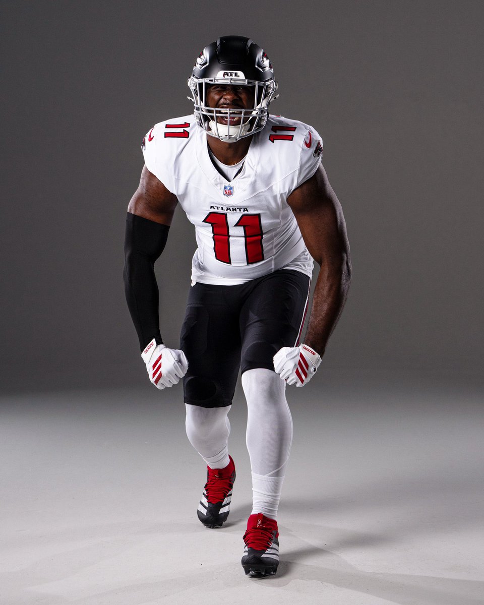

Overall a positive upgrade for a team that has primary uniform issues for decades. They like a lot of other teams, despite the calls of staleness by some younger fans, have gone back to a more classic football template. Which in my mind is timeless. My only quibble, would be the lack of helmet stripe and at least the possibility of a red helmet with the modern logo.