Coach Chefanski

4.8K posts

Coach Chefanski banner
Coach Chefanski

Coach Chefanski

@Chefanski

Cookin up Ws. #TrueToAtlanta #DirtyBirds

Atlanta, GA Katılım Ocak 2022
133 Takip Edilen88 Takipçiler
Coach Chefanski
Coach Chefanski@Chefanski·
@bigjoe93 The current logo is gonna look bad on any color helmet. Like always.
English
0
0
0
12
I-85 Joe
I-85 Joe@bigjoe93·
This article implies that the Falcons are likely to add grey pants into the mix at some point and that NFL rules will allow them to wear the red helmets with red jerseys providing the current logo is used on the helmet
Chris Creamer | SportsLogos.net@sportslogosnet

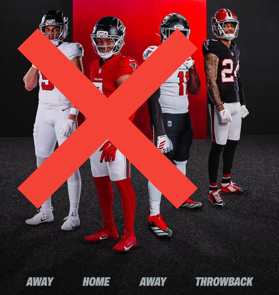
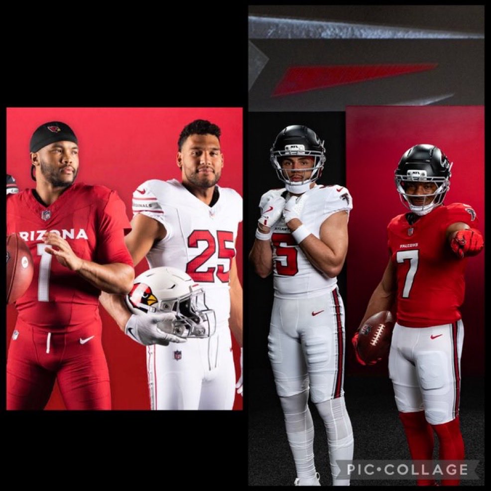
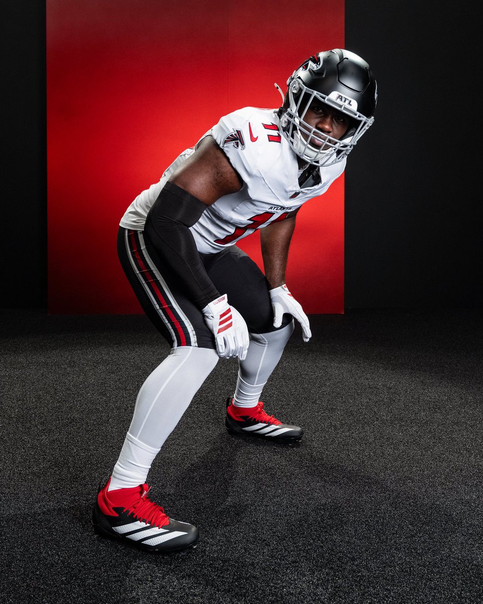
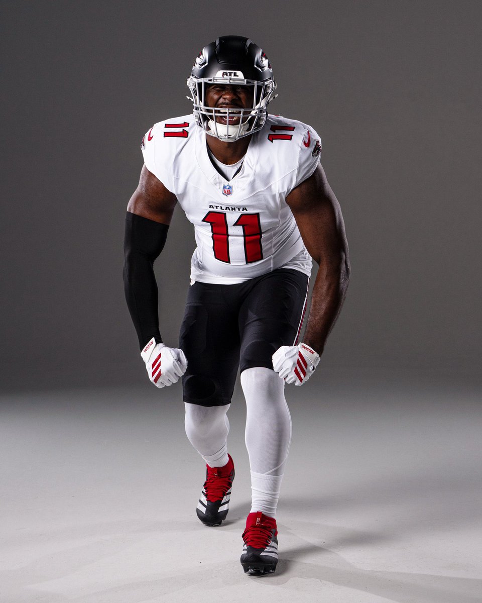
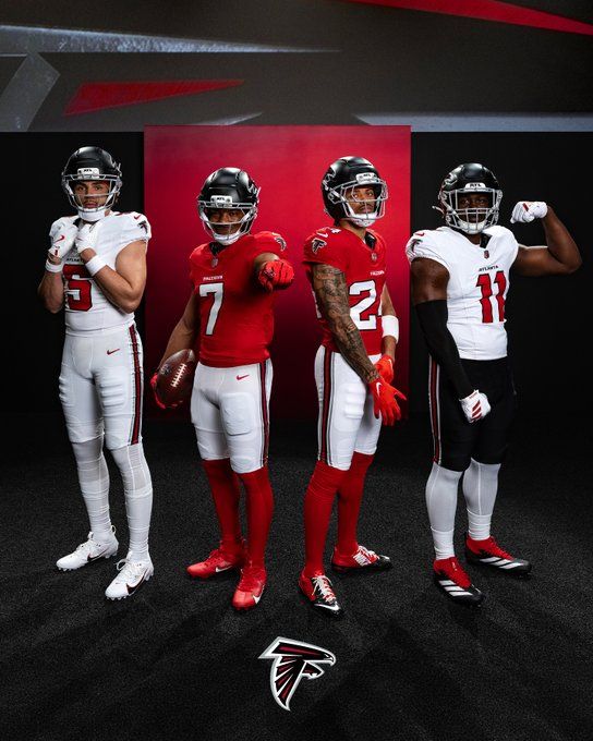
🏈 NEW UNIFORMS ARE HERE: The Atlanta Falcons have officially unveiled their 2026 uniforms. A new red home + white road jersey, notched numbers, updated helmets, and "Dirty Birds" inside the collar. Throwbacks survive. More pics + details: news.sportslogos.net/2026/04/02/atl…

English
3
10
51
5.2K
Coach Chefanski
Coach Chefanski@Chefanski·
@MilesGarrettTV We don’t want this to be the throwback. We want the brand back. The brand we had before Blank decided he needed to put his stamp on it in 2003.
English
0
0
0
8
Miles Garrett
Miles Garrett@MilesGarrettTV·
There they are. The #Falcons throwbacks still in the lineup.
English
6
20
289
18.6K
Coach Chefanski
Coach Chefanski@Chefanski·
@iBeButlerr They look like we decided to just end it all and walk into the ocean. But then chickened out and turned around half way.
English
0
0
0
57
Coach Chefanski
Coach Chefanski@Chefanski·
@fashion_nfl These are (sadly) the best of the new looks released today. Probably because they aren’t all red.
English
0
0
0
11
NFL Fashion Advice
NFL Fashion Advice@fashion_nfl·
⬛️⬜️⬛️ has typically been an underwhelming Falcons look for me - especially in the prior set. But the new version is speaking to me. Red numbers really pop here. And the silver accents in the pant stripe tie right into the mask - and actually justifies its existence.
NFL Fashion Advice tweet mediaNFL Fashion Advice tweet media
English
22
3
187
14.2K
Coach Chefanski
Coach Chefanski@Chefanski·
@8chainz07 @TheFalcoholic They should've done what the Hawks did and found a tasteful middle ground in terms of logo vs. doubling down on the current and baking it into all the uniform choices.
English
0
0
0
7
Coach Chefanski
Coach Chefanski@Chefanski·
@TheFalcoholic Nothing has grown on me in 23 years since Blank decided he needed to make his mark and change the brand. Still waiting.
English
0
0
0
6
The Falcoholic
The Falcoholic@TheFalcoholic·
You all know I was hoping for the full-time return to throwbacks, but I wasn't expecting it. These are solid and will probably grow on us in a way the 2020 uniforms emphatically did not
English
10
0
40
3.5K
Coach Chefanski
Coach Chefanski@Chefanski·
@MATTY2GOAT @p0pp_ @jalenreagors The "Atlanta Falcons" font is the same it has been since 2003 And it's always been a generic-bird font that looks similar to all the other bird teams since then. Personally, I think everything done to the brand in 2003 was a mistake. But Blank wanted to put his stamp on things.
English
1
0
0
55
ATL Will
ATL Will@ATLWill_·
Man Bijan looks like he was made in a lab specifically for these new uniforms 🔥
English
3
1
102
2.8K
Coach Chefanski
Coach Chefanski@Chefanski·
@SznPltts Don't want "more throwbacks." We want the brand back. Arthur Blank just refuses to admit he made a mistake when he put his stamp on things in 2003.
English
0
0
0
75
Kai
Kai@SznPltts·
No black uniforms probably mean we’re getting more games with the throwbacks so that’s a win
GIF
English
7
0
130
3.6K
𝙃𝙚𝙡𝙢𝙚𝙩 𝘼𝙙𝙙𝙞𝙘𝙩
Overall a positive upgrade for a team that has primary uniform issues for decades. They like a lot of other teams, despite the calls of staleness by some younger fans, have gone back to a more classic football template. Which in my mind is timeless. My only quibble, would be the lack of helmet stripe and at least the possibility of a red helmet with the modern logo.
𝙃𝙚𝙡𝙢𝙚𝙩 𝘼𝙙𝙙𝙞𝙘𝙩 tweet media
English
28
2
72
12.7K
Coach Chefanski
Coach Chefanski@Chefanski·
@squidbilly929 The same “people who have formed billion dollar businesses” gave you this. And yes, it’s alternated between red and black over long periods of their history, but thankfully they keep having the good sense to change it back to original.
Coach Chefanski tweet media
English
0
0
0
373
Beau “Squidbilly” Morgan
They’ve been one for most of their existence… With all due respect I’ll take business advice from someone who has formed billion dollar businesses over Twitter-experts
Coach Chefanski@Chefanski

@squidbilly929 No, smart business was never changing it in 2003. There are only a ton of red primary teams in the NFL. The Falcons don’t need to be another one.

English
1
0
0
294
Coach Chefanski
Coach Chefanski@Chefanski·
@squidbilly929 No, smart business was never changing it in 2003. There are only a ton of red primary teams in the NFL. The Falcons don’t need to be another one.
English
0
0
0
319
Beau “Squidbilly” Morgan
explain to me how this is so different from the black throwback jersey (only) they’ll wear 3-4 times this year. How is red bad? It’s a primary color of the team That logo isn’t changing, smart business is having that logo stay same and still selling the other one like they do
Coach Chefanski@Chefanski

@squidbilly929 It’s not. And red is worse. Same busy post-2003 logo. Same damn post-2003 lockup/font. Simple doesn’t equal classic.

English
1
0
2
629
Atlanta Falcons
Atlanta Falcons@AtlantaFalcons·
Thank you for sharing the vision, André 3000
Atlanta Falcons tweet media
English
32
338
3.1K
61.3K
Coach Chefanski
Coach Chefanski@Chefanski·
@p0pp_ @jalenreagors And the font. The whole jersey is colors and font. There are no other details. Thus, they look pretty damn similar.
English
1
0
0
82
Coach Chefanski
Coach Chefanski@Chefanski·
@squidbilly929 It’s not. And red is worse. Same busy post-2003 logo. Same damn post-2003 lockup/font. Simple doesn’t equal classic.
English
0
0
1
734