Aktivated.Designs

758 posts

Aktivated.Designs banner
Aktivated.Designs

Aktivated.Designs

@100Aktivated

I Help Startups & Businesses Design Simple, Smart, and Beautiful User Experiences | UI/UX Designer Focused on Clarity, Conversion & Real-World Results

Lagos, Nigeria Katılım Temmuz 2022
858 Takip Edilen415 Takipçiler
Sabitlenmiş Tweet
Aktivated.Designs
Aktivated.Designs@100Aktivated·
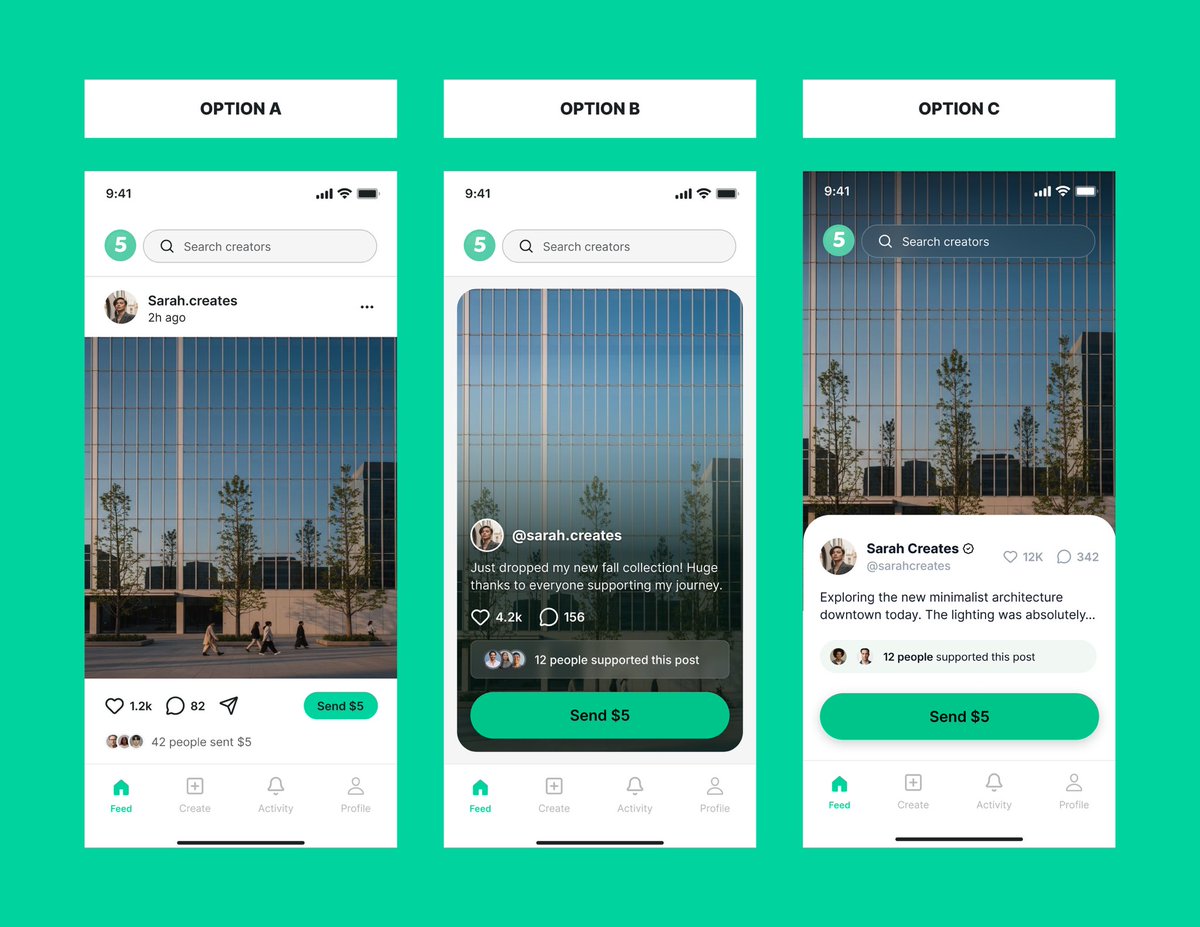
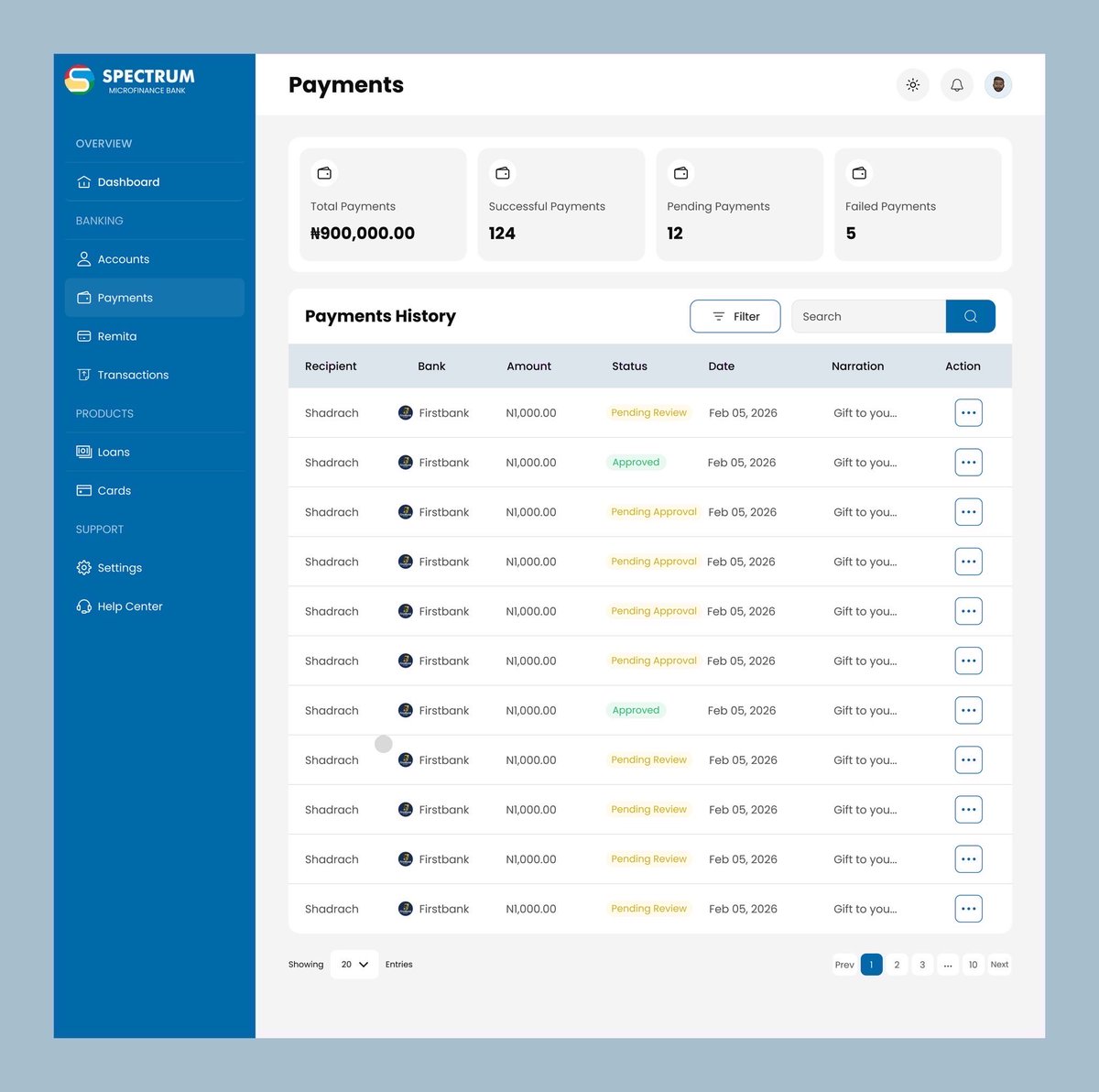
Which hero section resonates with you more as a user: First or Second? We’d love your feedback! #AorBtesting #UX #UI
Aktivated.Designs tweet mediaAktivated.Designs tweet media
English
54
6
185
9.3K
Aktivated.Designs
Aktivated.Designs@100Aktivated·
Recently, I haven’t written a single line of prompt myself in my Vibe designing processes. I just speak to Whisper Flow, and it translates everything directly into whatever AI tool I’m using, also connected to Claude. This has been insanely helpful. The future is already here 👏 #UIUX #UX #UI
English
0
0
0
22
Aktivated.Designs
Aktivated.Designs@100Aktivated·
𝗜 𝗛𝗮𝘃𝗲 𝗕𝗲𝗲𝗻 𝗗𝗲𝘀𝗶𝗴𝗻𝗶𝗻𝗴 𝗳𝗼𝗿 𝗮 𝗪𝗵𝗶𝗹𝗲, 𝗡𝗼𝘄 𝗜’𝗺 𝗟𝗲𝗮𝗿𝗻𝗶𝗻𝗴 𝗛𝗼𝘄 𝗧𝗼 𝗕𝘂𝗶𝗹𝗱 💻✅ Over the past few days, I’ve been working through the early stages of my vibe coding journey and it’s been a shift in how I think as a designer. The problem I’m tackling is simple but very real: There are too many AI tools, and most people don’t know where to start. So I decided to build something around it. Here’s what I’ve done so far: ✅ Identified the core problem and mapped out the solution ✅ Used AI tools to generate a working prototype ✅ Structured the full system with user flows and a detailed PRD This is MAP 1 → MAP 3 done. Now comes the real part: MAP 4 → Building the MVP using AI coding agents. This is where I move from designing ideas to actually bringing them to life. I’ll be building this in public, sharing what works, what breaks, and what I learn along the way. If you’re also exploring AI, design, or building products: What’s the biggest challenge you’re currently facing? #AIDesign #UXDesign #ProductDesign #VibeCoding #BuildInPublic #AI #NoCode #TechJourney #AIProducts #DesignJourney
Aktivated.Designs tweet media
English
0
0
1
20
Aktivated.Designs
Aktivated.Designs@100Aktivated·
𝗙𝗿𝗼𝗺 𝘃𝗶𝗯𝗲 𝗱𝗲𝘀𝗶𝗴𝗻𝗶𝗻𝗴 𝘁𝗼 𝘃𝗶𝗯𝗲 𝗰𝗼𝗱𝗶𝗻𝗴. 𝗛𝗲𝗿𝗲’𝘀 𝘁𝗵𝗲 𝗿𝗼𝗮𝗱𝗺𝗮𝗽 𝗜’𝗺 𝘂𝘀𝗶𝗻𝗴. 👇 Over the past few months, I’ve been deeply immersed in vibe designing, exploring tools like Banani, Figma Make, Visily, and more. Now, I’m pushing beyond my comfort zone into vibe coding. To make this transition structured and intentional, I used Claude to craft a roadmap that guides the journey and honestly, I believe this can help anyone looking to become an AI-native designer. Here’s the roadmap I’m currently following: 🔹 MAP 1: Identify the right problem 🔹 MAP 2: Define the solution (PRD with AI) 🔹 MAP 3: Design the system (flows + prototypes) 🔹 MAP 4: Build the MVP (with AI coding agents) 🔹 MAP 5: Refine the experience (UI/UX polish) 🔹 MAP 6: Launch → Get feedback → Improve I’ve already made progress across the early stages, and over the coming weeks, I’ll be sharing my journey as I work towards MAP 6. If you’re exploring this path too, what stage are you at? #AIDesign #UXDesign #ProductDesign #VibeCoding #AIDevelopment #DesignJourney #BuildInPublic #NoCode #AIProduct #TechJourney
Aktivated.Designs tweet media
English
0
0
2
46
Aktivated.Designs
Aktivated.Designs@100Aktivated·
𝗘𝗺𝗽𝗮𝘁𝗵𝘆 𝗿𝗲𝗺𝗮𝗶𝗻𝘀 𝗼𝗻𝗲 𝗼𝗳 𝘁𝗵𝗲 𝗺𝗼𝘀𝘁 𝘂𝗻𝗱𝗲𝗿𝗿𝗮𝘁𝗲𝗱 𝗱𝗿𝗶𝘃𝗲𝗿𝘀 𝗼𝗳 𝗾𝘂𝗮𝗹𝗶𝘁𝘆 𝗨𝗫 ✅ If you don’t truly understand your users, their context, frustrations, and expectations there’s a high chance you’re not really designing for them… you’re designing for yourself. This became even clearer to me on a recent project where my role focused entirely on user research and testing. No screens, no pixels just observing, listening, and learning how real users interact with the product. And as always, the insights were humbling: What seems “obvious” to you as a designer can be confusing to a user. What feels “simple” in theory can break down in real usage. That’s the gap empathy helps you close. It shifts your mindset from: “I think this works” to “I’ve seen how this works for actual users.” Grateful for the 5⭐️ feedback from the client, but more importantly, for the reminder that great UX starts with understanding, not assumptions. When last did you truly test your product with real users not just assumptions? #UXDesign #UserResearch #UserTesting #DesignThinking #ProductDesign #UXCommunity #Empathy #BuildInPublic #DesignProcess
Aktivated.Designs tweet media
English
0
0
0
20
Aktivated.Designs
Aktivated.Designs@100Aktivated·
𝗬𝗼𝘂𝗿 𝗔𝗽𝗽 𝗵𝗮𝘀 𝟭𝟬 𝘀𝗲𝗰𝗼𝗻𝗱𝘀 𝘁𝗼 𝘄𝗶𝗻 𝗮 𝘂𝘀𝗲𝗿 ✅ Designing App Store screenshots isn’t just about making things look good, it’s about capturing attention fast and driving downloads. Users typically decide within 8–10 seconds whether an app is worth exploring. Research also shows that a large percentage of users are more likely to download an app if the screenshots are visually appealing and clearly communicate the product’s value. For the “5” app, the focus was simple: → Make it visually striking at a glance → Clearly communicate what the product does → Highlight the core experience instantly Every screen is designed to balance aesthetics with clarity, so users don’t just scroll past, they actually want to try it. Curious to hear your thoughts 👇 #UIUX #ProductDesign #AppDesign #MobileDesign #AppStoreOptimization #UXDesign #UIDesign #DesignProcess #Fintech #StartupDesign
Aktivated.Designs tweet mediaAktivated.Designs tweet mediaAktivated.Designs tweet media
English
0
0
1
27
Aktivated.Designs
Aktivated.Designs@100Aktivated·
𝗪𝗵𝗶𝗰𝗵 𝗵𝗼𝗺𝗲 𝗳𝗲𝗲𝗱 𝘄𝗼𝘂𝗹𝗱 𝘆𝗼𝘂 𝗮𝗰𝘁𝘂𝗮𝗹𝗹𝘆 𝘂𝘀𝗲? 👇 I’m currently designing a product called “5” a platform where creators can earn tips directly from their posts. Right now, I’m exploring different directions for the core experience: the home feed. I’ve created 3 variations, and I’d love to get your input, which one works best for you, and why? Personally, I’m leaning towards A, but I’m open to seeing what stands out to you. Drop your choice in the comments 👇 #UIUX #UX #Userinterface #Userexperience
Aktivated.Designs tweet media
English
0
0
2
33
Aktivated.Designs
Aktivated.Designs@100Aktivated·
𝗔𝗶 𝘄𝗼𝘂𝗹𝗱 𝗴𝗲𝘁 𝘆𝗼𝘂 𝘁𝗼 𝟳𝟬% 𝗼𝗳 𝘄𝗵𝗮𝘁 𝘆𝗼𝘂 𝘄𝗮𝗻𝘁, 𝗮𝗻𝗱 𝘆𝗼𝘂𝗿 𝗷𝗼𝗯 𝗻𝗲𝘅𝘁 𝗶𝘀 𝘁𝗼 𝗰𝗹𝗼𝘀𝗲 𝘁𝗵𝗲 𝗿𝗲𝗺𝗮𝗶𝗻𝗶𝗻𝗴 𝟯𝟬% ✅ I tested something recently on a project I’m working on. I designed the same screen using AI… and then refined it myself. AI Design vs Human Design The AI result? Clean. Fast. Impressive. But also… a bit generic. Because here’s the truth: AI can generate. but it can’t feel. It doesn’t fully understand product depth, user intent, or that premium touch that makes a design stand out. That’s where the human comes in. For me, AI gets me about 80% there. I handle the final 20%, the thinking, the refinement, the detail. And that 20%? That’s the difference. Curious, which one would you pick? #UIUX #ProductDesign #UIDesign #UXDesign #AIDesign #DesignVsAI #CreativeProcess #DesignThinking #TechDesign
Aktivated.Designs tweet media
English
0
0
2
47
Figma
Figma@figma·
Learn how to go from Claude Code to Figma and back again Livestream with Anthropic: March 31, 9:00AM PST | 12:00PM EST
English
63
284
3K
252.7K
Aktivated.Designs
Aktivated.Designs@100Aktivated·
𝗧𝘄𝗼 𝘀𝗼𝗳𝘁 𝘀𝗸𝗶𝗹𝗹𝘀, 𝗻𝗼𝘁 𝗷𝘂𝘀𝘁 𝗵𝗮𝗿𝗱 𝘀𝗸𝗶𝗹𝗹𝘀, 𝗴𝗼𝘁 𝗺𝗲 𝘁𝗵𝗶𝘀 𝟱⭐️ 𝗿𝗲𝘃𝗶𝗲𝘄. Recently, I completed a UI/UX design project for a client who needed a landing page for an event… on a very tight timeline. Naturally, you’d think the 5-star review came from the design quality alone. But honestly, it didn’t. It came more from how I worked, not just what I delivered. The two soft skills that made the difference: ✅Clear communication ✅Effective time management Because of the short turnaround, I knew I couldn’t afford to over-design or waste time on unnecessary details. So I applied the Pareto Principle (80/20 Rule). The Pareto Principle states that 80% of results come from 20% of efforts. In other words, a small portion of what you do drives the biggest impact. 𝗛𝗲𝗿𝗲’𝘀 𝗵𝗼𝘄 𝗜 𝗮𝗽𝗽𝗹𝗶𝗲𝗱 𝗶𝘁: I focused 80% of my time on the core UX and key sections of the landing page, the parts that actually drive user action and event conversions. Then I used the remaining 20% to handle secondary elements, like refining visuals and exploring system consistency. Instead of trying to perfect everything, I prioritized what mattered most first. And that made all the difference. What this means for you: Start with the highest-impact parts of your work. Don’t get lost in perfection, focus on what drives results. Because at the end of the day, clients don’t just rate your skills… They rate your process, clarity, and reliability. #UIUX #UX #Productdesign #Design
Aktivated.Designs tweet media
English
0
0
0
27
Elon Musk
Elon Musk@elonmusk·
I don’t even smoke lol 💨
English
27.7K
17.4K
248.8K
21M
Aktivated.Designs
Aktivated.Designs@100Aktivated·
𝗪𝗵𝗮𝘁 𝘆𝗼𝘂 𝗻𝗲𝗲𝗱 𝗶𝘀𝗻’𝘁 𝗱𝗶𝘀𝗰𝗶𝗽𝗹𝗶𝗻𝗲. 𝗪𝗵𝗮𝘁 𝘆𝗼𝘂 𝗻𝗲𝗲𝗱 𝗶𝘀 𝗮 𝘀𝘁𝗿𝗼𝗻𝗴 𝗱𝗲𝘀𝗶𝗿𝗲. ✅ When your desire is strong enough, discipline and consistency follow naturally. Looking back at my early days in design, it wasn’t smooth at all. I faced real challenges not having enough money to fully enroll in a tech school, struggling to get a good PC, dealing with poor data access… the list goes on. At different points, those obstacles could have easily made me quit. But one thing kept me going, a strong why. That desire helped me push through the noise, the delays, and the uncertainty. And it made me realize something important: discipline alone is not enough. Without a strong reason behind what you’re doing, it’s hard to stay consistent when things get tough. Recently, I spoke with someone who decided to switch paths after learning a skill for 6 months without earning from it. Honestly, I understand, I’ve been there too. But instead of giving up completely, sometimes the better move is to revisit your why. Yes, money is important. But if it’s not coming in yet, it might mean you need to adjust your approach, not abandon the journey. You can find ways to support yourself while still building that skill. In the end, discipline is important. But desire is what sustains you. Find your why. Hold on to it. And let it carry you through. #UIUX #UX #Productdesign
Aktivated.Designs tweet mediaAktivated.Designs tweet media
English
0
0
2
21
Your Designer
Your Designer@Daviowhite·
Happy 2 years Anniversary baby girl 💝
Your Designer tweet mediaYour Designer tweet media
English
44
2
812
15.7K
Aktivated.Designs
Aktivated.Designs@100Aktivated·
𝗥𝗲𝗰𝗲𝗻𝘁𝗹𝘆 𝘄𝗼𝗿𝗸𝗲𝗱 𝗼𝗻 𝘁𝗵𝗲 “𝗪𝗲𝗯 𝗮𝗽𝗽 𝗱𝗲𝘀𝗶𝗴𝗻 𝗳𝗼𝗿 𝗦𝗽𝗲𝗰𝘁𝗿𝘂𝗺 𝗠𝗶𝗰𝗿𝗼𝗳𝗶𝗻𝗮𝗻𝗰𝗲 𝗕𝗮𝗻𝗸” 𝗮 𝗳𝗶𝗻𝘁𝗲𝗰𝗵 𝗽𝗹𝗮𝘁𝗳𝗼𝗿𝗺. ✅ My focus was to create an interface that feels clean, simple, and easy for users to navigate, especially for a product that deals with financial interactions where clarity and trust are important. Always interesting working on products like this because every screen and flow needs to make sense to the user. If you’re building a product and need help designing a clear and well-structured UI/UX, feel free to reach out. ✉️ orimoladeeniola65@gmail.com #UIUX #UX #UI #productdesign
Aktivated.Designs tweet mediaAktivated.Designs tweet mediaAktivated.Designs tweet media
English
0
0
1
33
Aktivated.Designs
Aktivated.Designs@100Aktivated·
𝗔 𝗯𝘂𝘁𝘁𝗼𝗻 𝘁𝗵𝗮𝘁 𝘀𝗮𝗶𝗱 “𝗣𝗿𝗼𝗺𝗼𝘁𝗲 𝗳𝗼𝗿 𝗳𝗿𝗲𝗲” 𝗮𝗹𝗺𝗼𝘀𝘁 𝗰𝗼𝘀𝘁 𝗺𝗲 $𝟱𝟱𝟬 𝘁𝗼𝗱𝗮𝘆. ✅ I was posting a job on a popular platform we all use. I saw a CTA that said “Promote for free.”
Naturally, I clicked it. Later, I got charged $550. Turns out the action actually triggered a paid promotion behind the scenes. That right there is a classic UX dark pattern, Hidden Fees. It’s when a product leads users into payments they never intended to make. Dark patterns like this might boost short-term conversions, but they destroy user trust. Good UX should guide users, not trick them. Thankfully I contacted support and got a refund (since it was my first time using the feature). But it made me think: How many users get charged without even realizing what happened? Curious, what UX dark patterns have you experienced while using a product? #UIUX #UI #ProductDesign
Aktivated.Designs tweet media
English
0
0
1
19
Aktivated.Designs
Aktivated.Designs@100Aktivated·
𝗧𝗵𝗲 #𝟭 𝗠𝗶𝘀𝘁𝗮𝗸𝗲 𝗙𝗼𝘂𝗻𝗱𝗲𝗿𝘀 𝗠𝗮𝗸𝗲 𝗪𝗶𝘁𝗵 𝗠𝗩𝗣𝘀‼️ If you’ve got a product idea as a founder and only plan it on paper, that’s the biggest mistake. I spoke with a startup founder who was building something incredible in the edtech space. He showed me rough sketches and some AI-generated images of how he pictured his platform. During our meeting, I could already tell there was a gap in his intended user flow. According to him, he estimated 50 screens, but at the end of the day, it amounted to 80+ screens. You know why? Because there was a prototyped version of the MVP… and prototypes respect details, not just final screens. Having seen the prototype, the team realized they were really behind because they had been planning on static images and sketches. The bottom line… you can’t fully estimate your product flow without a design prototype. And to get a quality prototype, whether it’s for a startup or an existing product, you need the help of a human UX/UI designer. (Yes, you heard me right. I said “HUMAN”, not AI.) The thing is, AI gives results based on your prompt. Even if you get a result you like, it can never deliver the final, best UX, because AI is only as good as how you feed it. You still need a designer who understands real human emotion and truly sees your target audience. Need a designer that can bring your product to life? Reach out to me at orimoladeeniola65@gmail.com #UXDesign #UIDesign #StartupLife #MVP #Prototyping #HumanCenteredDesign #DesignMatters #Founders #ProductDesign #StartupTips
Aktivated.Designs tweet mediaAktivated.Designs tweet media
English
0
0
0
24