People decide how they feel about your brand in seconds.
That is why homepage design matters.
If the message is confusing or the layout feels off, they leave before you even get a chance to sell.
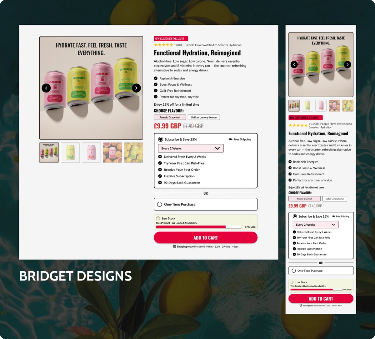
Your product page should not just “look good.”
It should answer questions, remove doubt, build trust, and make buying feel easy.
That is what actually converts.
@figma
Your homepage is not just there to look nice. It is the first thing people see, judge, and decide on.
If they don’t get what you offer in seconds, they’re gone.
Keep it simple. Make it obvious. Make it easy to act.
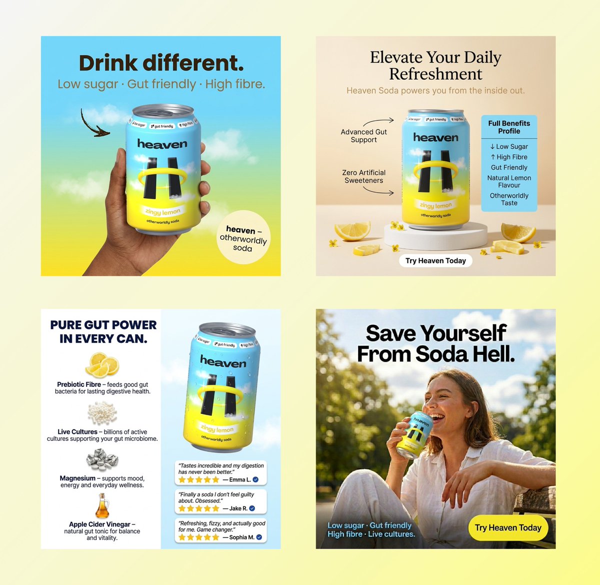
Listicle pages built on @Instant apps just hit different.
No load time. No friction.
Feels like content, not a sales page.
People scroll, get hooked, and before they realize it they are already sold.
That is the difference.
A listicle page works because it doesn’t rush people.
It breaks everything into small, easy points so the reader can actually understand the value without feeling pushed.
more clarity → less pressure → easier decision.
You do not need more traffic.
You need better conversion.
An advertorial warms cold clicks, builds trust fast, and sells without feeling pushy.
More reads → more clicks → more sales.
@figma
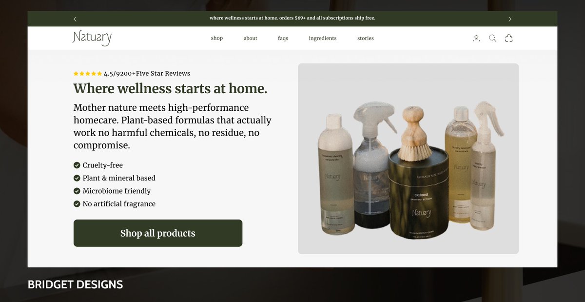
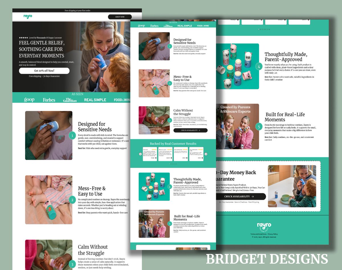
Your homepage has one job make someone stay.
If it is cluttered, confusing, or slow to explain the value, they are gone in seconds.
Clear message. Strong hook. Instant trust.
That is what turns visits into sales.
@figma
Before: good product, but the page feels unclear. No direction, no real hook. People scroll… then leave.
After: clear headline, strong hierarchy, and a focused flow. Visitors instantly get it and stay engaged.
Clarity turns interest into action.
Most people are seeing your site on their phone, not desktop.
So if your hero section doesn’t grab attention in the first few seconds, they are gone.
Keep it simple. Clear message. No clutter. Make it easy to understand and even easier to act.
@figma
Your product might be amazing, but if it is not in the Buy Box, no one sees it. Grab the box, get more clicks, get more sales. Do not leave money on the table.
@figma
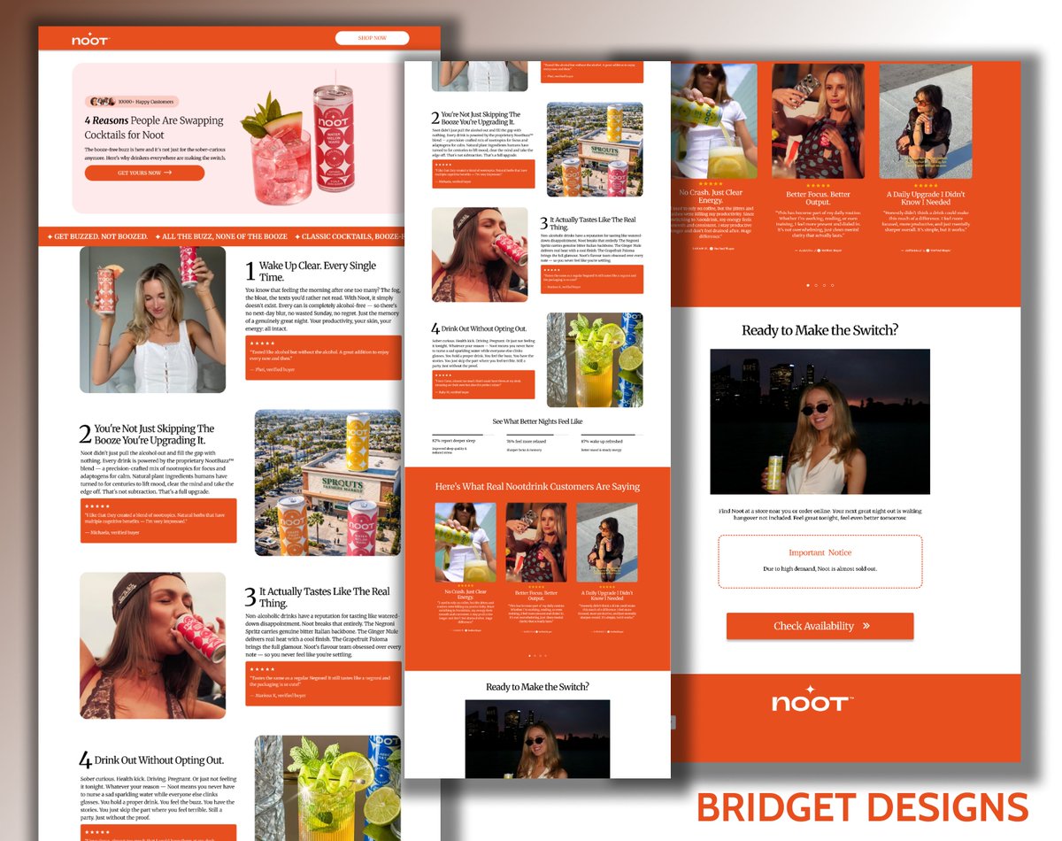
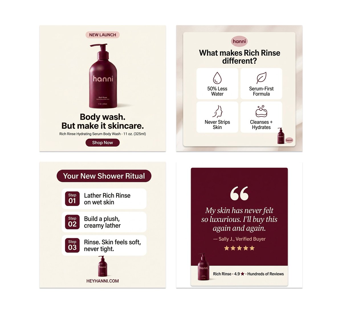
Listicle page is not designed to look pretty. It was designed to convert.
Clear layout,Strong focus and Smooth flow.
Every scroll has a purpose.
@replohq
Traffic isn’t your problem.
conversion is.
Here's a listicle page I designed ,@Figma every section is intentional.
Every scroll builds buying intent, that’s what drives sales.
#figma#cro#dtc#eco#landingpage