Sabitlenmiş Tweet

The first time I designed a poster, I spent minutes staring at it. I was trying to figure out what was wrong.
The colors were nice and the fonts were clean. Everything looked "correct" on the surface, yet it still did not feel right.
The layout felt shaky, almost like a table with one leg shorter than the rest. It could not decide where it wanted to sit.
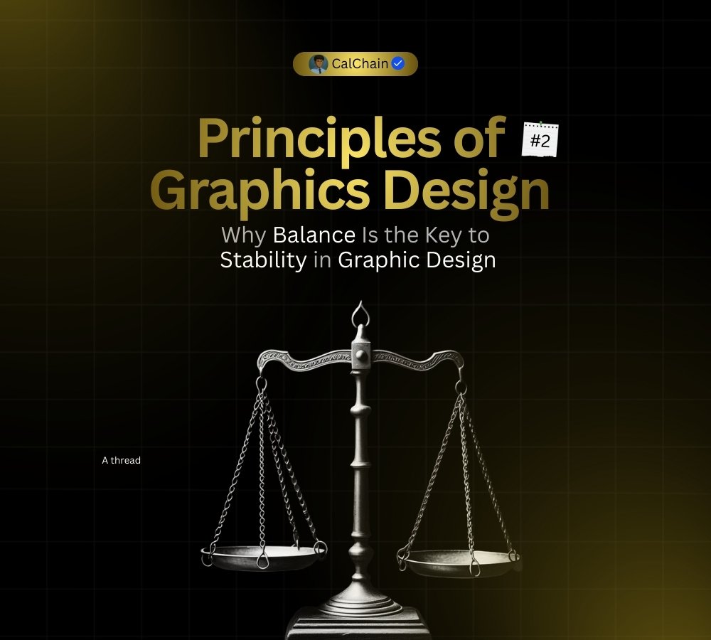
I eventually realized the problem was not my tools or my colors. It was the 𝗯𝗮𝗹𝗮𝗻𝗰𝗲.
Over the past few months I have learned that good design is not always about perfect symmetry or being "flawless."
It is about how you distribute visual weight.
------------------
Why your design might feel "off"
𝗕𝗹𝗮𝗻𝗰𝗲 is what makes a design feel stable and grounded. It is how you distribute that weight across the layout
The text, images, color and empty space all working as a team.
When one side of your design feels way heavier than the other, the eye struggles to find a resting place. It feels like the design is about to tip over.
When elements pull in different directions without a plan, your message loses its focus entirely.
---------------------
Two ways to find that balance:
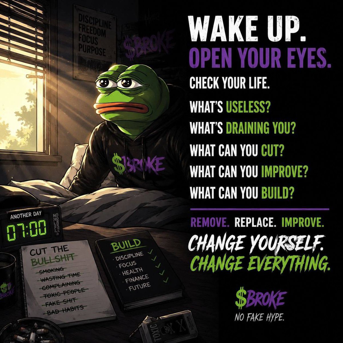
Symmetrical Balance: This is the "classic" look. You mirror elements on both sides of a central axis. It feels very formal, stable and organized. It is great for wedding invitations or high end luxury brands.
Asymmetrical Balance: This is where the magic happens. You balance a large, "heavy" element on one side with several smaller, "lighter" elements on the other. It feels more modern, energetic and interesting to the eyes
------------------------
Balanced designs feel calm. They feel like they were made with a specific purpose.
Next time you are working, try squinting your eyes at your screen. If one side looks like a dark blob and the other side looks empty
you know exactly what you need to fix. (BALANCE)
English