dangoodspeed

290 posts

dangoodspeed

dangoodspeed

@dangoodspeed

Web developer, Ultimate frisbee player/captain/coach/TD, musician, videographer, journalist/documenter with a love of all things data.

Schenectady, NY Katılım Haziran 2008
0 Takip Edilen2K Takipçiler
dangoodspeed
dangoodspeed@dangoodspeed·
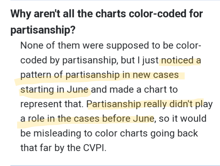
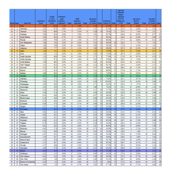
@MikeS13259672 @girlsreallyrule @arob12_ Every statistic on the charts is backed up with real numbers. All verified for accuracy. Something your spelling clearly shows you don't care about. Maybe once you start caring about accuracy, you can start to understand things.
English
0
0
0
28
Mike S
Mike S@MikeS13259672·
@dangoodspeed @girlsreallyrule @arob12_ Oh, bullshit. The unvexed? How many morbidities did those on vaxed have? Do me a favor don’t throw out statistics that you can’t back up with real fucking numbers because then it’s all bullshit.
English
1
0
0
19
dangoodspeed
dangoodspeed@dangoodspeed·
@MikeS13259672 @girlsreallyrule @arob12_ That's what the charts show. COVID killed a lot. The flu kills about 25,000 Americans per year. COVID killed over a million Americans in the past few years. Almost all unvaxed. Almost all who died would have lived if they were vaccinated. That's what the hard numbers show.
English
1
0
0
26
dangoodspeed
dangoodspeed@dangoodspeed·
After a six-month hiatus due to an import error and lower priorities, reports of an uptick in COVID cases inspired me to get the COVID charts up-to-date again. So all case and death data charts are now current, as always available at: dangoodspeed.com/covid/
English
1
4
10
313
dangoodspeed
dangoodspeed@dangoodspeed·
@timetobal13 @Jason @Austen It literally does lower your chances of death. The death rate of the unvaccinated is much higher than the vaccinated.
English
0
0
0
0
timetobal13
timetobal13@timetobal13·
@dangoodspeed @Jason @Austen the lie that was told, which im sure you conveniently forgot, was that the vaccine lowers death. The trend should be extremely clear at this point if that was the truth
English
1
0
0
0
dangoodspeed
dangoodspeed@dangoodspeed·
@timetobal13 @Jason @Austen Not sure if that story has any statistical significance. It's like saying "Most Americans who die are less than 80 years old". That doesn't mean you're less likely to die if you're over 80. And similarly, most Americans are vaccinated.
English
1
0
0
0
dangoodspeed
dangoodspeed@dangoodspeed·
@dianepsych I do plan to. My script stopped working, I just have to find the time to debug it so I can keep using it for the updates.
English
0
0
0
0
dangoodspeed
dangoodspeed@dangoodspeed·
Weekly COVID cases are falling, with one very notable exception- Maine. For some reason it's nearing 10x the new per-capita COVID cases compared the rest of the country. It's also leading the country in per-capita deaths. dangoodspeed.com/covid/state-by…
English
2
3
3
0
dangoodspeed
dangoodspeed@dangoodspeed·
@cornchipscotta1 So before June, the science wasn't in so no leadership could make any truly informed decisions about COVID policy and it was essentially random (other than where people travel the most) who was hit the hardest. Once it was known how to handle COVID, Republicans did much worse.
English
1
0
0
0
dangoodspeed
dangoodspeed@dangoodspeed·
@cornchipscotta1 I never said that. I said the science wasn't in until June of 2020 for leaders to make science-based policies.
English
1
0
0
0
cornchips&cottagecheese
cornchips&cottagecheese@cornchipscotta1·
@dangoodspeed You suggest partisanship didn't affect COVID policies until June of 2020. How do you figure that? What made it become partisan then?
English
1
0
0
0
Martin Kulldorff
Martin Kulldorff@MartinKulldorff·
Pandemic Response Scores Top 10: UT, NE, VT, MT, SD, FL, NH, ME, AR, ID Bottom 10: NJ, DC, NY, NM, CA, IL, MD, NV, CT, PA equal weights for mortality, education and economy
Martin Kulldorff tweet media
English
68
389
1.2K
0
Lost Folk
Lost Folk@lost_folk·
@dangoodspeed Your chart might be good for a political campaign @dangoodspeed but if you are trying to help people understand the truth of the situation, looking to see it from many angles should be obvious.
English
1
0
0
0
dangoodspeed
dangoodspeed@dangoodspeed·
Just updated the partisanship colors based on the latest Cook Partisan Voting Index numbers. Every state that changed became more moderate. The CPVI groupings are 0-2, 3-7, 8-12, and 13+. You can see the new colors on the partisan charts like this one - dangoodspeed.com/covid/total-de…
English
4
0
3
0
dangoodspeed
dangoodspeed@dangoodspeed·
@lost_folk That's the opposite of the truth. Starting the animation before the science was in that the states' leaders could use to place policy would be misleading and just skew the charts toward whatever states were sucker-punched before the science was in as far as how to react.
English
1
0
0
0
Lost Folk
Lost Folk@lost_folk·
@dangoodspeed Starting the animation after the first wave is cherry picking, especially if you are creating a comparison between political parties as a way to point out policy failure. Again stringency index would be a more accurate, less polarizing way to look at this.
English
1
0
0
0
dangoodspeed
dangoodspeed@dangoodspeed·
@lost_folk Nothing was removed. It's dishonest to say something was removed.
English
1
0
0
0
Lost Folk
Lost Folk@lost_folk·
@dangoodspeed dan would love to see this using the stringency index as an option as it is a more accurate way to determine strictness of policy. Also as i'm sure you saw in that other thread, i wish you would leave in the first wave, I think it's dishonest to remove it.
English
1
0
0
0
dangoodspeed
dangoodspeed@dangoodspeed·
@_wunderwood_ Unfortunately, I'm limited in interface customization by what Flourish offers, and that feature is not included with Flourish (unless I make each state its own category which can get pretty messy).
English
0
0
0
0
Clay Travis
Clay Travis@ClayTravis·
Positive news @SouthwestAir has brought back alcohol on their flights. Now about this ridiculous airplane mask mandate that does nothing to protect anyone and just makes us all look like idiots — can we finally end it too?
English
102
331
4.6K
0
Mikahh
Mikahh@Mikahh479·
@vemcg @hitmeister1 @SilentNoMore21 Odd that this chart has wildly different numbers than what at least 3 states officially reported. But I guess this the real "science" you're talking about bc it uses fake numbers to support your claim.....
English
1
0
0
0
dangoodspeed
dangoodspeed@dangoodspeed·
@TheJTM31 @ShawnTempesta @GWCOLEIII IN has almost twice the per-capita deaths in the past year than MA. And masks work by greatly reducing the spread of COVID. If you don't understand what "reducing" means, ask your math teacher.
English
1
0
1
0
JJ
JJ@TheJTM31·
@dangoodspeed @ShawnTempesta @GWCOLEIII I didn't know age was a factor in the number of cases and if masks work then why would population density matter? According to your statistics, MA is most vaxed while IN is least vaxed. So why would a state that is most vaxed, mask mandates and more shutdowns be doing so poorly?
English
1
0
0
0
Shawn Tempesta 💰
Shawn Tempesta 💰@ShawnTempesta·
I love seeing people on Twitter crowing about the "poor precious souls" that were forced to wear a mask at school finally freed from the shackles of communism. My kids are 5 and 3. Didn't complain once. Get a grip.
English
28
7
104
0
dangoodspeed
dangoodspeed@dangoodspeed·
@keith4355 @ShawnTempesta @Spencetology Wow, that's a lot of ignorant conspiracy chatter. The only months excluded were those where state leaders did not have the science to apply to laws and mandates, thus the entire reason for the partisan charts.
English
1
0
1
0
Keith
Keith@keith4355·
@dangoodspeed @ShawnTempesta @Spencetology Selectively excluding five months of a pandemic when Democrat governors murder tens of thousands if nursing home residents is very convenient. For you to ignore this fact is massively biased. Maybe the Nazis didn’t kill Jews if you exclude 1943-45 as well.
English
1
0
0
0
dangoodspeed
dangoodspeed@dangoodspeed·
@keith4355 @ShawnTempesta @Spencetology Simple fact is Biden has been president during COVID longer than Trump, also through not one, but two killer variants far worse than the COVID we saw in 2020. And putting patients in nursing homes instead of overflowing hospitals was the right call at the time.
English
1
0
0
0
Keith
Keith@keith4355·
@dangoodspeed @ShawnTempesta @Spencetology Ok, built in excuses to absolve incompetence. Kind of like putting Covid patients in nursing homes in blue states. I’m done trying to fix stupid, twist all your figures to fit your narrative. Simple fact is that more Americans have died from Covid under Biden vs Trump.
English
2
0
0
0