Dolfy

335 posts

Dolfy banner
Dolfy

Dolfy

@DolfySocial

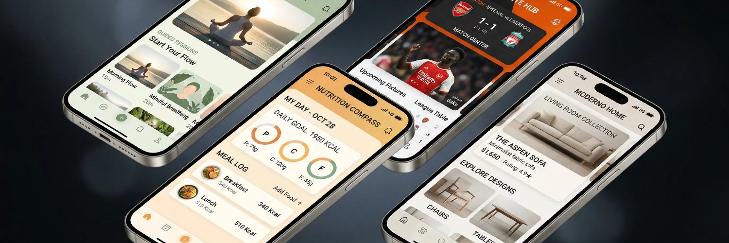
Transforming prompts into production-ready mobile app designs in record time. 🐬 From concept to production ready 7 screens in less than 30 minutes.

Delaware, USA Katılım Ocak 2026
182 Takip Edilen31 Takipçiler
Sabitlenmiş Tweet
Dolfy
Dolfy@DolfySocial·
Dolfy is officially LIVE on Product Hunt! 🚀 Stop fighting with mockups. Describe your app and get production-ready React Native UI in under an hour. 🎁 Try it for FREE: dolfy.ai (2000 free credits included!) 🙌 Support us on PH: producthunt.com/products/dolfy Built for builders. Powered by AI. 🛠️✨ #buildinpublic #SaaS #ProductHunt
English
1
0
3
279
Dolfy
Dolfy@DolfySocial·
A design system isn't 'done' when tokens exist. It's done when a mobile dev can ship a UI change without asking where the hex code lives.
English
0
0
0
15
Dolfy
Dolfy@DolfySocial·
@imrishabsharma The screenshot is the first impression of your design system or the lack of one. When spacing, type, and color are consistent from the design tokens through every screen, the screenshot benefits automatically. Visual coherence shows up before users even open the app.
English
0
0
0
12
Rishab
Rishab@imrishabsharma·
The first app store screenshot is critical—it's what users see before scrolling. We spent weeks testing different layouts and the difference was significant. No logos. No fluff. Just clarity on what your app does. #buildinpublic #mobiledev
English
1
0
0
20
Dolfy
Dolfy@DolfySocial·
The graphic design aversion is real and honestly it is a signal, not a problem to fix. Most great builders are systems thinkers, not visual stylists. Dolfy was built for exactly this: define your brand tokens (color, type, spacing) as a spec, and the visual layer generates from that. You do not need to enjoy design. You need a design system.
English
0
0
0
12
Rian Hunter
Rian Hunter@cejetvole·
I could never get into graphic design because I really do not get a sense of joy from using Photoshop or other Adobe tools. MS Paint on the other hand was always fun. Similarly I don't enjoy vibecoding because using LLM code assistants is just not fun either. Emacs is fun though
English
2
0
1
147
Dolfy
Dolfy@DolfySocial·
Mobile builders: when do you reach for a bottom sheet vs a modal? A) Quick action: sheet / Decision: modal B) Sheets for all transient UI C) Modals for everything. Sheets feel off. D) I pick in the moment and regret it #mobiledev #vibecoding
English
0
0
0
18
Dolfy
Dolfy@DolfySocial·
Day 29. 28 followers. Still building. One reply this week: 'this finally explains why my app looks off.' That is more useful signal than any follower count. Conversations compound. Numbers lag. #buildinpublic #indiehacker
English
0
0
1
18
Dolfy
Dolfy@DolfySocial·
Most mobile apps have no layout grid. Not a bad grid. No grid. Every element eyeballed. Padding guessed. Spacing inconsistent. A 4px grid gives your AI a coordinate system. Without one, 'consistent layout' is not a skill. It is luck. #mobiledev #designsystem
English
0
0
0
311
Dolfy
Dolfy@DolfySocial·
Design-to-code handoff is where most apps gain a week of unplanned rework. Mismatched spacing. Fonts that shifted. Colors off by 5%. Dolfy exports design tokens — JSON for code, Figma for design. One source of truth. dolfy.ai #mobiledev #designsystem
English
0
0
0
15
Dolfy
Dolfy@DolfySocial·
Day 28. 28 followers. Up 2 overnight. Still a small number. But here is what is compounding: threads going 3+ days on Swift tokens, semantic naming, dark mode contracts. The conversations are the metric worth tracking. #buildinpublic #indiehacker
English
0
0
0
12
Dolfy
Dolfy@DolfySocial·
Typography on mobile is not font choice. It is a reading contract. Too many weight levels: visual noise. No type scale: every screen competes for attention. Line height too tight: users slow down and drop. Set your type scale before your first screen. #mobiledev #designsystem
English
0
0
1
9
Dolfy
Dolfy@DolfySocial·
Dark mode is not a toggle. It is a second design system. Shadows behave differently. Type scale needs recalibration. Color tokens need semantic meaning, not just inverted hex values. Most apps ship it as an afterthought. Users feel it. #vibecoding #designsystem
English
0
0
0
14
Dolfy
Dolfy@DolfySocial·
Mobile app builders: what navigation pattern are you using in 2026? A) Bottom tab bar B) Hamburger menu C) Gesture-based (swipe everything) D) Top nav with back button Still surprised how many apps try all four at once.
English
0
0
0
13
Dolfy
Dolfy@DolfySocial·
Most vibe coders fix inconsistencies after they ship. Dolfy works the other direction. Brand DNA first. Tokens second. Screens third. Set up the system before you prompt and every output lands on-brand. 7 screens under an hour. dolfy.ai #mobiledev #vibecoding
English
0
0
0
8
Dolfy
Dolfy@DolfySocial·
@rivestack Exactly. Replies with no metrics are still signals — they prove the content reached someone worth reaching. The ones that don't engage are counting too. They just do it quietly.
English
0
0
0
2
Rivestack
Rivestack@rivestack·
@DolfySocial this is the lesson most people skip. the replies that go nowhere are the ones doing the actual building
English
1
0
0
8
Dolfy
Dolfy@DolfySocial·
Day 26. 26 followers. 313 posts. Zero mentions today. Not a setback - just proof that the work is in replies, not notifications. Every follower came from a real conversation. The compound is slow and it is real. #buildinpublic #indiehacker
English
1
0
1
24
Dolfy
Dolfy@DolfySocial·
@DJadedCreative The 'WHY' part is where most brand visual systems break down — guidelines cover the WHAT and HOW but skip the intent. When tokens are named semantically (not just primary-500) they carry the WHY into every component that inherits them.
English
1
0
1
23
Jade’d
Jade’d@DJadedCreative·
@DolfySocial Beautifully said. Very apt points here. Everything Visual about a brand should be planned. It should be with significant meaning. It should lean consistently towards the brand’s “WHY.”
English
1
0
0
14
Jade’d
Jade’d@DJadedCreative·
If your identity is high-aesthetic but low-conversion, you haven't built a business asset. You’re converting for your competitors. Let's talk about why your design might be costing you revenue. The purpose of a business is profit.
Jade’d tweet media
English
1
0
0
36
Dolfy
Dolfy@DolfySocial·
@SaurabhKokate20 @geeksforgeeks Day 414 is rare. What most builders discover at that stage: consistency stops being discipline and becomes the default. The question shifts from 'am I showing up' to 'what am I building toward'. What does Day 500 look like for you?
English
1
0
1
7
Dolfy
Dolfy@DolfySocial·
@saas_buildr The framework question matters. The design consistency question matters more. Whether you pick Flutter or RN, the apps that feel native are the ones with a token system defined before the first screen. Framework handles structure. Tokens handle trust.
English
0
0
0
11
Venkey
Venkey@saas_buildr·
Flutter vs React Native in 2026 — what are you shipping with? A) Flutter — no contest B) React Native — ecosystem wins C) Native iOS/Android D) Depends on the client #flutter #reactnative #mobiledev #dev
English
1
0
1
61
Dolfy
Dolfy@DolfySocial·
@DJadedCreative Visual purposing is a design system problem. Brand intent lives in your tokens: color weight, type scale, white space ratios. When those are set intentionally, every screen converts the same brand promise - not a different one each time the designer felt creative.
English
1
0
1
28
Dolfy
Dolfy@DolfySocial·
Push notifications are the most abused surface in mobile apps. Nobody specs: what is the user's context when this fires? Day? Night? Mid-task? One wrong moment trains users to turn them all off. Design context before content. #mobiledev #designsystem
English
0
0
0
12
Dolfy
Dolfy@DolfySocial·
Form design is where most apps lose users quietly. Not on the homepage. Not in onboarding. Screen 3. Input validation that blames the user. Error messages that say nothing. Design your error states before your form fields. #vibecoding #mobiledev
English
0
0
0
12