Sabitlenmiş Tweet
Doodle 🦇🩵
531 posts


Doodle 🦇🩵
@DoodleBatVT
🦇 Perpetually confused bat Cryptid that does art 🩵 she/her | Illustrator | Occasionally hisses at Cameras | 🇿🇦
I think I got lost again ;w; Katılım Ekim 2023
195 Takip Edilen96 Takipçiler

I can't wait until I get home tonight you will be mine! @MukyaVT and @DoodleBatVT you ready for this new DLC
store.steampowered.com/app/4242210/Sp…
English
Doodle 🦇🩵 retweetledi

Doodle 🦇🩵 retweetledi

THANK YOU SO MUCH EVERYONE FOR ALL OF YOUR SUPPORT FOR TODAY'S REDEBUT!!!
Now for that big plot twist, you can watch it below:
WATCH THE BIG PLOT TWIST HERE:
English
Doodle 🦇🩵 retweetledi


Doodle 🦇🩵 retweetledi

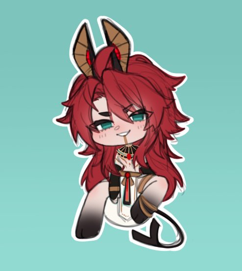
slowly getting back to making fanart again :3
@PhoenixxVT ft. tiny happy @VELMORAS
[ #Phoenixxart #Phoenixxvt #VELMORAS #VTuber #Vtubers ]

English
Doodle 🦇🩵 retweetledi

Doodle 🦇🩵 retweetledi


Doodle 🦇🩵 retweetledi

there are dragons everywhere for those with the eyes to see them


aya@wint3rbunny0
what a boring world, without giants, without dragons, without monsters under bridges, without vampires in castles...
English
Doodle 🦇🩵 retweetledi

Doodle 🦇🩵 retweetledi

You are now able to nominate YOUR favorite Black VTubers for The Onyx Awards! Let's get these creators their flowers and showcase talent and excellence! 🖤
(More Information in the form below~) ⬇️
English
Doodle 🦇🩵 retweetledi


@PeachyRana_ The profile pic! Cutie!!!!
You got this Peachy, it might be a good time to indulge in just drawing some low stress silly things 🩵
English
@MukyaVT Oh god, it’s one of those. Not all content is for everyone, and them being an ass to you just cause this isn’t their particular cup of tea is just such a weird, self-infatuated thing for them to comment.
Critique from people like this is worth less than dust. Youre doing good 🩵
English

Don't you love getting these comments?
Just doin my thing for people who also enjoy what I do and you get this.
Just a lil VTuber doin my thing in my space.
Ah...we live in a society.

English

Good morning~ now say it back to you god~
Art by @/Xiang_xumxum
English
Day 10 of the donothon and we have reached the goal! I'm ugly crying so hard! Any extras we make now goes towards saving up for rigging QWQ
Thank you all!
Twitch.tv/dendrobunnyvt
English
Doodle 🦇🩵 retweetledi

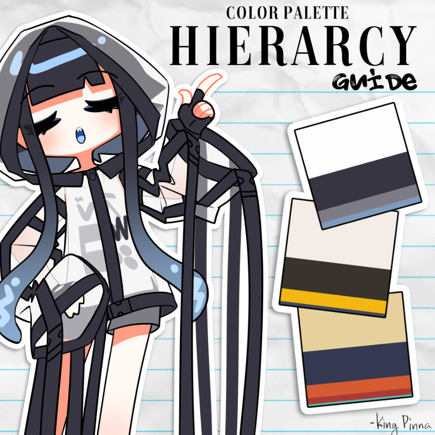
I accidentally started a Vtuber trend so I thought I’d make a more in-depth guide on balancing a color palette! 🤓🎨
When I initially made those squares for a few of my friends, I mentally consolidated most palettes into 4 categories: primary, secondary, accent, and complimentary. The ratios follow the “big, medium, small” rule of composition which aids in the balance of the palette feeling more cohesive overall. This is NOT a hard and set rule. Keep in mind composition and color theory is just that: theory. In the end, the best choice is whichever choice you like the most!
The purpose of these squares is to establish a simple palette for branding purposes, I think the ratios of color are just as important as the colors themselves.
Further explanation + visuals in the thread!
English
Doodle 🦇🩵 retweetledi

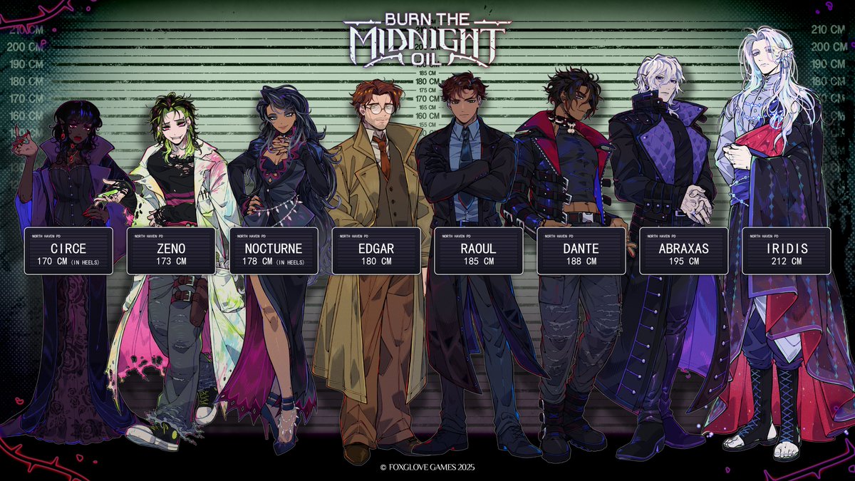
Only two more weeks until the Kickstarter + Demo for Burn the Midnight Oil! 🔥
Who are you most excited to meet? 💜
English
Doodle 🦇🩵 retweetledi