Sabitlenmiş Tweet
Elijah Meeks
11K posts

Streaming Geospatial Data Visualization.
Or... if you're @kennethfield, maybe Animated Cartography.
GIF
English
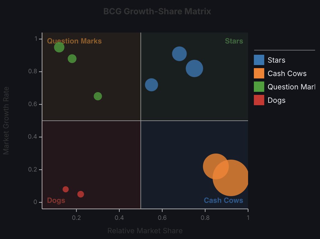
I love the HOC model in Semiotic, now I can make easy wrappers on the XYFrame so people can have simple effective Quadrant Charts with an easy interface.
English
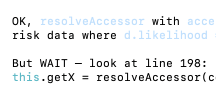
"But WAIT"
I don't care what any of you say, I love Claude's inner dialogue style.
English
I can see Bret Victor's Explorable Explanations in every Claude prototype and data story and yet we don't really seem to be celebrating the democratization of the form and instead it seems more like we're scared that we lost the ability to keep these barbarians out.
English

@Elijah_Meeks You can claim it 👍 There's a couple of decent books I could point you to of course. Mostly it's just about thinking, making justifiable design decisions, sharing work and being open to critical eyes. That's my opinion fwiw.
English
@kennethfield Oh you! I always feel scared to claim cartography as a skill because I'm not making the kind of work (or the kind of tooling that can produce the kind of work) that real cartographers can do. But I would love any pointers on good defaults and universally useful functionality.
English
Elijah Meeks retweetledi

What is the best way to encode a road network as data?
sandboxspirit.com/blog/data-stru…
English
@shrimpala Soon everyone will be able to do it with almost no effort.
English

@Elijah_Meeks Flashbacks, did that 20 years ago for a university course.
English
@warcriminalgreg It's a version of Minard's Map that is geolocated and placed on actual geography and uses particles to indicate flow with a connected scatterplot below it showing temperature correlated with the size of Napoleon's army.
en.wikipedia.org/wiki/Wikipedia…
English

@Elijah_Meeks Not sure the dots work for this viz.
Have you tried stripes?
English
It's performance testing day and the early results are really quite promising.
GIF
English
Elijah Meeks retweetledi

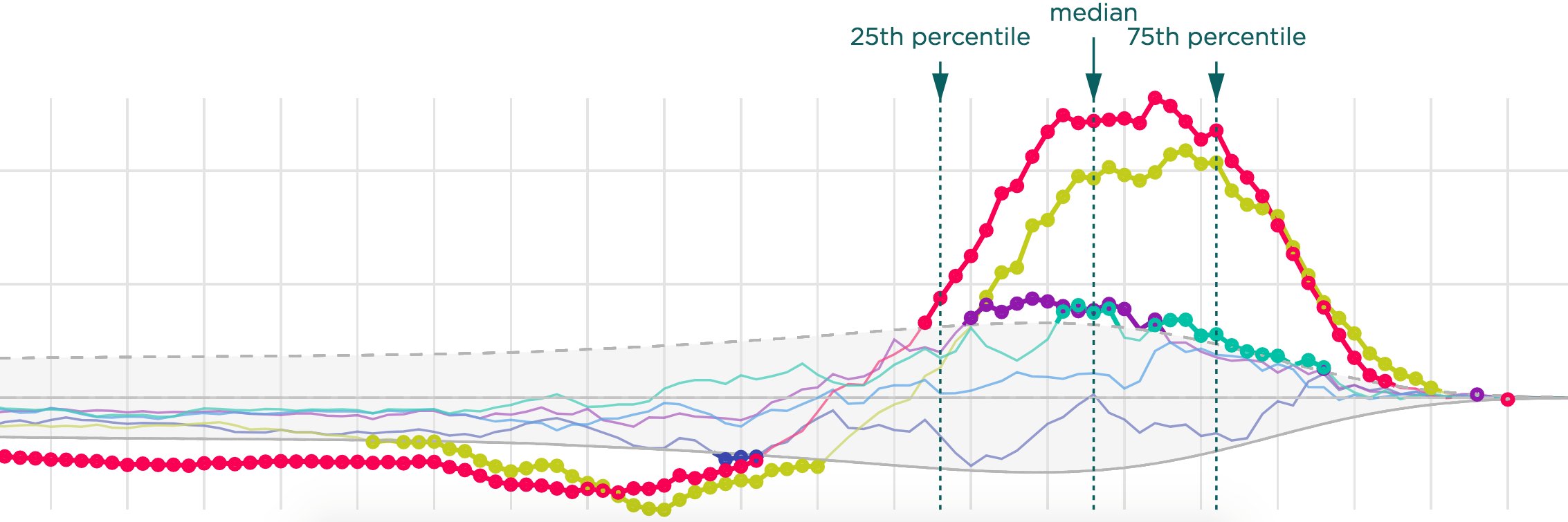
Testing out how well AI understands the instructions for Semiotic realtime charts and while there are still some rough spots to work out... it's really quite easy now to build a realtime dashboard. Here's wikipedia event streams from two prompts.
GIF
English
Elijah Meeks retweetledi

Personal AI should run on your personal devices. So, we built OpenJarvis: a personal AI that lives, learns, and works on-device.
Try it today and top the OpenJarvis Leaderboard for a chance to win a Mac Mini!
Collab w/ @Avanika15, John Hennessy, @HazyResearch, and @Azaliamirh. Details in thread.

English

English

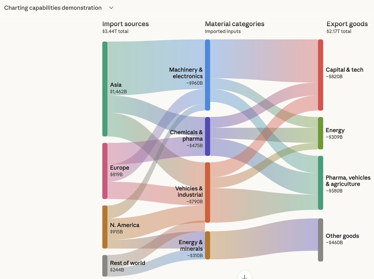
I'm glad Claude is supporting diagrams and I love Claude (it has revolutionized my approach to software development) but these are nice diagrams and neither cool nor amazing. Nice. Nice job @AnthropicAI on the charts. Not amazing yet but maybe some day.
Greg Feingold@GregFeingold
The new interactive diagrams feature in Claude is seriously amazing. Go make some cool charts!
English
@GregFeingold @AnthropicAI Making sure to get them right and legible and use very comprehensible charts was the right first step. I think the best approach sees dataviz as first data access, then data transformation, then data literacy. I would go for maps next, then maybe counterintuitively DAGs (flows).
English

@Elijah_Meeks @AnthropicAI would love some feedback on how we can improve!
English