Evan Collins | BLM 🏳️‍🌈🇵🇸

1.3K posts

Evan Collins | BLM 🏳️‍🌈🇵🇸 banner
Evan Collins | BLM 🏳️‍🌈🇵🇸

Evan Collins | BLM 🏳️‍🌈🇵🇸

@EvanCollins90

Architectural designer, Co-founder of CARI; Y2K, Frutiger Aero, McBling, GVC, Whimsigothic, Factory Pomo, Frasurbane, CGXC, Gen-X SC, etc. Patreon in link

Katılım Eylül 2018
97 Takip Edilen8.8K Takipçiler
Sabitlenmiş Tweet
Evan Collins | BLM 🏳️‍🌈🇵🇸
Phew! After some late nights our CARI site is finally up! While it's still a work-in-progress, we've compiled quite a bit of our research over the past few years in here! I've got some fun ideas for the future, eg. each aesthetic page themed in its respective style
Y2K Aesthetic Institute 💽@y2k_aesthetic

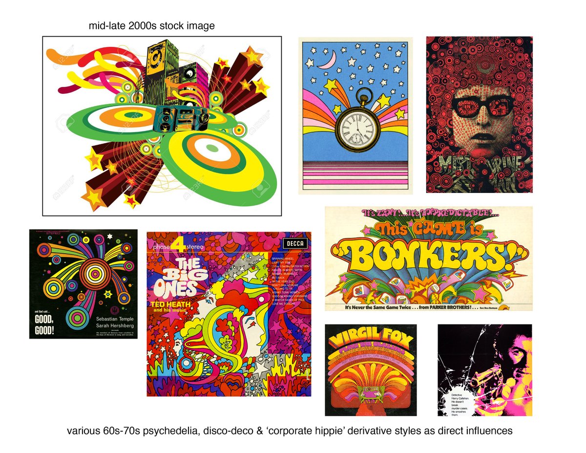
It's official! Our CARI website is finally up & open to explore! After years of hard work by our dedicated team, we've created this platform to share our research into the ever-expanding landscape of 1970s-present consumer design. cari.institute

English
7
37
168
0
Evan Collins | BLM 🏳️‍🌈🇵🇸
@MarikoRawralton @kalomaze yea its called that incorrectly, that style is honestly the polar opposite - it doesn't have anything to do with windows metro, and everything to do with the peak of 'vector maximalism/vectordelia' inspired by 60s-70s psychedelia & pop art
Evan Collins | BLM 🏳️‍🌈🇵🇸 tweet media
English
0
0
1
244
MarikoRawralton
MarikoRawralton@MarikoRawralton·
@kalomaze It's called Frutiger Metro, and people are nostalgic for it.
English
3
0
6
2.2K
kalomaze
kalomaze@kalomaze·
this actually happened. there was a period of time where they were pushing this
kalomaze tweet media
English
600
1.8K
69.8K
1.9M
Evan Collins | BLM 🏳️‍🌈🇵🇸
@JonnyD @PolyDepression Just to add; at the time it was probably also associated with The Attik, a design firm that may be the true pioneers of the style -- here's the graphics they did for a magazine, Plazm iss. #20, in '98(!) - some of their earlier stuff going back to '95 has hints of this style too
Evan Collins | BLM 🏳️‍🌈🇵🇸 tweet mediaEvan Collins | BLM 🏳️‍🌈🇵🇸 tweet media
English
0
0
4
61
𝐋𝐨𝐰 𝐏𝐨𝐥𝐲 𝐃𝐞𝐩𝐫𝐞𝐬𝐬𝐢𝐨𝐧
Metalheart is a futuristic Y2K design aesthetic most commonly associated with the late 90s to the mid 2000s. The style is characterized by distorted abstract forms, metallic or chrome textures, futuristic UI-like graphics and typography with blurry dark backgrounds
𝐋𝐨𝐰 𝐏𝐨𝐥𝐲 𝐃𝐞𝐩𝐫𝐞𝐬𝐬𝐢𝐨𝐧 tweet media𝐋𝐨𝐰 𝐏𝐨𝐥𝐲 𝐃𝐞𝐩𝐫𝐞𝐬𝐬𝐢𝐨𝐧 tweet media𝐋𝐨𝐰 𝐏𝐨𝐥𝐲 𝐃𝐞𝐩𝐫𝐞𝐬𝐬𝐢𝐨𝐧 tweet media𝐋𝐨𝐰 𝐏𝐨𝐥𝐲 𝐃𝐞𝐩𝐫𝐞𝐬𝐬𝐢𝐨𝐧 tweet media
English
29
524
3.2K
115.2K
𝕤𝕠𝕗𝕚 𓆸
𝕤𝕠𝕗𝕚 𓆸@sincerelysofi·
oddly drawn to this generation of portable external drives
𝕤𝕠𝕗𝕚 𓆸 tweet media𝕤𝕠𝕗𝕚 𓆸 tweet media
English
7
25
726
14.2K
beanmouth strikes again
beanmouth strikes again@piperocktheory·
not even the old West can escape becoming soulless Corporate Memphis blobs
beanmouth strikes again tweet media
English
55
672
12.2K
124.9K
People’s Graphic Design Archive
Margaret Kilgallen. Sloe. 1999. Print. Kilgallen was interested in vernacular folk art and local shop signs around San Francisco; combined graffiti + sign painting to make graphic hand-painted works. From the De Young Museum Archived by @marinabyocean #WomensHistory
People’s Graphic Design Archive tweet media
English
1
0
2
272
Evan Collins | BLM 🏳️‍🌈🇵🇸
@AllSpacesFilled @madokaleninist It's also surprising to see it gain so much popularity inspiring new art/graphic design amongst gen z/alpha; when at the time (late 00s) it was basically 'vector-slop' - random mixes of graphics/motifs that were slapped onto every cheap product imaginable
English
1
0
2
68
rin 🔻
rin 🔻@madokaleninist·
frutiger aero is to the 00s as synthwave is to the 80s, it's an entirely modern retro genre built not from what the era's aesthetics were factually like but what people who vaguely remember it as a kid recall it *feeling* like
nitzu 🫧@nitzukai

I’m convinced that people have literally experienced a memory loss for anything made before 2018 websites didn’t look like this in 2009 this type of stuff used to be called Y2K few years ago and now its late 2000s what is even going on anymore

English
44
628
6.3K
132.2K
Maung Thuta
Maung Thuta@CypressDahlia·
I know the delay probably put a damper on it but I hope people are still interested in Marathon's art style. The flat graphic futurism thing is something people hadn't tapped into as much. We kinda skipped straight to Frutiger Aero
Maung Thuta tweet mediaMaung Thuta tweet mediaMaung Thuta tweet mediaMaung Thuta tweet media
English
56
426
3.8K
68.3K
Evan Collins | BLM 🏳️‍🌈🇵🇸
Bright Child activity centre - Santa Monica, CA (1998) One of my earliest memories is of a brightly-colored 'activity centre' just like this, they had such a boom in the 90s. Mainly 'Wacky PoMo', w/ some touches of the 'Decon-dustrial' style also popular at the time. (1/2)
Evan Collins | BLM 🏳️‍🌈🇵🇸 tweet mediaEvan Collins | BLM 🏳️‍🌈🇵🇸 tweet mediaEvan Collins | BLM 🏳️‍🌈🇵🇸 tweet mediaEvan Collins | BLM 🏳️‍🌈🇵🇸 tweet media
English
5
79
295
0