
Fletcher P
59 posts

@FletcherP315155 May has a better offload, better defense, better engine. AFB is more explosive and has better footwork late. Thats it. This season AFB has been shocking. May is better
English
@TomHeyes12 One more thing.
You complain that AFB was Prop Of The Year over May.
He averaged 16 post contact metres per game and made over 600 total across the entire season.
You are absolutely delusional if you think May was better than AFB.
English
@TomHeyes12 That is proof in the pudding that May isn't efficient in his carries for rep football.
Whether you agree that Pole is more efficient, although stats say so.
May isn't up to rep football, yet.
English
@TomHeyes12 May makes a huge 5 more post contact over Pole in 20 extra minutes, something doesn't add up.
English
@TomHeyes12 Pole:
Average minutes 47.2
Average post contact: 50.9
Average post contact per minute: 1.07
Average Metres: 122
Average Metres Per Minute: 2.58
May
Average Minutes 67.5
Average post contact: 55.3
Average Post Contact per minute: 0.81
Average Metres: 166
Average MPM: 2.46
Français
@TomHeyes12 Personally, I prefer him yes.
Offers more aggression and more punch with the minutes he is on the field.
English

Logo evolutions - the backlash they faced:
Nike Swoosh (1971)
Carolyn Davidson designed this for $35.
Nike co-founder Phil Knight’s first reaction was “I don’t love it, but it will grow on me.” The simplicity was radical for the time - a curved checkmark. Critics thought it was too abstract/meaningless. Now it’s the most recognizable logo globally, representing movement, speed, athletic excellence, without needing the Nike name at all. The genius was in its versatility and the meaning consumers projected onto it over time.
Apple (1977-1998)
Apple moved from a detailed Isaac Newton illustration, to a rainbow apple, then to a monochrome apple in 1998. When Steve Jobs simplified it to solid colours, design critics said it lost personality. The rainbow version had become iconic of the creative revolution. But Jobs understood a monochrome version would work better across products, in different materials (aluminum MacBooks, glass iPhones). It projected a more premium aesthetic. Today, the bitten apple is instant recognition worldwide.
Starbucks (2011)
When Starbucks removed the words “Starbucks Coffee” entirely and just kept the siren, customers were outraged. “How will people know what it is?” The company was confident in their global presence, and that the symbol alone would suffice. Removing text gave them flexibility to expand beyond coffee. It was a bold statement of brand confidence. Within a year, the controversy died.
Instagram (2016)
The shift from a retro Polaroid camera to a flat gradient icon sparked massive backlash. Users called it “generic,” “soulless”. They mourned the loss of the detailed camera. Instagram’s rationale was purely functional - the old logo was too detailed for small screens and app icons. The gradient allowed the icon to stand out on home screens while being simple enough to work at any size. Now nobody thinks twice about it.
Mastercard (2016-2019)
Gradually removed their name from the logo, leaving just the red and yellow overlapping circles. The criticism was that it looked incomplete, too simple. Their research showed the circles alone had 81% recognition globally without text. Like Starbucks, it was a statement of brand strength. It gave them flexibility across digital platforms, and various applications where text doesn’t work well.
Pepsi (2008-2009)
Spent $1 million on a redesign that tilted the circular wave. The backlash was brutal - people thought they’d wasted money on something barely different. But the subtle change modernized the look. More importantly, it allowed for dynamic variations across different Pepsi products while maintaining brand unity. The criticism soon faded as the applications showed their versatility.
The Pattern:
These changes share common elements:
1.Simplification for scalability - fewer details work better across sizes and platforms
2.Confidence in brand recognition - willingness to remove text shows they trust consumers know them
3.Future-proofing - designs that work in contexts not yet imagined (who knew we’d need app icons in 2007?)
4.Initial resistance, eventual acceptance - typically takes 18-24 months for criticism to fade.
What this means for Bulldogs:
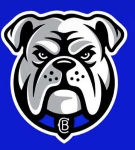
The new logo follows this exact playbook.
It’s bold enough to work on a hat or a stadium screen, simple enough to be instantly recognizable on a phone app, modern enough to appeal to young fans who are the future of a club’s support base. The circular element pays homage to history. The simplified Bulldog face has real personality/attitude.
The fans criticizing it are doing exactly what Nike customers, Apple users, and Starbucks drinkers did - mourning the familiar. That’s expected. From a branding perspective, this positions Bulldogs well for next 20-30 years across all platforms/applications that matter in modern sport.
The real test isn’t what people say today - it’s whether in 3 years time, you can spot a Bulldogs supporter across a crowded pub, just by seeing that logo on their shirt. 💙
English
@TomHeyes12 May isn't even the most efficient prop at his club for PCM's, that belongs to Fonua Pole.
English
@FletcherP315155 So does Phillip Sami deserve the winger of the year because he's the second winger in post contact meters? Dumb
English
@TomHeyes12 No, it's not.
Different positions.
May is good but he takes a lot of dead hit-ups and there is a reason why he isn't selected for NSW or Australia.
There is better Props out there that are more efficient with impact, post-contact and overall X-Factor.
English
@OldManFrostie @thelarrytaylor Manly's one is way better for me personally.
English

Canterbury-Bankstown Bulldogs new logo.
Personally, I hate it.
How do we feel?

English


@centralNRL The Broncos one is Juventus like, I don't think it's bad but I don't think it suits our sport.
As a logo not considering anything else, it's miles better.
English
@AussieSM_ @NRL_Bulldogs I punched create a bulldogs logo in Chat GPT and it almost looked the exact same!
English


Eyes forward. New look, same heart. Built for what's next. 💙
English
@529lovesmile I didn't get to see.
Who went through from Ronan and Kate?
English

Both Ronan and Kate picked right 2 to the Semi. Minus Euan, Anyone can win this season and hard to pick a winner #TheVoiceAU
English
@NSWCup How come this isn't Televised? It seems pretty ordinary how QLD Cup is and this isn't!
English
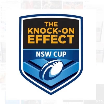
Only 3️⃣ days 'til kick-off for The Knock-On Effect NSW Cup 👀🏆
🎟️ cpnl.ink/NSWRLGFDay25
#KOECup #NSWRLGF

English
@slimcaedy @fainty6 For me he is a straight up and down player that likes to run but his runs at times are very ineffective too - He is really struggling right now.
English


It’s clear to me that Galvin was given free run at the tigers, play what you see, eyes up footy. He is struggling in a structured side like the bulldogs! Maybe Benji’s coaching wasn’t that bad for his game?! Just saying.
English
@slimcaedy @fainty6 He is slow, no organisation, gets flustered easily - I don't think I've seen him kick one field goal to win a game either.
Granted he is young but normally young players have one outstanding trait that everyone gets hyped about and the rest will improve through development.
English