

Gameplan Creative
43.3K posts
Gameplan Creative
@GameplanChicago
⚾️ 🏀🏒⚽️ 🎥 ⭐️ Recognized design disruptors. Sports branding pioneers. Event animation all-stars. NBA. WNBA. MLB. NHL. NFL. MLS. US Polo. Founded in 2004.
Chicago, IL USA Katılım Mayıs 2009
3.9K Takip Edilen3.9K Takipçiler
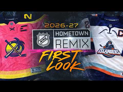
⚠️ REPORT: Details emerge of rumored NHL “Hometown Remix” jersey program, set to launch in September for 2026-27, via @icethetics.
The collection features #Isles fisherman look + #FlaPanthers **pink** sweater + other jersey color details
YouTube link👇
youtu.be/6fx2cY2zr-U?si…
YouTube


English
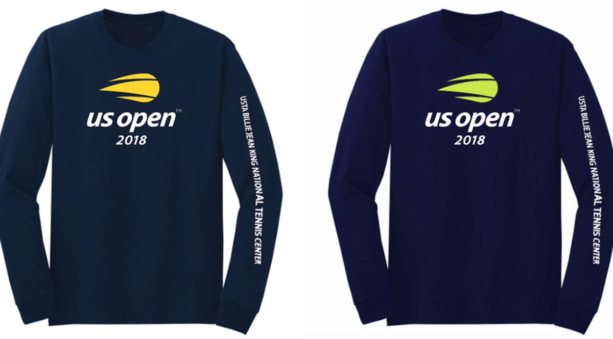
@MakersofSport @dgarciadesigns @ToddRadom @usopen @Fanbrandz @sportslogosnet @WilsonTennis Starting with the optic Wilson color in place of the canary yellow. The bright color trend never went away. See that color on many sports apparel lines.


English

@GameplanChicago @dgarciadesigns @ToddRadom @usopen @Fanbrandz @sportslogosnet @WilsonTennis Time for a rebranded after 8 years!
English
@usopen Tennis has unveiled a new corporate logo designed by Chermayeff & Geismar & Haviv. Would like to hear initial thoughts from our followers and respected associates? @ToddRadom @Fanbrandz @torchcreative @sportslogosnet @MakersofSport @PhilHecken


English
@RTaub_ @Drive4Five_ Dick’s Sporting Goods clearance rack.
English

A prototype Islanders jersey from 2021 popped up on Instagram yesterday. Assuming this was potential for the Reverse Retro program that season.
Thoughts?
📸: rattrickjerseys/IG via @Drive4Five_


English

Gameplan Creative retweetledi

@GameplanChicago @usopen @ToddRadom @Fanbrandz @TorchCreative @sportslogosnet @MakersofSport @PhilHecken Really disappointing logo to come out of that firm. You could make a case for the mark being “okay.” Can’t say the same about the type.
English
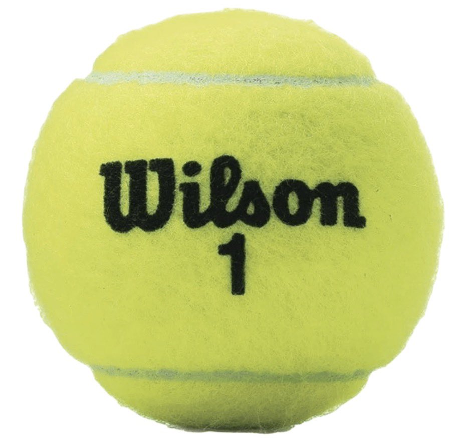
@dgarciadesigns @ToddRadom @MakersofSport @usopen @Fanbrandz @sportslogosnet @WilsonTennis 8 years later, flaming ball still hits differently than the updated icon.
When you engage a corporate identity agency, Chermayeff & Geismar Haviv
to tackle an obvious sports branding assignment, you sacrifice authenticity that resonates with your core audience.

English

@GameplanChicago @ToddRadom @MakersofSport @usopen @Fanbrandz @TorchCreative @sportslogosnet @PhilHecken @WilsonTennis Here's a write up by the designing agency:
cghnyc.com/work/project/u…
English
Gameplan Creative retweetledi
@ToddRadom @MakersofSport @usopen @Fanbrandz @TorchCreative @sportslogosnet @PhilHecken Always easy to second guess a finished brand ID project. As client, I would have demanded ball element match exact @WilsonTennis optic yellow which is both unique and speaks to energy and a youthful (emerging) fanbase. Had to serve up an example. Thoughts?

English

President Donald Trump shares a message about Kyle Busch, calling him "a true talent who loved NASCAR and its fans." usatoday.com/story/sports/n…
English


I have a few more great examples.
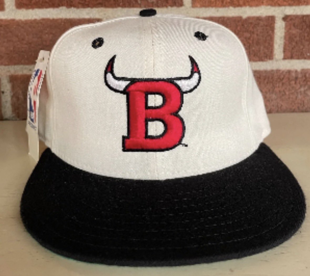
The Bulls “horny B” logo almost became an official Bulls secondary logo…

Gameplan Creative@GameplanChicago
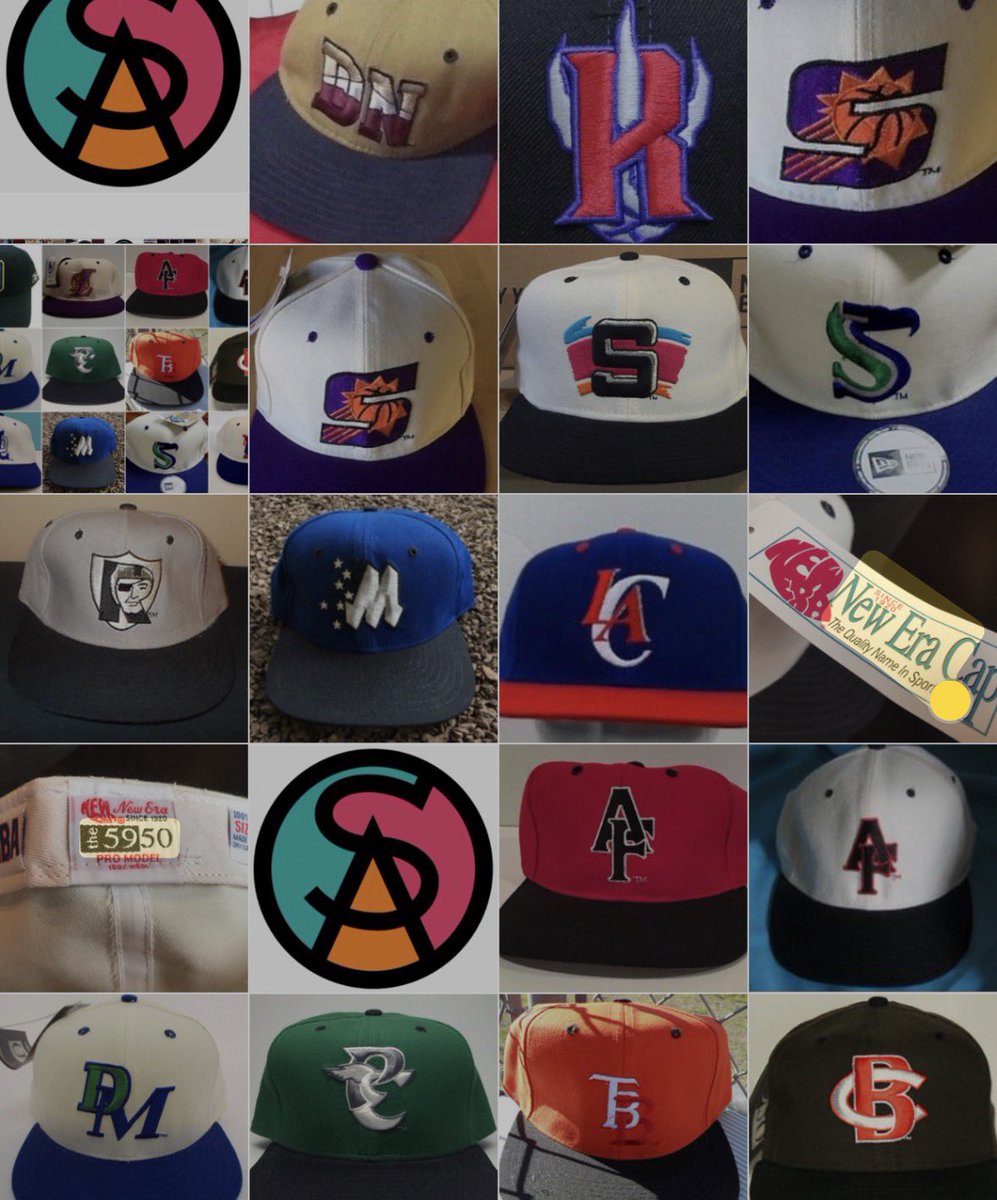
@Uninstructed718 @Shakabrodie Hi Ben- Hope you’re well. Yes. Early 1990’s. New Era wanted to expand their cap offerings but the @NBA had few logos that worked well on a baseball cap front… here are some examples.
English

@GameplanChicago Got this as a gift when I was visiting my aunt in Orlando back in 95. The Magic “M” with the stars floating off like it did on the basketball logo

English



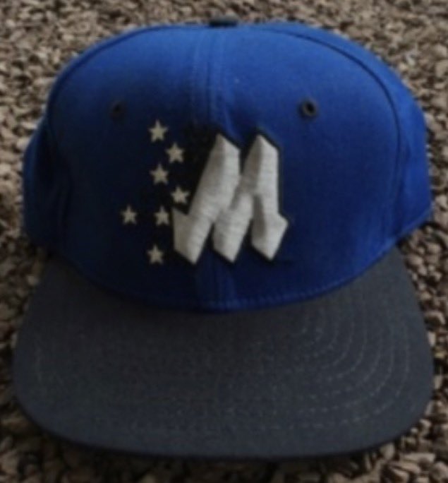

@SportsDIYguy Many of the designs were rushed and not really flushed out as core important additions to the primary branding. A few exceptions which were 🔥 !!!


English
@GameplanChicago Those were HOT for a while. I remember most of them from the catalogs I used to collect.
English
English
English
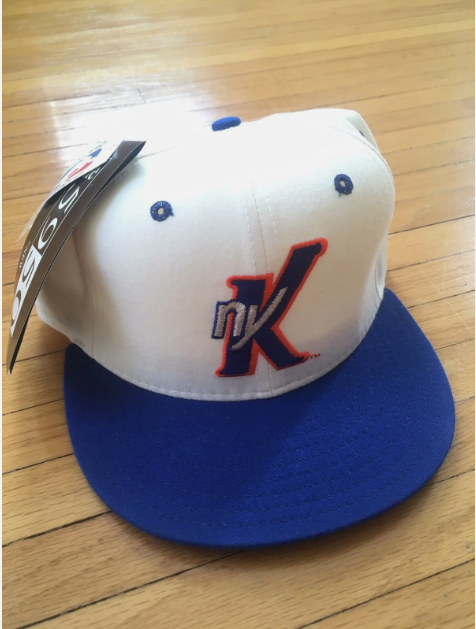


@Uninstructed718 And this was before the NYK Knicks subway token secondary logo was adopted.
We were firing on all brand cylinders in those wonderfully creative ‘90s!


English
@Uninstructed718 This a rarity! Great find. The overall New Era construction is so different!
English