Zhu, Gengping

805 posts

Zhu, Gengping banner
Zhu, Gengping

Zhu, Gengping

@Gengping_

landscape ecology, insect niche and distribution modeling, functional insect, biodiversity and conservation, biological invasion, global change, microclimate

Pullman, WA Katılım Mayıs 2019
1.6K Takip Edilen333 Takipçiler
Zhu, Gengping retweetledi
Mashford Mahute
Mashford Mahute@MashfordMahute·
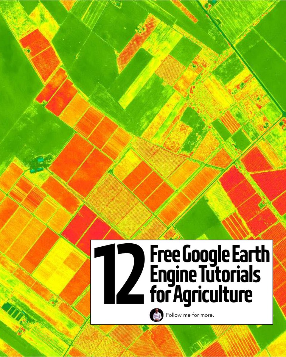
12 FREE GOOGLE EARTH ENGINE TUTORIALS FOR AGRICULTURE 🪡🧵
Mashford Mahute tweet media
English
12
265
1.3K
75K
Zhu, Gengping retweetledi
Xie Feng 谢锋
Xie Feng 谢锋@AmbXieFeng·
China’s traditional lantern festival falls on March 3 this year. Marking the first full moon of the Chinese lunar new year, it brings families together under glowing lanterns. Wish everyone peace, happiness and a fulfilling year ahead. Happy Lantern Festival!
English
11
28
151
3.4K
Zhu, Gengping retweetledi
Joachim Schork
Joachim Schork@JoachimSchork·
Shrinkage methods like Ridge Regression, Lasso, and Elastic Net are essential techniques in modern statistics and machine learning. These methods help reduce overfitting in models by shrinking the coefficient values, making them more robust and generalizable to unseen data. ✔️ Improved model performance: Shrinkage methods reduce the risk of overfitting by penalizing large coefficients, leading to more reliable predictions. ✔️ Feature selection: Lasso, in particular, can reduce some coefficients to exactly zero, prioritizing features that most improve predictive performance. ✔️ Balance between Ridge Regression and Lasso: Elastic Net offers a balance, combining Lasso’s feature selection and Ridge Regression’s stability for correlated variables. ❌ Loss of interpretability: If shrinkage is too aggressive, it may drive important coefficients closer to zero, making it hard to interpret the true importance of predictors. ❌ Tuning challenges: Selecting the correct penalization parameter (lambda) is crucial. Too much shrinkage can lead to underfitting, while too little shrinkage can still cause overfitting. ❌ Not all methods perform well in every situation: Ridge Regression works better when all predictors are important, while Lasso is more suited when only a few predictors matter. Elastic Net tries to balance both but may need careful tuning to work effectively. The plot attached visualizes the differences between OLS (no shrinkage), Ridge Regression, Lasso, and Elastic Net. OLS shows the raw coefficients, while shrinkage methods reduce the magnitude of the coefficients to varying degrees. Lasso sets some coefficients to exactly zero, Ridge Regression keeps all coefficients non-zero but shrinks them, and Elastic Net combines aspects of both methods. 🔹 In R: Use glmnet for Ridge Regression, Lasso, and Elastic Net, providing control over the alpha parameter to adjust between Lasso and Ridge Regression. 🔹 In Python: Use sklearn.linear_model with Ridge, Lasso, and ElasticNet classes for efficient model fitting and coefficient shrinking. You can check out my online course on Statistical Methods in R, which explains this topic as well as other related topics in further detail. More information: statisticsglobe.com/online-course-… #datavis #R #datascienceenthusiast #DataVisualization #RStats
Joachim Schork tweet media
English
1
4
40
1.8K
Zhu, Gengping retweetledi
Michael Pyrcz🌻
Michael Pyrcz🌻@GeostatsGuy·
I really love teaching Bayesian linear regression. It’s the perfect introduction to #Bayesian methods for #MachineLearning. Spoiler alert: they’re awesome. 🔥 In class, I walk students step-by-step through: 1️⃣ How the prior is updated with the likelihood to produce the posterior 2️⃣ How we sample that posterior using Markov Chain #MonteCarlo (MCMC) — specifically Metropolis sampling Then we open up my interactive #Python dashboard and actually do it: Sample the Markov chain of model parameters, compute the acceptance probability directly from prior × likelihood ∝ posterior Theory → algorithm → live visualization. No black boxes. Just probability in motion. 🚀 That moment when students see the posterior emerge from the sampling process? Completely stoked. 🤘 I share the full interactive notebook here: github.com/GeostatsGuy/Da… #GitHub
GIF
English
1
38
255
9.3K
Zhu, Gengping retweetledi
Joachim Schork
Joachim Schork@JoachimSchork·
When variables have different scales or units, it becomes difficult to compare them directly or use them effectively in many machine-learning algorithms. Feature scaling techniques such as normalization and standardization solve this by putting all variables on comparable scales, making your data easier to interpret and analyze. Why feature scaling is useful: ✔️ Scale comparability: Prevents large-scale variables (e.g., income) from dominating smaller ones (e.g., satisfaction scores). ✔️ Improved model performance: Algorithms like k-means, PCA, or neural networks work better when features are scaled. ✔️ Faster convergence: Gradient-based optimizers reach stable solutions more efficiently. ✔️ Better interpretability: Makes visualizations and statistical comparisons clearer. ✔️ Consistent ranges: Methods like min-max normalization map values to a specific range (often 0–1), while standardization centers around zero with unit variance. There are different types of normalization and standardization, and the right choice depends on your data and analysis goal. I found this helpful table on Wikipedia that summarizes several commonly used methods. Source: en.wikipedia.org/wiki/Normaliza… Want to know how to standardize data in R? Check out my tutorial: statisticsglobe.com/standardize-da… For more tutorials and insights on R, Python, and data science, subscribe to my newsletter. See this link for additional information: statisticsglobe.com/newsletter #RStats #datastructure #R #DataScience
Joachim Schork tweet media
English
2
24
131
3.9K
Zhu, Gengping retweetledi
Joachim Schork
Joachim Schork@JoachimSchork·
Regression outputs contain many different components, each providing crucial insights into the effectiveness and characteristics of the model. The detailed explanation below will help you understand the various parts of the regression model output provided by R. From the formula used to the statistical significance of the coefficients, each element plays a key role in interpreting the overall performance and validity of the model. ✅ Call: Restates the regression formula and the data set used. Example: Modeling happiness with predictors (gdp, social, freedom, corruption) using data set my_data. ✅ Residuals: Differences between observed values and model predictions. Summary includes: - Min and Max: Range of residuals. - 1Q and 3Q: Middle 50% of residuals. - Median: Middle value of the residuals. Close to 0 suggests accuracy. ✅ Coefficients: Provides estimates of the regression coefficients and their significance: - Estimate: Impact of each predictor on the target variable. Example: Increase in gdp leads to a 0.25374 increase in happiness. - Std. Error: Variability of each estimate. - t value: Test statistic for the significance of each coefficient. - Pr(>|t|): p-value for the t-test; values < 0.05 often indicate significant effects. ✅ Significance codes: Quick reference for significance levels next to the p-values. ✅ Residual standard error: Measure of the fit quality, indicating the average size of the residuals. Lower values suggest a better fit. ✅ Multiple R-squared: Proportion of variance in the target variable explained by the predictors. For instance, 82.51% in this model. ✅ Adjusted R-squared: Adjusts the R-squared to account for the number of predictors, providing a more accurate measure of model performance. ✅ F-statistic and its p-value: Tests if at least one predictor has a non-zero coefficient. A small p-value rejects the null hypothesis that all coefficients are zero, confirming the model’s significance. Explore my webinar titled "Data Analysis & Visualization in R," where I demonstrate how to estimate linear regression models alongside other essential techniques. More info: statisticsglobe.com/webinar-data-a… #Statistics #Data #programmer #RStats
Joachim Schork tweet media
English
2
23
141
3.8K
Zhu, Gengping retweetledi
Joachim Schork
Joachim Schork@JoachimSchork·
Bayesian logistic regression is a powerful method for predicting binary outcomes (such as yes/no decisions). It differs from traditional logistic regression by incorporating prior beliefs and quantifying uncertainty using posterior distributions. This makes Bayesian logistic regression ideal for situations where you want to explicitly account for uncertainty or include prior knowledge. Here’s a breakdown of the four key graphs that provide insights into a Bayesian logistic regression model: ✔️ Posterior Distribution Plot: This plot displays the posterior distributions of the coefficients for predictor1 and predictor2. The shaded area shows the range of probable values (credible intervals), while the vertical line marks the median estimate of each coefficient. Unlike frequentist approaches that provide single point estimates, Bayesian logistic regression gives a distribution of possible values, which allows for a clearer understanding of uncertainty in the model parameters. ✔️ Trace Plot: This shows the trace of the MCMC (Markov Chain Monte Carlo) sampling process over 4000 iterations for predictor1 and predictor2. The traces should ideally look "fuzzy" and well-mixed, moving around the full parameter space without getting stuck. This indicates that the chains have converged and that the model’s parameter estimates are reliable. A poorly mixing chain (one that looks like a straight line or is stuck) would indicate convergence issues. ✔️ Posterior Predictive Check: This plot helps to evaluate the model's predictive performance by comparing the predicted outcomes (y_rep, light blue) with the observed data (y, dark blue). The closer the predicted values align with the observed data, the better the model captures the underlying structure. In this case, the predicted values align well with the observed data, indicating a good fit. This check is crucial for assessing whether the model generates realistic predictions. ✔️ Posterior Interval Plot: This plot visualizes the credible intervals for the model coefficients, including the intercept. The wider the credible interval, the more uncertainty there is in that coefficient estimate. Both 50% (inner) and 95% (outer) credible intervals are shown, providing a range of probable values for each coefficient. If a credible interval includes zero, it means the predictor may not have a strong effect on the target variable. This grid of graphs allows for a comprehensive understanding of your Bayesian model, showing how well the model fits the data and how much uncertainty there is in the parameter estimates. Bayesian logistic regression provides a richer interpretation than traditional methods by quantifying uncertainty and incorporating prior knowledge into the analysis. Want more insights on data science? Subscribe to my free email newsletter! Check out this link for more details: eepurl.com/gH6myT #DataAnalytics #datavis #Statistics #VisualAnalytics #Python
Joachim Schork tweet media
English
1
52
283
10.4K
Zhu, Gengping retweetledi
Xie Feng 谢锋
Xie Feng 谢锋@AmbXieFeng·
While boasting the world’s fastest bullet trains, China is still running slow trains to help farmers transport their produce to market, with ticket prices ranging from $0.14 to $5 — unchanged for decades. Development is for all, and we are committed to ensuring no one is left behind.
Xie Feng 谢锋 tweet media
English
9
13
79
2.6K
Zhu, Gengping retweetledi
Sofia khatun
Sofia khatun@sofia3973·
STOP telling ChatGPT: “Check my grammar and writing.” Bad prompt = bad output. Use these instead 👇
English
103
3K
13.8K
3.1M
Zhu, Gengping retweetledi
Ujaval Gandhi
Ujaval Gandhi@spatialthoughts·
Exciting news for #QGIS users! The "Google Earth Engine Plugin for QGIS" is now updated with new no-code tools that allow you to download and use #EarthEngine datasets in QGIS easily. Check out my newly contributed tutorials for the latest plugin (1/n) 👇
Ujaval Gandhi tweet mediaUjaval Gandhi tweet media
English
19
229
1.1K
54.2K
Zhu, Gengping retweetledi
Joachim Schork
Joachim Schork@JoachimSchork·
Want to visualize between-group comparisons with added statistical insights? The ggbetweenstats() function from the ggstatsplot package is designed for exactly that. It combines violin and box plots to show group distributions while seamlessly including statistical test results directly on the plot. ✔️ Clear Group Comparisons: Visualizes data distributions across multiple groups using a mix of violin and box plots, effectively highlighting mean values and differences between groups. ✔️ Statistical Details Built-In: Automatically includes statistical test results, effect sizes, and confidence intervals in the subtitle, offering key insights without the need for extra steps. ✔️ Flexible Plot Design: Choose between a violin plot, box plot, or a combination of both, depending on how you want to present your data. ✔️ Seamless Integration: Works directly with ggplot2, so you can customize and extend your plots with the familiar syntax. The visualization shown here is from the package website, illustrating how ggbetweenstats() makes it easy to compare groups with detailed statistical information: github.com/IndrajeetPatil… Ready to master ggplot2 and its powerful extensions to create stunning, insightful visualizations? Enroll in my online course, “Data Visualization in R Using ggplot2 & Friends!” Click this link for detailed information: statisticsglobe.com/online-course-… #statisticsclass #ggplot2 #datascienceenthusiast #RStats
Joachim Schork tweet media
English
1
23
147
6.9K
Zhu, Gengping retweetledi
Matt Dancho (Business Science)
The 3 types of machine learning (that every data scientist should know). In 3 minutes I'll eviscerate your confusion. Let's go: 🧵
Matt Dancho (Business Science) tweet media
English
38
169
1.1K
109.3K
Zhu, Gengping retweetledi
Matt Dancho (Business Science)
Random forest was wild to me. In 3 minutes, I'll share 3 weeks of research on Random Forest. Let's go:
Matt Dancho (Business Science) tweet media
English
6
136
713
49.4K
Tom Kuhar
Tom Kuhar@TomKuhar·
I researched the brown marmorated stink bug for 15 years, published over 50 papers on it, graduated several grad students who worked on it. I left it alone for a few years and now it becomes a predator. Saw this today in my broccoli plots.
Tom Kuhar tweet media
English
2
1
11
441
Zhu, Gengping retweetledi
Joachim Schork
Joachim Schork@JoachimSchork·
The Kruskal-Wallis test is a non-parametric method used to determine if there are statistically significant differences in the distributions of three or more independent groups based on ranks. Unlike ANOVA, it does not assume that residuals are normally distributed, making it more flexible for analyzing data sets that do not meet this assumption. Advantages of Proper Use: ✔️ Suitable for ordinal data or data sets where the normality assumption in residuals is not met. ✔️ Does not assume homogeneity of variance, offering more flexibility. ✔️ Can be used with small sample sizes, increasing its applicability in various research settings. Challenges If Not Handled Correctly: ❌ Interpretation can be complex, especially if the test is mistaken for a direct comparison of medians when specific conditions aren't met (e.g., independent samples, symmetric distributions). ❌ Less powerful than ANOVA when residuals are normally distributed and variances are equal. ❌ May require post-hoc tests to pinpoint specific group differences, adding complexity to the analysis. How to Apply in Practice: 🔹 R: Use the kruskal.test() function from the base package to perform the Kruskal-Wallis test. 🔹 Python: Utilize the kruskal() function from the scipy.stats module for the analysis. Visualization Explanation: The visualization accompanying this post compares ANOVA and the Kruskal-Wallis test by ranks. This visualization is adapted from a Wikipedia source: en.wikipedia.org/wiki/Kruskal%E… For those interested in learning more, consider joining my online course on Statistical Methods in R, where we explore this topic and related methods in greater detail. Further details: statisticsglobe.com/online-course-… #Data #RStats #DataScience #R #Python
Joachim Schork tweet media
English
0
84
392
12.3K
Zhu, Gengping retweetledi
Matt Dancho (Business Science)
The concept that helped me go from bad models to good models: Bias and Variance. In 4 minutes, I'll share 4 years of experience in managing bias and variance in my machine learning models. Let's go. 🧵
Matt Dancho (Business Science) tweet media
English
6
78
471
29.7K
Zhu, Gengping
Zhu, Gengping@Gengping_·
Check our recent paper, we show the devastating emerald ash borer has vast suitable habitat in the Pacific Northwest, it could disperse into Washington within 2 yr, throughout western Oregon in 15 yr, and reach California in 20 yr.… doi.org/10.1093/jee/to…
English
0
1
1
72
Zhu, Gengping retweetledi
Joachim Schork
Joachim Schork@JoachimSchork·
Mahalanobis distance measures how far a point is from a distribution while considering correlations between variables. Unlike Euclidean distance, it accounts for scale differences and feature dependencies, making it useful in high-dimensional data. ✔️ Can be useful to detect anomalies in your data by identifying points that deviate from expected patterns. ✔️ Improves clustering and classification by considering correlations between features. ✔️ Used in discriminant analysis and multivariate statistics to assess similarity effectively. ❌ Requires a well-estimated covariance matrix, which can be unreliable with small samples or highly correlated features. Regularization techniques like shrinkage estimators or robust covariance estimation help. ❌ Assumes a Gaussian distribution, which may not always hold. Transformations or alternative metrics can improve results for non-normal data. ❌ Sensitive to multicollinearity, which can distort calculations. PCA or dimensionality reduction can improve covariance matrix reliability. The image below shows Mahalanobis distance with three methods for defining multivariate location and scatter. The chosen method affects distance calculations. Image adapted from Wikipedia: en.wikipedia.org/wiki/Mahalanob… 🔹 In R, mahalanobis() computes Mahalanobis distance. For better covariance estimation in small or noisy data sets, use cov.rob() (MASS) or cov.shrink() (corpcor). 🔹 In Python, scipy.spatial.distance.mahalanobis calculates Mahalanobis distance. MinCovDet or LedoitWolf (sklearn.covariance) provide more stable covariance estimates when needed. Stay updated on statistics, data science, R, and Python by subscribing to my newsletter! More info: eepurl.com/gH6myT #statisticians #RStats #datascienceeducation #datastructure #Python #Data
Joachim Schork tweet media
English
3
40
249
12.3K