In our latest article, @andrasszepesi2 shares the case study of discovering a surprisingly useful hidden feature of non-linear gradient coloring in @tableau .
Click on the link in the comment below to learn more!
#Tableau#datafam#dataviz
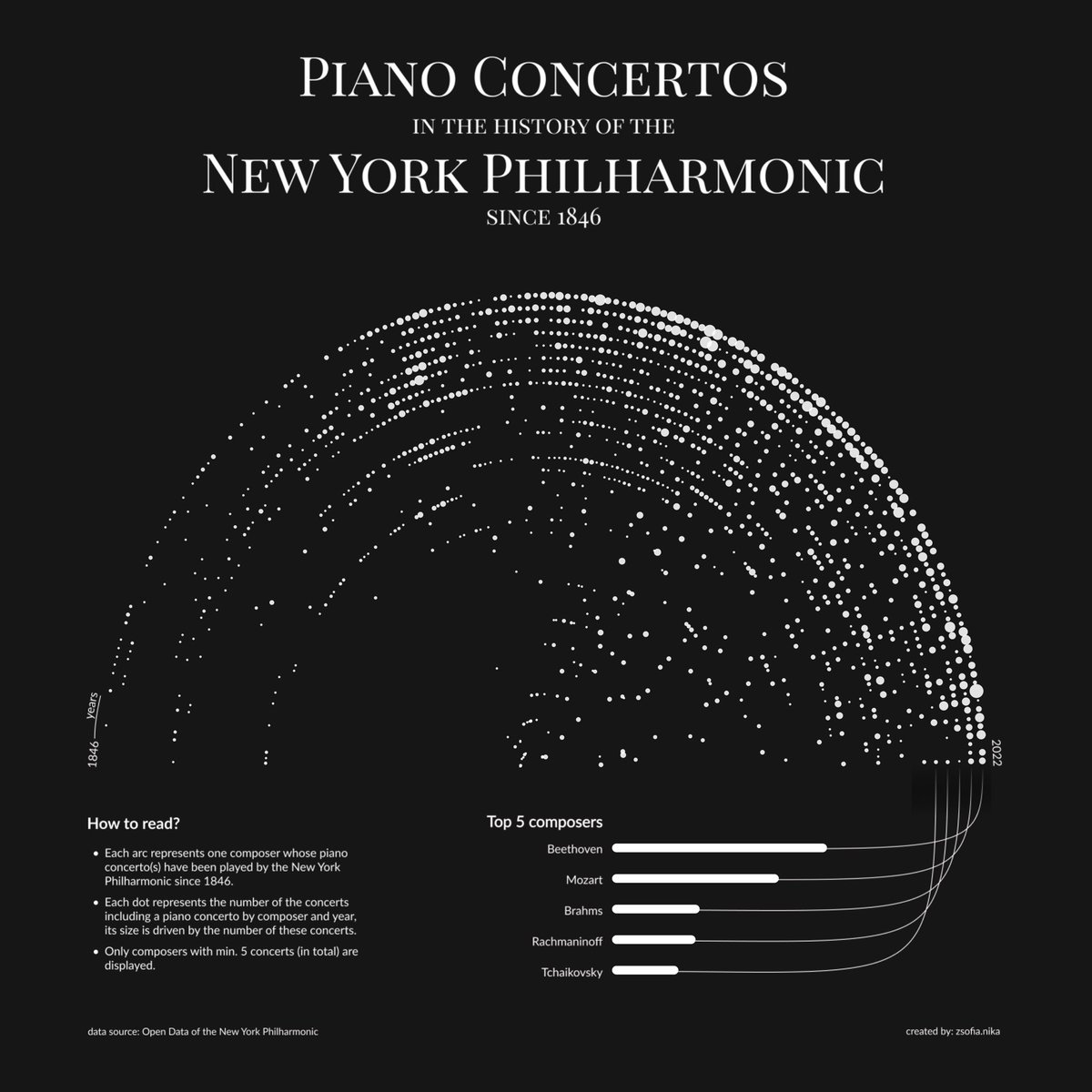
Turning data into a symphony 📷! @ZsofiaNika's personal Iron Viz journey hits all the right notes in the Concerto of Data Points. Explore classical music from the #DataViz point of view! 📷📷 #IronViz#DataSymphony
Designers want to make their work more accessible but decision makers want good enough products in the quickest possible time. Can these two positions be squared? #accessibility#a11y#dataviz
The long-awaited #Outlier2023 videos are now on our YouTube channel! Browse and explore 40+ talks delivered by researchers, developers, artists, designers, and more! youtube.com/playlist?list=…
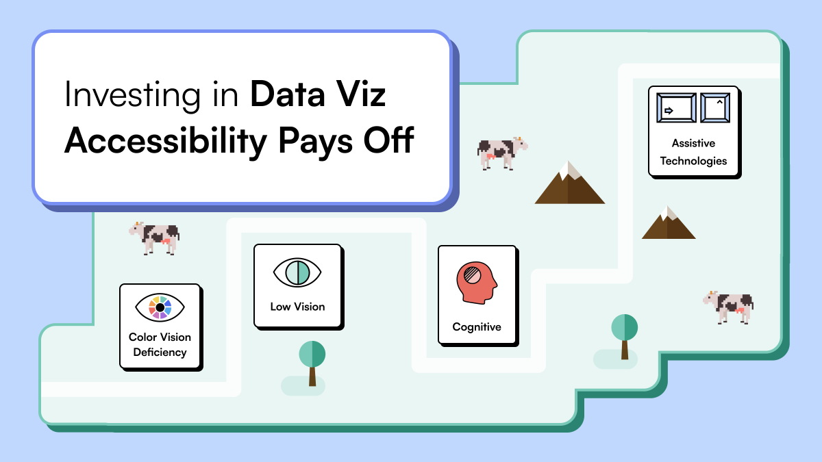
#datafam we're really excited to share our second dataviz #accessibility article with you.
This post is about demonstrating best practices and readily available features that anyone can use immediately in the two industry-leading Business Intelligence tools: PowerBI & #Tableau!
Is it mere coincidence or the intuition of Apple's designer?
This composition aligns remarkably well with the classic musical scale of octaves at a 2:1 ratio.
Steal this concept for your next design 😈
🟡 UI Colors - Tailwind CSS Color Generator by @erikdevries_nl
A fantastic web app where you can create custom color scales by entering HEX codes, using HSL sliders, or simply pressing the space bar.
Just have fun with it ✨
uicolors.app
When it comes to designing with data, #accessibility is a factor that’s critical to ensuring easy and deep engagement—yet it’s often overlooked.
Join us for the first article in a three-part series where we explore #dataviz accessibility standards in an enterprise context.
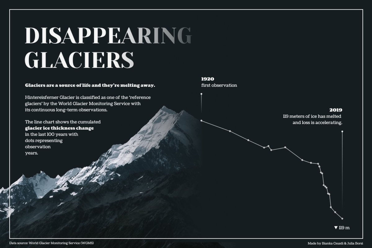
🌡️🥵 We're definitely melting here in Budapest, but have you ever wondered how glaciers feel? Our latest post unveils a heartbreaking #datavisualization of the iconic Hintereisferner Glacier, showcasing its gradual disappearance. Witness the dramatic effects of climate change.
No men left behind - but some women are, regarding lifetime achievement awards. Our visualization explores women's thin slice of Hungary's most established cultural award, the Kossuth Prize. #dataviz#datafamthevizcollective.starschema.com/posts/kossuth-…
Who says portraits have to be conventional? 🤔
Check out our team’s attempt to create our own data portraits by collecting some unusual attributes of our daily routines, orientations and things we
are frustrated or inspired by.
thevizcollective.starschema.com/posts/visualiz…#dataviz#datafam
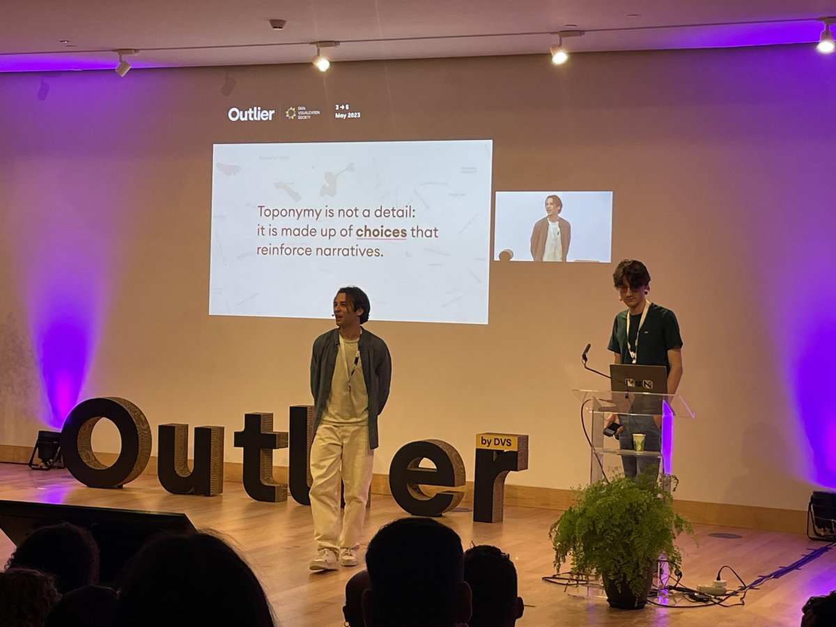
@rodolfoalmd out of breath! Very dramatic visualization of no. of deaths in Brazil, accompanied by a very well put together theoretical framework for visualizing larger than life events l, beyond data-humanism @OutlierConf#outlier2023@LabVis_UFRJ