ITom

73 posts

ITom banner
ITom

ITom

@ITom_Dev

Creative Developer ✦ Crafting Interactive Experiences. Student @uniopole . Stack: GSAP, Lenis, WebGL. Building the future of web with code

Poland Katılım Kasım 2024
35 Takip Edilen36 Takipçiler
Sabitlenmiş Tweet
ITom
ITom@ITom_Dev·
It’s finally live! 🚀 I just launched my new interactive 3D developer portfolio. I wanted to challenge myself to blend hand-drawn aesthetics with real-time WebGL, custom shaders, and physics-based interactions. Built with @reactjs, @threejs, and @greensock.
English
8
8
116
5.6K
ITom
ITom@ITom_Dev·
@protoduct_ai absolutely! it saves so much boilerplate time and lets us focus on the actual creative logic. exciting times
English
0
0
1
43
しん|AI×iOS開発
しん|AI×iOS開発@protoduct_ai·
アニメーションUIライブラリでMCP連携できるやつ見つけたんだけど… 完成度高すぎてマジでヤバい😂 光るボーダーとか流体カーソルとかパーティクルとか、クオリティ高すぎる しかもMCP経由でClaudeとかと直接連携できるらしい 全部無料でコピーできるとか最高すぎる…
日本語
24
156
1.4K
88.4K
ITom
ITom@ITom_Dev·
@Immersive_g massive congratulations! your team has been pushing the absolute limits of webgl and digital craftsmanship for years. getting into the fwa hall of fame is incredibly well-deserved. a huge inspiration for all of us creative devs!
English
0
0
1
25
Immersive Garden
Immersive Garden@Immersive_g·
It is a huge honor for us to join the FWA Hall of Fame. Since the early days of the web, FWA has stood as one of the highest distinctions in digital craftsmanship. Above all, this recognition celebrates the work of our entire team, who push the boundaries every year to create experiences that feel truly unique and unexpected. Reaching this level year after year requires an incredible amount of passion, precision and commitment, and we are more determined than ever to keep raising the bar. A huge thank you to @fwa.
English
2
2
12
605
ITom
ITom@ITom_Dev·
@pwnies the 'renderaissance' aesthetic combined with that dynamic lighting is absolutely stunning. doing a full walkthrough for the community is huge man, thank you! are you using custom normal maps mapped onto a webgl plane for the light interaction?
English
0
0
0
110
Jacob Miller
Jacob Miller@pwnies·
A bunch of people were asking how I made the effect for the "renderaissance" style page I made previously. Here's a full walkthrough of creating that depth / dynamic lighting effect for the web. Interactive version: html.non.io/tarot/
English
47
156
2.1K
110.9K
ITom
ITom@ITom_Dev·
putting an actual 3d interactive sketchbook right in the hero section is such an incredible way to inject pure personality into a portfolio. curious about the execution did you build custom shaders for the page bending logic or is it relying on a specific webgl library? absolutely stunning work!
English
0
0
0
13
ITom
ITom@ITom_Dev·
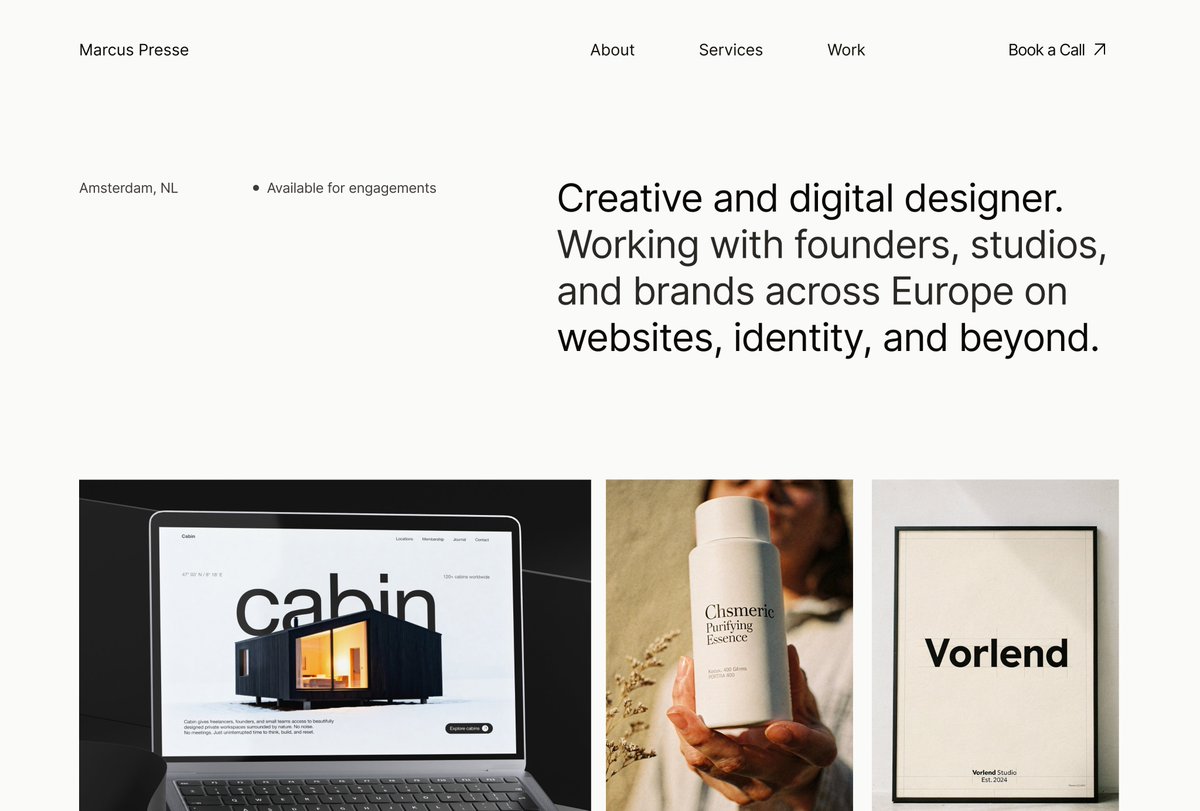
@uikuba minimalist portfolios are honestly the hardest to pull off because there's nowhere to hide bad spacing. the typography hierarchy and use of whitespace here is absolutely flawless. super clean work
English
0
0
0
13
Kuba
Kuba@uikuba·
Website for a digital designer portfolio
Kuba tweet mediaKuba tweet mediaKuba tweet mediaKuba tweet media
English
24
0
86
2.9K
ITom
ITom@ITom_Dev·
@adamhmwn @MotionLonelines @SlabPixel the contrast between that heavy, chrome/glass 3D aesthetic and the elegant editorial typography is so incredibly clean. adding motion to this really took it to another level. stunning work by the whole team
English
1
0
1
31
ITom
ITom@ITom_Dev·
@3DXRGuy @VIVERSEofficial @threejs projecting the raw webcam feed directly onto the mediapipe face mesh is such a clever way to handle the texturing. connecting that to a soft body solver without tanking the framerate is seriously impressive. thanks for the breakdown man!
English
0
0
0
31
David
David@3DXRGuy·
@ITom_Dev @VIVERSEofficial @threejs great question, yes mediapipe for both face and hands. the mesh that mediapipe includes for the face is what im projecting the webcam video on top of and then yes its a soft body solver
English
1
0
4
301
David
David@3DXRGuy·
made my face into a squishy toy for @VIVERSEofficial - webcam physics simulation, all in browser - built with @threejs - demo link below in replies
English
73
226
2.6K
154.3K
ITom
ITom@ITom_Dev·
@flowbertgustave couldn't agree more. the 'clean and monochrome' trend made 90% of portfolios look like they were built from the exact same template. injecting this much vibrant color and bold typography is exactly how you actually stay in someone's memory. beautifully done! 🔥
English
0
0
0
21
Gustave Flowbert
Gustave Flowbert@flowbertgustave·
Somewhere along the way, the web decided that everything had to be cool, clean, and monochrome.🥱 When we built Kirk, we went the other way. We embraced color. More personality. More expression. Because sometimes, all it takes is color to turn a good portfolio into one people actually remember. Cheers to that
English
5
0
46
1.3K
ITom
ITom@ITom_Dev·
@Matvej274 @framer the visible grid structure paired with that gradient mask on the 'MERIDIAN' type looks incredibly clean. framer templates are getting so high-end lately. looking forward to the release! 👀
English
1
0
1
23
Svaco
Svaco@Matvej274·
Homepage for my next @framer template in progress.
English
8
5
78
3K
ITom
ITom@ITom_Dev·
@CristianMielu this looks so cinematic. curious about the shader setup are you using a simple sine wave displacement based on mouse distance, or something heavier like a fluid sim for those ripples?
English
1
0
1
29
Cristian Mielu
Cristian Mielu@CristianMielu·
Ripple shader for this one...
English
23
0
81
2.4K
ITom
ITom@ITom_Dev·
@adriankuleszo b2b websites are usually so dry, but this looks incredibly premium. the typography and whitespace make it feel almost like an editorial piece rather than just a tech product site. super clean execution 🔥
English
0
0
0
18
Adrian
Adrian@adriankuleszo·
New client site is live! We collaborated with ParkBee to relaunch their B2B-product website. ParkBee Business connects real estate owners, mobility platforms, and millions of drivers into a single parking network across Europe, backed by camera hardware for touchless drive in, drive out. We reworked the positioning and copy together, gave every customer type its own page, and built it in Webflow over a few weeks.
English
46
10
425
66.6K
ITom
ITom@ITom_Dev·
@by__huy couldn't agree more. building with a modern headless cms like sanity makes this so much easier nowadays. empowering the client to own their content without breaking the layout is the ultimate flex. trapping them in retainers is just lazy.
English
0
0
0
8
Huy Nguyen
Huy Nguyen@by__huy·
Last week we started handing Backhouse the keys to their own website. Full CMS access, tutorial videos, Search Console, everything. In 90 days we're making sure they won't need us for the day-to-day. Unfortunately, too often I hear it from clients and prospects where they have a site they can't update themselves or a CMS nobody else understands. The people who built it are long gone, and now the business is stuck with something they can't touch. We do the opposite on purpose with ninety days of free support after launch for every project no matter what. We fix the CMS until updating content feels like second nature. I would record the tutorials myself walking through managing the site one by one then step back. If they need us after that, it's an hourly rate for small changes, or a fixed quote for something new. No retainer sitting quietly on their invoice every month whether they need us or not. I understand why studios choose retainers. Predictable revenue feels safer than earning the next project from scratch every time. But a website is supposed to be a living asset that last for years. It only lives if the people running the business can actually touch it. We'd rather be the studio a client recommends because they didn't need us anymore, than the one they're quietly resentful of because they still do.
English
5
5
154
5.1K
ITom
ITom@ITom_Dev·
@HeyDetya @animosapp that cascade stacking effect is incredibly clean. built a similar interaction manually last month and getting the overlap math right was a pain. does animos export this directly to gsap code?
English
0
0
0
27
Hey Detya
Hey Detya@HeyDetya·
Sneakpeek at the newest template for @animosapp 👀 Clean, smooth, and ready to use. What do you think?
English
4
2
58
4.2K
ITom
ITom@ITom_Dev·
@_pwd_ seeing old flash legends resurrected with webgpu and TSL is the best timeline. the mesh deformation on interaction feels incredibly tactile. super clean rebuild man
English
0
0
1
46
Frank Reitberger
Frank Reitberger@_pwd_·
Unstable solid. #threejs Had some time to rebuild one of my fav efx using WebGPU & TSL from an demo called "𝘈𝘳𝘦𝘢 𝘜𝘯𝘴𝘵𝘢𝘣𝘭𝘦" done in 𝙵̶𝚕̶𝚊̶𝚜̶𝚑̶ (r.i.p.) back then. An all mesh-based deformation due to user´s interaction. Live: dasprinzip.com/tinker/day39/ #webgpu
English
4
7
102
8K
ITom
ITom@ITom_Dev·
@cssdesignawards @obys_agency Experiment spaces are always where the best creative dev magic happens. The WebGL work on that floating 3D gallery is incredibly smooth. Well deserved WOTD!
English
0
0
2
42
ITom
ITom@ITom_Dev·
just wrapped my first year of CS (4.9 GPA) so I shipped a new component to celebrate Messy Stacking Sections scroll and sections stack like tossed paper. random rotation on entrance, straighten on scroll, pin in place. @greensock ScrollTrigger + @LenisSmooth . 3 files. no frameworks.
English
0
0
0
63
ITom
ITom@ITom_Dev·
@tubikstudio Oversized typography masking the hero image always feels so premium. Love the editorial direction here, especially how the warm palette ties the grid together. 🔥
English
1
0
1
44
tubik
tubik@tubikstudio·
A website for an architecture and interior design studio. Warm neutral palette, oversized typography and an editorial image grid that keeps all the focus on the work.
English
4
3
70
2.8K
ITom
ITom@ITom_Dev·
@areebadesigns That massive typography in the footer goes incredibly hard. 🔥 Love how clean and structured the bento grid feels for the product section. Beautiful work Areeba!
English
0
0
0
15
Areeba
Areeba@areebadesigns·
Still obsessed with how this one turned out. ✨
Areeba tweet mediaAreeba tweet mediaAreeba tweet mediaAreeba tweet media
English
18
1
75
2K