Sabitlenmiş Tweet

JarlDM is proud to announce that the Kickstarter for Iskløft is now live! - kck.st/2rcRnXt
Will you join your Jarl in the shield wall?
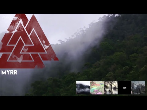
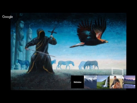
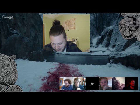
You can check out an ongoing campaign here! - youtu.be/27j55ncIfsY
#DnD #rpg #dungeonsanddragons #dnd5e
YouTube
English