
Sakumi
5.5K posts


I don't think I've ever watched a show with a good season 3
English

@ItsSakumi I mean, it would be too confusing for the drivers if there were drastic changes
English
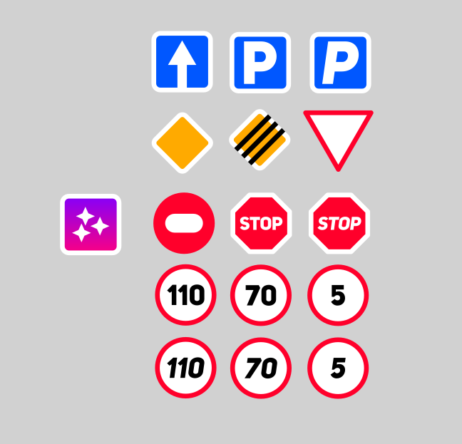
After I found out that my country's road signs are similar to the soviet-era ones, I randomly decided to redesign some of them and they look like they're from a fucking videogame 😭
English


CSS Trick! ⭐️
You can animate your gradient borders by defining types for your custom properties with @ property 🔥
1. Define a property
@ property --angle {
syntax: ''; /* 👈 type angle*/
inherits: true;
initial-value: 0deg;
}
2. Animate the value
article {
animation: rotate 2s infinite linear paused;
}
@ keyframes rotate { to { --angle: 360deg; } }
3. Use the value in your conic-gradient background.
article {
--gradient: conic-gradient(from var(--angle), ...);
background:
linear-gradient(var(--bg), var(--bg)) padding-box,
var(--gradient) border-box;
border: 4px solid transparent;
}
4. Change the play state to running on :hover, etc.
article:is(:hover, :focus-within) {
animation-play-state: running;
}
That's it! 🤙
As soon as Firefox 120 lands, this one will work in all browsers! 🙌 Until then, it's a progressive enhancement. You will still get the brightening of the border on hover, etc. That's handled with a pseudo-element ✨
@CodePen link below! 👇
jhey ʕ•ᴥ•ʔ@jh3yy
CSS Trick! ⚡️ You can create gradient borders by using transparent borders 👀 No extra elements 🤙 article { background: // layer them up with different origin! linear-gradient(var(--bg), var(--bg)) padding-box, var(--gradient) border-box; border: 4px solid transparent; } The trick is to layer background images using different background-origin ⭐️ Then use a transparent border to define how thick the border is! padding-box positions a background relative to an element's padding. border-box positions a background relative to the border-box 🔥 The ✨magic✨ part? You get that nested radius for free 😅 Check out the exploded view in the video and have a play with different values in the demo 🎞️ @CodePen link below! 👇
English
Future CSS Tip! 🚀
You can create auto-resizing text inputs with one line of CSS 🤯
textarea {
form-sizing: content; 👈 That's it!
}
The size of your input will grow to fit your content. If you want to constrain the size, do something like this:
textarea {
form-sizing: content;
min-height: 2lh;
max-height: 10lh;
}
This one's awesome. Think about how much effort it will save you 🙌 No more JavaScript to sync a textarea height to fit the content 🔥
Perfect for chat interfaces, messaging, comments, etc. 📢
@CodePen link below! 👇
English


15 years ago today, ‘LEGO BATMAN: THE VIDEOGAME’ was released.

English

I completed building this X-clone with HTML and CSS.
It took me two sleepless nights to hardcode the clone.🥹🚀
English


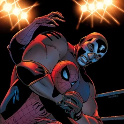
la pasión de Benito son las luchas libres, por algo entrenó para estar en la WWE, si te dicen que serás el protagonista en una película de un wey de luchas libres que es villano de Spider Man, para mi es mas q entendible que sea un proyecto que le apasionaba tanto.
Sakumi@ItsSakumi
@CultureCrave @VanityFair Imagine saying "El Muerto is my dream role" 💀
Español
@CultureCrave @VanityFair Imagine saying "El Muerto is my dream role" 💀
English

@VanityFair It was his dream role
When asked what happened, he went silent before his publicist said "obviously, it's out"
vanityfair.com/style/2023/09/…
English


We spent the last ~15 months building 🕹️ react.gg – our take on a modern, interactive React course.
Today we're happy to announce that it's live and available for everyone.
Here's why we're excited about it and why it took so long to create.
English