

NJI PHILL NARD AWA👨🏾💻
34 posts

NJI PHILL NARD AWA👨🏾💻
@LarryDeAnalyst
DATA ANALYST || SOFTWARE ENGINEER || GRAPHIC DESIGNER. Excel || Tableau || Python || Power BI || SQL || PowerPoint || Figma || AWS || AZURE...
Katılım Ekim 2025
12 Takip Edilen2 Takipçiler



A nail tech finishes a long day at the salon.
Payments came in from a UK client, an Australian booking, and a regular customer paying locally.
Different currencies. Different amounts especially at this time of the year 🎄 with tourist and foreigner’s around
At night, she opens Excel and asks herself:
“So… how much did I actually make today in dollars?”
This is the reality for many small business owners, freelancers, salons, and creatives working with clients across borders.
Manual conversions, Google rate checks, inconsistent numbers, and by month-end, the figures don’t fully add up.
So I built a VBA-based Currency Conversion System in Excel to fix this exact problem.
What the system solve:
🔻Automatically converts foreign payments to USD
🔺Uses live exchange rates via API
🔻Stores every transaction in a clean, audit-friendly structure
🔺Eliminates manual calculations and conversion errors
How it works (behind the scenes):
🔺A structured Transactions sheet for accurate record-keeping
🔻A VBA UserForm that handles entry, validation, and instant conversion
🔺API integration with smart caching, so rates stay fresh without hitting limits
🔻Multiple fallback layers so it still works when the internet or API doesn’t
🔺Locked calculation fields to protect data integrity
What looks like a simple form is backed by careful logic, error handling, and performance optimization, because financial tools don’t just need to work, they need to be reliable.
If you’re interested in Excel automation, VBA, financial systems, or practical business tools, let’s talk.
And if you’re a business owner dealing with multi-currency payments, this is exactly the kind of problem Excel can solve when built right.
Tool: @msexcel x ExchangeRate-API.com
#Excel #ExcelVBA #MicrosoftExcel
English

Just completed this dashboard analyzing key metrics from HR data.
- attrition rate
- location analysis
- demographics and inclusivity
- how age and education affects income
Generally I believe @tableau visuals are better, although the tool has a steeper learning curve.
Who wants to take the challenge of replicating this with Power BI?
Walkthrough from @datawithbaraa

English

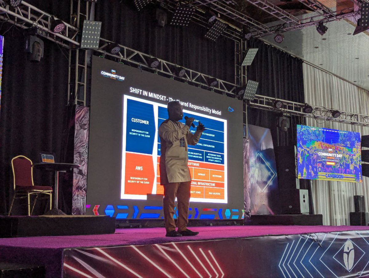
We’re kicking off AWS Community Day Buea with a bang!
Ernest Mougoue broke down the Shared Responsibility Model and the IMDS case study, noting that 80% of companies faced breaches last year—a sharp reminder for Cameroon’s builders to stay security-savvy.
#AWS #AWSCommunityDay


English
@Roshethequeen @ObohX @cheftee_lead @iam_daniiell @ThisIsDikky @starboy_abefe @TheMattAnalysis Your color choices are always top notch
English

ROSHE STORE SALES ANALYSIS👌
The aim was to uncover customer and product insights, track seasonal and behavioral trends, and identify opportunities for improving retention and sales strategies.


English

𝗛𝗲𝘆 𝗴𝘂𝘆𝘀, 𝗴𝗼𝗼𝗱 𝗺𝗼𝗿𝗻𝗶𝗻𝗴.
Imagine being able to track your spending patterns and see trends over time. Not just “I spent £200 this month” but actually understanding WHERE your money goes and HOW it changes.
That’s what I built 👇
𝗨𝘁𝗶𝗹𝗶𝘁𝘆 𝗘𝘅𝗽𝗲𝗻𝘀𝗲 𝗧𝗿𝗮𝗰𝗸𝗲𝗿
A Power BI dashboard that tracks electricity, gas, water, and internet expenses month over month.
You can see:
→ Total expenses at a glance
→ Breakdown by utility type
→ 12-month trends with comparisons
→ What increased, what decreased, by how much
𝗧𝗵𝗲 𝗖𝗵𝗮𝗹𝗹𝗲𝗻𝗴𝗲:
I wanted a dynamic rolling 12-month period for the charts. Not fixed dates, but a window that moves as new data comes in.
Took me a while to crack it, but I got it working. This feature is something I’ll be implementing in future projects because it makes dashboards way more flexible.
𝗜𝗻𝘁𝗲𝗿𝗮𝗰𝘁 𝘄𝗶𝘁𝗵 𝗶𝘁 𝘆𝗼𝘂𝗿𝘀𝗲𝗹𝗳:
app.powerbi.com/view?r=eyJrIjo…
Play around with it. Filter by month. See how expenses move.
𝗠𝘆 𝗻𝗮𝗺𝗲 𝗶𝘀 𝗗𝗮𝗻𝗶𝗲𝗹. 𝗜’𝗺 𝗮 𝗗𝗮𝘁𝗮 & 𝗕𝗜 𝗔𝗻𝗮𝗹𝘆𝘀𝘁.
If you need dashboards that actually help you make decisions, let’s talk.
📧 ntedaniells@gmail.com
Also, I just launched a YouTube channel where I’m teaching data analytics from scratch. Subscribe here: @talkdatawithdanny?si=dW773Opl58W8qVLI" target="_blank" rel="nofollow noopener">youtube.com/@talkdatawithd…
𝗪𝗵𝗮𝘁 𝗲𝘅𝗽𝗲𝗻𝘀𝗲 𝘁𝗿𝗮𝗰𝗸𝗶𝗻𝗴 𝗱𝗼 𝘆𝗼𝘂 𝘄𝗶𝘀𝗵 𝘆𝗼𝘂 𝗵𝗮𝗱? 💬
#PowerBI #DataAnalytics #Dashboard #DataVisualization #BusinessIntelligence #datafam


English
(volume strategy/clearance required)?
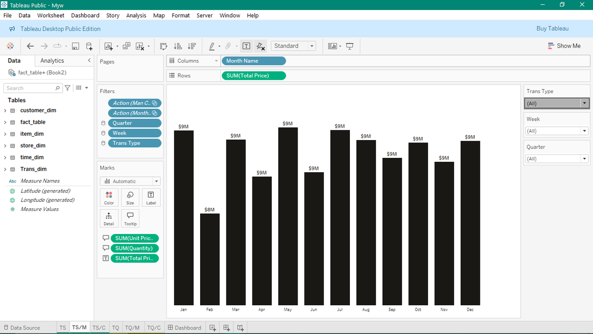
🫴🏾The dark theme is optimized for executive use, and the dynamic filters (Week, Quarter, Trans Type) ensure a personalized view for every stakeholder.
Critiques and connections are welcome as I look to land my first role in analytics!
English
Data Story: Uncovering Discrepancies in Global Sales Performance in Tableau 🌍
As a data analyst, my goal is to reveal the why behind the numbers.
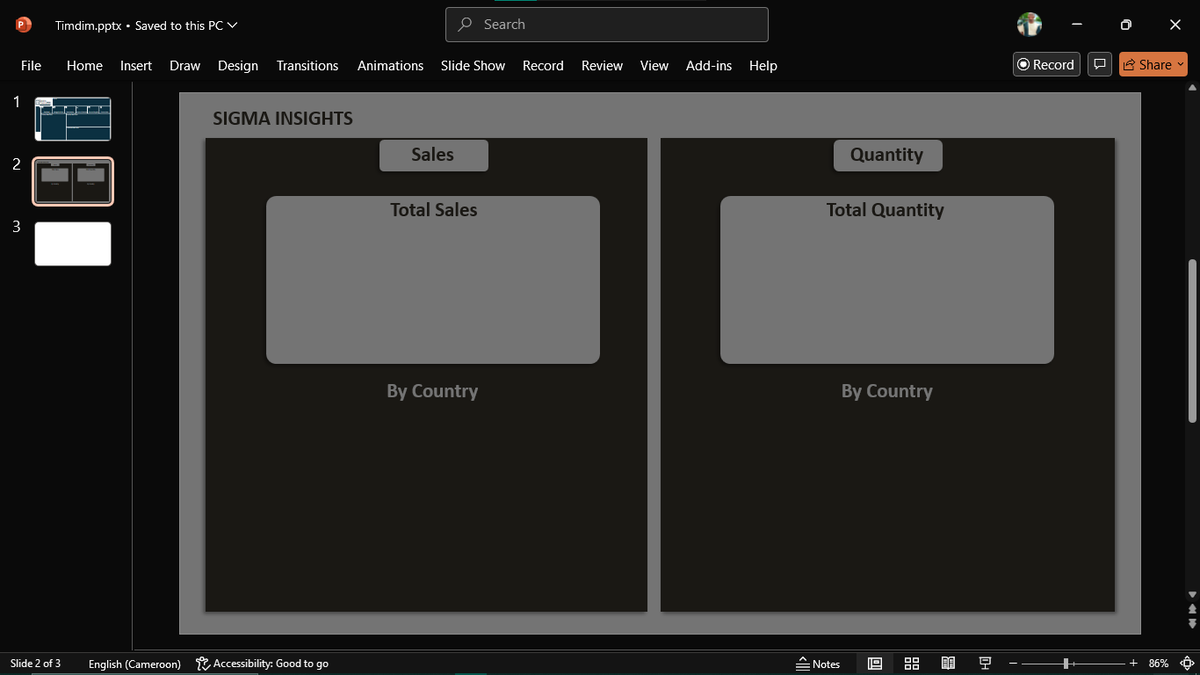
I did the dashboard with Tableau and Wireframing in PowerPoint.
This dashboard tackles a critical business question: Are we


English
maximizing profit or volume?
🫴🏾By placing Sales figures and Quantity figures side-by-side, we can quickly spot strategic opportunities:
🫴🏾Which countries have high dollar sales but lower quantity (high-margin success)?
🫴🏾Which countries move high quantity but generate lower sales
English
or have you fully switched to Relationships/Noodles for your data prep? Share your modeling tips below! 👇
#Tableau #DataModeling #DataAnalytics #StarSchema #BusinessIntelligence #FactAndDimension
English
📐 Stop Joining. Start Relating. The Power of Data Modeling in Tableau.
For years, connecting tables in Tableau meant wrestling with traditional SQL JOINs. That’s changed, thanks to Tableau’s modern data modeling.
The image attached shows how easy it is to set up a true Star

English
Less need for complex Level of Detail (LOD) calculations to fix join errors.
The result? We spend less time modeling and debugging data duplication issues, and more time focusing on generating insights—the real job of a data analyst!
Are you still using old-school joins,
English
customer_dim or time_dim) don't duplicate records when relating to the fact_table.
🫴🏾Clean Analysis: You can easily drag fields from any table without worrying about which joins to use. Tableau figures out the correct relationship on the fly, leading to more accurate analysis and
English
the "noodles" in the model) keep tables separate internally. They only JOIN when fields are needed in a viz, and they intelligently handle measure aggregation.
🫴🏾Referential Integrity: It respects the cardinalities (one-to-many, many-to-one), ensuring your Dimension tables (like
English
Schema (Fact and Dimension Tables) right in the data pane.
Why this is a Game-Changer for Analysts:
🫴🏾Flexibility (No More Join Agony): Traditional INNER or LEFT JOINs pre-aggregate the data, potentially causing data duplication and invalid measures. 🫴🏾🫴🏾Tableau’s Relationships
English
What’s your favorite Tableau trick to instantly add context to a visualization? Let me know below! 👇
#DataAnalysis #Tableau #DataVisualization #BusinessIntelligence #Analytics #DataStorytelling
English

show a mini bar chart of that region's historical performance.
The result? Instead of interrupting their analysis to look up context, your user gets the full picture instantly. This moves the conversation from “What does this number mean?” to “What action should we take?”
English
the tooltip editor to create visual hierarchy. Key metrics should jump out immediately.
Embed a Viz-in-Tooltip (Optional, but Powerful): For a really advanced touch, you can insert an entire secondary worksheet into the tooltip. For example, hovering over a region on a map could
English
Contextual Statement: Use the logic of your viz to build a sentence, like: "For this product, 433,827 Units were Sold, and it generated $68,650,971 in Operating Profit, making it a top performer this quarter."
Use Markdown & Formatting: Use bolding, color, and line breaks within
English