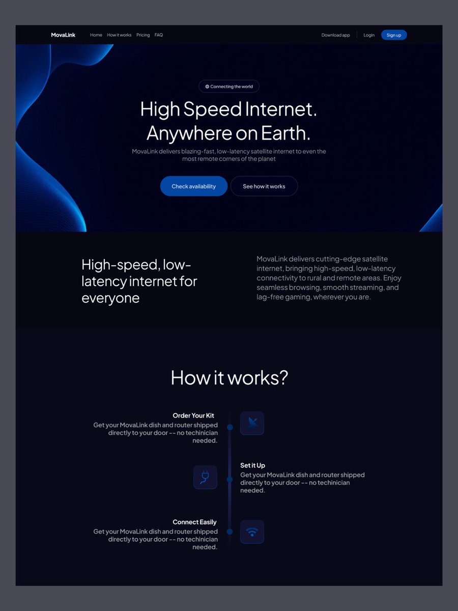
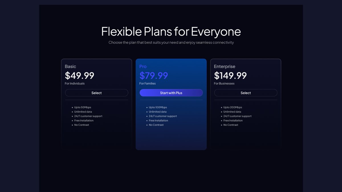
@noordesignn Good colouring! Background image on hero section needs a bit more of proper positioning. It looks a bit imbalanced. And also, purple on blue (pricing section) reduces visibility and contrast, therefore makes it hard to read! Hope it helps!🙏✌️🫶
English