Noor

488 posts

Noor banner
Noor

Noor

@noordesignn

Simplifying complex ideas into clean interfaces - Open for commissions

Katılım Mayıs 2024
44 Takip Edilen65 Takipçiler
Sabitlenmiş Tweet
Noor
Noor@noordesignn·
designs from April
English
6
1
19
427
Elias
Elias@Lightstudio__·
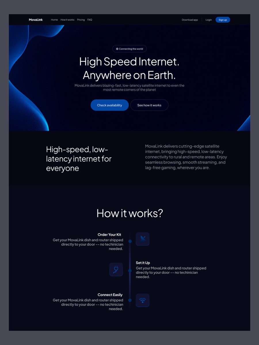
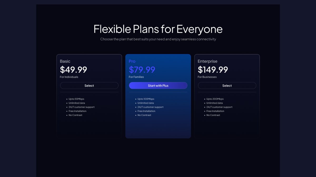
@noordesignn Good colouring! Background image on hero section needs a bit more of proper positioning. It looks a bit imbalanced. And also, purple on blue (pricing section) reduces visibility and contrast, therefore makes it hard to read! Hope it helps!🙏✌️🫶
English
0
0
0
7
Noor retweetledi
Noor
Noor@noordesignn·
some shots from a recent landing page design
Noor tweet mediaNoor tweet mediaNoor tweet media
English
5
0
10
195
Noor
Noor@noordesignn·
@emonuxui im glad it serves the intention
English
0
0
0
15
Emon Datta
Emon Datta@emonuxui·
@noordesignn A cohesive theme and polished presentation usually say more than long explanations ever could.
English
1
0
1
14
Sameer
Sameer@samtwtss·
fintech landing page design in progress thoughts?
Sameer tweet mediaSameer tweet mediaSameer tweet mediaSameer tweet media
English
23
3
79
3.8K
Sheikh Tahir
Sheikh Tahir@sheikhtahir7098·
AI Books App Onboarding
Sheikh Tahir tweet media
English
2
0
9
52
Akem
Akem@AkemyDesign·
Bento from my Rocket-Studio Redesign How fresh does this UI look?
Akem tweet media
English
5
0
16
256
Amna
Amna@amna_designz·
I went from 6 → 100 followers in 40 days, here’s what actually worked: → When I didn’t have content, I didn’t do shit posting, I just designed something worth staring at (yes, I do stare at my own designs a lot 😭) → I observed that UI shots and short videos performed +
Sammy@Sammyykm_

@amna_designz Congratulations 👏🥳. I am really happy for you, But can I know what posting strategy you used on achievement (っ º - º ς) ?

English
5
0
4
115
Amna
Amna@amna_designz·
@noordesignn Looks stunning! I love the theme as well!
English
1
0
1
15
Akem
Akem@AkemyDesign·
@noordesignn You're most welcome, keep doing Noor! And btw let's be mutual and support each other if you want :)
English
1
0
1
6
Noor
Noor@noordesignn·
help me choose between these two
Noor tweet media
English
18
1
31
641
Noor
Noor@noordesignn·
@JayPROb01 2nd, looks very unique to me
English
1
0
1
9
Jay Jihane
Jay Jihane@JayPROb01·
Help me pick one..
Jay Jihane tweet mediaJay Jihane tweet mediaJay Jihane tweet mediaJay Jihane tweet media
English
11
1
18
304
Amena
Amena@AmenaiSabuwala·
Recently started this new onboarding ✨ Show some love 😭
Amena tweet media
English
12
5
84
1.3K
Noor
Noor@noordesignn·
@AkemyDesign thanks for the feedback/advice😇
English
1
0
1
10
Akem
Akem@AkemyDesign·
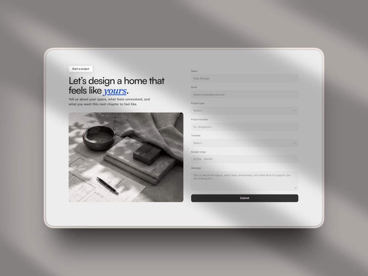
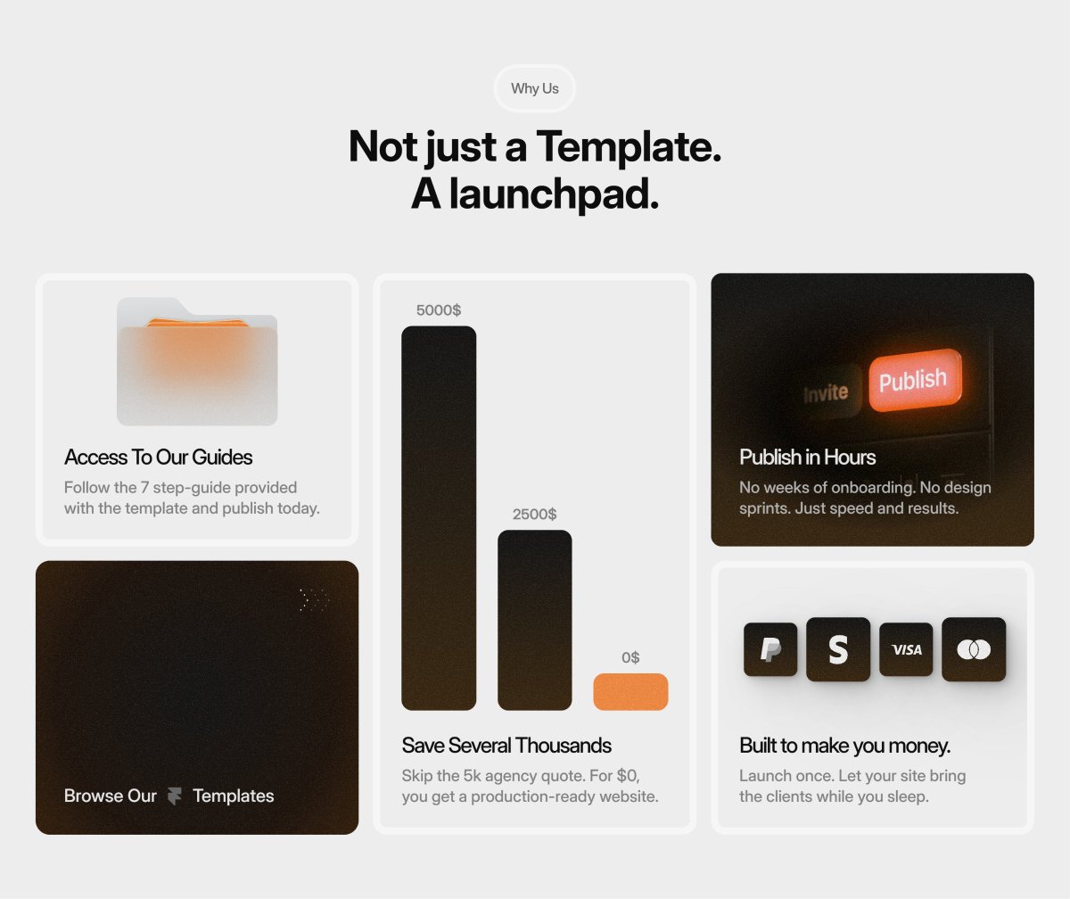
First no doubts, better visual balance, also if it's on framer you could enable text balance to the subtitle, or just shorthen the max width of it so the text is better balanced. Also you could try to remove the nav bar bg and apply a bg blur on it, and only activate the black background when the user scroll once or reach a triger
English
1
0
1
15
Noor
Noor@noordesignn·
@samtwtss i personally liked the 2nd one but y’all convinced me for 1st so now i like it too😅
English
0
0
0
8
Noor
Noor@noordesignn·
which one would you choose?
Noor tweet mediaNoor tweet mediaNoor tweet mediaNoor tweet media
English
23
3
59
1.9K
Noor
Noor@noordesignn·
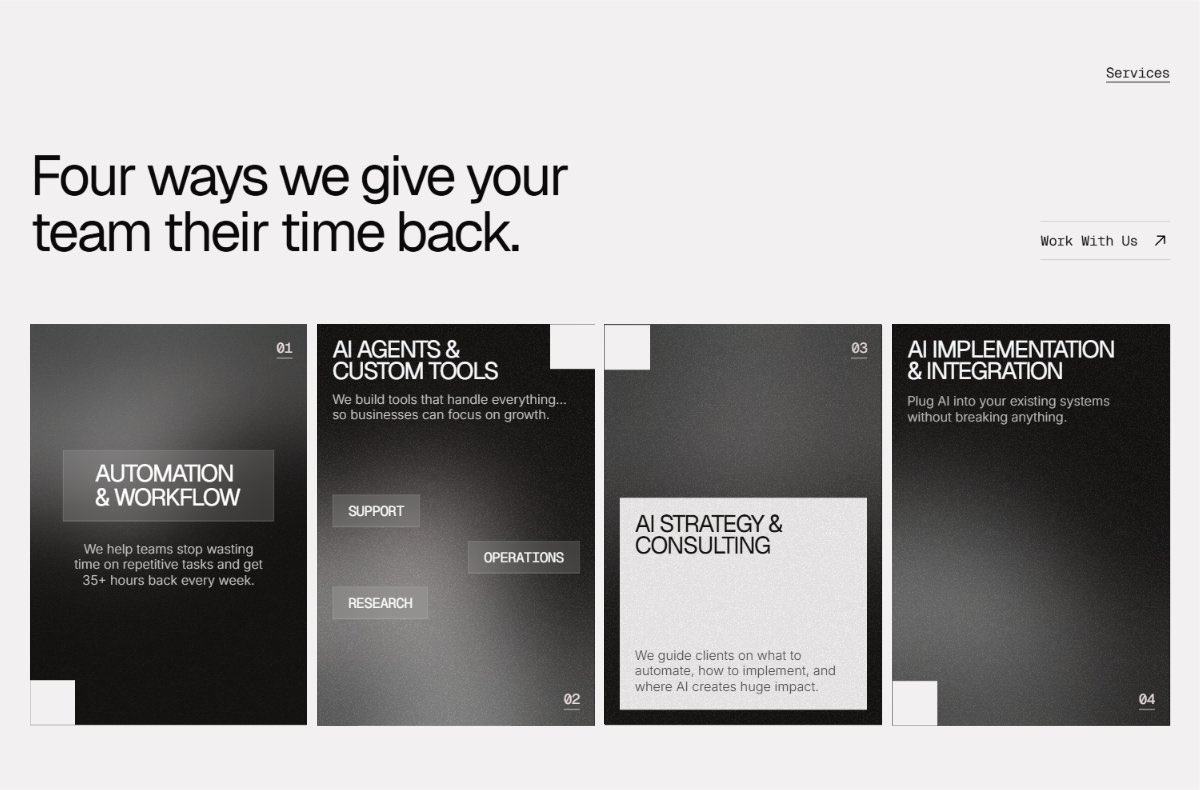
@areeshhaa bold typography, b&w color scheme, card details everything about this is top notch
English
1
0
1
56
Areesha Fatima
Areesha Fatima@areeshhaa·
One of my latest landing page for an AI agency
Areesha Fatima tweet mediaAreesha Fatima tweet mediaAreesha Fatima tweet media
English
7
1
32
707