The Paninos off-line

130 posts

The Paninos off-line banner
The Paninos off-line

The Paninos off-line

@Paninosoffline

💾 Adventure Games & free-remakes. 256 Colors Pixel AI art | Fantasy | Retro. Now working on "The Black Cauldron" 256 color remake.

Madrid, Spain Katılım Ocak 2026
30 Takip Edilen810 Takipçiler
The Paninos off-line
The Paninos off-line@Paninosoffline·
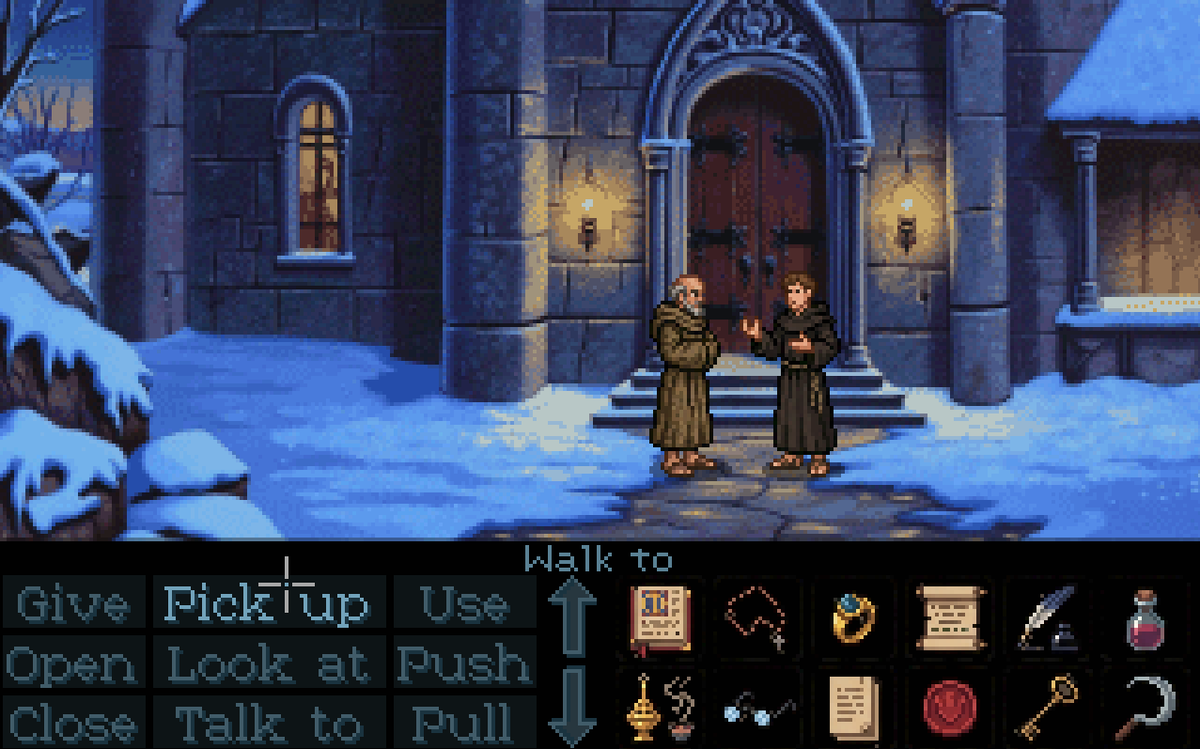
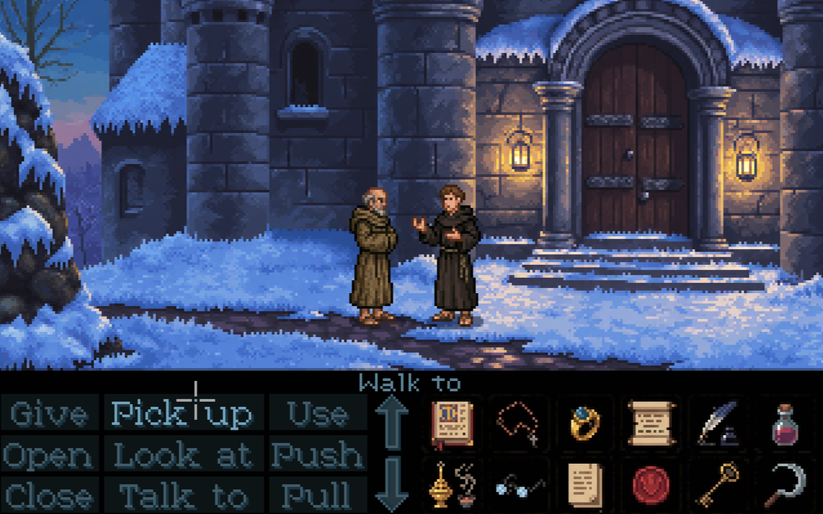
@CallMeWhatNot Thanks for your ideas, webdon't want to use different pixel size nor hi res UI. The idea is to work with 320x180 and that's it. With that in mind, there are some ideas that could be nice to have but this is gonna be a classic point and click...
English
1
0
0
8
Dan Iel
Dan Iel@CallMeWhatNot·
@Paninosoffline Out of these, the pre-rendered one look better. You could pixelate it further then the second version might look good. But the last one, the really dated one is not very good. Puzzle games need to be brought back upgraded.
Dan Iel tweet mediaDan Iel tweet mediaDan Iel tweet media
English
1
0
0
10
The Paninos off-line
The Paninos off-line@Paninosoffline·
Two styles: Painted-Scanned or Pure-pixel. What do you think?
The Paninos off-line tweet mediaThe Paninos off-line tweet media
English
92
25
388
26.5K
Dan Iel
Dan Iel@CallMeWhatNot·
@Paninosoffline Margin rules, font size, beveled buttons, or no buttons at all. Could display objects as text, when you scroll a list visual representation of the object appears in a separate window. Many ways to make it better. Gamepad instead of mouse ctrl in these type of games would be inter
English
1
0
0
12
GamEX
GamEX@GamEX_ElecEco·
@Paninosoffline Right picture! Do you search some programmer to help on this project ?
English
1
0
1
81
Aaron Gadol
Aaron Gadol@CRTOGRPHR·
@Paninosoffline It depends on the goal, the scan to me looks like a late era scumm-type game, They wanted games to look more "realistic". almost like a living painting. the second looks closer to the modern pixel-art approach. cleaner, hand drawn, but actually looks slightly less old-school.
English
1
0
8
803
manalabs
manalabs@thisuser·
@Paninosoffline pure pixel, don't create a style difference between the background and the characters (is my take)
English
1
0
1
124
Rock Steadfastson
Rock Steadfastson@bugler·
@Paninosoffline The one on the right looks better. Better quality of light, easier to focus. The one on the left is more tiring to look at because of all the blur.
English
1
0
1
57
perpetual stew
perpetual stew@theywilljustdie·
@Paninosoffline depends on personal taste. for me both are nice, so developers should probably go for the less work-consuming thing.
English
1
0
1
60
Duck Made Of Wood
Duck Made Of Wood@DuckMadeOfWood·
@Paninosoffline @myco54896926 Probably he means if you have the rights to make a game from an existing Intellectual Property. Even if Umberto Eco is dead, that doesn't mean the rights are available.
English
2
0
1
106
Claude Ronin
Claude Ronin@TwoForDinnerTFD·
@Paninosoffline Painted-Scanned is more pleasing here. Somehow this is how I remember playing those games (MI2). The Pure-Pixel is too harsh here for my taste.
English
1
0
2
174
The Paninos off-line
The Paninos off-line@Paninosoffline·
@DeSerrateGame Bear in mind those are from PC-like era so even EGA/VGA monitors were CRT, scan lines was not the same as consumer tv crt
English
0
0
2
299
Robcfg
Robcfg@robcfg·
@Paninosoffline I like both, but maybe the pure pixel one is slightly better. As I said, both are beautiful and won't complain about any of them :D
English
1
0
1
130
Dan Iel
Dan Iel@CallMeWhatNot·
@Paninosoffline I see no difference, both pixelated. But the UI needs improvement, monkey island was never good at it.
English
2
0
1
230
The Paninos off-line
The Paninos off-line@Paninosoffline·
@CallMeWhatNot The two styles differ, but they don’t exclude each other. The first is a hand-painted image, rendered pixelated by self-imposed limitations. The second is an image built by pixels, shaped by those very same constraints.
English
0
0
1
131